Brent Couchman
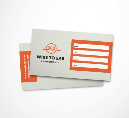
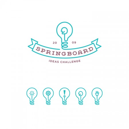
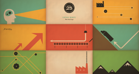
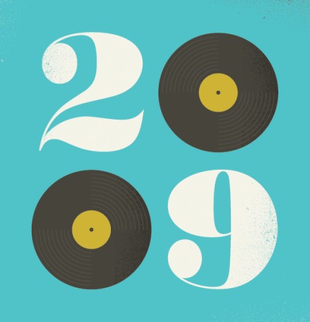

Brent Couchman has some great design/illustration work over at his portfolio. Love the style and his color palette is perfect.
More work over at his Flickr (thanks Matt for the link)


Brent Couchman has some great design/illustration work over at his portfolio. Love the style and his color palette is perfect.
More work over at his Flickr (thanks Matt for the link)
If you’re in need of some editorial or layout design inspiration, head over to the Behance site for POGO. I’ve just been cruising the archives of all issues of the online magazine SOKO. There is a ton of great typography and photography throughout each issue and I’m sure you’ll find something you like. Content-wise, it’s mostly fashion we’re talking, but it’s really just a playground for POGO to go crazy and design what they like. I also included their video Voyeur, because the color and post-processing is so good it made me forget I have to go to work tomorrow.
“The birth of a new color exists”. Well I’m intrigued; I’ve always wanted to see a new color. This video gives you a little behind the scenes look at the Pantone color factory. Be prepared for a number of tasty shots of ink and paper. The video is “to celebrate the release of The Plus Series, the next generation of the classic Pantone Matching System” and was produced by Base.
What would be really cool is if a color was invented that actually *looked* new. Sure they have ‘invented’ lots of new colors, but to the average person, it’s all the same stuffs: green, blue, pink, etc. You show 99/100 people a new Pantone color and they will look puzzled if you tell them it didn’t exist before. What I want to see is a new color that literally doesn’t exist yet. The kind of thing that is so new your mind cannot even comprehend what it would look like because by definition it is impossible. Something outside the spectrum of visible light. Until then, I don’t want to hear about these “new” colors. A little trippy I know, but when the Pantone guy said they invented new colors I got excited.
via Quipsologies.
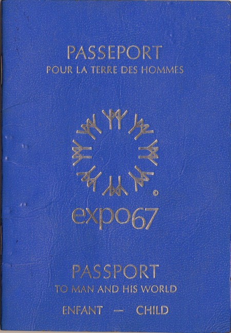
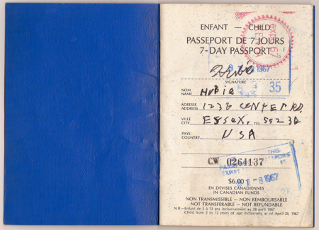
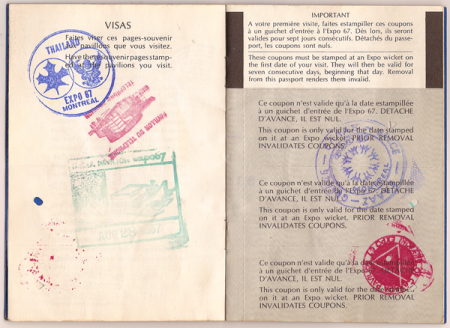
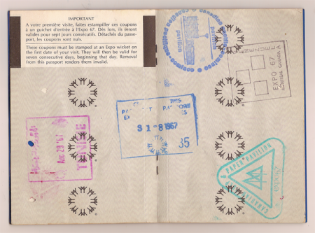
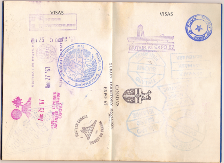
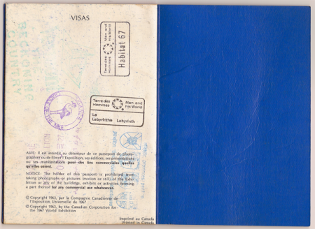
As evidenced by the various posts I’ve made on the subject, I’m quite fond of all things surrounding the World’s Fair Expositions. So when I found this gem on Ian Henry Smith’s Blog, Smallcano, I was pretty blown away. For someone who has fetishized all manner of official documentation since childhood, seeing an artifact that somehow combines the ideas of a passport and a 60’s-era World’s Fair Expo was pretty much the holy grail. The stamps send this thing over the top; it really doesn’t get any better. And check out the Habitat 67 stamp on the last image! I swear I’m going to get a tattoo of one of these.
According to Ian from Smallcano, he found this thing while “rooting around in [his] parents’ basement”. For me, this is basically the equivalent of those old stories about digging up a cigar box with a Honus Wagner in it. My only gripe is that the images are scans and not photos; scans don’t do objects like this justice. So Ian, if you’re reading this (I found the link through a comment he left here), thanks so much for posting these, but please shoot the passport on a nice wood table or something, a’la Insect54. That is, if you have the time, we’ll all thank you!
Via Smallcano

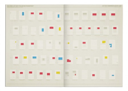
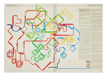
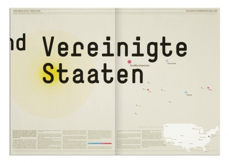
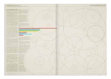
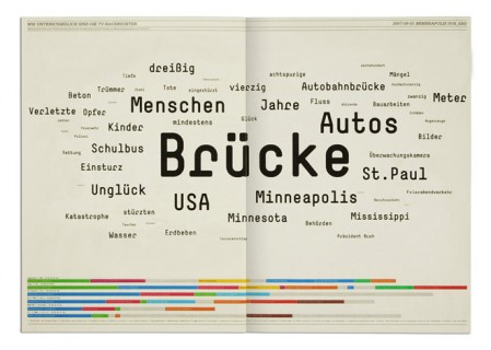
Overnewsed but Uninformed is a collection of infographics and by Stefan Bräutigam. When I first saw the title, I misread it thinking it said Overnewsed and Uniformed, which could also have made sense strangely enough. As it is, Stefan point is something we all can relate to: feeling overwhelmed with incoming “news” while actually learning nothing at all. At least that’s what I can gather, some may be lost in translation. Either way, the design is pretty brilliant.
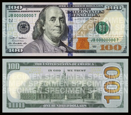
In case you haven’t heard, a new $100 bill was recently unveiled and will be rolling out in early 2011. The good news is that the new bill will be flashy. It has been updated to include some new “3D” anti-counterfeiting features. The bad news is that the design suffered in doing so.
Maybe I’m expecting too much, but the new features that this bill has brought to the table aren’t doing it for me. The few techie “3D” color-shift features are cool but clearly look to be crammed alongside and over other elements in the design. If you look at an old $100 bill, you can see that the design has more of a structured layout from element to element. As hard as it is to say, the new design actually has a couple positive things going for it, but they still don’t outweigh the negatives.
The new design adds vibrant color which something that the old bill lacked. It seems to me that if such a vibrant color is added, it should only be in one location: either in the actual numbers or as the background of the entire bill. I do believe that the spot of color on the back of the bill (second image) is a nice accent when used with the larger ‘100’ type but I can’t say the same for the color accent on the front.
With that said, it’s pretty clear that I’m skeptical about this design, but what do you think. Were these design changes for better or for worse?
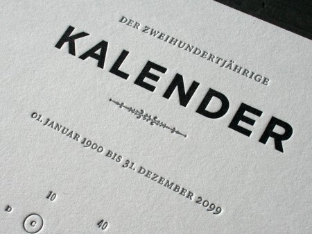
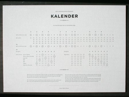
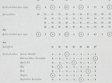
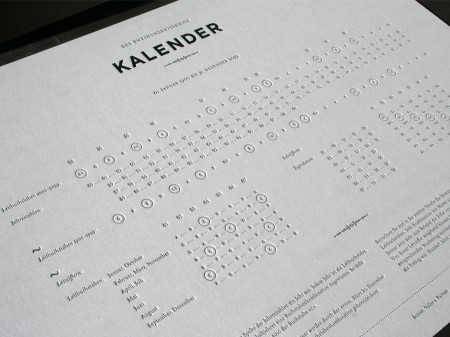
Calendars to me have always been items that I tell myself to use, but rarely do. However, I think that would change if I had this beautifully designed 200 year calendar by Sonner, Vallée u. Partner–a Munich, Germany based design studio.
This calendar was letterpress printed on a thick, 220lb cotton stock and is approximately 16.5 x 11.6 inches in size (click images to see larger).
Images via Beast Pieces.
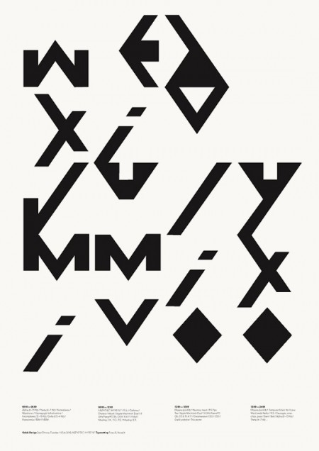
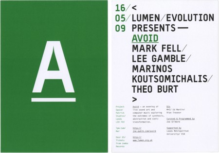
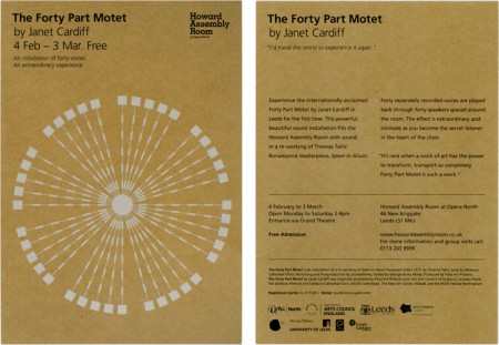
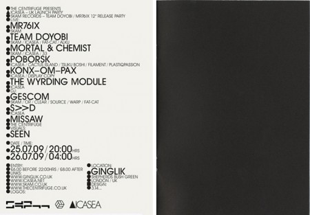
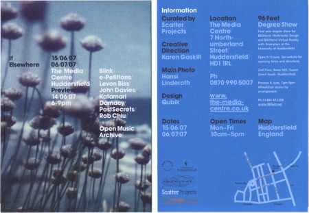
Qubik Design is a graphic studio based in Leeds UK. I like everything about these pieces except the color. The layout and type compositions I find very interesting; personally I just don’t prefer the chosen hues of green, blue or gold. Otherwise I think this work is fantastic. Especially that first one! I also like how clean and organized their site is. I’m starting to appreciate this much more now as a writer; recently I’ve come upon a number of sites that are so poorly laid out I give up researching, even if the work is amazing.