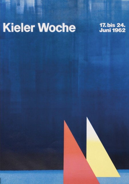
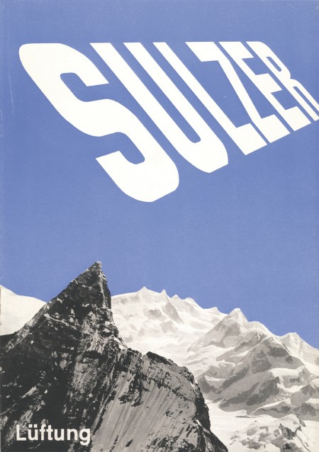
First off let me just say that it’s awesome to have come across this beautiful archive of work by German graphic designer, Anton Stankowski. The images in the archive are fairly large so the detail of the design becomes evident. In the first image of this post it looks to me like the background of the poster was painted with a brush then overlaid by the type. The process of how this was done would be refreshing to see.
The first thing about Stankowski’s work that pulled me in was the amount movement. Nearly every one of these pieces utilizes a visual system that controls your eyes across the graphic elements and to the typography. The system is very effective considering that I keep looking at these pieces every couple of minutes to see how my eyes move around.
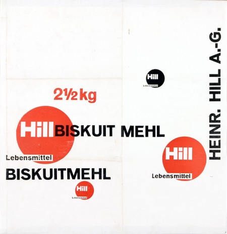
The Sulzer poster and the Hill Briskuit Mehl packaging are undoubtedly my favorites. Even though both are very simple they still have a lot of motion in them. Also in the Sulzer piece, the transition of the mountain peak to the type sings composition to me and in the Briskuit packaging I really admire the grid and typography.
I met Christopher and Edward from The Silent Giants at a show a while back where they gave me this beautiful The National poster along with a couple even beautiful-er hand-screened business cards. Being firmly planted in the digital world, I’m always fascinated by artists going the traditional route. The Giants are all about screen printing and their work is oozing with hands-on goodness. I especially like their packaging work.
Check out their portfolio and blog for more (the blog is highly recommended for some nice process shots)
I am very excited about the work of Sulki & Min. I saw these on but does it float this morning and they jump-started my mind. I’ve been in a bit of a creative funk recently and these posters were just what I needed to get excited about design again. I’m not exactly sure what specifically it was, though I suspect the type lockup in the top right quadrant of the 2nd poster down may have had something to do with it.
I also love the subtle details in the first poster — the line weight of the circle around the D, the differences between the two fours — simple yes, but boring no. (I’m sure some may disagree with me on this, but I can’t help but admire the restraint/confidence it takes to call a poster like this finished.)
Sulki and Min are Korean designers who both got their MFA in design from Yale. They have an astonishing body of work and have been exhibited many times. I am also a big fan of a few of their typefaces designs.
Aisle One posted earlier on this incredible Wim Crouwel Archive. The Het Geheugen van Nederland has generously archived over 500 of the Dutch master’s works. Break out your printers, you could probably get some decent prints out of some of these. I have his book but a lot of these are completely new to me.
Shailesh Chavda has a beautiful collection of matchbox labels up on Flickr. I have a book of Czech labels but I’ve never seen these German ones. Dave from Grain Edit originally turned me on to matchbox labels when he showed me his collection (I think they were mostly Czech). They’re so incredibly detailed considering the format; most of these would do fine as posters. I think the most striking part to me is the printing, when blown up you can really see that nice grain and spacing in the ink.
These are some original mock-ups of Cuban posters; painted on boards and then sent to the printers to have the shapes cut out and separated into colors for silk screening. It’s amazing to see how much the printing industry has changed. It seems that back then the printer had a more of a role in the composition itself, defining the edges and choosing the colors. I can’t imagine dropping off a painting at a modern print shop and expecting them to deliver a silkscreened masterpiece based on it.
A few killer works by Justin Allen LaFontaine. I had the Up North one on my blog a while back, but forgot how cool it was until today when I was perusing the electronic basement as it were. I wonder where that photo was taken.. Would love to see some recent work by Justin!