ISO50

RSS

Archive for the Advertising Category

IBM Slides: 1975

Posted by Scott

ib9[1]ib31.jpgib61.jpgib55.jpgib47.jpgib101.jpgib23[1]ib7[1]
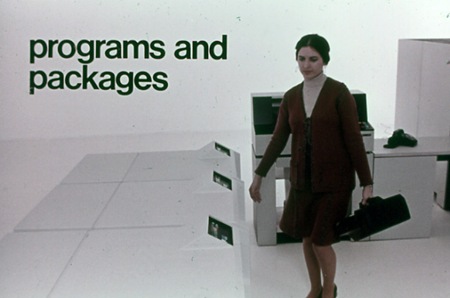
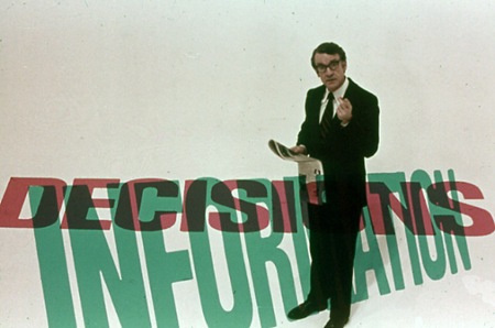
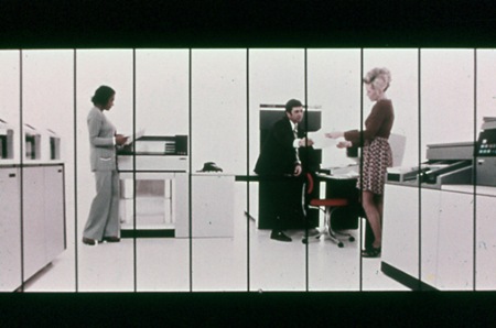
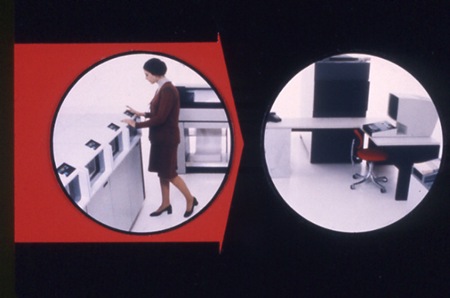
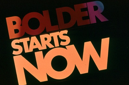
Stuart Dixon sent in these slides from a 1975 IBM presentation. They’re posted in a collection featured at Square America; the only information listed is the tagline at the top:

"It’s 1975 And This Man Is About To Show You The Future (Scenes From An IBM Slide Presentation)"

Have a browse through the rest of the collection, there are some really nice slides in there. I particularly like the information design examples like the last image pictured above. As far as I can tell much of it is set in Helvetica, but there seem to be a couple other faces floating around in there. The segmented slide (4th one down from top) would be great as a massive wall hanging. Someone needs to email Square America and see if we can get hi-res versions of these; many would make great posters.
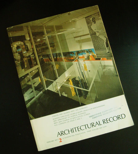
1971 Architectural Record Issue 2

Posted by Jakub

Cover
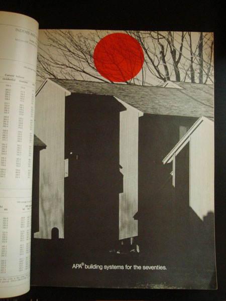
red circle
page1
ad
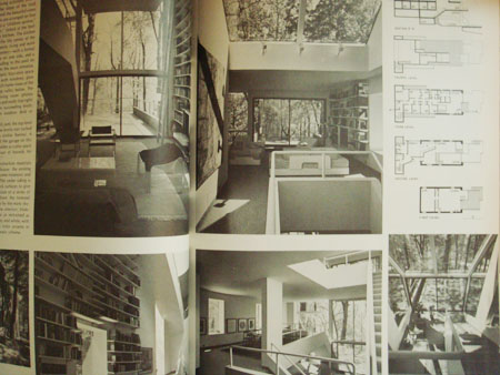
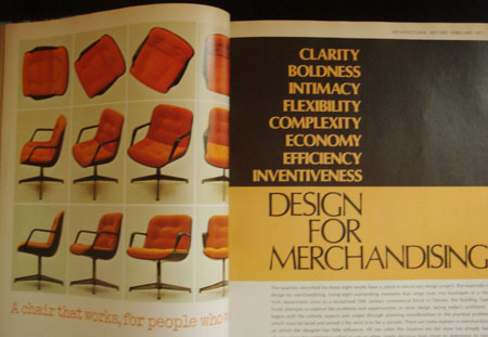
I grabbed some copies of this magazine because someone was going to throw them away. I’ve had them for awhile now and i thought i could share a few. I really love the red dot one, the dot just shows up randomly thru the magazine on black and white photographs. When i look at these older magazines i always wondered where they got all their typography, did these designers meet up and share? was there a mail-in ordering company for different types? hopefully i’m not treating the 1960’s-70’s like the stone age or anything to anyone but i always wondered about the process of graphic design was during that time to put out a well layed out higher end magazine.

More Graphis 71/72

Posted by Scott

grphs7172o grphs7172p grphs7172q
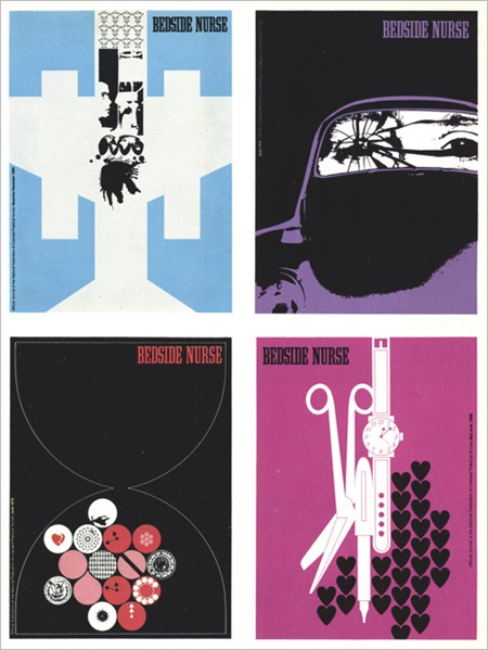
Some random beauty from Graphis 71/72 via The Nonist. These are from the same issue as that Dietmar Winkler piece I posted a while back (one of my all time faves). The Bedside Nurse stuff sort of reminds me of Air’s Virgin Suicides OST cover.

1. Charles Goslin / David Barnett. Covers for the magazinebedside Nurse. (Look very modern don’t they? But the bigger question “Bedside Nurse magazine?!")

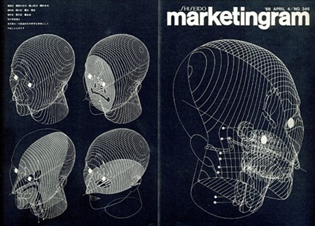
2. By: Kohei Sugiura. Front and back covers of Marketingram, the Shiseido house organ, here dealing with the morphology of the human head.

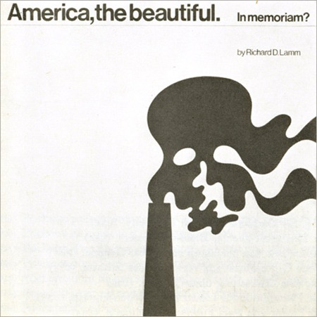
3. By: Ron Hughes. Cover for a record about ecology. (Gore could have used this for An Inconvenient Truth 35 years later.)

Hoffman-La Roche: Esanin

Posted by Scott

489258096_16809d3fe3_o
Hoffman-La Roche commissioned this ad featuring photography by René Groebli for the anti-anxiety drug, Esanin. At first glance I really didn’t grasp how amazing this composition is. If you really study it you’ll see some incredible typography and layout. I love the image, the various faces blending to create these almost psychedelic colors is very striking. Those crazy Germans, why do they have to be so good? You’re making us all look bad.

Via Alki1 on Flickr.