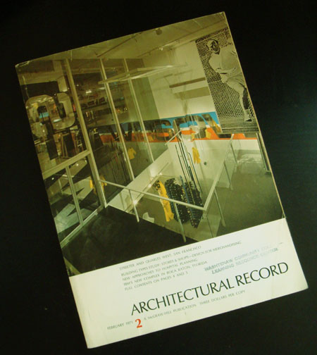
1971 Architectural Record Issue 2
Posted by Jakub
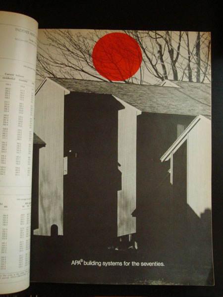
I grabbed some copies of this magazine because someone was going to throw them away. I’ve had them for awhile now and i thought i could share a few. I really love the red dot one, the dot just shows up randomly thru the magazine on black and white photographs. When i look at these older magazines i always wondered where they got all their typography, did these designers meet up and share? was there a mail-in ordering company for different types? hopefully i’m not treating the 1960’s-70’s like the stone age or anything to anyone but i always wondered about the process of graphic design was during that time to put out a well layed out higher end magazine.

4 Comments Leave A Comment
andy says:
July 5, 2008 at 1:46 pmPublications and printers would receive catalogs from foundries and order their typefaces in packages, much like the way you get digital type families and packages now.
At the time this was published, the most likely format would have been to receive the typesets in a “photo ready” format in the most typical point sizes. Designers would often use stencils of the type (and later, transfers) so they could make color mock-ups. What they would send to the printer, however would be two-color black and white layouts on boards. The printer would then photograph the layouts to make usable plates.
This is why so much of the design from that time uses very limited colors and type. Not just because the process got more expensive as you increased the amount of color and typefaces, but because it also got much more complicated.
Creating four-color separations during that time was particularly complicated. Usually there was at least one person at a printer who did separations exclusively.
I worked for a small mom and pop printer for several years not long ago, and we still had much of the equipment to handle this kind of printing because some of the clients we had went back 20 years. Although much of the technology from 20 years ago was *better* than that of 30-40 years ago, it was just an improvement of the same thing. The paradigm shift from shooting plates to making digital plates is a HUGE one. Same with creating layout with boards and hot wax (“paste up”) to layout on the computer.
But, to be honest, I use to love doing paste up. There’s something incredibly satisfying about putting that much detail in to what amounts to a handicraft. Also, hot wax smells *really* good :)
frank says:
July 6, 2008 at 4:24 amThat is very cool.
With the software and printing technology we have today it’s easy to lose appreciation for all of the hard work that would go into a project like this.
andy – it is cool to see that even with all of our technology today, the actual printing process has changed very little. Some things just can’t be improved much.
Great post!
Greg Vickers says:
July 6, 2008 at 8:29 pmdocumentary film-maker gary hustwit made an excellent film called ‘helvetica’ that i was able to catch as part of a type festival earlier this year.
in it, some of the old-school designers talk about the process of typefacing in the pre-digital era of design and they show some of the tools involved, including the original foundry typefaces themselves.
it must have been a totally different skill-set and work-timeline to be able to produce such beautiful work in an era before computers gave us the shorthands we all take for granted these days!
Dan Harlow says:
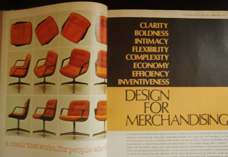
July 7, 2008 at 10:04 amThat chair in the magazine … I’m sitting in one right now as I type this comment. I bought it at a flea market not only because I love the style and the color orange, but because it still has an IBM corporation identification sticker on the leg.
Hmmm, now that I type this, I’m beginning to realize this is a big deal only to myself :)