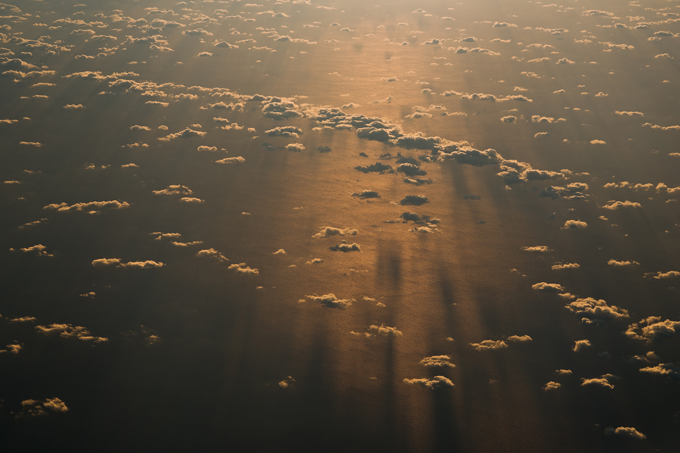
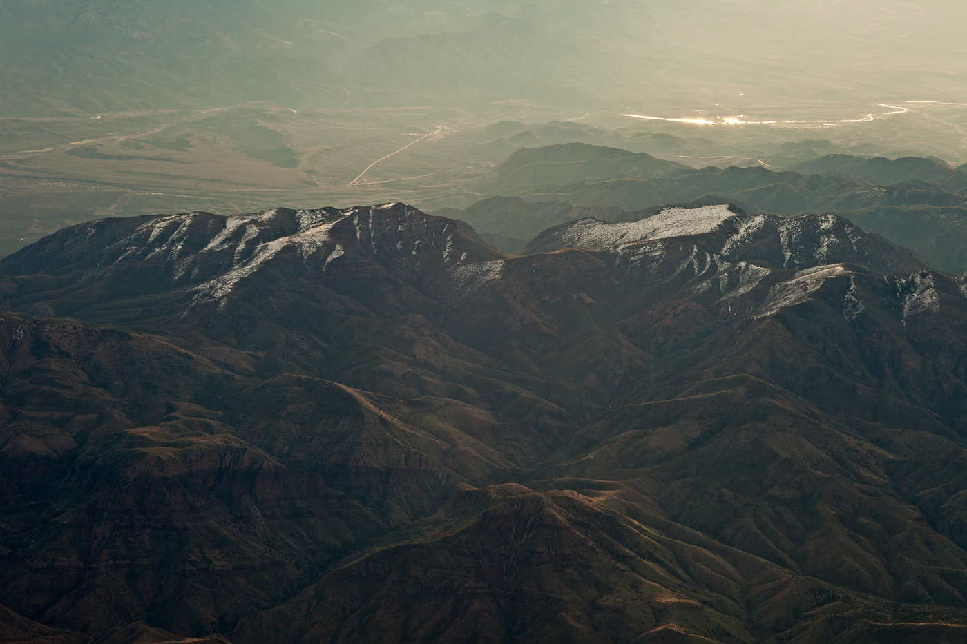
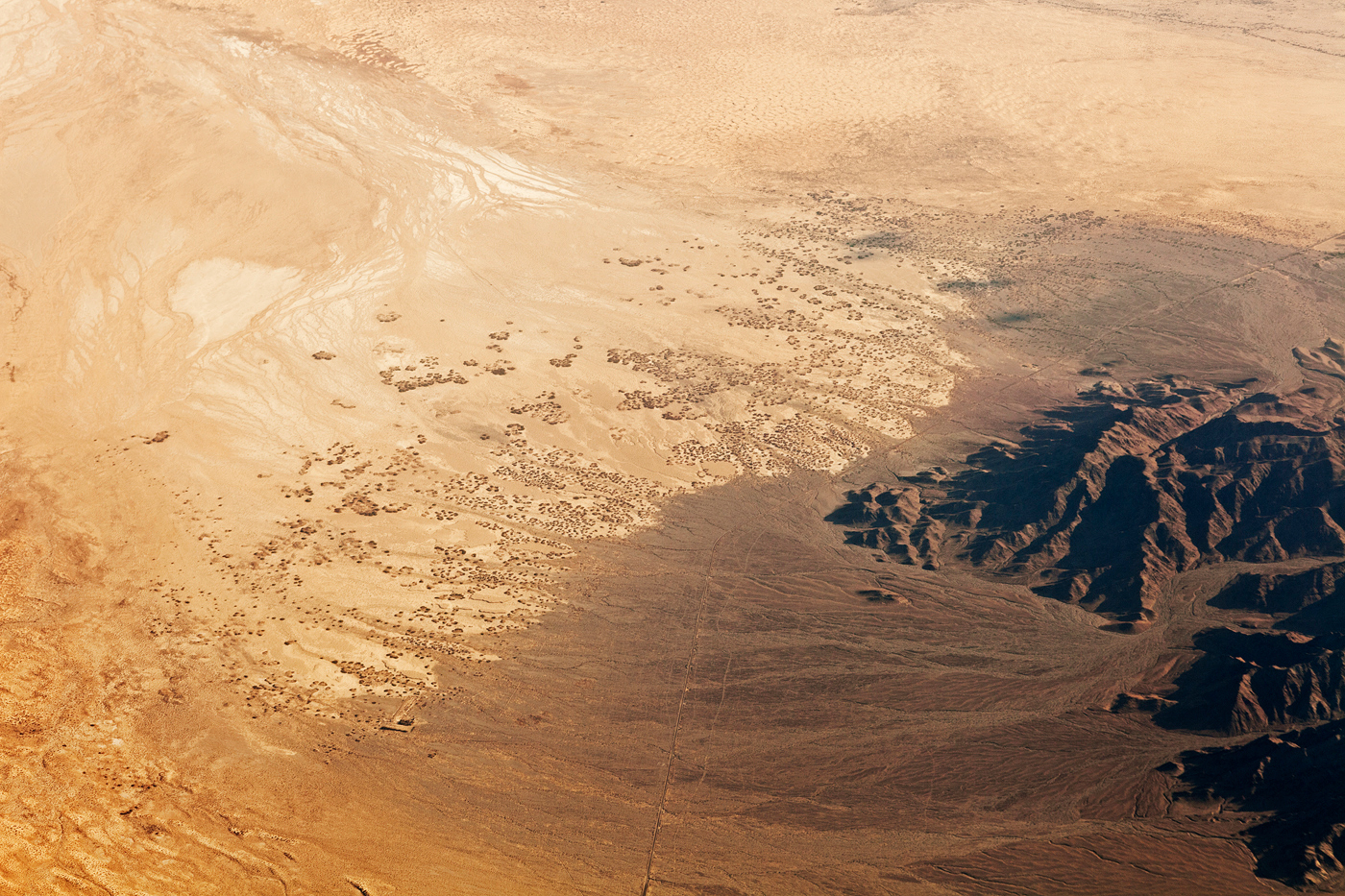
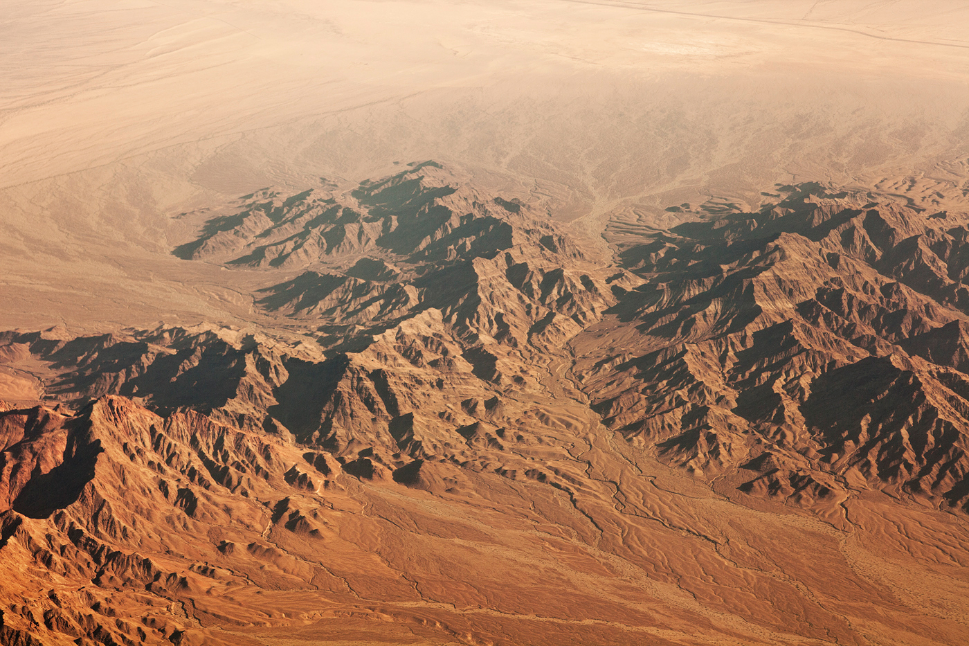
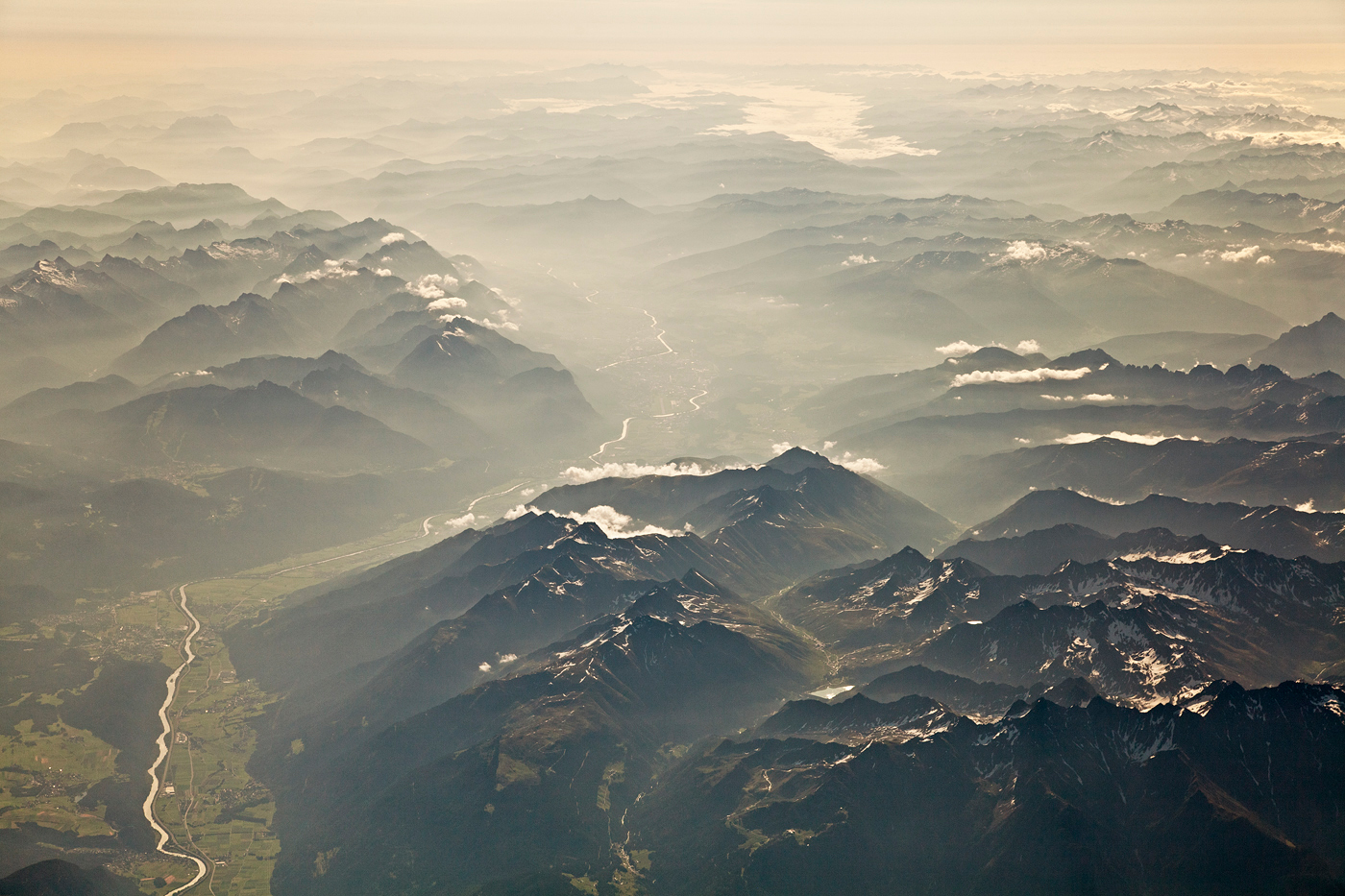
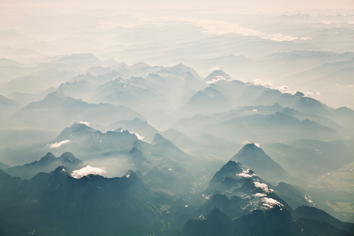
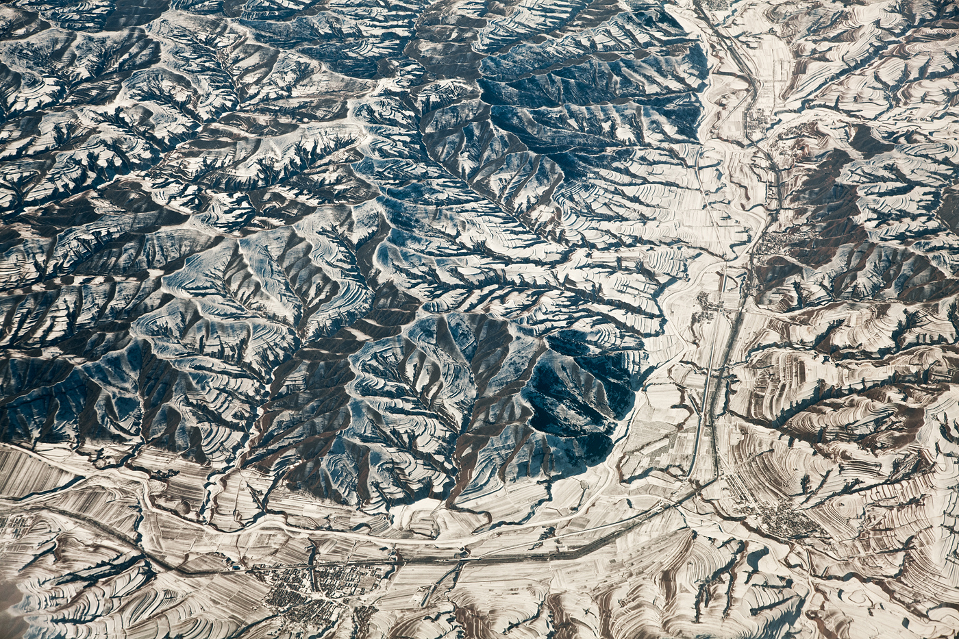
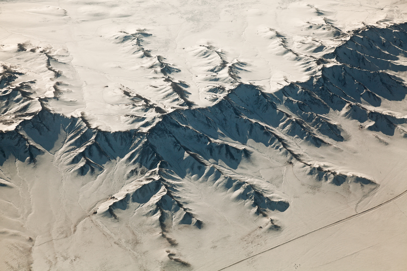
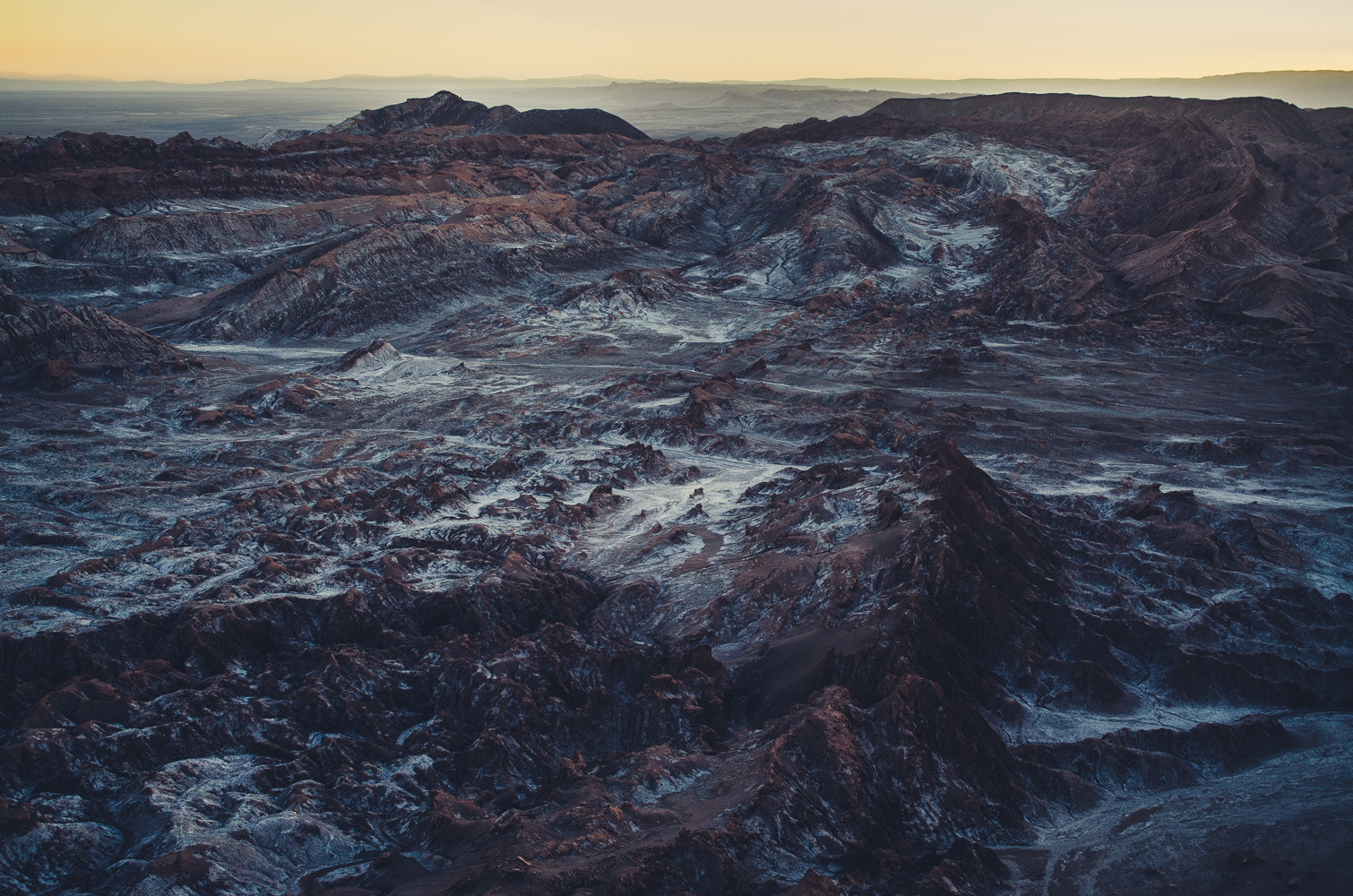
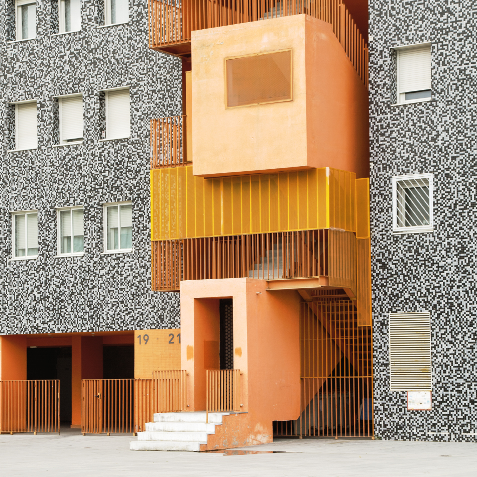
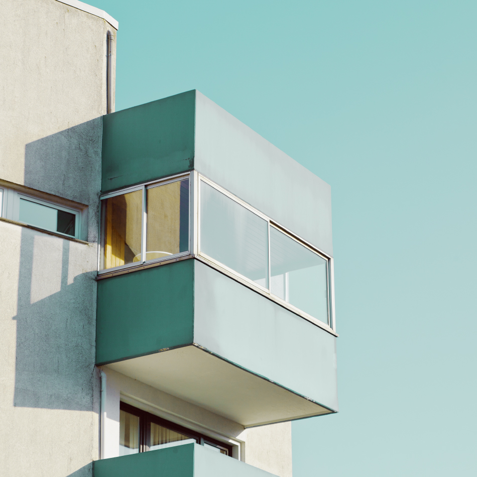
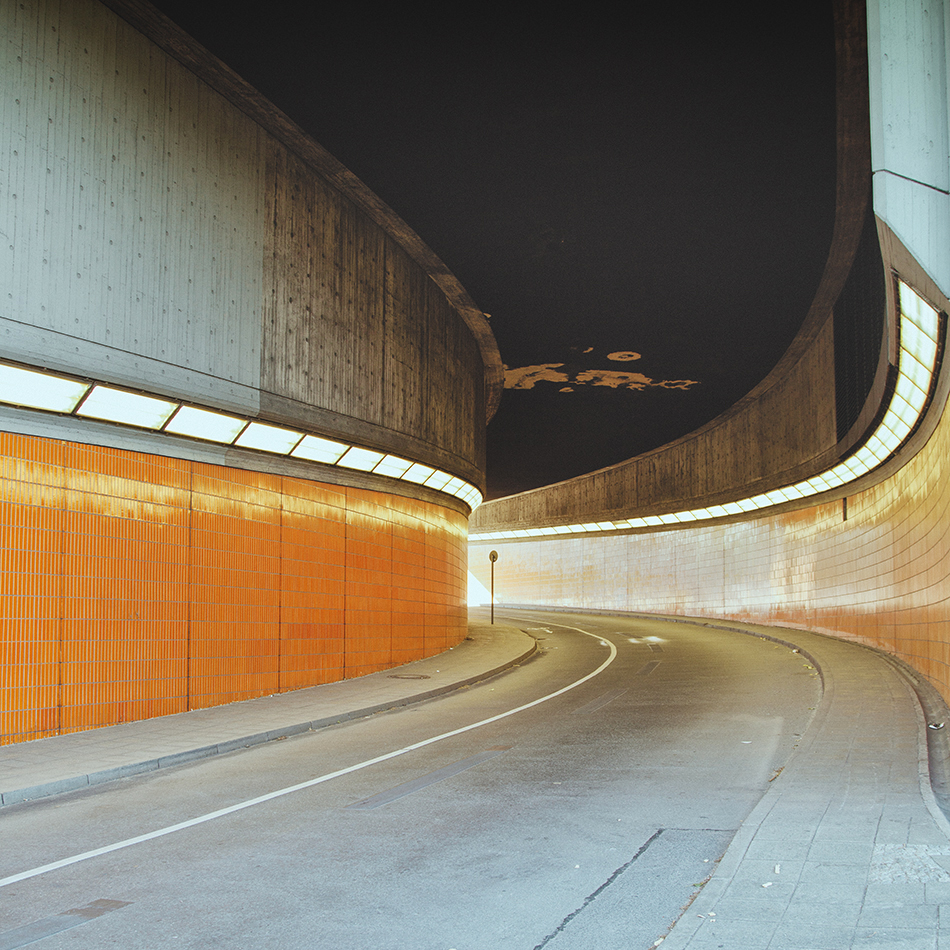
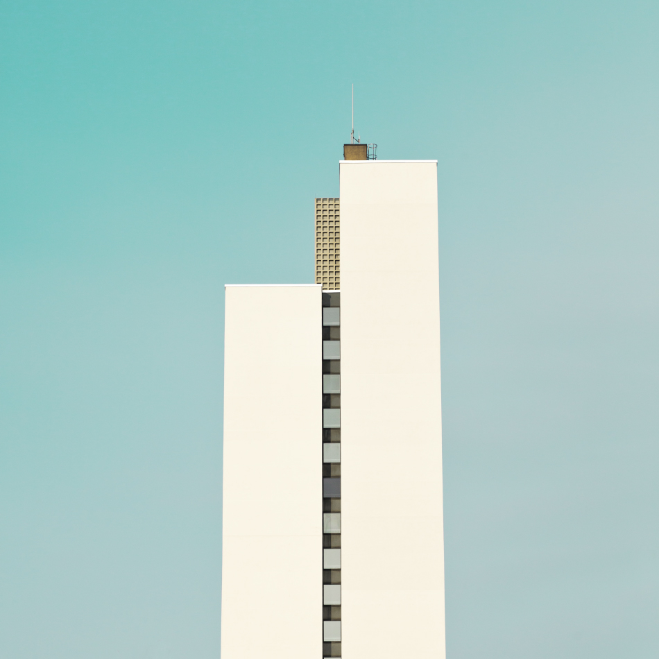
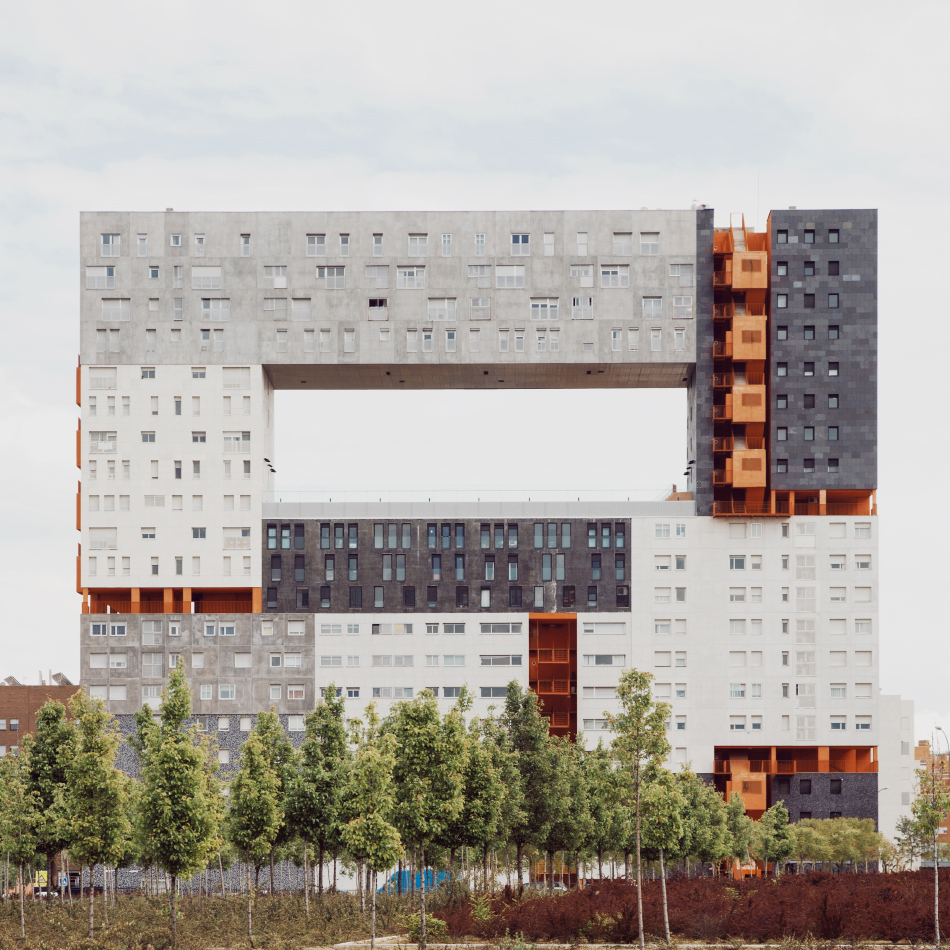
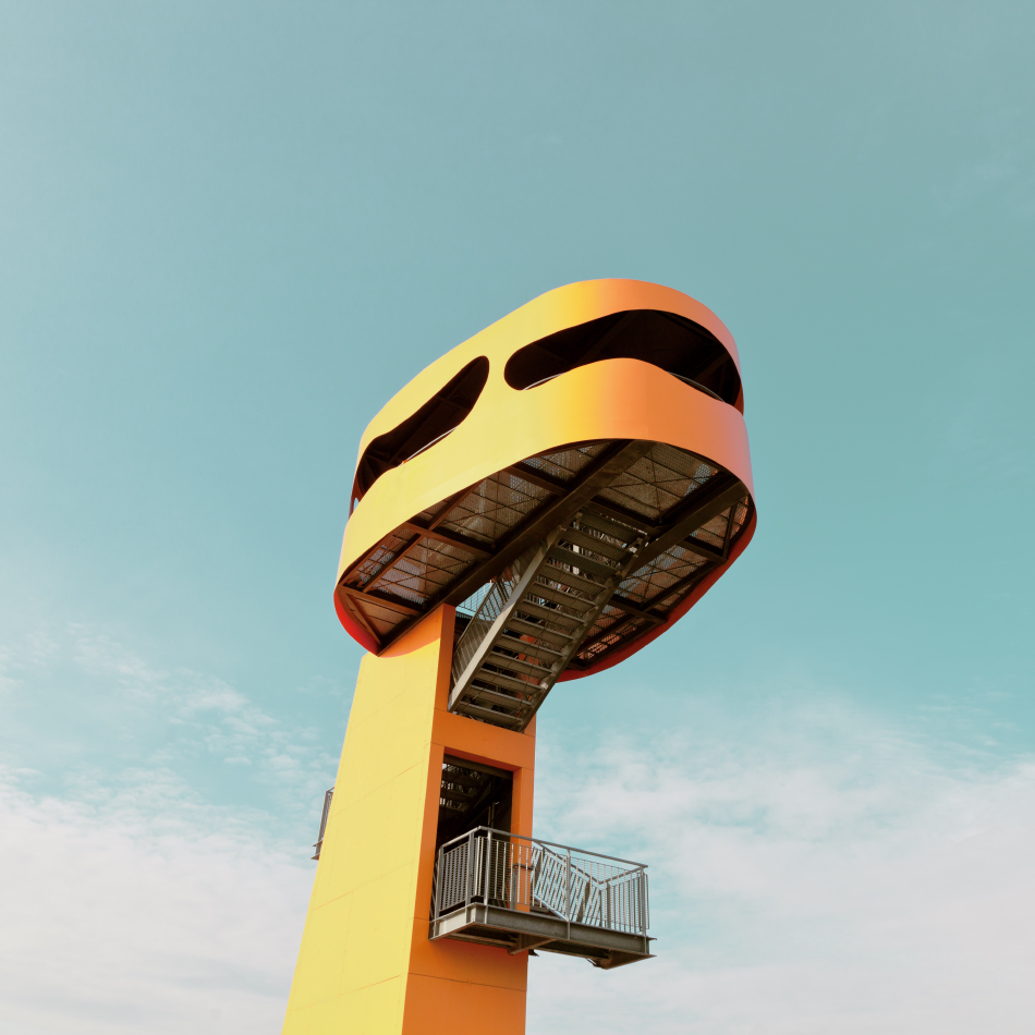
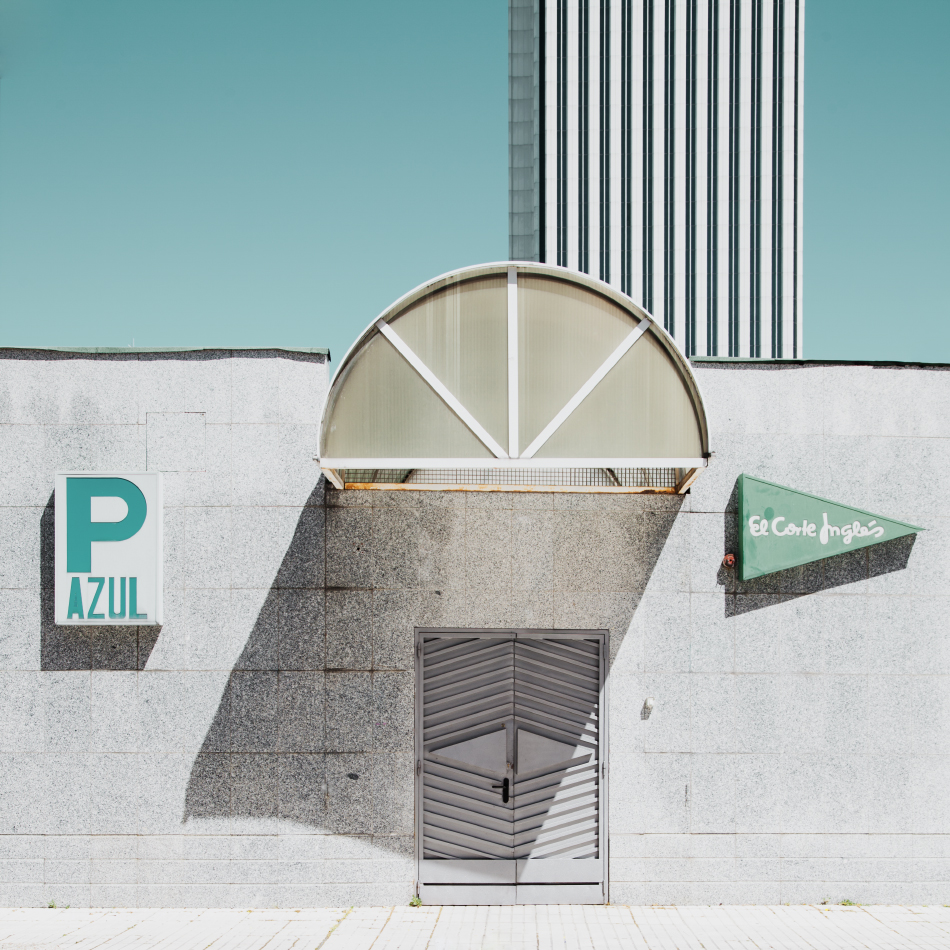
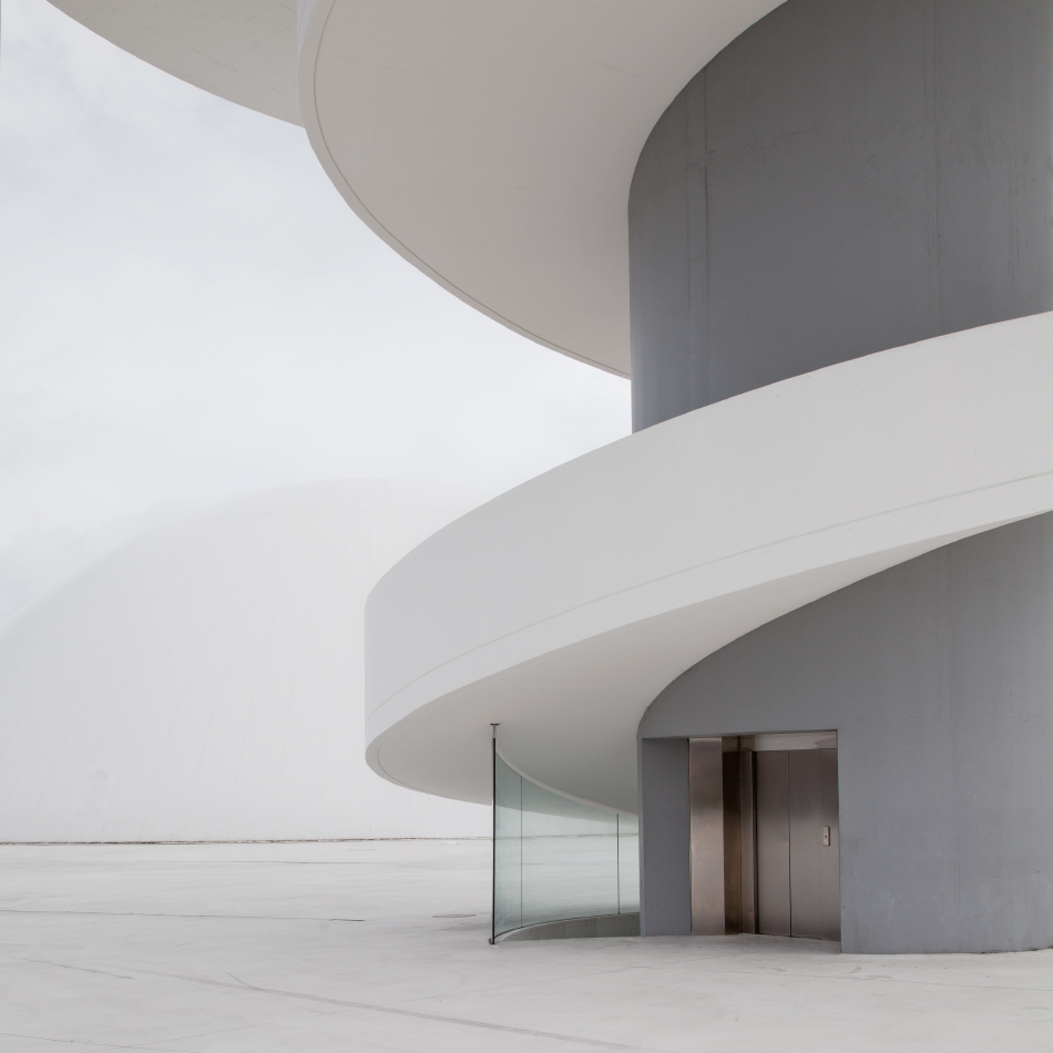
Behold the aerialscapes of young German photographer, Jakob Wagner. I love the consistency of Wagner’s editing style and color pallets — he does a fantastic job of enhancing textures and shadow details while still keeping the photographs looking clean and natural. It goes without saying, but the locations he’s captured are also truly outstanding.
I highly recommend you check out his portfolio for more of this visual candy.
You may remember seeing the first Lytro light field camera here on the blog back in 2011. If its unconventional box-like shape wasn’t enough to catch your eye, the astounding technology that enabled photographers to adjust the focal point of the image after it had already been captured surely would have. Check out an example below, you can click to change the focal point and scroll to zoom in and out. There are more samples on Lytro’s Gallery page.
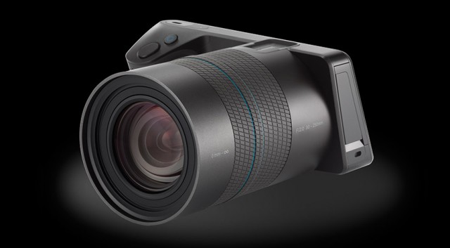
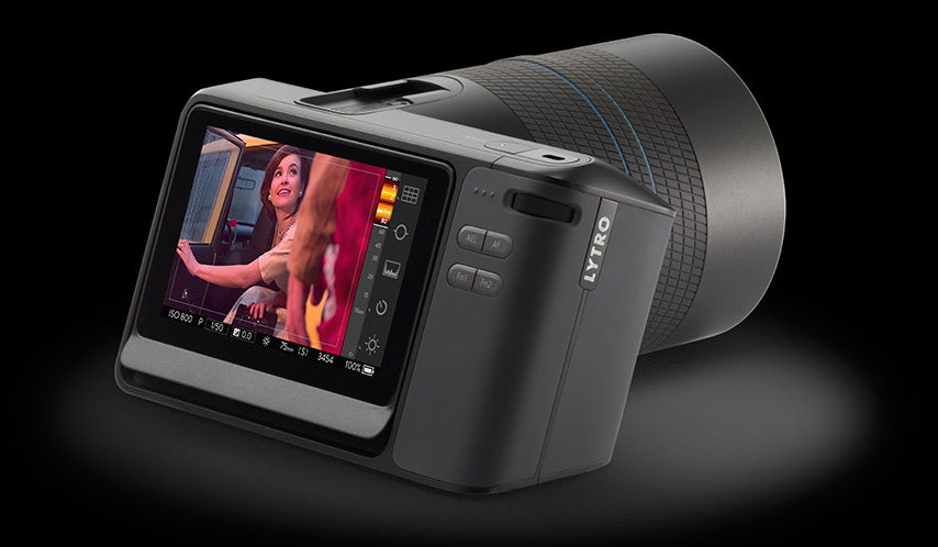
Well, now Lytro is back with the next evolution of the light field camera: the Lytro Illum. Physically, it appears much more in-line with traditional point-and-shoot cameras than its radical predecessor, with an angled display screen that gives the profile of the camera big points on both character factor and, I’d imagine, ergonomics. I’ve also read in some hands-on reviews that it feels remarkably light, weighing in at less than two pounds…yes, that lens that looks like a cumbersome beast apparently weights only half a pound.
As pretty as the Illum is on the outside, it isn’t until you take a look at what’s inside that you can get a sense for how revolutionary this camera really is. The Illum uses a patented micro-lens array that captures data about color, light direction and intensity, storing this data for later use. This is the key difference between light field cameras and other cameras, which generally don’t give you much control over the photo once it’s been taken. A special Lytro button enables a helpful UI overlay that outlines the contours of objects in the shot, giving a sense of depth and a preview of how the image’s focus will be able to be adjusted by its viewers.
Perhaps the biggest kicker of all is the price tag. Looking at a piece of technology as revolutionary as this, you might instantly assume that it’s going to run tens of thousands of dollars. Wrong. It’s being listed at around $1,599 USD, which isn’t exactly cheap, but in the photography field it actually is very affordable. In his original post, Jon finished it off by opening the table for ideas on how this technology could be applied to great effect. One can’t help but think of all the possibilities when you look at technology like this: how would you use the Lytro Illum differently than you would your usual camera? Or, which of your favorite photographers would you like to see use a camera like this?
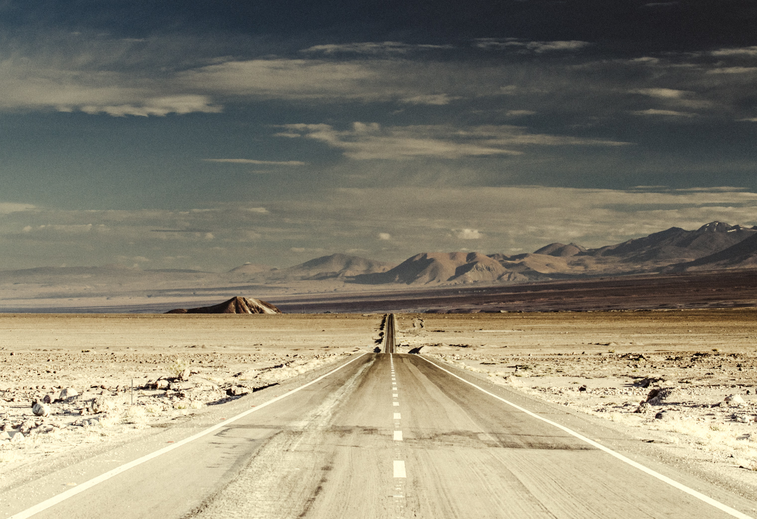
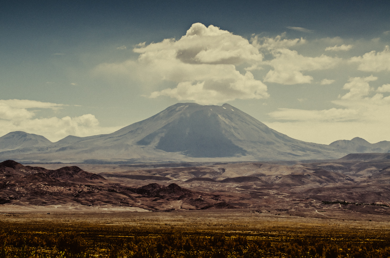
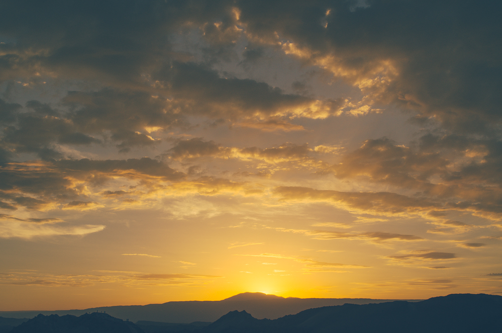
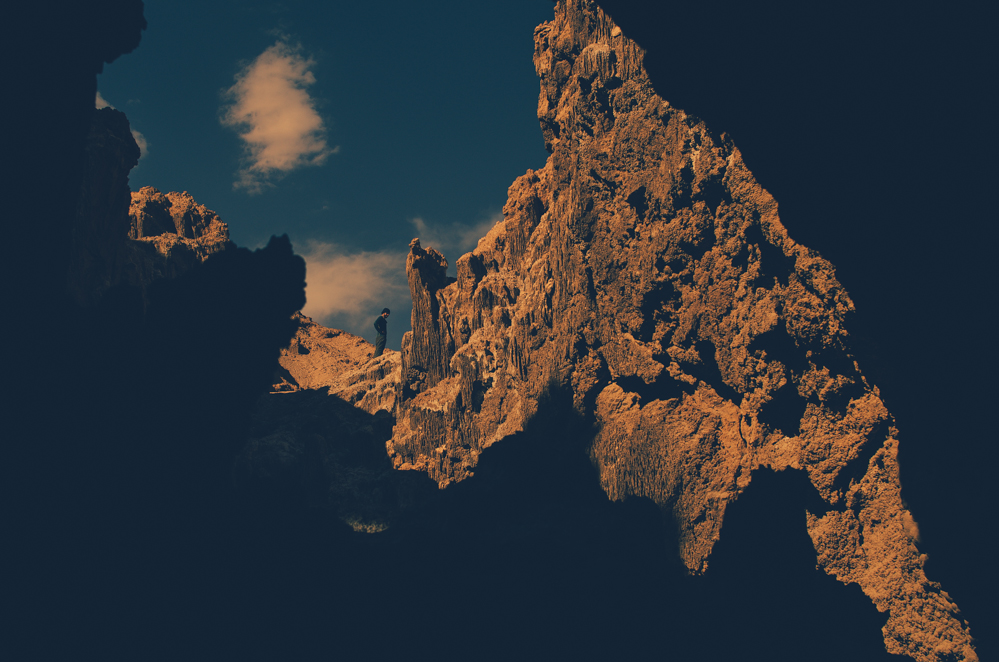
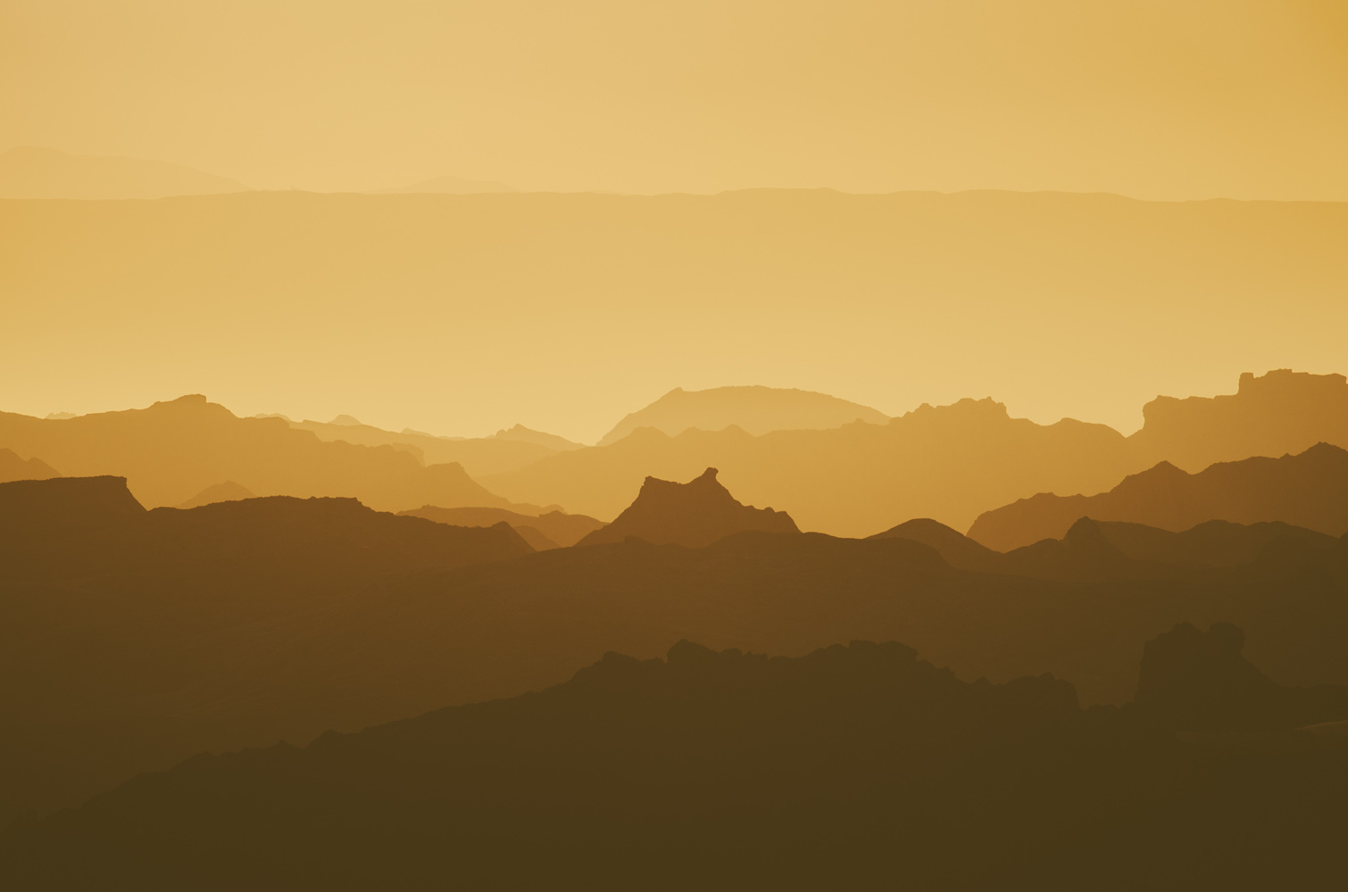
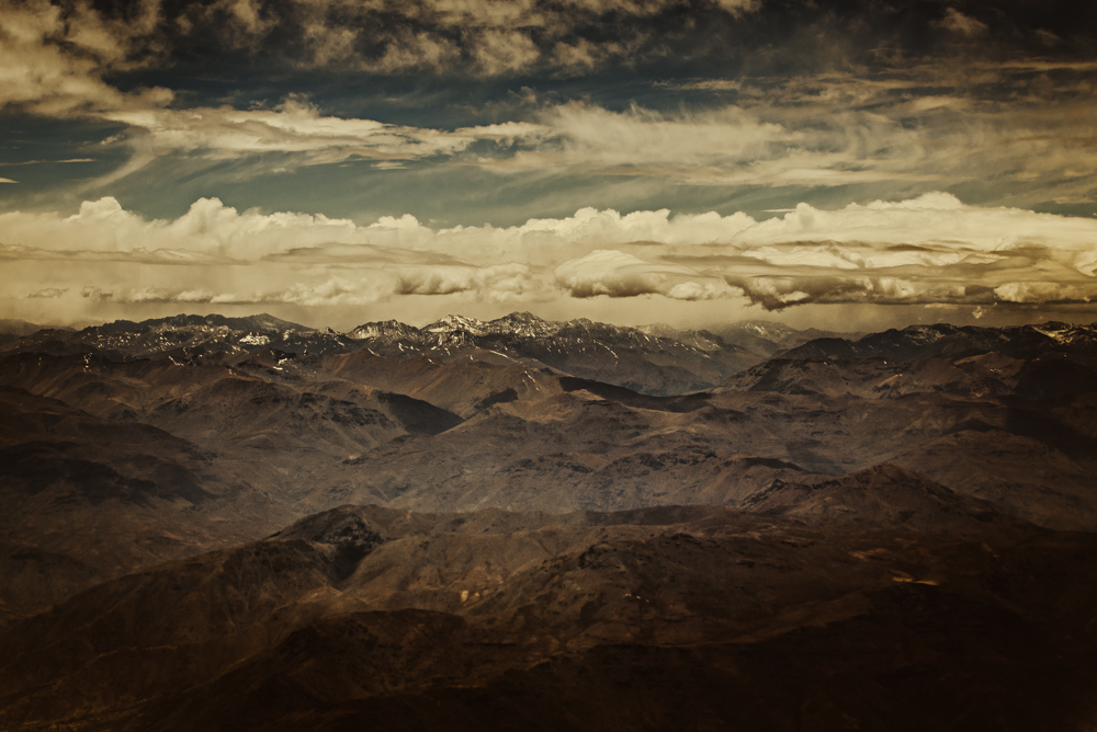
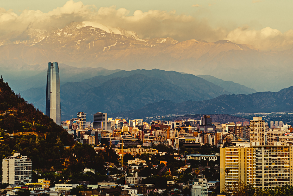
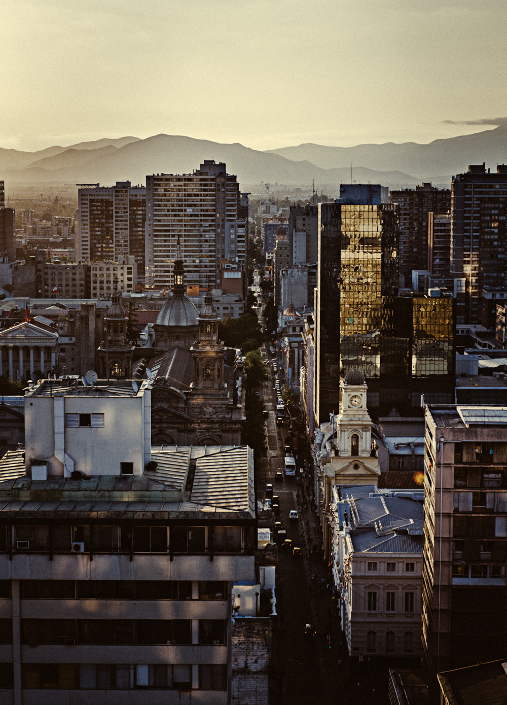
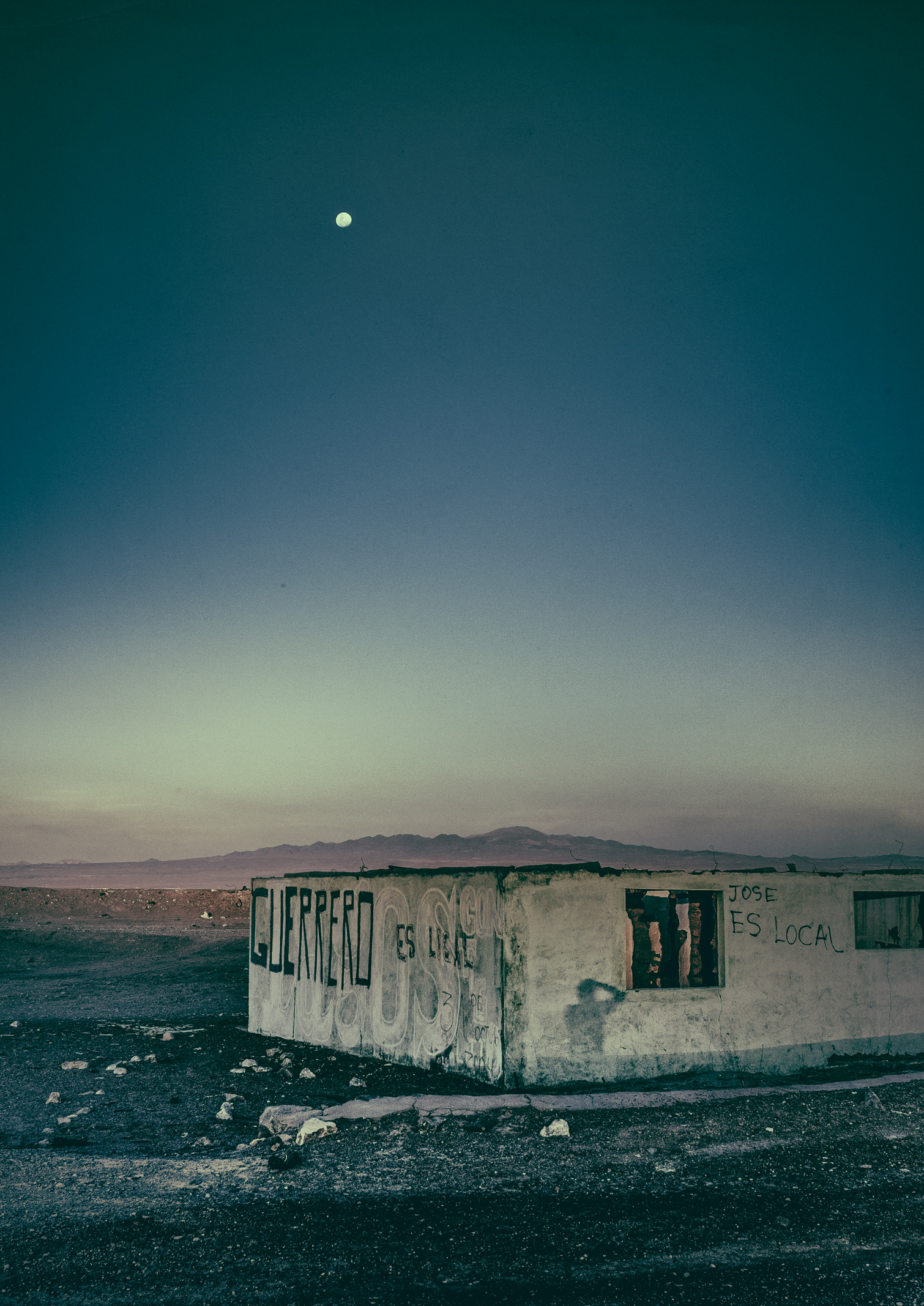
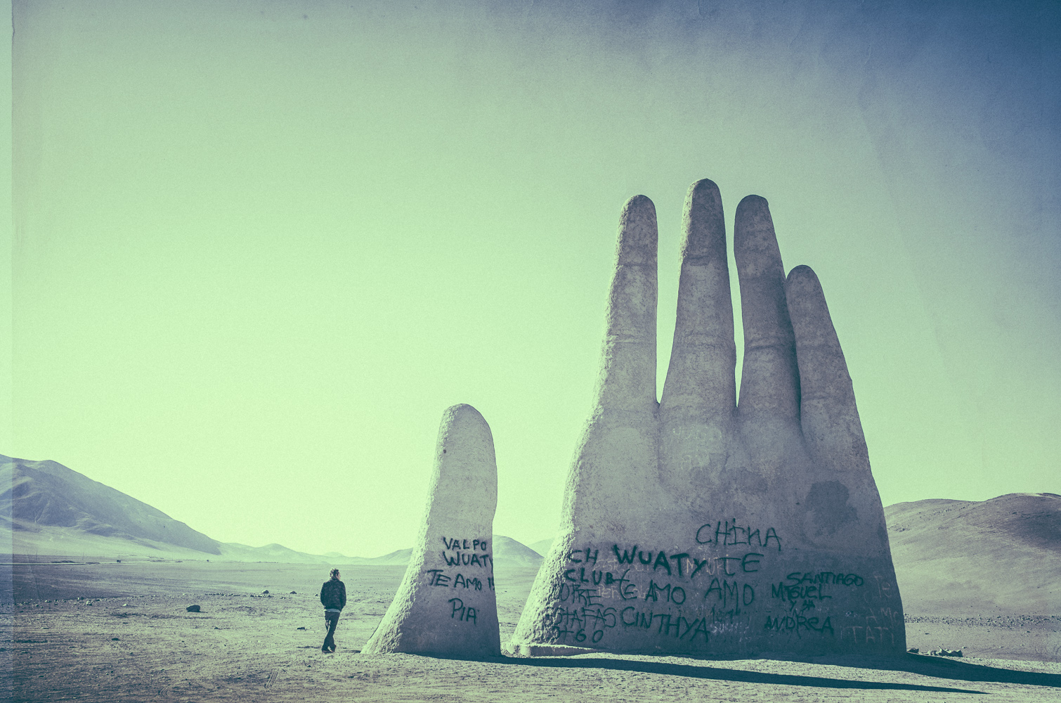
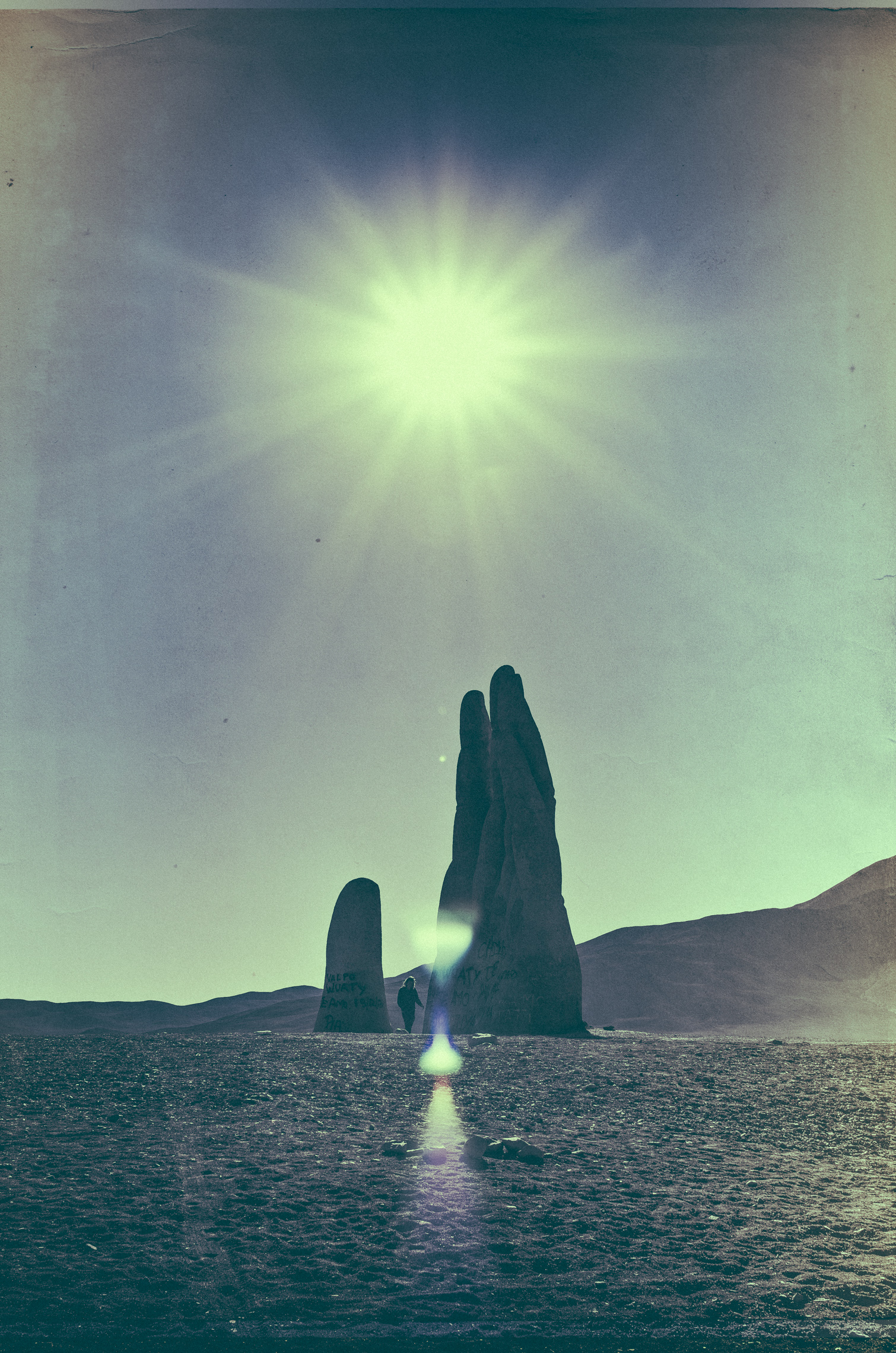
A few images from my travels through Chile this past December. Featured here are locations in the Atacama Desert, including Valle de la Luna, Salar de Atacama and Mano del Desierto. There are also two images from Santiago, which happen to be the final shots I captured with my D600 before having it taken from me at knifepoint a couple days later in Valparaiso. Fortunately, I had a back-up camera and was able to capture the trip north into the Atacama.
For more photos of my travels through Chile, you can visit my new portfolio (filtered for Chile): http://circa1983.ca/Chile
I decided to check up with one of my favorite photographers Matthias to see what he has been up to. The above are some of his favorites from the recent Reflexionen/Reflexiones series shot in Berlin, Madrid, Amsterdam, and Hamburg. I asked him a few questions that he was kind enough to answer:
Where are you from?
I just moved from Berlin to Hamburg.
How did you get into photography?
In 2008, I was 26 then, I bought my first camera, this was shortly after I had moved to Berlin to write my thesis in computational linguistics. Photography has never been of great interest to me before that point, but I quickly became obsessed photographing Berlin’s architecture. I’m completely self-taught and I’m still learning new things about photography on a daily basis.
Who/what inspires you?
Mainly the work of other visual artists, for example Franco Fontana, Josef Schulz, Ward Roberts, Matthias Hoch.
Do you have any other passions/hobbies besides awesome photography?
I’m a hobby musician and I’m DJing from time to time. I also enjoy hiking and riding my bike.
Do you have a favorite city to explore?
There are too many to mention and there are so many cities I haven’t been to so far. I really enjoy exploring, so maybe it’s not too important which city it is. But well, I guess it’s not a secret I like Berlin a lot…
Is there a specific place that you would love to photograph in the future?
A roadtrip through Japan would be great.
Any albums or artists on repeat?
Currently on repeat: Morgan Delt, Group Rhoda, PVT, Raime, E.R.P. / Convextion
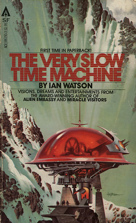
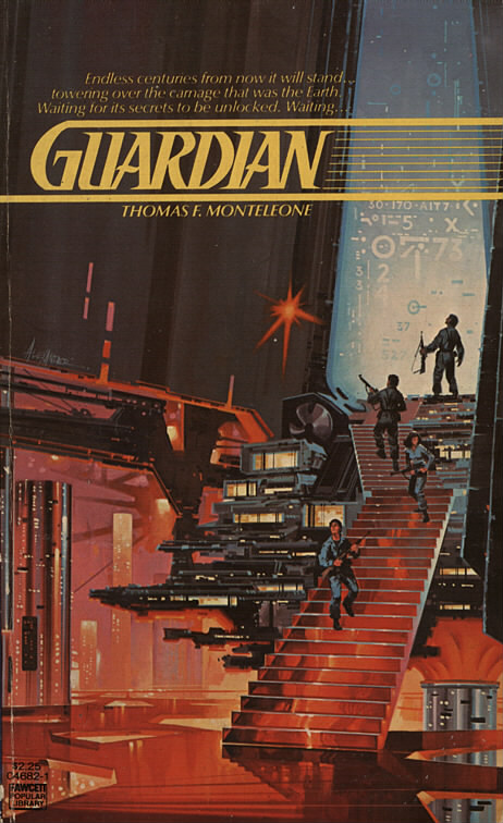
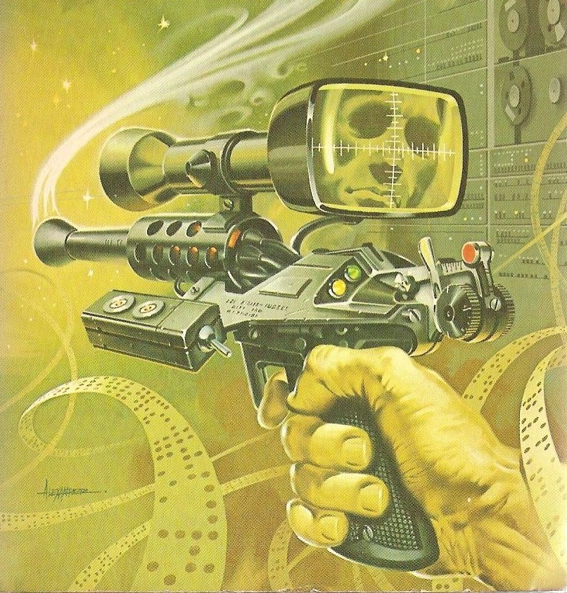
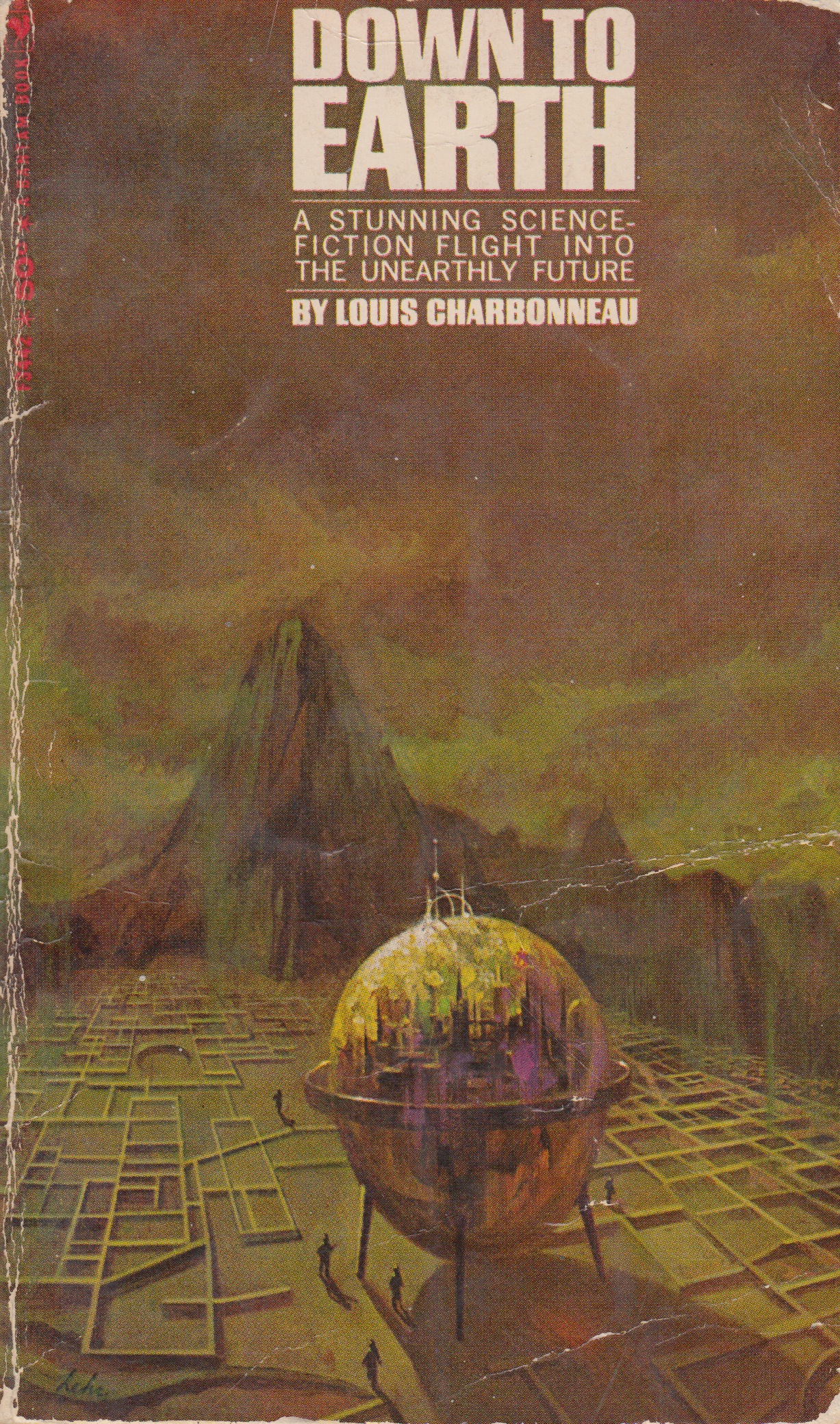
This week I decided to do a feature on Paul Alexander. He got his start working with architecture firms and advertising agencies, he then signed up with a New York City artists rep which got him on the radar with publisher ACE Books around 1977. ACE along with a number of other publishers for various books and magazines kept him very busy over the next two decades. He is very well known for his mechanical style and Vincent Di Fate called him “one of the top “gadget” artists currently working in the American paperback market”.
I really love illustration on that Guardian cover. I’m not a huge fan of most 80s sci-fi book covers but this one was released so early on in the 80s that it still feels like it isn’t too far gone. If you dig into some of his later stuff you will see what I mean about the heavy 80s style, I am talking raised lettering book titles with full mirror gloss finish. His early work really does differ from his later work, not so much in actual subject matter or quality but the style change is really evident. It’s clear throughout all his work he was an absolute master at the technical and mechanical elements.
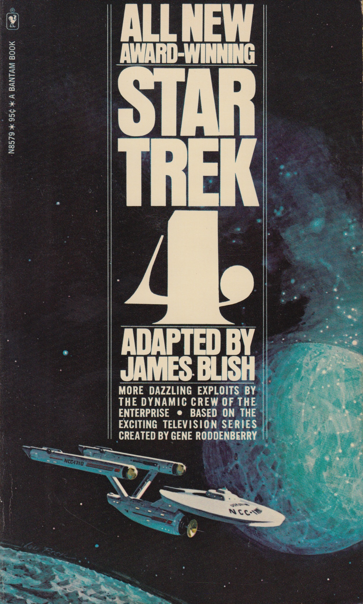
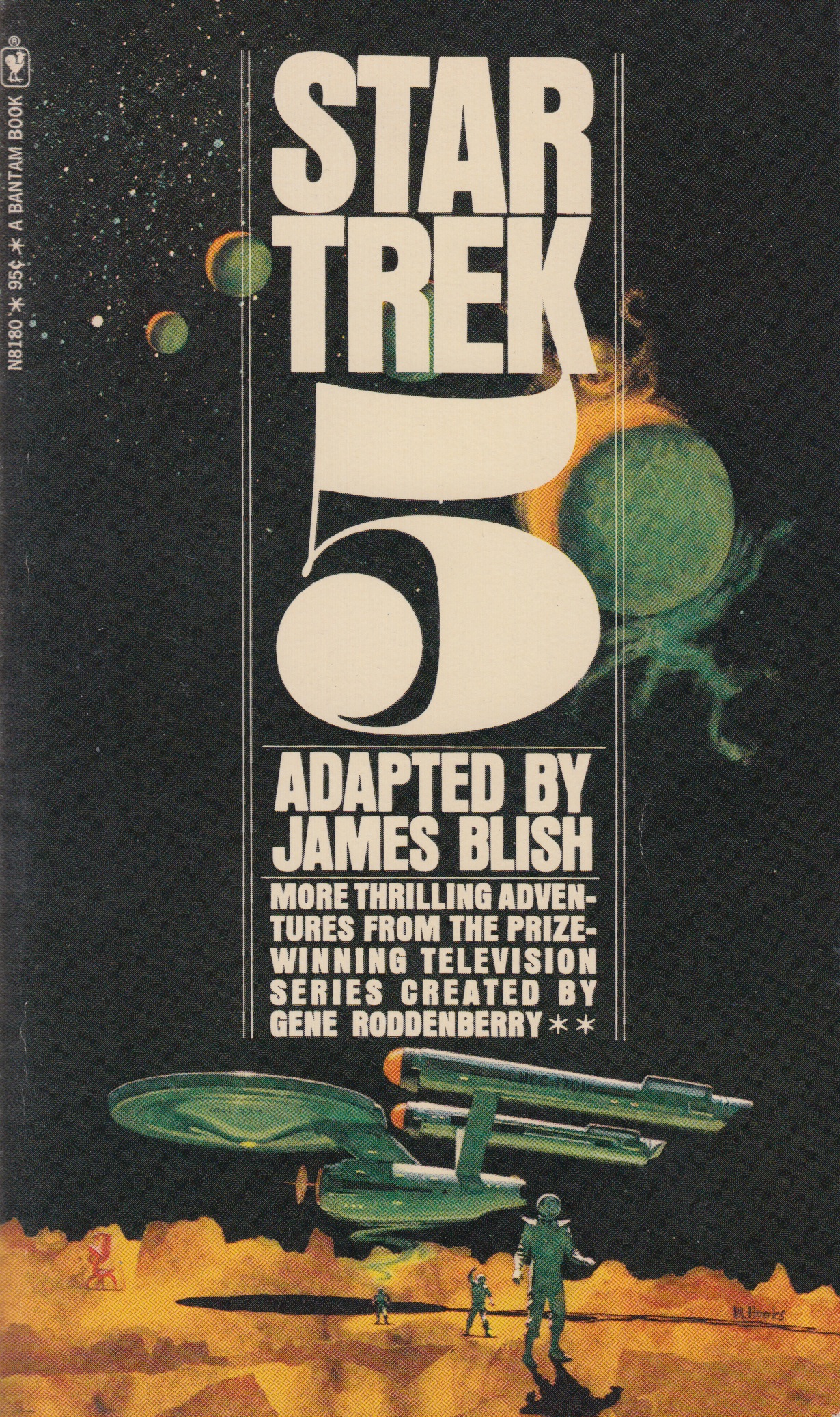
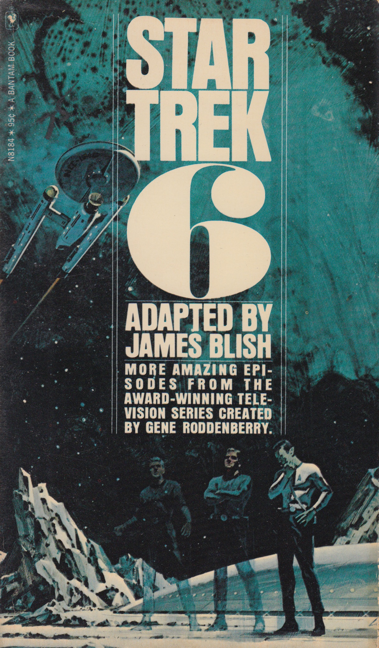
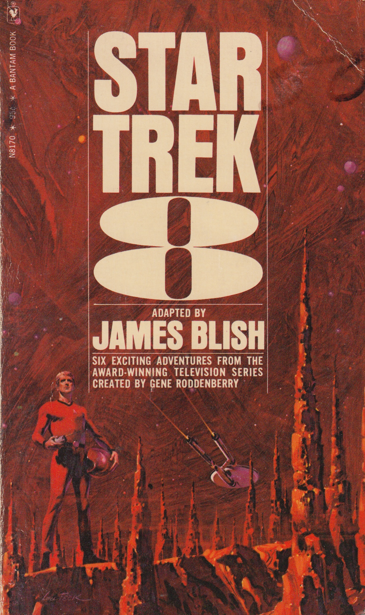
I’m following up last weeks post with one more series that I really like. In the late 60’s and early 70’s sci-fi author James Blish got commissioned to write a series of books that contained short story adaptations of the TV show. He started on volume one and made it all the way to twelve before he passed away, his run with writing this series was eight years long. Each book had a volume number and contained around ten short stories. Over the course of these twelve books there were many different artists that worked on the cover illustrations but the text treatments for the most part remained the same. How can you not love those big volume numbers on the cover, so good. I posted a few of my favorites from the series above but I encourage everyone to seek out the other covers and post personal favorites in the comments below.
My favorite would have to be volume six. This volume along with numbers four and eight (also favorites) were illustrated by Lou Feck. One reason I love Lou Feck is that his work is very easily recognizable when you are flipping rapidly through the paper back bins at your local used book store, high contrast and very dramatic. I am planning on doing a whole post dedicated to Lou, he is one of my favorite sci-fi cover illustrators and there are many other great ones outside of his work on this Star Trek series.
Number five was done by Mitchell Hooks, and I have to admit I didn’t know much about him before this post. When I went searching for more sci-fi work of his I really couldn’t find anything that came close to this one in terms of subject matter and style. A lot of his work seemed to be for mystery/thriller books and also some magazine cover work. Although much of his other work doesn’t quite fall under the sci-fi category I felt this image fits in well here so I included it. I hope you guys are enjoying this series.
A quick thanks to @jakekouba on instagram for tagging a few of these Star Trek covers a week or so back. Keep the #sundayscifi tags coming!
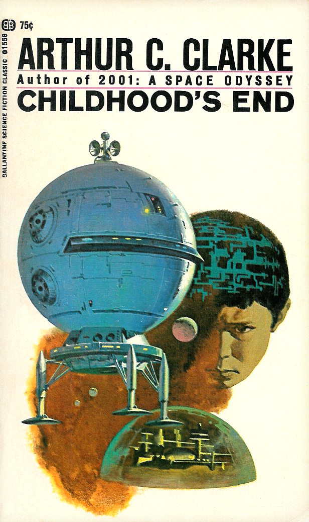
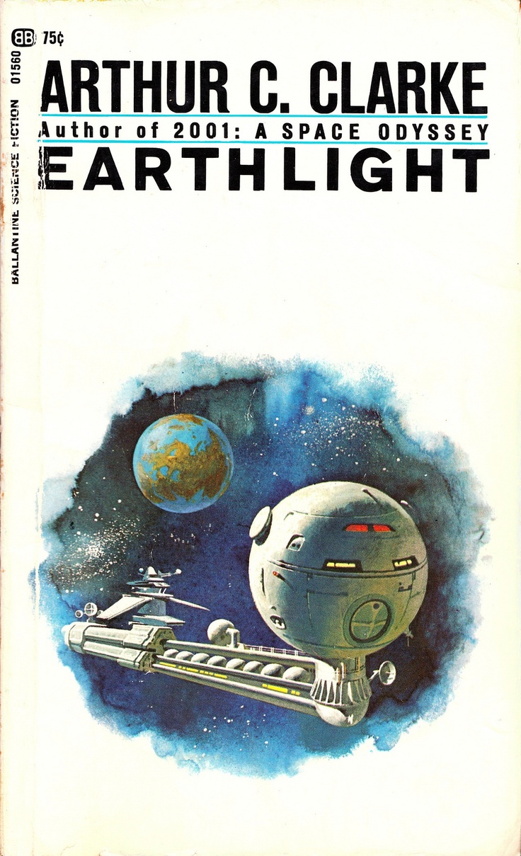
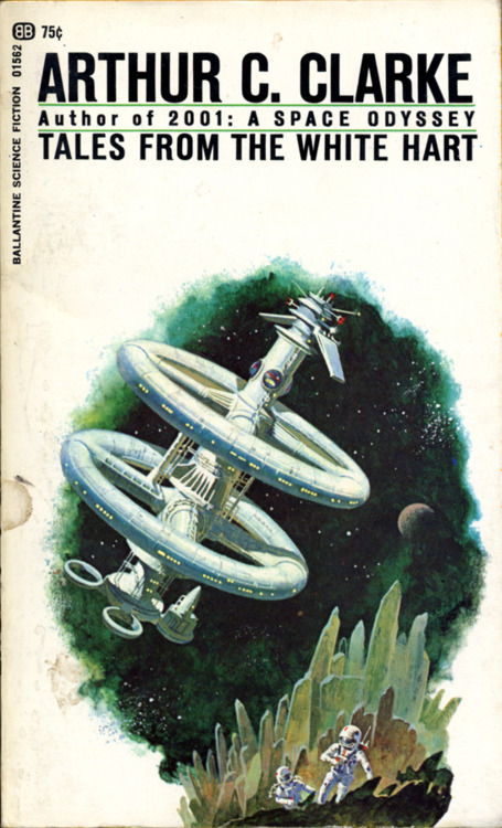
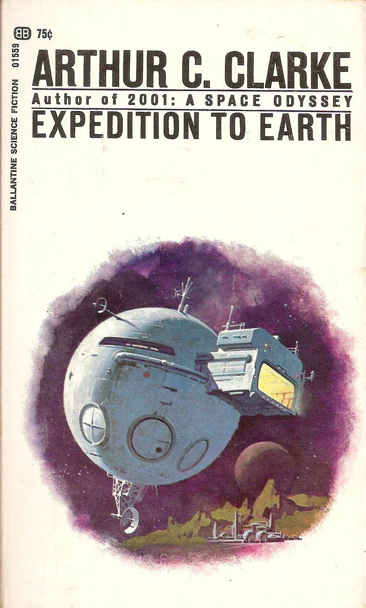
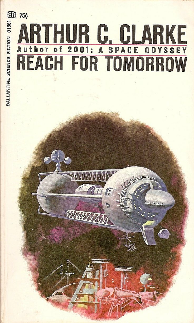
This week’s post starts with one of my personal favorite covers–Childhood’s End, which is also a great read. It’s pretty short and I think its up there with Arthur C Clarke’s best. On the back book cover I learned that Ballantine Books did a whole series of similarly illustrated covers–all just as beautiful. I love how the same illustration style and structure is maintained over the entire series of covers while each book is given its own dominant color. When I sat down to look into the series’ artist, everything unfortunately end in “artist unknown” or “uncredited cover art.” There is some speculation that the artist of the Earthlight cover may be Dean Ellis, but it’s not enough to tie him to any of them for sure. While I debated not posting this series after I found no conclusive artist, I decided they’re too good not to post. I am hoping a solid artist credit surfaces so that I can come back here to post an update. If anyone comes across anything, be sure to post in the comments below.
I’m happy to see the #sundayscifi tag on instagram is starting to get some posts. I will be pulling some ideas for future editions on there (in fact there is one I already know for sure I will be posting). As always, feel free to share your own favorite sci fi artist suggestions or thoughts on the post in the blog comments.
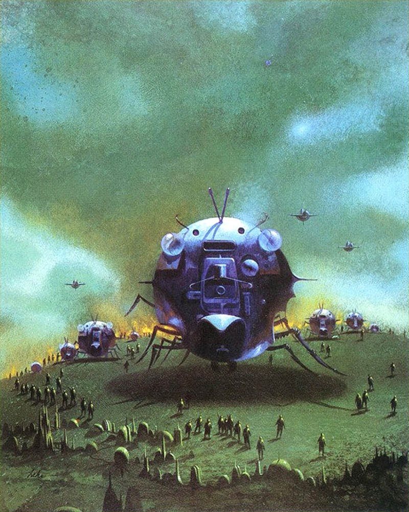
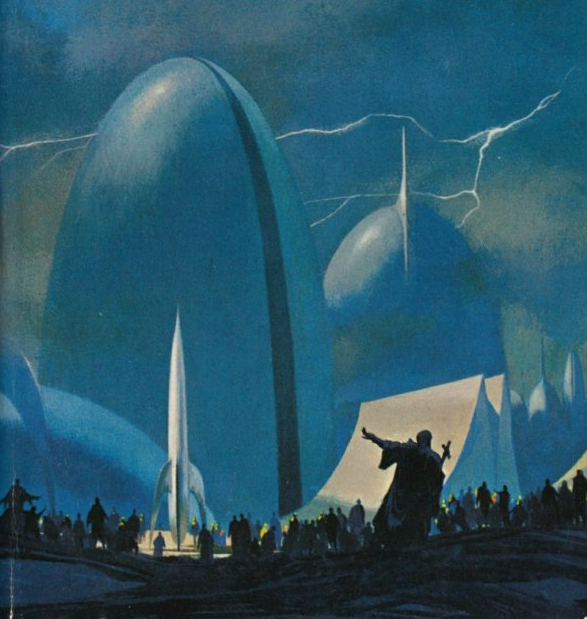
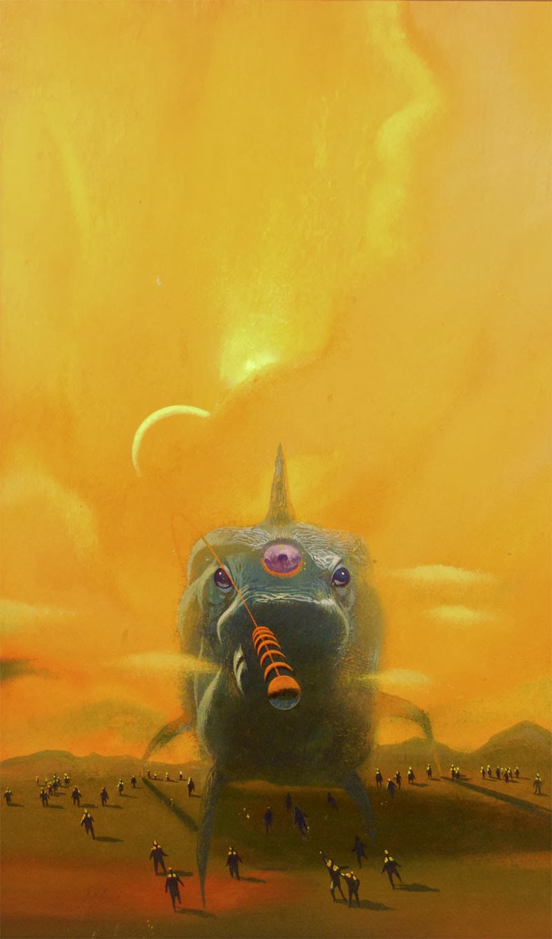
Paul Lehr illustrated a ton of work for sci-fi kings like Robert Heinlein, Isaac Asimov, and H.G. Wells. While last week we saw John Berkey’s scientific and technical approach to space craft and space flight, Lehr’s work is certainly more organic in both his subjects and technique. He leans more towards fantasy-like creatures, life forms, and orbs. There is also a recurring scene of numerous people all surrounding an object or life form. I find it interesting when artists have a heavy overarching presence of certain themes in their art; links between separate bodies of work. I was thinking while posting this week’s covers how different one artist’s view of the future can be from the others’. I think that seeing each artist’s different take on the future will be an interesting part of this series.
I’m curious–does anyone has any favorite images from this week or a preference between the styles seen this week or last?