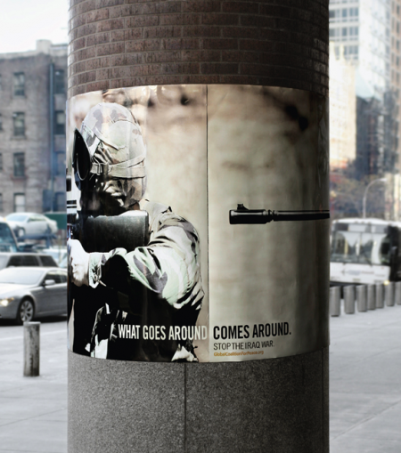
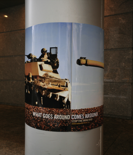
Big Ant International created these posters for the Global Coalition for Peace. The series has garnered significant recognition of late, including a Silver Pencil at the One Show Awards, and nominations for both the D&AD and CLIO Awards 2009. The posters are wrapped around street poles and achieve that ever so illusive “aha” moment when viewed in this circular manner.
I would imagine a poster series depicting soldiers essentially pointing guns at themselves is bound to be met with some controversy, but it seems clear to me that the “target” of the campaign is the US foreign policy and not the soldiers themselves. The metaphor is clear. Hopefully as the work competes for further acclaim, opinions about the message won’t get in the way of recognizing the work as a successful piece of graphic design. The series is a great example of a simple and brilliant concept executed very effectively.
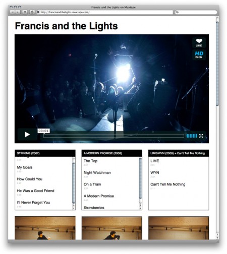
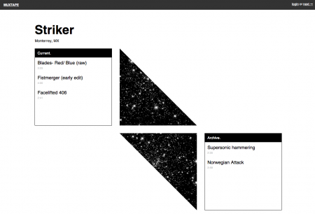
Muxtape is a new platform for bands to create profiles and showcase their music. It was originally designed as a place for users to upload MP3 mixtapes (like Apple iMixes) of their favorite music. This didn’t fly with the RIAA, and Muxtape had to shutdown in August of 2008; the year’s “most heartbreaking death” according to Wired. Rather than spend all of eternity in a futile legal battle, creator Justin Ouellette decided to switch gears and develop a new Muxtape centered around original content.
I haven’t had a chance to use it myself (new bands can only be invited by participating bands), but I see great potential for Muxtape. As a musician, I am constantly frustrated by the chaotic mess that is Myspace. If it wasn’t a necessary evil in the pursuit of a successful music career, I would gladly never visit Myspace again. The possibility of a new (and aesthetically pleasing!) platform is definitely exciting.
The layout of each Muxtape page is very simple and works off a strict three column grid. This creates a pleasing consistency between pages, and still allows a band’s personality to come through with creative implementations of the grid (without crashing my browser *cough* Myspace). It will of course be very difficult to compete with the reach and popularity of Myspace, but I think the simplicity of Muxtape’s design might be refreshing enough to draw a substantial number of users away. Some may miss the social networking component, but I like how Muxtape puts the focus back on the music and doesn’t allow for as many unnecessary distractions. Good luck Muxtape!
It’s hard to believe, but somehow my spring semester is coming to a close this week. The film festival project, which I’ve written aboutpreviously, finally has all pieces completed and accounted for. The last element added into the mix was a festival trailer (shown above). Originally, I planned to create a few more ancillary products to flesh out the brand, but these fell through and I had to move on the trailer option late in the game. I teamed up with my friend Phil Mills, a local actor here in San Francisco, and we set about writing, shooting, and editing the film last Sunday afternoon.
We were allowed to base the trailer on just about anything we wanted, so long as it advertised our hypothetical film festival and carried through the visual style of our brand. There were a multitude of directions this could take; we thought the most fun way would be to shoot a Royal Tenenbaums-esque short, and then just throw as much craziness as we could at it. Phil plays T. Allen Fenway, a fictional character we made up to live in our Wes Anderson film festival world. We wanted it to remind you of Wes Anderson, make you laugh, and eventually turn you on to the festival. The 3rd person narrator, use of Futura Bold for all titles, extravagant setting, and full blown randomness were all utilized to aid in conjuring this look and feel.
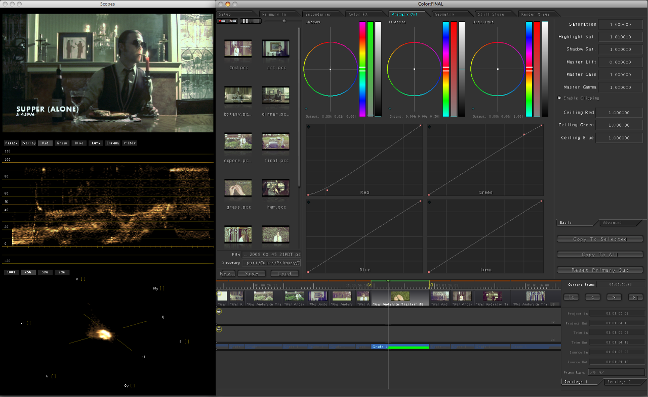
The equipment for this project was sort of all over the place. I luckily had a video camera lying around (usually relegated to filming stationary Youtube videos) and I figured I might as well take it out for a real test drive on this project. I used the Panasonic PV-GS250; an older handheld consumer camcorder that doesn’t have much in the way of image quality, especially compared to the newer HD models. I considered renting a Panasonic HPX-170, but was deterred by the expensive daily rental rate. I figured I’d make it work with the little guy and try my best to fix things up in post. I had also recently purchased a continuous tungsten lighting kit and this helped with the indoor shots greatly. (I am planning to do a post on video lighting after some more tests.)
I edited this project using iMovie ’08, the disastrous upgrade to iMovie HD. I had never used the upgrade before and was very disappointed to find that the program had basically been downgraded into an almost unusable trainwreck. (No waveform mixing!?) I had to stick with it, for the increased flexibility with titles, but it was not a pretty sight. Once the project was edited and all cut together, I procured Final Cut Pro (sadly too late to edit with) and Color. I sent the final output through Color and it was a great help in getting the trailer to look the way it does. Color is an amazing application and I feel like I just scratched the surface of its capability. It basically provides the same color editing functionality you have in Photoshop for still images, but for video. I worked on each shot individually, and first tried to clean up the stale color the camcorder captured, and then tweak it just enough to provide that timelessness of Wes Anderson films. Of course, the program’s power is limited by the image quality of the camera, so some edits weren’t possible without destroying the integrity of the image. (Exposure or saturation edits for example looked terrible.) The basic color editing functions (below) were enough to give the final product the look I was hoping for.
I had done a few test shots and some basic story-boarding prior to the shoot, but we were pretty much shooting from the hip the whole time. Phil is a great actor and he knew exactly what I was going for with this project. As we are both avid Wes Anderson fans, we didn’t have to do too much in the way of research or planning prior to the shoot. The order in which we completed the trailer was probably completely backwards (we wrote it after we shot it) but it ended up working out and provided us with many a happy accident. Despite the fact that this part of the project was not “graphic” design in the traditional sense, it was definitely the most fun, and my favorite part of the semester.
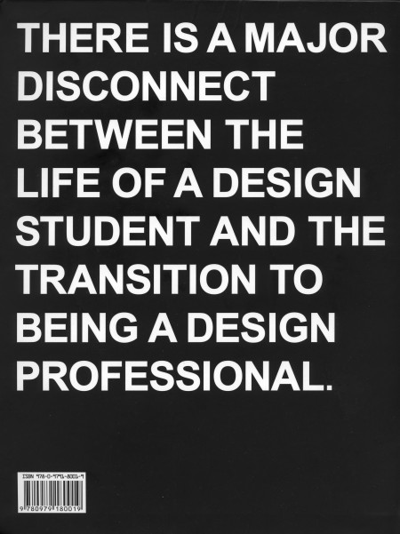
I just finished reading Never Sleep, the new book by Andre Adreev and Dan Covert of dress code. As a student, the back of the book (pictured) kind of freaked me out when I first saw it. My brief and occasional foray into the world of freelance has exposed me to some differences between school and the professional world of design, but I’ve always figured I’ll be in for a wake up call when I graduate regardless. I was psyched to see a book written about this exact process, and I spent last night (as the title suggested) reading the lot of it.
The book chronicles Andre and Dan’s transition from design school to the professional world. They describe, in-depth, just about every aspect of their journey; studying at CCA, working for MTV, and the eventual creation of their own studio in NYC. Along the way, they include examples of their own work from each stage of their career, as well as various essays by professors and professional designers (many of which are available on the site). The book describes just about everything that happened to Andre and Dan, even the occasional IM conversation, and this makes for a very engaging read. The third person narrative is just about as random as it is amusing, and is ultimately very accessible and insightful for the struggling design student (that’s me).
Dan is Ohio. Andre is Bulgaria. They is dress code. At the combined age of 50 their work has been recognized by shiny awards, appeared in lots of magazines, coffee table books, and 3 museums. They met while studying graphics designs at California College of the Arts. Then moved to New York and got jobs with MTV working in motion and print—before stupidly leaving their dream jobs to start a studio of their own. (Buy)
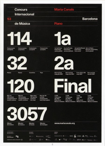
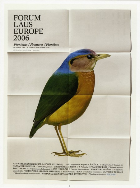
A couple pieces from the wonderful Astrid Stavro. The top image was the poster for Maria Canals International Piano Competition in 2007, and the bottom is from the Forum Laus Europe in 2006. I’ve seen some of her other work circulating on the blogs recently, but I prefer these older posters for their refined typography.
I also enjoyed this quote they have up on their website: “Small design companies produce good work, large ones produce shit work.” (Jonathan Barnbrook). Not sure if I agree completely (because I just don’t know, not because I have evidence to the contrary), but the work coming out of Astrid’s studio certainly validates the claim.
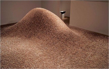
The above are from Mark Weaver’sMake Something Cool Everyday project. I’ve seen a number of these types of projects, especially on Behance, and Mark consistently has some of the more impressive results. The top image is my favorite by far; drastic big/small differences in type always appeal to me when done well.
I’ve never really put my daily “coolness generation” skills to the test; I usually make something cool over a period of weeks or months. Once I have a visual aesthetic defined, I can churn out work pretty quick, but the development of this always takes at least a week. Maybe I should start my own ‘everyday cool’ project to speed up my workflow…
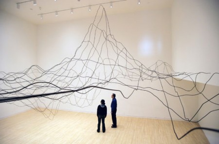
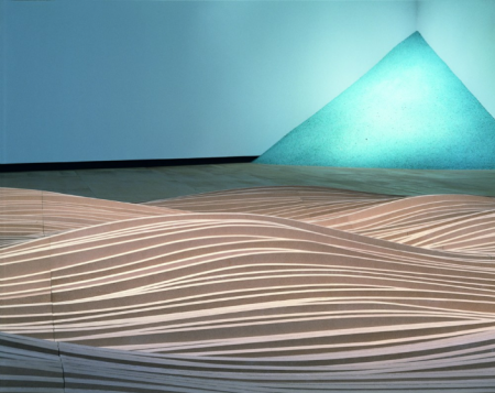
I saw Maya Lin speak this past Tuesday as part of the City Arts & Lecture series. The event was in part sponsored by the California Academy of Sciences and was a conversation between Maya and the Academy’s Ryan Wyatt, Director of Science Visualization. They walked through many of Maya’s projects, old and new, and discussed her approach to art and science. Much of the work that was shown (some of which is pictured above) I was not familiar with. As I am from Washington DC, I have always been aware of her design for the Vietnam Veterans Memorial. I was very much impressed with the way her work has evolved since then. (She was only 20 years old when she designed it.)
Science plays a major role in the work she is doing now. She is very intellectual in her approach and conducts a massive amount of research for each project. For example, her first of two pieces for the Academy of Science, entitled Where the Land Meets the Sea, was based on data from a US Geological Study mapping the topology of the San Francisco Bay. As with her Systematic Landscapes, she takes great care to humanize this data and give it new depth and life. The piece looks like a drawing, floating in space above the terrace, and she describes this melding of art and science as a “way to visualize our world in an effort to more fully understand it.”
Maya has a tremendous passion and curiosity for the world around her. She surrounds herself with mountains of research and works tirelessly to translate cold hard facts into more accessible and relatable pieces of art. Some of this stems from what she calls a “child like curiosity” to just see what it will look like, but there is also a very political aspect to her work. She wants to make people aware of the environment they take for granted, and she said a few times, “If we can’t see it, we pollute it.” Through constant collaboration with scientists, Maya is trying to help us see what we’re missing.
The work pictured above is: Systematic Landscapes (2), Topologies, and Wave Field, all of which can be seen on her website. All are very experiential, something she laments is lost in the stillness of a photograph. Better to visit in person if you can.
I had the chance to go to the San Francisco premier of Objectifed last night. It was the first of four screenings here in the city, and part of the film’s journey as it makes its way around the world, showing in over 100 cities. After the screening, there was also a short Q&A with the filmmaker Gary Hustwit and a few designers from the film. It was sold out, as it is for the two showings tonight, but if you’re in the area, it’s definitely worth going to check out anyway. There were more than a few open seats and I think they release a few tickets at the door. If not, Gary mentioned it would return in June to the Yerba Buena Center, and possibly release on DVD later in the year (though this seems really soon).
I feel like it takes two viewings for me to really formulate my opinion on a film, but my initial reaction to Objectified is very positive. I really enjoyed it and came out a lot more inspired than I was going in. Hustwit has a very accessible style; he is able to quickly engage the viewer regardless of prior knowledge or experience. His subject choice is fantastic as well, and he captures some poignant and salient remarks from incredible minds working in the field. My favorite segment was probably the one on Marc Newsom (or maybe Rob Walker) but it’s hard for me to remember. I wish I could have taken more notes!
When I posted on the film a while back I didn’t really have any idea what the film was actually going to be about. I had heard it was about industrial design but that was about it. After the screening tonight, I’d say it’s really about everything; design in a general sense. (Interestingly, the term “industrial design” only occurs once or twice.) As with Helvetica, what is said about the chosen arena of (industrial) design can really apply to all design fields. Discussions of utility, objectivity, and efficiency come up regardless of whether or not you work on paper or in steel. The film is really about design thinking and the creativity designers bring to whatever problem they are solving. There was a mention, and I forget by whom, that designers are the philosophers and intellectuals of the future. For me, this sums up the film. Sure it focuses on industrial design, but the real takeaway is that designers are becoming increasingly valuable to society for their way of thinking and problem solving, not just for making pretty objects.
Comparisons with Helvetica are inevitable, and the one thing that Objectified was missing was an opposing perspective. Erik Spiekermann had an unforgettable segment in Helvetica that pretty much made the movie for me. His passionate hatred of the typeface was not only hilarious and entertaining, but also extremely valuable in that it provided a counter-argument to make the film more well rounded. Objectified is very optimistic and hopeful, and it stays this way throughout the entire film. As one of my classmates pointed out, there is no downer interview that provides an alternative perspective. Everyone is drinking the Kool-Aid so to speak. Regardless, it was fun to discuss this issue with my classmates after the film, and I would really recommend seeing it with fellow designers.
Seeing it in San Francisco was definitely a treat. The design community here feels very small, and I love it when there is an event which brings a lot of us together. After the film, everyone emptied out onto the street and hung around discussing the film and design in general. You could really feel the energy of so many people being creatively inspired all at once. I felt really excited and proud to call myself a Designer.