Film the Blanks is an ongoing design experiment that takes existing film posters and abstracts them down to their core elements. The project has garnered much press over the last few months, and I figured I’d post up some of my favorite pieces. I like the work because of the visuals, but there is also a strong participatory component that sets it apart. Each time a “blank” is uploaded to the site, users are invited to guess which film the abstraction represents. In some cases the solution is obvious, but it’s often remarkably difficult to discern which poster is hiding behind the blocks. Eventually clues are released and points are awarded to the successful guessers. It’s an exciting format for a design project; one that takes a strong concept, built around a fairly standard medium (poster), and twists it into something unique and engaging.
These advertisements are part of a Geigy campaign from 1965. They are all letterpress illustrations by Fred Troller. Each version pairs a striking figure with a related slogan and encourages you to “Ring Geigy for service.” I probably would have called these guys up even if I had no idea what “service” they could provide.
I like Winkreative’s identity for Porter Airlines for similar reasons. I wouldn’t stack one against the other by any means, but the use flat colors, stark figures, and limited perspective at least puts them in the same inspiration folder for me. (And the panda is awesome)
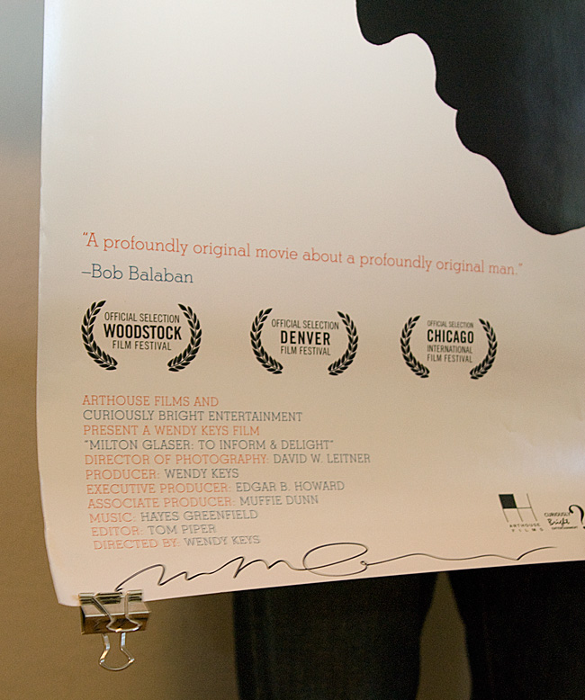
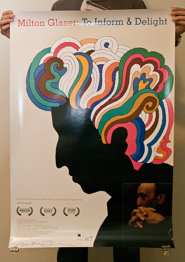
Don’t forget to enter the Milton Glaser giveaway! We will be choosing two winners on Monday, so you’ve still got a couple days to get your comment in and have a chance at winning the signed poster and/or a copy of Glaser’s new book. Winners will be drawn at random and notified via email. Leave a comment on the original post to enter.
I got a chance to see To Inform and Delight on Thursday and I really enjoyed it. It’s not a big production by any means; just a simple portrait of one of the world’s greatest designers. The film does a great job overviewing Glaser’s career and you really get a sense of the magnitude of his impact on the field. Glaser is strikingly articulate and a pleasure to listen to as he describes his career, work, and perspectives on design and art. It’s still playing at the Roxie in San Francisco until July 2nd.
note: For you Bay Area folk, Objectified is making another San Francisco run this weekend. If you missed the premier a few months ago, try and get over to the Yerba Buena Center for the Arts before the end of the weekend.
These images are by New York City based artist Robert Longo. Props to but does it float for spotting these, truly a great find. I have always been fascinated with anything and everything to do with aviation, so these are of obvious appeal. The coolest thing is the process behind them; though they look like photographs at first, they are actually graphite and charcoal drawings, based off projected photographs. The background disappears and all that is left is the strikingly detailed subject. These pilot renderings are my favorite, but much of his other work is up on his site for your enjoyment.
UPDATE: Comments are closed, we’ll be picking a winner today. Thank you to everyone who entered!
To Inform & Delight is a new documentary about the life and work of Milton Glaser. It’s currently playing in San Francisco, at the Roxie Theater, and will be in other selected US cities this summer. Further info on the site.
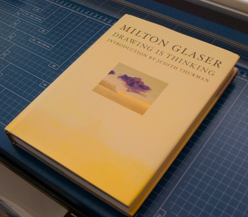
In support of the film, we are doing a giveaway of a couple signed posters and Glaser’s new book Drawing is Thinking. The grand prize will be onehand-signed (by Mr. Glaser himself) film poster and one copy of the book (displayed above). The runner up will receive onehand-signed (by Mr. Glaser himself) film poster. To enter, just comment on this post and be sure to leave your email address so that we can contact you if you win (email will not be publicly visible). The winners will be chosen at random from the comments on Tuesday, June 30th, 2009. Click here to enter!
If you’re in the San Francisco area, make sure to get out to the Roxie and catch this before it’s gone. It will be showing through the 25th of June. Also worth checking out is the Hilman Curtis short film on Glaser if you haven’t already.
Art of the Title Sequence has a bunch of new material up, including an interview with the minds behind the Wall-E end credits. Looks like a staggering amount of research went into this. As usual, the results are terrific. A version is up on Youtube, but as they suggest on the site, much better to consult the Blu-Ray if you’ve got it.
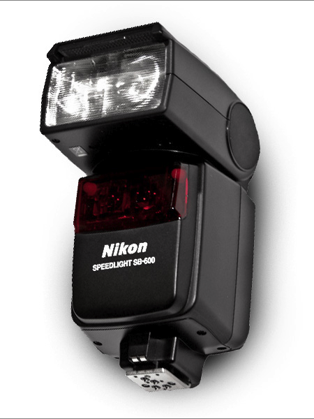
Recently I purchased a Nikon SB-600 flash for my D40. I have never owned anything in the way of photographic lighting and I figured this would be a good first step. I’ve outfitted my studio with a good continuous lighting set up (for video), but photographic lighting has always intimidated me (in regards to complexity and cost). The SB-600 is a flash attachment that works with the D40 (thankfully) and basically just augments the existing flash. The big difference is the ability to adjust the direction of the flash, allowing you to bounce light off the ceiling etc. It also has more options and allows for more control than the basic flash.
Above I’ve posted two pictures, the first uses the SB-600 (pointed at the ceiling), and the second is just the on-camera flash. Neither has been edited. Given that I have no idea what I’m doing with this flash, I think the results are fairly impressive out of the box. Every time I’ve used the SB-600 indoors, the pictures reflect exactly what I see in real life. None of that blown out flash nonsense. The colors are correct, the light is balanced, and the level of detail is like nothing I’ve seen come out of my D40 previously. Of course, the SB-600 is no substitute for a real studio lighting setup, but it’s a great way to cheaply augment the power and versatility of your on-camera lighting situation.
There are a number of other options for speedlights of this kind. I chose the SB-600 mainly because it seemed to be the best fit for my relatively “low end” D40. It’s not too heavy and didn’t break the bank like some of the other Nikon models (the SB-800 for example costs more than my camera). It’s been very easy to use and I would recommend it to anyone looking for a quick and easy way to improve their indoor photography. If anyone has experience with other models, Nikon or otherwise, I’d love to hear your thoughts or see some examples. I’m still learning how to get the most out of mine, but the potential definitely seems to be there.
The New York Times Magazine is the reason I wake up early on Sunday morning. Excellent photography, fascinating articles, and sophisticated design fill its pages week to week. It was recommended to me when I started graduate school and I haven’t missed an issue since.
This week the Times rolled out a new, svelte version of the Magazine. Like everyone, they are cutting costs where they can, and it was determined that reducing the size of the magazine by 9% would save them millions in paper costs. To accommodate the smaller page real estate and squeeze in more words, they enlisted Lyon Text, a more condensed typeface than they were using before. It’s a very subtle switch, and as they say, “Perhaps if we hadn’t mentioned it, you would hardly know the difference.” Where the change is most obvious is with the two new display faces: Knockout (H&FJ) and Nyte (Dino dos Santos). Both work really well in the new layout; definitely my favorite part of the redesign. They have also reworked the table of contents, changed the section order a touch, and sprinkled a multitude of new design elements throughout.
I think Arem Duplessis and his team have done an incredible job. I loved the Magazine before, and was initially concerned they might mess with a winning formula, but I think they succeeded in turning budget induced page shrinkage into a successful and well-executed redesign. Intact is the nuanced and ultra refined look and feel that first caught my eye. The smaller size is actually more manageable (a la Rolling Stone), and afforded them the opportunity to make the exciting upgrades. I don’t think anyone will miss the extra millimeters.
note: There were two covers that came out with the redesign. The one above, with a model by Thomas Doyle, was my favorite, but be sure to check out IC4Design’s version on the NYT website if you’re interested.