A great article by Michael Bierut about how things have changed in the world of design since the incorporation of the computer. An excerpt:
Design work that would have taken me a week in 1980 can now be done on a personal computer in less than an hour. Cutting and pasting, when needed, is done in the basement, often by interns. I get the impression that this kind of work, to which I once applied myself with the pride of a master chef, is now viewed as a chore like dishwashing.(The New York Times)
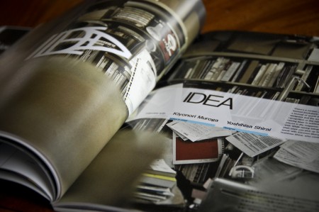
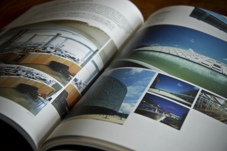
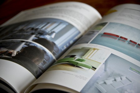
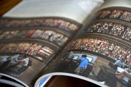
I had a chance to travel to Japan last June and I came back with many new sources of inspiration. I spent a lot of time digging through little design shops and actually had to leave some clothes behind to fit all of the great books I found. One of my favorite finds was +81, an interview driven magazine about graphic design, fashion, photography, cities, etc. They present a ton of work in each issue and it can be a great source of visual inspiration when you are looking for something stylistically very different than what you see in most American design publications. With articles presented in both Japanese and English, you see a lot of very creative layouts and unique type treatments. They experiment quite a bit, and with each issue focusing on a different theme, you never really know what to expect. Definitely worth checking out if you’re looking for a change.
You can usually find it at Japanese language bookshops here in the States (I know Kinokuniya carries it in SF), or you can check out their website for subscription information. (Currently about 40% of their readership is outside of Japan)
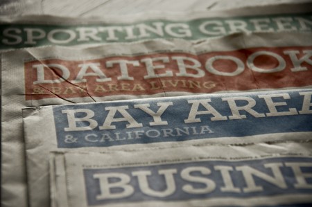
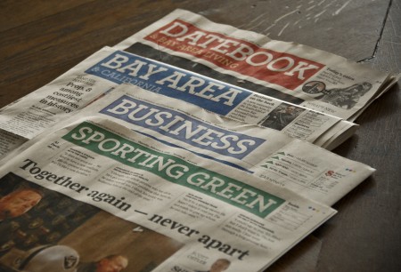
The San Francisco Chronicle just unveiled a redesign of their print edition this past Sunday. According to them, the new look is “brighter and more modern” and retains “its distinctive, classic character.” I’ve never felt like the Chronicle was fantastically designed, but this most recent incarnation is definitely a step down for me. The colors give it a USA Today-esque vibe, and I don’t feel like I can take it seriously at all.
Central to the new look is the incorporation of Archer, the “colorful slab serif” by H&FJ, as their principal headline typeface. I like Archer, always have. I really like the ball terminals on some of the uppercase letterforms, and I think they did a great job crafting a distinctive and more exciting slab serif. I’ve found it very useful for clients that want to look reliable, safe and friendly, and still seem unique and exciting. Given my general fondness for the face, I was surprised to feel such disgust when I saw Archer staring back at me on Sunday morning.
I think it’s a combination of things that ruined Archer for me. First, it’s played out. As much as I love it, I see it everywhere these days (assignments at school, adverts for just about every paper company, home and garden magazine, etc). That sort of typeface proliferation is fine for something like Helvetica, but Archer is too distinctive to work in so many different scenarios effectively, let alone a national newspaper. It reminds me slightly of what happened to Papyrus over the years. It was distinctive font that was rendered completely useless by millions of people browsing through their font list and picking the most “unique” looking. Of course, Archer is not included on your computer when you buy it, or as specialized as Papyrus, but a similar thing seems to be happening at least to some degree. Either way, I was sad to see two things ruined for me on Sunday morning: Archer and the SF Chronicle.
What do you all think? Is Archer the next Papyrus? Any Bay Area readers still receive the print edition of the Chronicle and like the redesign? Let us know in the comments.
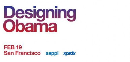
Sol Sender and Scott Thomas, the minds behind the Obama logo, will be in San Francisco in a couple weeks to talk about the process and development of the campaign. (Recall the Obama Logo Design videos that circulated a while back) I love hearing designers talk about their work, and even though I’ve heard just about everything possible regarding this logo, it should be interesting to hear them explain and answer questions about their process, in a live setting. The event is free. Register here.
Designing Obama
February 19th / 6-8:30pm
Morgan Auditorium
491 Post St at Mason
San Francisco, CA
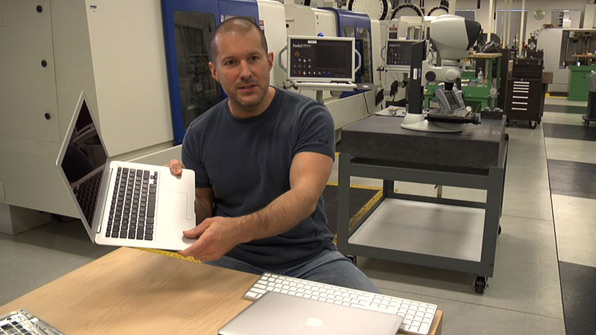
Objectified, the upcoming documentary on industrial design by Gary Hustwit, will be premiering soon at the South by Southwest Festival in March. It will take an in-depth look at the designers and creative processes behind some of today’s most popular objects, and should provide a great introduction into the field of industrial design.
I enjoyed Hustwit’s last film, Helvetica, and I thought it was a great way to give the general public some perspective on the world of graphic design. I am constantly asked what graphic design “is” by friends and family, and it was nice to have a film I could show them that pretty much summed it up. It was also interesting to see how the film’s release affected the use of Helvetica at school. Despite the fact that it was ubiquitous already, students suddenly became afraid of using it at all, for fear of further saturating the design community with more Helvetica, or doing something predictable.
I’m sure a lot of you will have heard of the release by now, but be sure to keep an eye out for a screening in your area. The fantastic Sundance Kabuki Theater, here in San Francisco, will be showing it on April 21st, with a Q&A with Hustwit to follow. More dates and screening information can be found on the Objectified site.