Designing With Photography
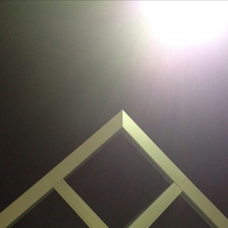
1. Initial photo (architectural feature)
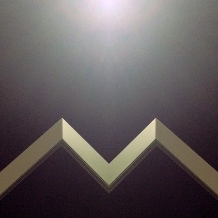
2. Cropped and mirrored
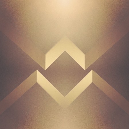
3. Cropped and mirrored and layered in Image Blender
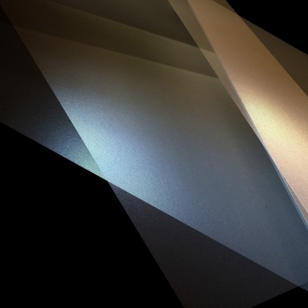
1. Initial Photo of some shadows in a corner (taken with Stilla)
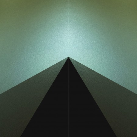
2. Cropped and mirrored
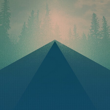
3. Final Image layered in Image Blender
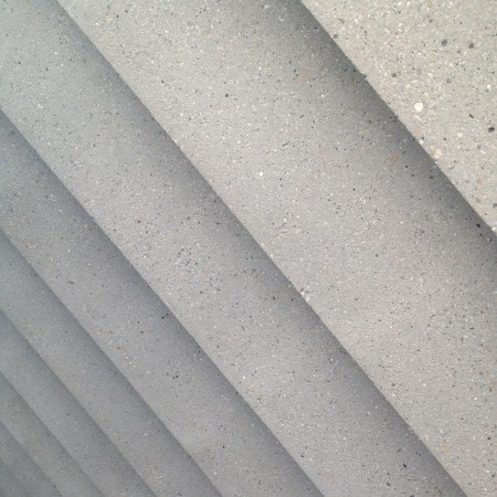
1. Initial photo of some stairs
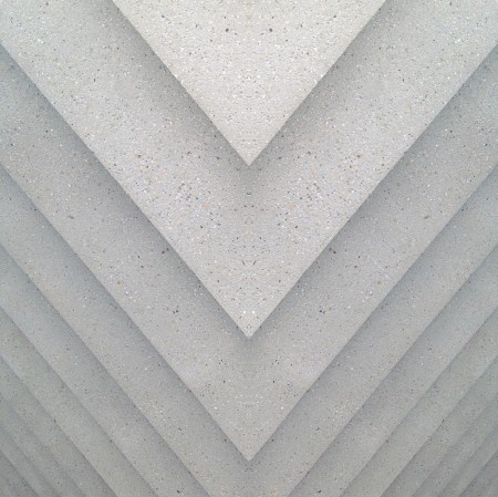
2. Mirrored (you may notice a habit here)
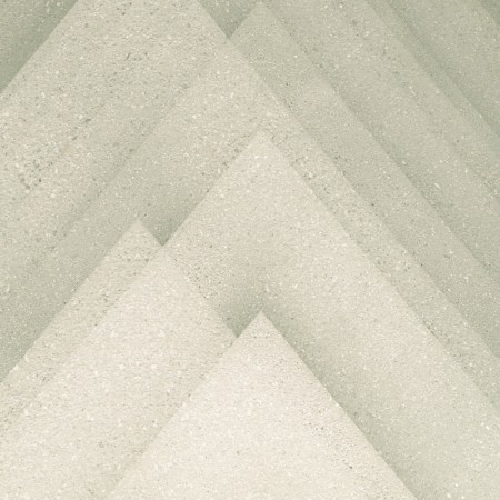
3. Final image layered in Image Blender
The first photos I started using in my designs were simple textures. (we’ve all seen the explosion of texture sites out there) but lately I’ve been using photos to get shapes that typically I would have drawn before. This has been largely driven by having a decent camera in my pocket at all times, allowing me to capture random staircases or light hitting the corner of an architectural feature just right. I find the natural light and texture in photographs have so much more depth in the final product then what I can come up with in photoshop …and its much easier to get to the end result.
Posted by: Seth Hardie
Instagram: @hallwood

11 Comments Leave A Comment
Tanner says:
August 28, 2012 at 12:09 amHow are you creating reflections? I download image blender, but I had a hard time figured out how you pulled off the mirrored effect. Great articles on iPhone design.
hellopanos says:
August 28, 2012 at 3:24 amGreat work. I have been trying some mirror photography of building corners and had some very interesting results.
If interested you can see some on my Instagram account @hellopanos
This takes it to another level. :)
Ryan Merrill says:
August 28, 2012 at 6:21 amLove the post. Took some inspiration in it and created this: http://cl.ly/J3YX From this original photo: http://cl.ly/J3XP
Maxime says:
August 28, 2012 at 10:47 amAnyone know what app he used for the cropping and mirroring?
Jonathan says:
August 28, 2012 at 10:58 am@MAXIME: A good App for both cropping and mirroring would be Diptic.
http://dipticapp.com
felix says:
August 28, 2012 at 11:06 amhorizontal mirroring makes everything look better.
Jakub says:
August 28, 2012 at 12:20 pmAmazing Seth!
Ken says:
August 29, 2012 at 6:22 pmI’ve had good success with Grid Lens as well
http://gridlens.bucketlabs.net
Gustavo says:
September 1, 2012 at 8:41 amDid you tried to mix images with Layover app? I don’t know if it is a good app and wanna some feedback for who tested it. Anyone?
Oh, and excuse my poor english. Thanks
Ireen says:
October 4, 2012 at 12:05 amFunny, I have some of those EXACT same images saved to my initaripson folder. In fact, the one with the blue and orange walls is taped to our nursery door. We painted the wall robin’s egg blue and then I found that image and am using it for ideas. I love your nursery so far and can’t wait to see it all finished. I will post photos of ours soon.
Lerina says:
October 11, 2012 at 9:50 pmThis is so great. I have a question though, how do you flip images on iPhone. This is something I’ve struggled with for months trying to figure out.