Scott Campbell
Posted by Collective
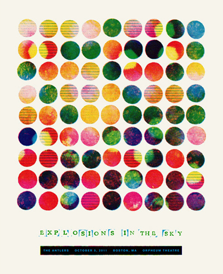
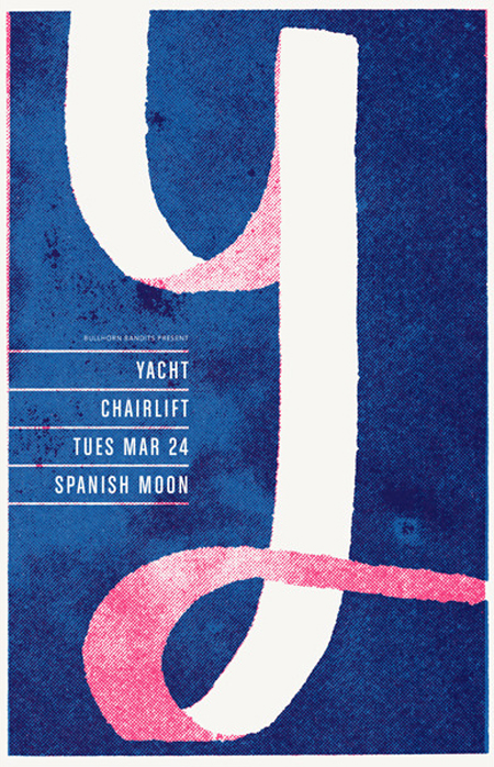
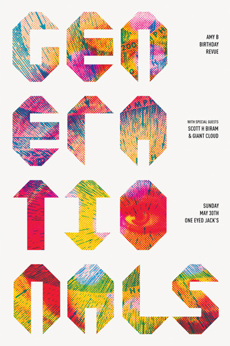
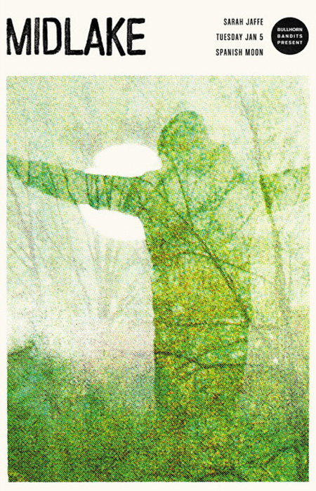
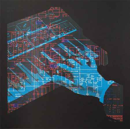
Beautiful halftone heavy poster work by Scott Campbell. Scott is a graphic designer & illustrator based in New Orleans. Check out more of his work here

Beautiful halftone heavy poster work by Scott Campbell. Scott is a graphic designer & illustrator based in New Orleans. Check out more of his work here
13 Comments Leave A Comment
Justin says:
January 18, 2012 at 6:46 pmScott does some really amazing work. You should also check out his buddies Young Monster, just as great.
一个人 says:
January 18, 2012 at 6:51 pm一个人走到哪,我就走到哪。
Grumpy says:
January 19, 2012 at 4:08 pmi like it, however i find pretty much any half-talented ‘designer’ can make cool gig posters. show me something where there was a strict brief with an actual strategic goal and a beautiful solution/execution and i’ll pile on the praise.
just sayin’…
Scott says:
January 20, 2012 at 9:35 amthanks for the post! Its always nice to be recognized on a blog I read everyday
stresstest says:
January 20, 2012 at 9:50 amRight on Grumpy.
I’d never put a gig poster on my wall.
brandon says:
January 20, 2012 at 9:53 am@grumpy: i suppose it’s odd that you’re not featured on here. (if you are, i’m sure everyone would like to see some examples.)
i see subtle moves that move away from in-the-box thinking and towards a less “goal” driven purpose. =more art than advert.
just sayin’…
Scott says:
January 20, 2012 at 10:16 amI find it ironic that you dudes are hating on gigposters and aesthetic over concept driven design on Scott Hansen’s blog
brandon says:
January 20, 2012 at 10:47 ami thought stresstest’s comments were satirical. let’s hope or else that’s just sad.
Grumpy says:
January 20, 2012 at 11:26 ambrandon, i’m not sure why it’s “odd” i’m not featured on here. oh, i get it now, you are implying that i probably suck because i’m NOT on here and you really don’t like my comment, haha. ok fine.
well, i do think these are pretty sweet and are executed well. i think i said i liked them, no?
that said, everyone and their mother does the aesthetic apparatus gigposter steez. and that’s fine too, and i would agree that some do it very well. and i realize these are…gigposters. i visited scott’s site…and i like his stuff. i was really hoping to see a section for identities though…
Nick says:
January 20, 2012 at 12:34 pmGrumpy,
I find it odd that identity systems are what you consider best illustrates real design. Sounds like a bunch of undergrad design school jive to me.
But I’ll give you the benefit of the doubt here. Please hit us with a link to your amazing strategic identity work so we can all drool over the next level stuff you are producing.
Thx, “Grumpy”.
“just sayin…”
Grumpy says:
January 20, 2012 at 4:25 pmwhew, you find it odd, brandon finds it odd – you guys should get out a bit more, go have a coffee together and discuss how odd everything is…
actually when i look at a portfolio, that is a VERY good way to tell the skill of a designer. you disagree apparently. great. is it ‘a bunch of undergrad design school jive’? i wouldn’t know and i have no idea what that even means. i do know it’s a very simple way to get a feeling for sourcing real talent. did i imply that scott sucked because there were no logos on his site because i don’t think i did…i was merely hoping to see a wider selection of his talents. i’m sorry if it offends you that i find logos particularly key in determining a designers skill set.
as for my ‘amazing strategic identity work’ you assume i obviously must have for me to even DARE to attempt any sort of criticism of design, feast your eyes on this and then go splash some cold water on your face:
http://www.dokimos.org/ajff/
BossnotBoss says:
January 21, 2012 at 10:09 amLike jesus, he takes a few colors and turns them to many to feed all our hungry eyes. I’ll be studying these for tricks to use on my own prints :)
Nick says:
January 21, 2012 at 11:19 am@grumpy – really good point. you’re the man. i hope someday i can get creative directed by you cos you are boss. swak.