New Site Alert: Warp Records
Posted by Jakub
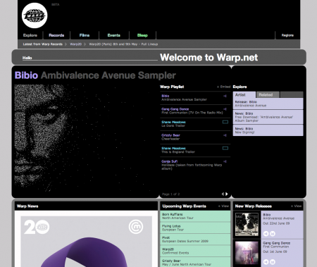
I’m not a web designer or am I Scott or many of you talented graphic designers but i’m really impressed with the new Warp website. I like how they finally used that Pantone patented purple they’ve owned for the first time in a proper way. Not to ever diss the old design which was done by Designer Republic which had a great interactive flash feature and gave each newly signed musician a color. I also like that this new site doesn’t feel like lego pieces stacked and that I can easily recognize what’s the important new news right from the start. Nice work guys

12 Comments Leave A Comment
Tardlovski says:
May 2, 2009 at 6:59 ami like it, but i was thinking they’d come up with something more distinctive.
i’m so hyped for that bibio album…it sounds amazing. and…the release date is so perfect.
Daniel Carvalho says:
May 2, 2009 at 7:55 amAs far as I know, Universal Everything is responsible for the new Warp Records website design. Matt Pyke (Universal Everything) used to actually work at The Designers Republic.
Although, trust me, I highly respect and admire The Designers Republic, they were always terrible at website design. Usability was something I think they never did consider.
Kevin says:
May 2, 2009 at 8:35 amgod, its about time. they’d had that other design for what, about 10 years?
Andrew J. says:
May 2, 2009 at 8:48 amAwesome site. And that Bibio album sounds like it will be fantastic!
Daniel Carvalho says:
May 2, 2009 at 3:13 pmCorrection above, “BUT” they were always terrible at website design.
frank says:
May 2, 2009 at 9:10 pmWow, really not digging the new site but I guess it kind of goes with the.. uh.. “new direction” warp has taken after Rob Mitchell died.
NAVIS says:
May 2, 2009 at 9:21 pmNew Bibio sounds great but… at like :54 is that still Bibio? There’s a few other random turns in that sample that made me wonder if that was Bibio. The song before the :54 mark was hot.
Tardlovski says:
May 3, 2009 at 6:37 amit’s all bibio. but that track at :54 in particular is an old duckular beat that was called ‘commodore 69’. i asked him about the duckular stuff and what the plan was for all his beat making adventures and he said it’s all under the bibio moniker for now.
Manuele De Lisio says:
May 3, 2009 at 12:52 pmI guess it’s a matter of taste… I used to like the original website very much. It was simple, unconventional, alternative… just perfect for a label like Warp Records. Respect > tDR + Kleber.
Unfortunately the new one is very Myspace-ish = trendy/boring.
frank says:
May 4, 2009 at 1:35 pmI don’t get why there’s a box at the top, then a wider round rect, and then another round rect with a different corner diameter!? Just looks really off balance and sloppy. And I don’t think it’s any easier to use. There’s so much text information on the homepage that I really don’t feel like clicking on anything. It all just looks boring. The old version was hard to use but in a kind of brilliant way that somehow drew you in.
Gareth says:
May 5, 2009 at 3:44 amhonestly, i think its very poor, nothing feels like it goes together, its very jarring and hard to read.
COCKHAMMER says:
September 2, 2010 at 5:24 pmwarp boring since ’92/’93 – of course obviating need to even comment on this or the old website. rephlex, slightly more interesting, but only slightly.