Weekend Inspiration: Andrea Galvani
Fantastic work by Italian photographer and artist Andrea Galvani. Talk about manipulating perception and reality.
Fantastic work by Italian photographer and artist Andrea Galvani. Talk about manipulating perception and reality.
As a kid, a lot of my time was spent either drawing or rummaging through my parents vast music collection. The latter becoming more of bed time ritual, as every night I would listen to an album(s) until I fell asleep, literally, until I fell asleep, which meant that the next morning my Dad gave me his usual: “Jonathan, you’re going to go deaf if you continue to fall asleep with those headphones on…” speech. This ritual turned to obsession when in 4th grade I received my first Sony Walkman. Night to night I would pick out a new tape to listen to. At first, I started listening to albums that I had heard my parents play on one of many weekend camping trips or long drives to our lake house, but when I started running out of familiar names, I would choose solely on a what the album’s cover looked like (unbeknownst to me at the time, this would be one of the main reasons I would become a Graphic Designer). As I got older and became more familiar with certain artists, photographers and designers, I came to realize that 90% of the album covers I had fallen in love with as a kid, were designed by a group by the name of Hipgnosis.
Hipgnosis was a British design group responsible for creating some of the most iconic and recognizable album covers of all times. Most notably for bands and artists such as Pink Floyd, T-Rex, Led Zeppelin, AC/DC, Scorpions, Yes, The Alan Parsons Project, Genesis, Peter Gabriel, ELO, just to name a few. The group consisted primarily of Storm Thorgerson and Aubrey Powell, and later, Peter Christopherson. The group would dissolve in 1983, though Thorgerson still works on album designs, and Powell works in video.
The groups approach to album design was strongly photography-oriented, and they pioneered the use of many innovative visual and packaging techniques. In particular, Thorgerson & Powell’s surreal, elaborately manipulated photos (utilizing darkroom tricks, multiple exposures, airbrush retouching, and mechanical cut-and-paste techniques) were a film-based forerunner of what, much later, can be called “Photoshopping”. Hipgnosis used primarily Hasselblad medium format cameras for their work, the square film format being especially suited to album cover imagery.
Another trademark was that many of their cover photos told “stories” directly related to the album’s lyrics, often based on puns or double meanings of words in the album title. Since both Powell and Thorgerson were film students, they often used models as “actors” and staged the photos in a highly theatrical manner. Many of Hipgnosis’ covers also featured distinctively “high tech” pen and ink logos and illustrations (often by graphic designer George Hardie), stickers, fancy inner sleeves, and other packaging bonuses. One of the unique extras created by Hipgnosis was the specially printed inner sleeve for Led Zeppelin’s “In Through the Out Door LP”, a “black and white” affair that magically turned to color when dampened with water (tying in with the main cover’s photographic theme).
The groups contribution to album cover designs and packaging can best be described as more of a legacy than anything. A legacy that definitely shaped a generation and set the bar for future album design for years to come.
I just recently found out that Reuben Wu, aside from being a British DJ, producer and keyboardist for Ladytron, was also an avid photographer. Apparently the story goes that he started getting a bit more serious about photography when he decided to document his personal tour experiences and making the most out of being a musician on the road, while visiting some remarkable locations. Since then, he’s has amassed an impressive collection of cameras, which he has modified, spliced and pushed to their limits, all in the name of experimentation and discovery. This has resulted in a diverse and unusual and almost other-worldy like body of work, from urban architecture, to desert and remote landscapes.
Be sure to check out more of Reuben’s amazing on his Flickr.
Big thanks to Wendy Stenzel at NEST Artists for supplying the photos and info regarding Reueben Wu.
Posted by B3PO (Jonathan Marsh)
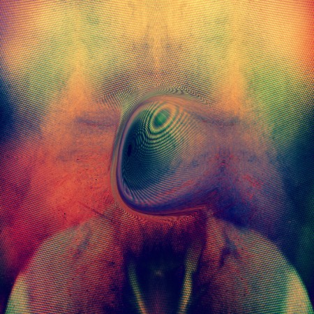
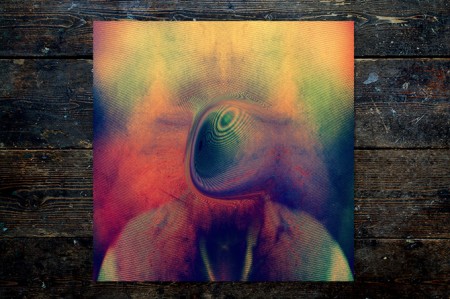
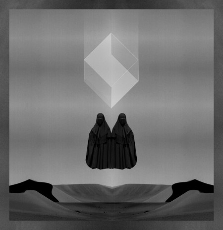
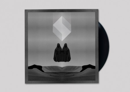
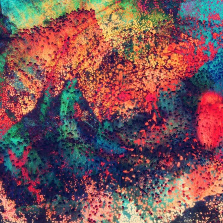
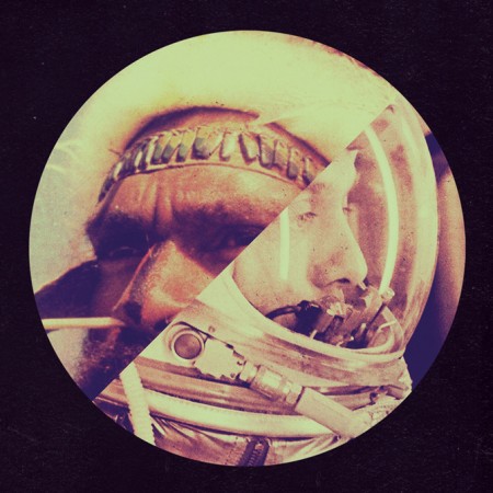
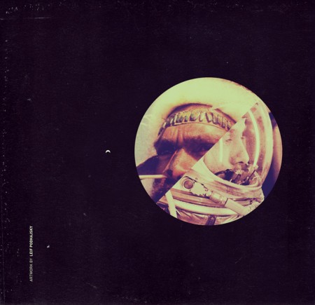
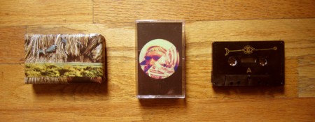
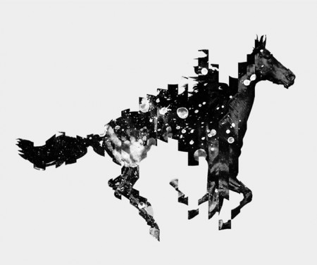
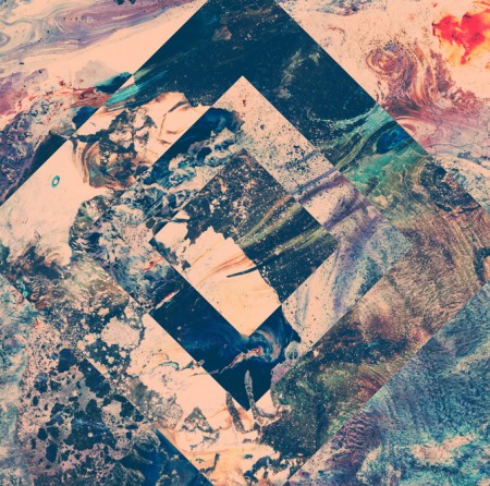
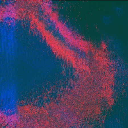
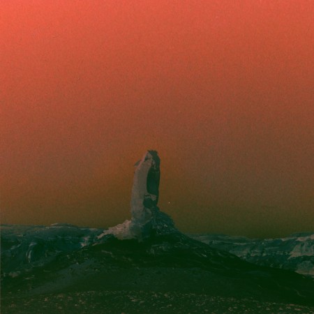
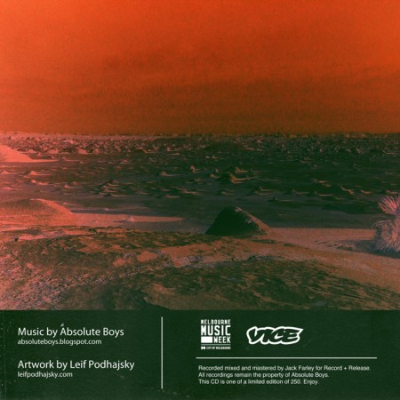
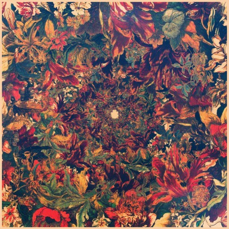
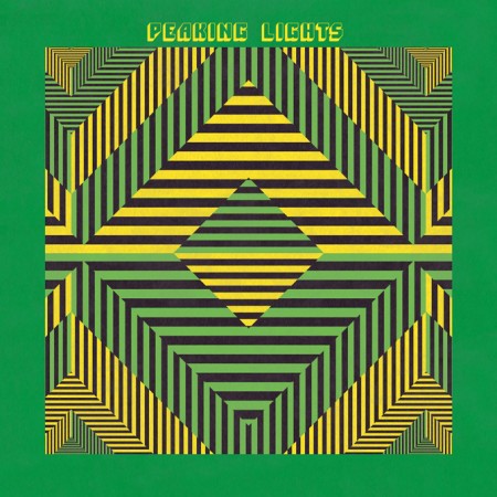
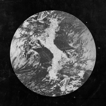
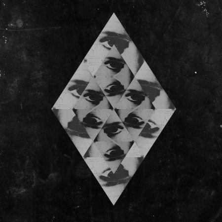
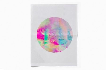
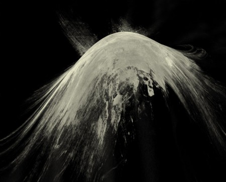
The amazing work of Australian artist and creative director Leif Podhajsky has been posted about here on the blog before, but I thought I would feature him again, this time as the subject of this week’s Weekend Inspiration. I have found myself revisiting his portfolio frequently over the past few weeks, In particular for his amazing album covers, as I’m working on a few myself.
He also launched the Melt Blog and has been experimenting with video and visuals.
Posted by B3PO

Fascinated by the work of Paul Davies, an Australian architectural-landscape painter and sculptor. Can’t help but to find some parallels between his work and Scott’s, who both seem to have the ability to create “dream-like sequences”, through the manipulation of layers, color and texture.
In the words of Paul himself:
Much of this work has been sourced from my recent visits to America and Europe. During these visits I examined The Eames House and Schindler House, both in Los Angeles, Frank Sinatra’s holiday retreat in Palm Springs, The Bauhaus in Dessau and The Villa Savoye in Poissy. I have also visited the modernist buildings in Phnom Penh, Cambodia, by Van Mollyvan, who spent time training under Le Corbusier. Gaining access to these sites often takes many requests as some of the buildings are privately owned. I was interested in these examples of international landscapes and architecture because of the striking, atmospheric qualities I could capture when photographing them. To amplify these images, I collaged them with sourced landscape photographs, of North America’s West Coast, by Ansel Adams. Adams’s photographs, with their crisp cinematic quality, allowed me to play with the composition and to stage dramatic, non- existent scenes. The photographic images reminded me of typical holiday postcards and I have attempted to capture this in my work by intensifying the perspectives and altering the colour ways.
Although the scenes and structures that inhibit them seem picturesque, in reality, these iconic homes can often feel austere and isolated. My work investigates these images as portraits of space, devoid of human form, inviting the viewer to generate their own emotional response to the painting. The absence of people in my work encourages the viewer to wander uninterrupted through the space and appreciate the built and non-built qualities of the surrounding environment. Through my practice I have attempted to explore this concept of isolation by incorporating empty swimming pools in the picture. Throughout my school years I swam competitively and was fascinated by the vacant feeling of the outdoor pools when they were drained for winter. I recently visited David Hockney’s underwater swimming pool mural, painted in the 1980’s for The Roosevelt Hotel in Los Angeles. Hockney’s work addresses issues of space and location, and his swimming pool design is a brilliant 3D version of these concepts. This year I designed a version of Hockney’s mural, for my Father’s swimming pool, and the experience was helped by the understanding of space I learnt from my Sculpture study at NSW College Of Fine Arts. By creating my paintings devoid of people, “emptying” the swimming pools and “burning” the forests, I am attempting to convey this dislocation to the viewer and raise environmental concerns that face us today.
Posted by B3PO
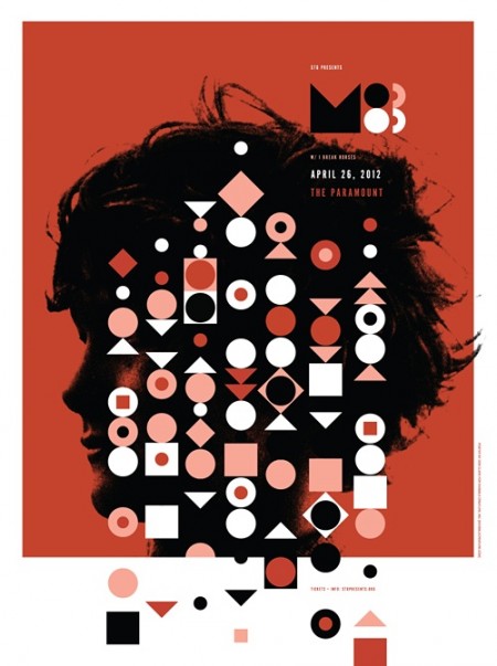
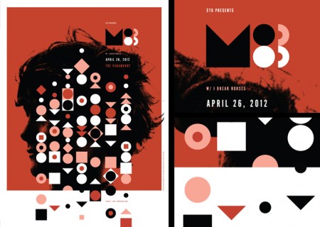
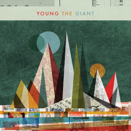
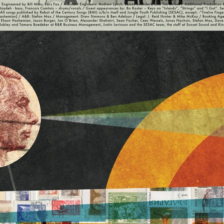
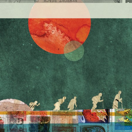


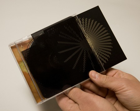
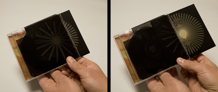
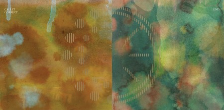


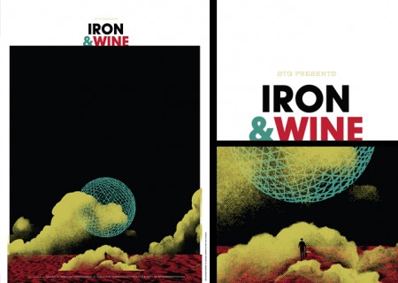
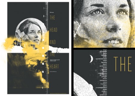
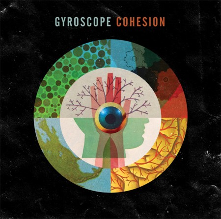
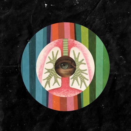
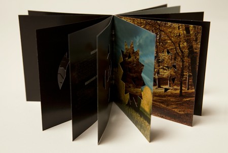
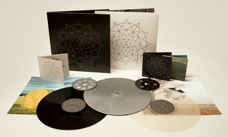

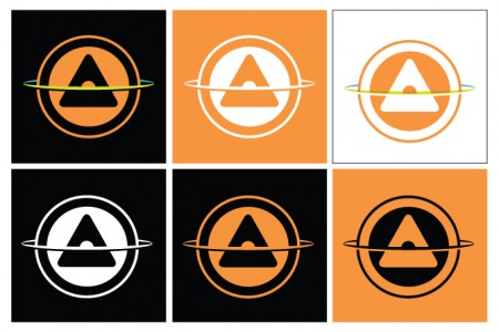
Invisible Creature is a Seattle based design studio comprised by brothers Don and Ryan Clark. From music packaging and band posters, to logos and identity, these guys do it all and they do it well, to the point of even being nominated for 4 Grammy awards for their music packaging.
Really enjoy their great use of textures and clean vectors.
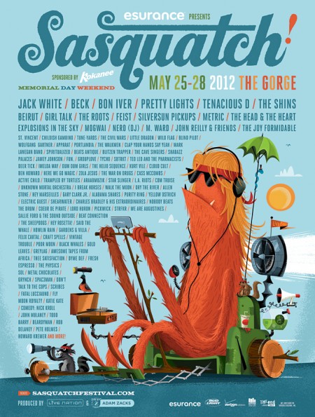
They are also behind the Sasquatch Music Festival identity, which Tycho will be playing at the end of this month, along acts such as Beck, Apparat, Purity Ring, Gardens & Villa, Com Truise, Star Slinger, Active Child, Lord Huron, to name a few.
Posted by B3PO
In the summer of 1968 three men and good friends, climber and surfer Yvon Chouinard, climber and skier Doug Tompkins, and champion skier Dick Dorworth, set off from California in an old van to surf, ski and climb their way down to the southern end of Argentina, where they were met by a young British climber, Chris Jones. Their goal was to climb a mountain that had been climbed only twice before: Cerro Fitz Roy.
Little did they know, this journey would not only have a tremendous impact on their own personal lives, but would also help launch a movement by inspiring (and continue to inspire to this day, like the film 180º South) many other outdoor lovers, as well as set the tone for many future expedition/adventure films and documentaries.
Mountain Of Storms was shot on a 16mm Bolex (drool Charles Bergquist) by Lito Tejada-Flores, and is narrated by Tom Donahue.
Two of these men would also go on to found and establish a couple the most successful brands out there. Yvon Chouinard founded Patagonia, while Doug Tompkins founded (and later sold) The North Face.
Posted by B3PO
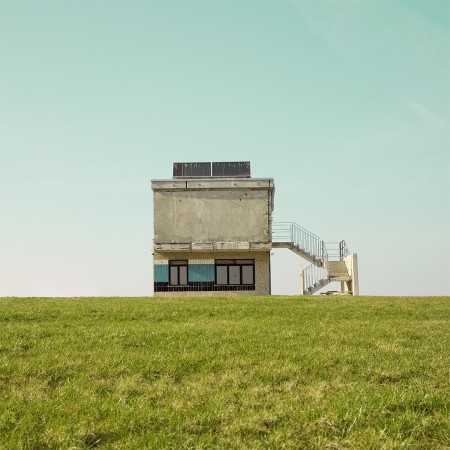
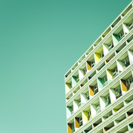
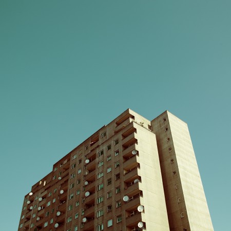
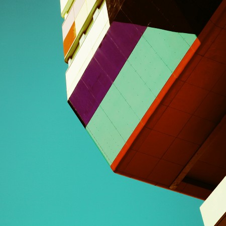
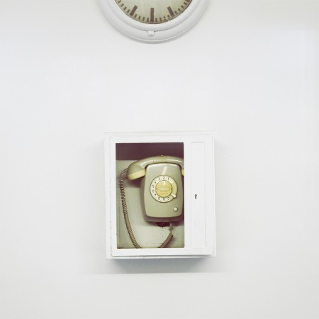
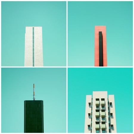
The wonderful work of Berlin based, self-taught photographer Matthias Heiderich has been covered here on the blog a couple of times before, but I thought I would check up on him to see what he’s been up to and glad I did so. He’s posted a few new amazing series and pieces since then, which I just can’t seem to get enough of. Great color and great composition.
Below are more examples of some of my favorites (hard to pick), which Matthias was kind enough to let me use for this post.
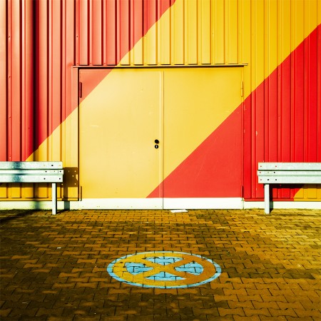
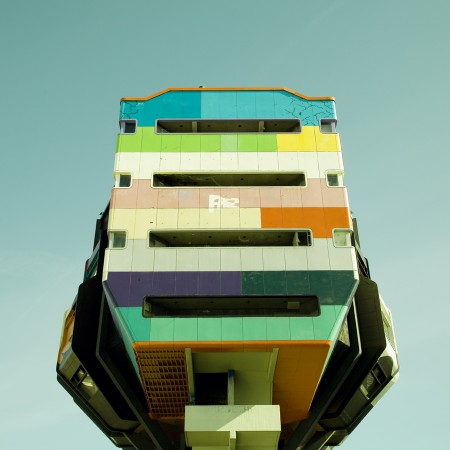
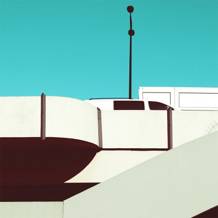
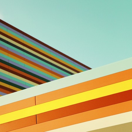
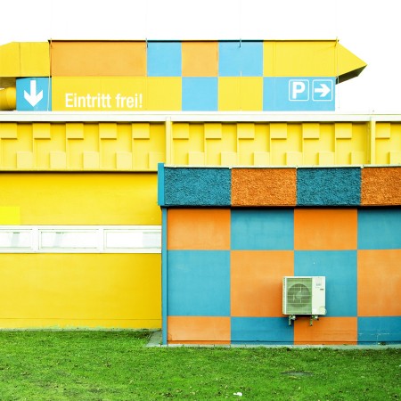
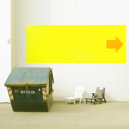
This also marks the first of the Weekend Inspiration posts I’ll be doing every Friday. This week is about photography, but I’ll be covering other subjects, as well doing a couple of process posts, weekend challenges and other ideas I’m cooking up. This is an effort to hopefully get all of us here on the ISO50 community to continue to be involved, sharing, and inspired enough to want to try and learn new things.
Please feel free to post in the comments below any ideas you may have for the Weekend Inspiration posts (challenges, process posts, etc.)
Posted by B3PO