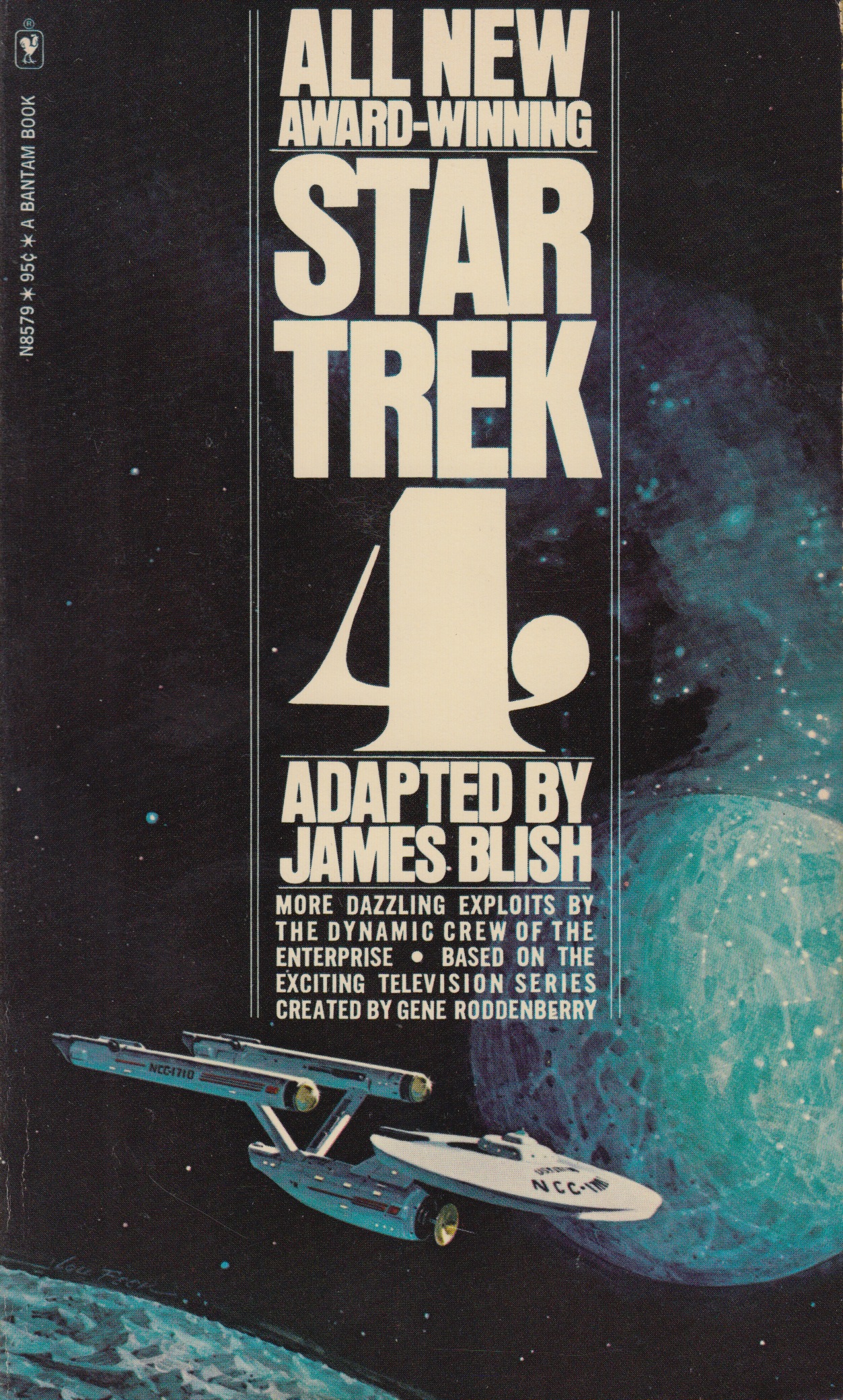
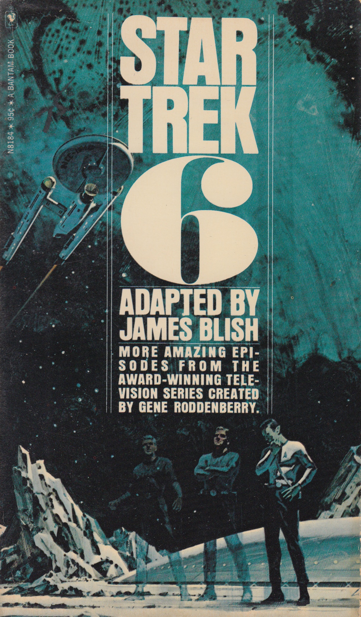
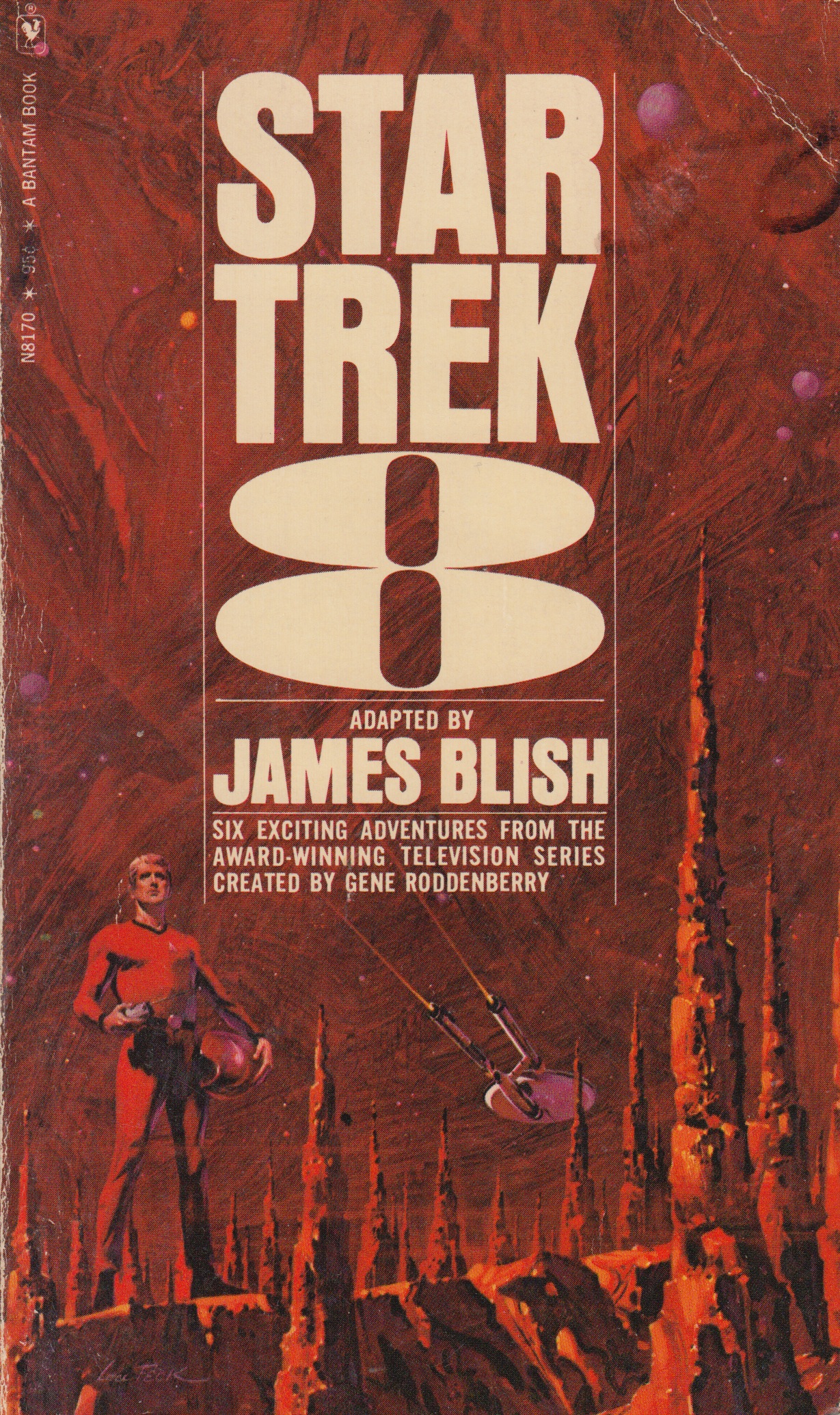
I’m following up last weeks post with one more series that I really like. In the late 60’s and early 70’s sci-fi author James Blish got commissioned to write a series of books that contained short story adaptations of the TV show. He started on volume one and made it all the way to twelve before he passed away, his run with writing this series was eight years long. Each book had a volume number and contained around ten short stories. Over the course of these twelve books there were many different artists that worked on the cover illustrations but the text treatments for the most part remained the same. How can you not love those big volume numbers on the cover, so good. I posted a few of my favorites from the series above but I encourage everyone to seek out the other covers and post personal favorites in the comments below.
My favorite would have to be volume six. This volume along with numbers four and eight (also favorites) were illustrated by Lou Feck. One reason I love Lou Feck is that his work is very easily recognizable when you are flipping rapidly through the paper back bins at your local used book store, high contrast and very dramatic. I am planning on doing a whole post dedicated to Lou, he is one of my favorite sci-fi cover illustrators and there are many other great ones outside of his work on this Star Trek series.
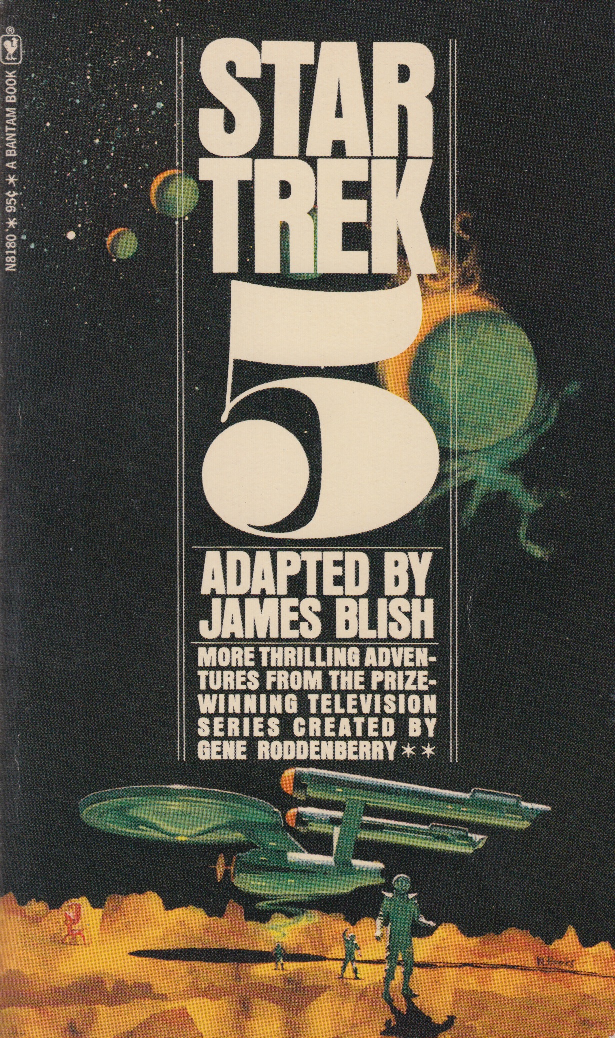
Number five was done by Mitchell Hooks, and I have to admit I didn’t know much about him before this post. When I went searching for more sci-fi work of his I really couldn’t find anything that came close to this one in terms of subject matter and style. A lot of his work seemed to be for mystery/thriller books and also some magazine cover work. Although much of his other work doesn’t quite fall under the sci-fi category I felt this image fits in well here so I included it. I hope you guys are enjoying this series.
A quick thanks to @jakekouba on instagram for tagging a few of these Star Trek covers a week or so back. Keep the #sundayscifi tags coming!
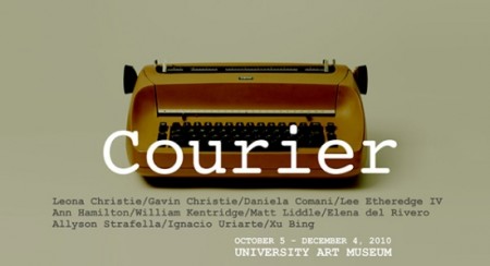
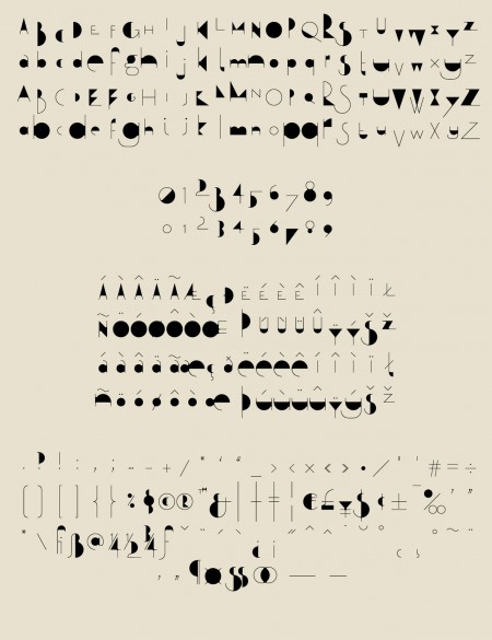
I just recently finished a five day intensive Typography course called Crafting Type. My head is still spinning a little from being so immersed into the realm of type design and fonts. I was surprised at after learning a few techniques for sketching and drawing how quick it was to get some decent ideas down on paper. I highly recommend the course if you ever get the chance to take it.
The course was led by Dave Crossland with Eben Sorkin and Octavio Pardo. Dave is a firm believer in “Libre Software” (free software) and is now creating Libre fonts. He is currently working as ‘Font Consultant’ to the Google Web Fonts project and has contributed many fonts to it. He also is a large contributor to FontForge and set each of us up with his own customized version to design our fonts.
The interesting part (that I didn’t realize) about Libre fonts is you are free to edit them and improve or make variations of them, providing you contribute them back into the Libre community. This is completely opposite of the current commercial type model (philosophically and financially). It was an eyeopener for me into the possibilities of this movement.
As web designer having fonts that I can use freely in my designs (on the web) is huge. Thinking back even a couple years, it was almost an impossibility due to Licensing. Some might argue that with the free fonts there is less “quality control” and a model more like Typekit is a better solution (both for users and font designers). Either way with a player as big as google building its free font library its exciting for me to see the flood gates on type and type creation opening up, even just a little bit.
I’ve just returned returned from a trip to both Munich and London, where I spent time with colleagues in both locations. Cosmic timing really, considering the London 2012 Olympics are on the horizon, and I’ve had Otl Aicher on the mind recently.
Much has been said in recent years about the shortcomings of the London 2012 graphic identity, but I hadn’t really been paying close attention to all the outrage, and had all but forgotten the design work – so I wasn’t prepared for the onslaught of Olympic schwag that greeted me at the official London 2012 shop at the St. Pancras Station in London. It’s borderline seizure inducing. Having just stepped off the train from Munich, where I spent time in Olympiapark and was exposed to Aichers work throughout the city, this London 2012 noise was especially jarring. And that mascot! Sigh. I took quite a few pictures, and had originally thought I’d post about Waldi vs Wenlock, but I decided I wouldn’t subject you to any of that madness. After all, this blog is here to celebrate beautiful things.
Scott has extensively covered Aicher’s work for Munich ’72 here before (in fact it’s where I was first exposed to it), but I thought the timing was right for us to be reminded just how amazing a coherent Olympic graphic identity and subsequent merchandising campaign can be.
Creative Review recently posted the above scans of the official Munich ’72 merchandise catalogue, and there are a few images of what look to be the official gift shops as well. While Waldi was the only souvenir that was actually designed by Aichlers studio directly, I find it really impressive how cohesive the entire output of the “Olympic Souvenir” department was. This is most likely due to the fact that Aicher dictated a very strict set of rules as to how the logotype and symbols could be used.
It’s easy to pick apart London 2012 when stacked up against the extremely high bar set by Aicher’s work for Munich, but let’s be real here, remember Izzy from Atlanta? NOTHING is as bad as that. What. Is. That. Thing.
I’m not sure if they entered the competition, but if they did I’d be real curious to see what Bibliotheque came up with for the London 2012 graphic identity. After all, they know a thing or two about Aicher’s legacy, having put together an exhibition of his Munich ’72 work over at the Vitsoe shop in 2007, comprised entirely of posters and print from their their own collection. This unofficial Olympic torch poster they did is pretty amazing as well.
Bonus link: While googling around, I found this site that offers up the official Olympic report books as PDFs. The Munich 72′ books span 3 Volumes, upwards of 1200 pages. For the true Munich ’72 geeks.
Alex Koplin is one of the veteran commenters on ISO50 blog, while he’s been working on graduating he’s also had time to work on a few collages and some free desktops for everyone. I talked to him over the phone before I posted this and he shared that Adrift by ISO50 was an influence on the work which I thought was a good choice always to look at before working mostly anything.
I’ve always been fascinated by collage. It’s a visceral technique that emerged in the early 20th century as a form of pop art, involving the assemblage of a variety of different sources of color and texture. Inspired by a few recent projects, I set out to experiment and develop my own technique for collage. These collage/number studies are the result of my first concerted effort, and I couldn’t be happier with the results. What excites me even more is the potential to apply this technique in future projects, using different color and texture palettes, and new layout techniques. I learned about how layout and order of placement dictate the motion and flow of the collage, which can be especially noted viewing the piece at a small size, or from far-away. It’s especially interesting to think about collage in this case as a digital approach to replicating a technique that traditionally relied on the physical sourcing, cutting and gluing of materials. The affordances of applications like Adobe Illustrator and Photoshop, and the abundance of pixels to source from the internet allow us to replicate these processes without all the mess, but is this still giving us the experience of bonding with the materials as we combine and re-contextualize them to form something new, expressive, and ultimately our own? I can say I did get a taste of this feeling, but there is still a barrier that existed between me and this final result that beckons me to somehow bring this sort of technique into the material world.
Flickr Pools can be a great resource for delving deeper into a visual theme or style and the Indic & Indian Scripts Pool is no exception. At least here in the US, the Latin Alphabet is pretty the only game in town when it comes to design so it’s easy to forget that their are whole other character sets out there. And while I’ve never encountered a project that called for any of these, it’s definitely inspiring to see such fluid characters and layouts.
From the Pool description:
“Indic scripts are Brahmi-derived scripts, This includes scripts used outside India, like Tibetan, Sinhala, Thai, Khmer, Burmese. Is this group for Indic scripts, or is it just for scripts used in India? If it’s the latter, then Arabic would count but Sinhala wouldn’t.”
These beautifully executed commercials for EF International Language Centers were created by designer Albin Holmqvist (who did the type) and director Gustav Johansson. The typography is simply incredible; many of these frames would be suitable as posters. There are four commercials in all, the rest can be found at Albin Holmqvist’s Vimeo.