In my new, and sure to be infrequent column, I’m discussing brands of note, some old, others new, and those long gone. As someone interested in the development of brands, these posts are less about business, and instead about where art and industry marry in historic form.
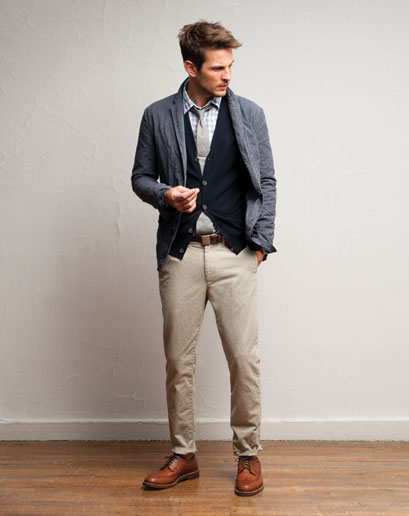
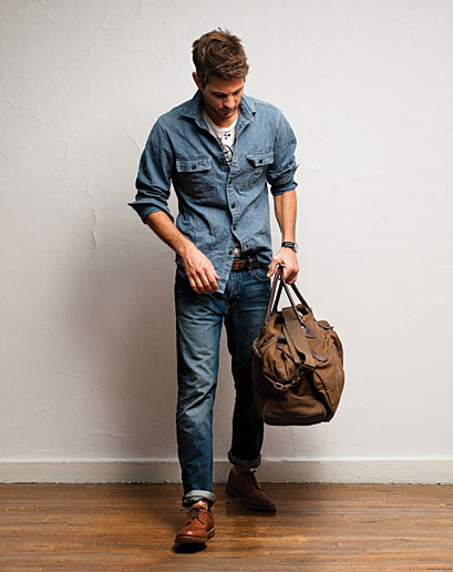
An unexpected brand making well-deserved headlines is J. Crew. Yes, that one. I had the same reaction when a few of my trusted friends made me aware of the brand and it’s current status. My memories of the brand were from the mid-90’s, of $98 Rollneck sweaters and greater misdeeds. Now I count myself amongst the fans for this most seemingly common of brands.
In it’s current moment, J. Crew has become less of a product line and more of a sensibility. The best example of J. Crew as a ‘perspective’ is their ‘In Good Company’ collection, which combines the 2000’s obsession with brand collaboration and good old fashioned curation, pairing the company up with well-worn heritage brands like Sebago and England’s 86 year-old outerwear brand, Belstaff. This is what is affectionately call an “ethos grab” or the adoption of the traits from greater brands via their inclusion in your own.
Riding on a wave of preppy fascination ushered in by a few East Coast indie bands, men’s clothing saw a sea change in recent years towards a more subtle look, taking over for a trend of logos and bright colors. J. Crew also wisely eschewed an overt prep direction, Instead opting for classic American and work-inspired clothing.
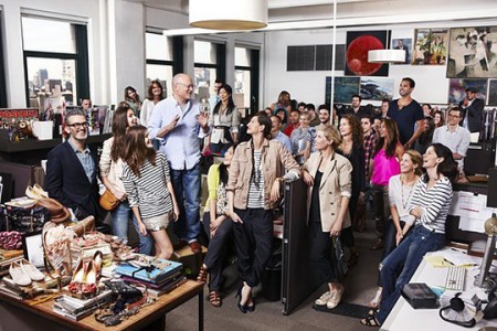
Like any brand resurgence (Apple, being one), it starts at the top and it infects the whole company. Mickey Drexler is the patriarch of this evolution, and his attitudes towards hiring and culture have informed the brand’s ascendency since he joined in 2003. Creative director Jenna Lyons has become a celebrity in her own right.
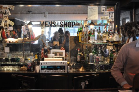
The inclusion of Andy Spade, co-founder (with his wife) of Kate Spade and his own confusingly named Jack Spade brand, was another brilliant hire, whose sly blend of Midwestern charm and a hint of old school smarm (David Spade is his brother) created the best asset perhaps of J. Crew-dom, the Liquor Store shop in Tribeca. A barely refurbished bar as men’s shop, and a signless work of retail genius.
“It’s odd that people think they have to brand everything with their own name to be successful. Certain companies are experts at certain things. I love brands that show humility and don’t try to be all things to all people. How many brands that got bigger got better?”
J. Crew
Founded: 1983
Golden Age: 2008- ?
Typeface: Goudy Old Style
Well this wasn’t a hard decision: Undercover is officially my favorite clothing store in Tokyo. The SS/10 collection is based on the work of Dieter Rams, using the motto “Less but Better” to guide the design. Need I say more? I walked in and saw rows of Vitsoe shelving and was sold immediately. Then I saw Snow White’s coffin, an old Braun catalog, and basically every object Dieter Rams had ever designed. Eventually I realized there were also clothes for sale and I had to take a seat to collect myself. Of course I found myself sitting on the 620 Chair.
We make noise, not clothes. – Jun Takahashi and Undercover.
So obviously I’m a fan of the overall aesthetic and ethos of the store. My one complaint was, as much as I loved the clothes (and I did), absolutely nothing fit me. Of course I became frustratingly used to this in Tokyo. Would have loved to pick something up; though I did search long and far to find their 2010 lookbook as a consolation prize. They had a display copy in-store, which I pleaded for in broken Japanese, but they wouldn’t part with it. Every book store in Tokyo was the same — it wasn’t until the last place I tried where the guy told me I could just grab one on Amazon.jp. This is true, but you need to create a new account and shipping ends up costing about double the book itself. I have one on the way and will let you know if it’s worth it. From what I remember, it is.
Cheers to the sales guys there for letting me take so many pictures. Pretty tough thing to do in Tokyo; most places will freak out and lock you down if you pull out a camera. Not sure why, free publicity as far as I’m concerned. Anyway these guys were really nice and made a special “exception” for me — I think because they felt bad that literally the entire line didn’t fit me.
There are a some new shirts up at the ISO50 Shop and I thought I’d announce them here before they go out in the newsletter next week. First is “Syv”, which is printed on the new American Apparel Tri-Blend “Coffee”, which is sort of a dusty version of the normal heather grey tri-blend with a slight coffee tint. When I first saw samples of these I was immediately hooked. The color and feel are exactly what I have been wanting for a while now and they compliment the design I had in mind well.
Next is the new Vuela colorway, black on black. I have been using American Apparel black shirts for a while now and while they have their own thing going on, I wanted to be able to work with a shirt that felt a little more vintage. I found a company called Alternative Apparel (no points for originality on the name…) who offer some pretty interesting colors. I like how their swatches aren’t truly red, or blue, they’re sort of a distressed version with a little color shift. For the Vuela shirt I went with their “Earth Coal” color, it feels sort of like a vintage concert tee, nice and soft with a slim cut. Definitely of the most comfortable tees I own.
All designs are available in men’s and women’s sizes. Quantities are limited so if you’re trying to get in on these before the holidays, now would be the time.
Just a quick note to let you know that many of the shirt designs at the shop have just been restocked. Among many others, Vuela, 77 Black-Black-Tri and 1976 Tri-Blue are all back online.
The heat is coming down hard out here in California so I decided to do a limited run of the 77 shirt on the new American Apparel Tri-Blend Black. It’s super soft and super light for those long summer days. You can check them out at the ISO50 Shop: Men’s Shirt | Women’s Shirt.
On a side note, these are the first product shots I’ve done with all strobe flash lighting. I picked up a Nikon SB-900 and SB-600 and have been loving them. I still have a lot to learn but I am really happy with the initial results (see above; used SB-900 w/ diffuser on camera and remote SB-600 on stand w/ umbrella). I’ll be posting more on the flashes this week.
Spring is finally creeping into town (although very slowly here in San Francisco) and I’ve been way into the AA tri-blend tees this year. So I printed up a modified version of the Vuela Print on Heather Grey tees for your sunny weather enjoyment. As always, you can get yours over at the ISO50 Shop. I’m also clearing out a lot of the older designs to get ready for summer so you’ll find lots of shirts marked down 20-30%. All marked down shirts are the final pressing of that particular design/colorway.
On a related note I’ve been spending a lot more time trying to learn the ins and outs of product photography. I’ve been shooting the products for years but I’ve never spent enough time worrying about the color accuracy of the output. After all this time working with cameras you’d think it would come easy, but I was surprised to find how difficult it was to get good shots when the goal is creating a color accurate representation of an inanimate object. With my creative photography I’m always trying my best to make things appear inaccurate and I guess old habits die hard. For the shots above I used a tungsten photo bulb/can light along with a Quad CF lamp from Calumet. I had been using 3 lights but it turned out that hitting the subject from the right side and front with lights and letting some natural light in from the left (there was a window there) made for better dynamics so I’ve been sticking with the 2 light setup.
The last couple product shoots were the first times I’ve used a Gretag card to calibrate the camera color temperature under the lights. That and shooting in NEF RAW really went a long way to getting a solid foundation, but there was still a lot of work done in post. Having the calibrated monitor definitely helped at that point, but the real key I found was changing my own perception of the image and training myself to see it in a different way than I’m used to. I always catch myself slipping and trying to make the shots look interesting or enhanced and then have to step back and realize that this needs to be a literal representation of the real object. At any rate, I’ve got a ways to go (can’t even imagine how they get all those high end fashion shots) but it’s been surprisingly interesting learning the subtitles and nuance of a new kind of photography. It certainly is it’s own art form. I’m sure a lot of you have some product photography chops, feel free to share any of your tricks of the trade in the comments.
Also, I know I’ve been promising it for a long time, and I assure you, a very detailed post about color calibration is on the way. The project has sort of taken on a life of it’s own and I’ve brought Alex on board to help with research and production. We’re going to be shooting an interview with a color expert in the next couple weeks and we should wrap the post soon after that so stay tuned!
It’s hot as hell but luckily the summer-friendly tri-blend edition 1976 Heather Blue shirt by ISO50 is back in stock! Get them while they last this time, it’s going to be a long summer… Link
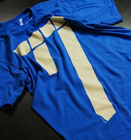
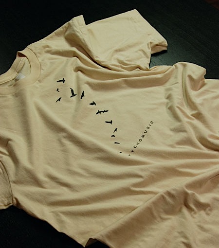
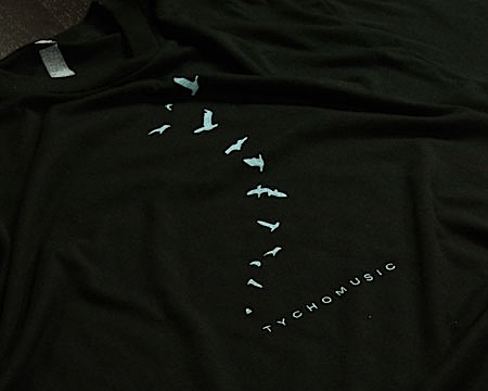
There are 3 new T-Shirt designs now available at the ISO50 shop. “77” Cream / Royal is printed on American Apparel 100% Cotton and comes in all Men’s and Women’s sizes. The two Tycho shirts are new typo / colorways of the original “Tycho Avian” shirts which have been out of print since last year. “Tycho Avian” Cream / Brown is printed on American Apparel 100% Cotton and “Tycho Avian” Black / Aqua-Grey is printed on American Apparel 50/50 Cotton/Poly. Each are available in all sizes, M/W. I’ll bee officially releasing these through the newsletter on Monday but I thought I’d post them up here so the blog readers could get a crack at them first. The product images at the shop page are temporary, I’ll try to get some close-ups and alternate angles posted up tomorrow. Enjoy!
On a side note, I can’t seem to get enough of Trade Gothic Bold Extended lately (the face used on the Tycho shirts above). I’m currently redesigning the interface of the shop and laid most of it out in TG with headers being Extended. For those in San Francisco: There’s an old California Savings (closed) on 16th & Mission (across from BART) with a very cool sign that looks a lot like TG Bold Ext. Has anyone seen that? Is it TG? It’s for sale so they’ll probably redo the exterior, I’ll try to walk over tomorrow and get a couple shots before that happens. Probably not a big rush though, 16th & Mission isn’t exactly hot property.