The 1960s had some of the most interesting design. The typography and photography really pushed design in a beautiful direction. These 1960s Life Science book covers and graphics bring on such a wave of nostalgia. The typeface used in these was perfect.
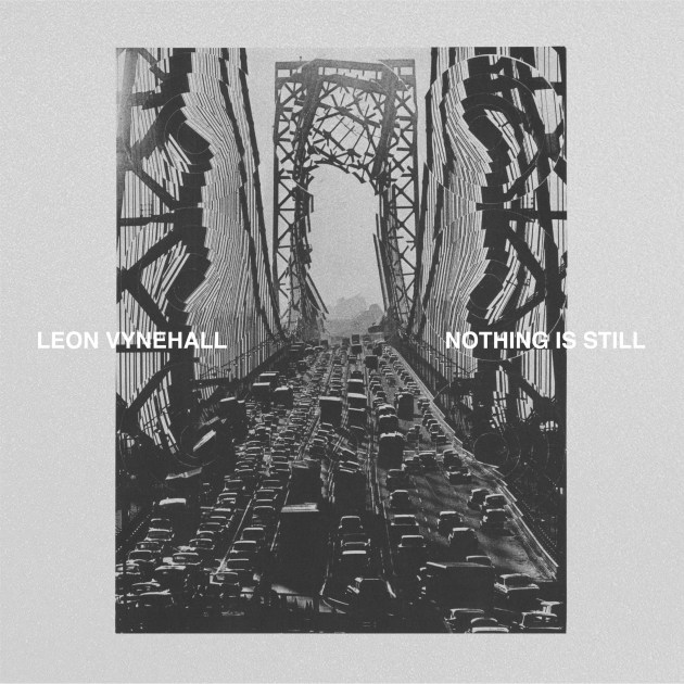
Following his recent signing to Ninja Tune, Leon Vynehall announces his debut album Nothing Is Still – a record that sees him digging deeper into the family history that has always inspired his most iconic tracks, whilst returning to his own musical roots.
Nothing Is Still is, at its core, an album dedicated to Vynehall’s grandparents. Emigrating from a leafy south east U.K. to New York City in the 1960s, their seven-day journey via boat from Southampton to Brooklyn, and the stories that followed, have only truly come to light upon the passing of his grandfather four years ago. “I knew they had lived in the U.S. and heard many anecdotes, but it was only after Pops died and my Nan presented these polaroids of their time there; of her waitressing at the New York Mayor’s Ball in ’66, or Pops with horses on a ranch in Arizona, that she delved deeper into their story, and I started to become overtly inquisitive about it” Vynehall says, following in depth conversations with his Nan to find out as much as he could about this part of his family history that was – in a way that easily resonates with us all – seemingly hidden in plain sight. “I felt the need to document this period for her, and it all just sort of snowballed from there.”
The result happened quite naturally, those early conversations going on to form an album of immense scale, physicality and wonder as well as two accompanying elements – a Novella and short films which expand the scope and context of the narrative. This is extended further through the use of visual artist Pol Bury’s ‘George Washington Bridge, NYC’ from his ‘Cinétisation’ collection as the album artwork; with permission granted to Vynehall by Bury’s wife – the artwork was created in New York by Bury at the same time as the album’s story takes place.
Clearly, that aforementioned feeling of exploration resonates with Vynehall creatively too. Vynehall has released two extended EP’s so far, his 2014 breakthrough Music For The Uninvited (3024) – a record inspired by the funk, soul and hip-hop tapes his mum used to play on car journeys which finished the year on a plethora of ‘Best of the Year’ lists including Pitchfork, FACT and Resident Advisor who called it “one of the most eclectic and rewarding house records you’ll hear all year” – and 2016’s Rojus EP (Running Back) which saw Vynehall building more layers and broadening the depth of his music to widespread critical acclaim including DJ Mag’s ‘Album of the Year’ and ‘Best New Music’ from Pitchfork for fan favourite single ‘Blush’. On both, he was crafting luscious grooves that were destined to dominate dancefloors. Nothing Is Still however, is defiantly atmospheric and textural, and finds him harnessing his passion for early contemporary minimalist composers such as Gavin Bryars as well as records like Philip Glass’ Koyaanisqatsi and Terry Riley’s A Rainbow In Curved Air.
Written and predominantly performed by Vynehall with additional musicians including a ten-piece string section arranged by Amy Langley, Finn Peters (saxophone and flute), and Sam Beste (piano) whom completed the final recording sessions that took place at Konk Studio’s – Nothing Is Still was mixed by Blue May in London before making its own transatlantic flight to New York, where it was mastered at Sterling Sound by Greg Calbi.
As well as being respected for the strength of his musical output, Vynehall has a global reputation as a DJ and curator. He has hosted and curated all-night-long residencies worldwide and has become a mainstay at many festivals including Glastonbury, Field Day and Sonar.
NOTHING IS STILL BY LEON VYNEHALL — OUT ON 15th June 2018
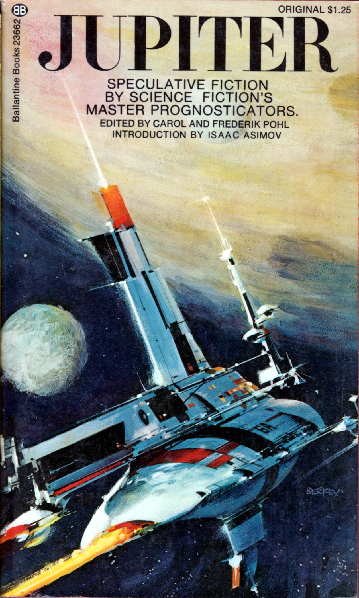
Ducking into used bookstores over weekends and after work, I have become a bit of a sci-fi paperback junky. I love the feeling of rummaging through stacks of forgotten paperbacks and discovering that hidden gem of a cover. There is just something about the idea of the future as illustrated by artists of the past that I find fascinating. If you do enough digging you can come away with some great covers for under a few bucks. Recently I began scanning and cataloguing my finds and this has led me to the idea for a new blog series I will be posting here on Sundays. Every week my post will be inspired by one of the covers I own or a new find. Some of these may be well known while others more obscure. I look at this as a way to learn about and resurrect some of the great cover illustrators and designers of the sci-fi genre. If you have suggestions or your own favorites, leave a comment or contribute to the collection of covers with a nice straight on shot of your find and tag it #Sundayscifi on Instagram. I started the tag off with a few of my own images but I would love everyone to include their finds.
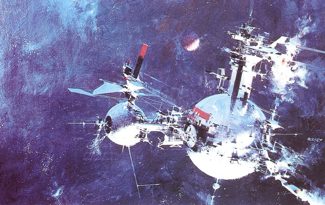
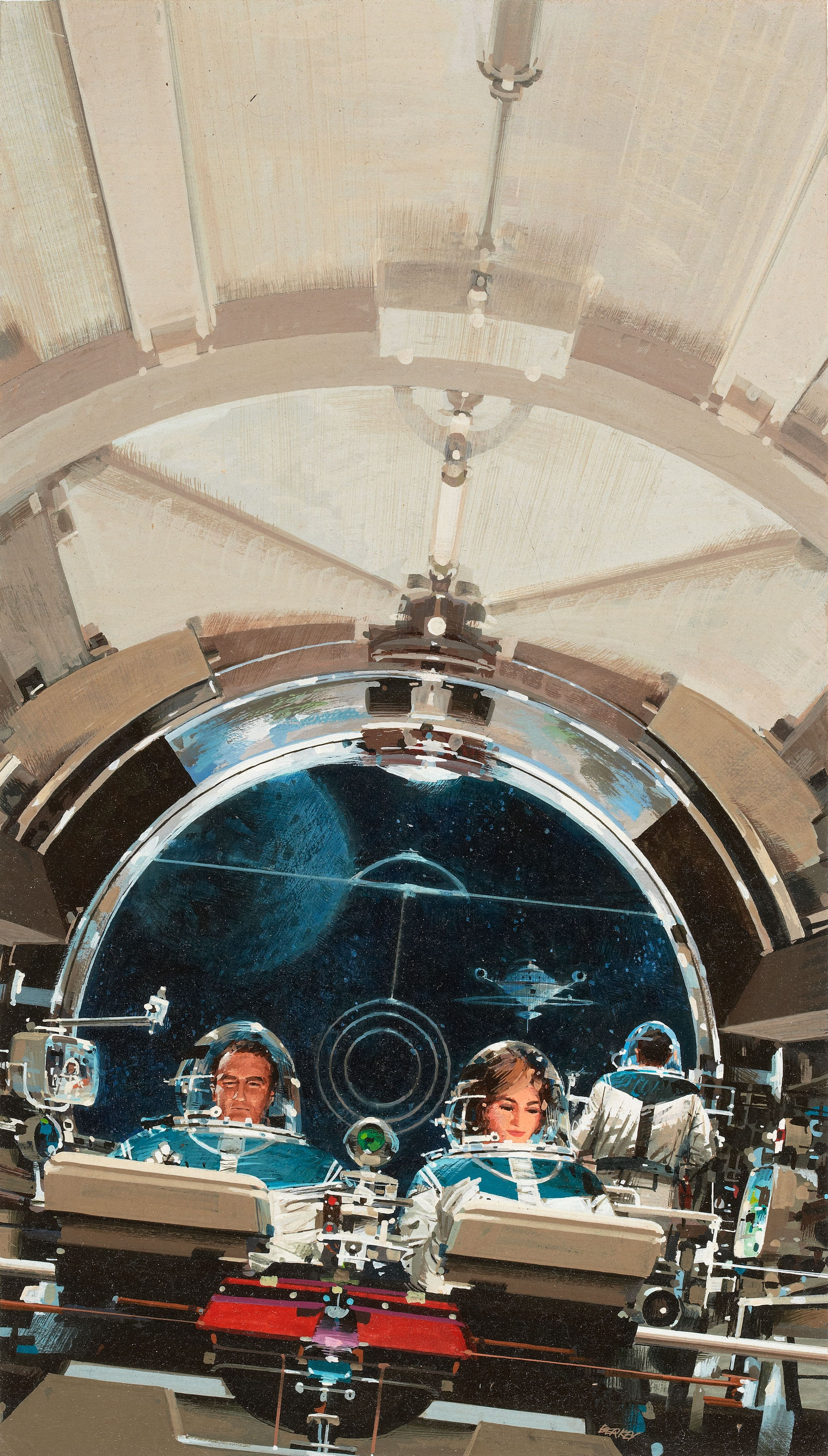
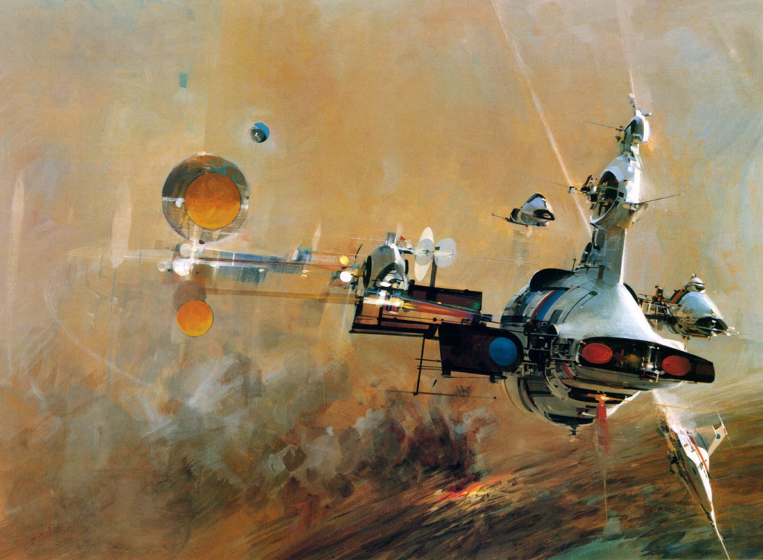
To start the post off, I am featuring one of the better known artists of the sci-fi genre. Most know John Berkey for his illustrations for Star Wars, but he holds a massive catalogue of varying types of work. Beginning in the 1960s, he was commissioned by NASA to further their space program as part of their efforts to travel beyond the Earth’s atmosphere and ultimately to the moon. No matter the type of work, I consistently love his use of color. My personal favorite thing about his work are his spaceships. The details of his images draw you in and you can get lost looking at every tiny detail he includes.
Blog favorite Matthias Heiderich is having his first solo exhibition in the US:
Gallery Carte Blanche is pleased to announce the opening of Spektrum Berlin, Matthias Heiderich on Thursday, July 19, 2012.
Featuring the work of German-based photographer Matthias Heiderich, in his first solo exhibition in the United States, Spektrum Berlin challenges visions and stereotypes of Germany, in particular East Berlin, through colorful eye-popping urban architectural photography.
Viewed together or individually, each of Heiderich’s images transform the banality and universality of buildings into a mosaic of geometrical shapes, reconstructing the world we live in into an abstract canvas of lines, patterns, angular compositions, and vibrant colors. Saturated to the limits of reality, Heiderich’s prints, emerging directly from a 1980s color palette and influenced by 1950s and 1960s color photography and polaroid images, look at an industrial past with a present freshness and optimism for the future.
Self-taught, Heiderich doesn’t often play by the “rules”, however the influence of German photographic tradition is apparent in Heiderich’s work. Invested in the same rigor and pragmatism as Bernd Bechers, Heiderich creates systematic photographic typologies of industrial buildings and structures, emphasizing how each building is a product of human mind and skill. Following his natural instinct for composition, in series after series Heiderich experiments, searches for individuality, and cultivates a unique style and sensibility.
Spektrum Berlin, Matthias Heiderich opens on Thursday, July 19 and runs through September 13, 2012. The opening reception will be held on Friday, July 20th from 6pm–9pm.
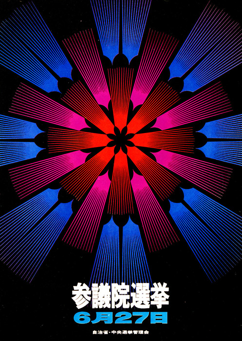
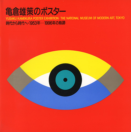
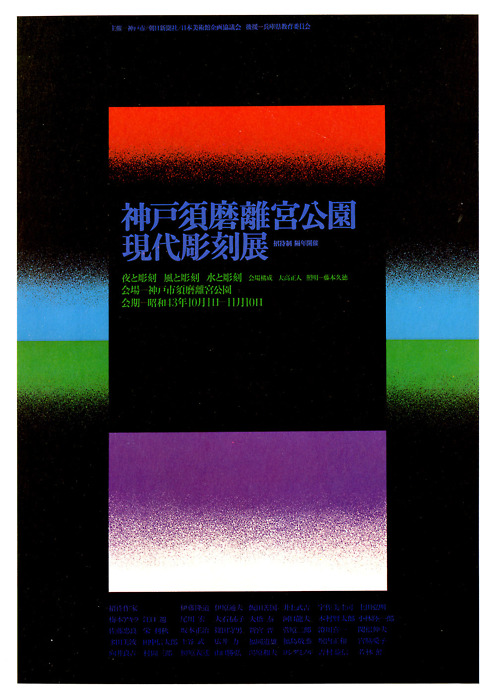
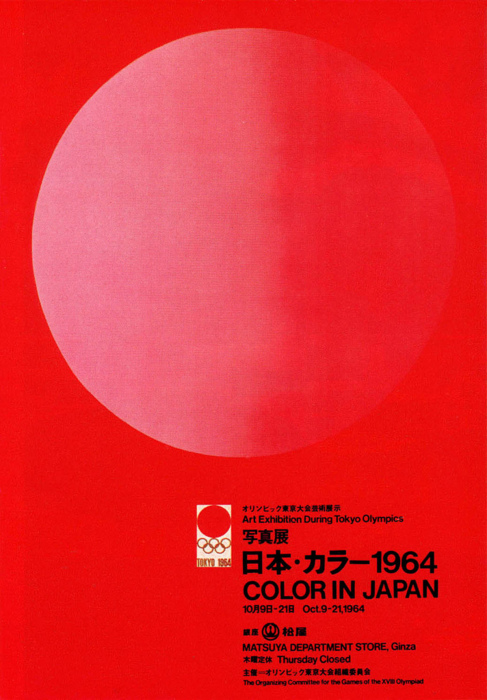
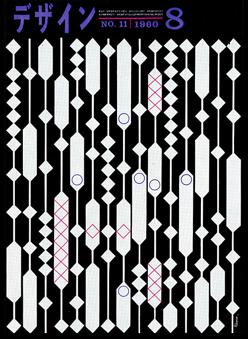
Gurafiku has an extensive archive of Japanese graphic design from the 1800s to today. In particular, the vibrant work of the 60s by greats like Yusaku Kamekura and Ikko Tanaka caught my eye.
Check out the rest of the set here, or see the previous post on “Graphic Design” magazine for more of their work.
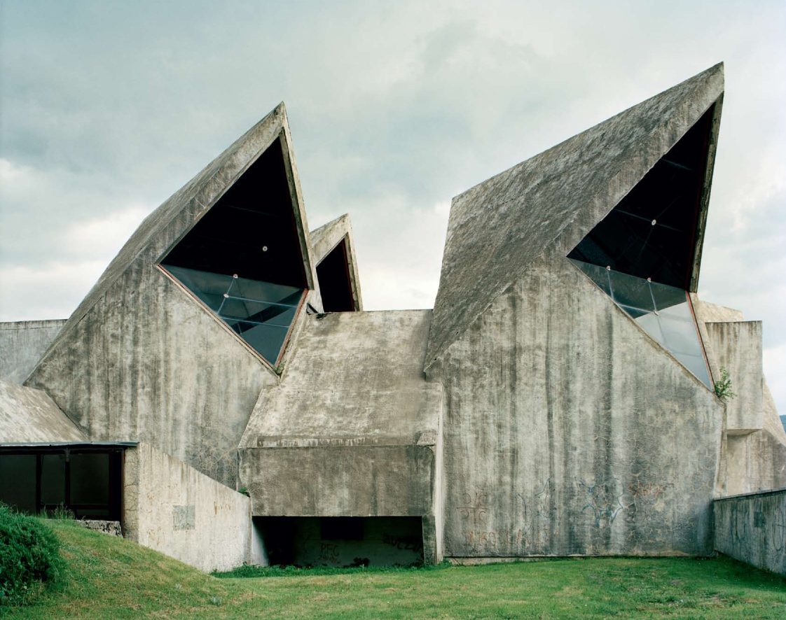
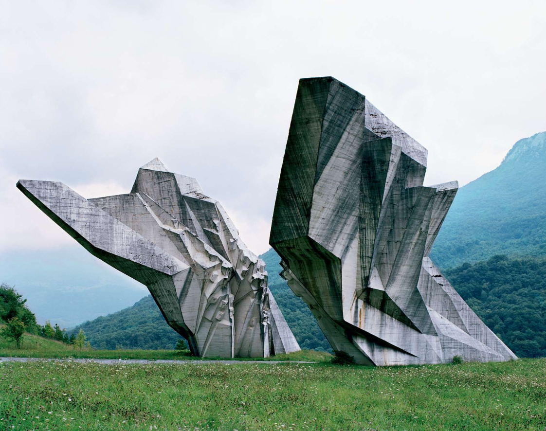
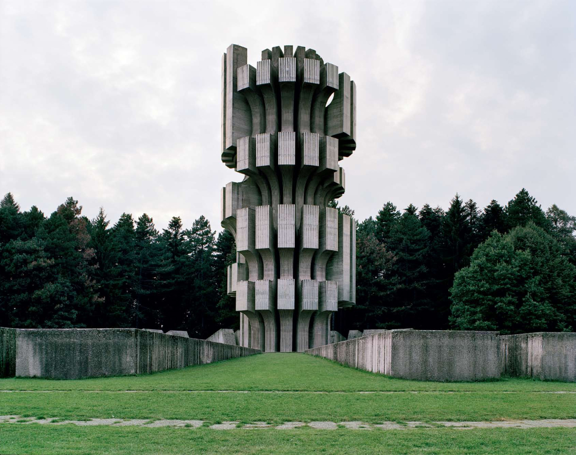
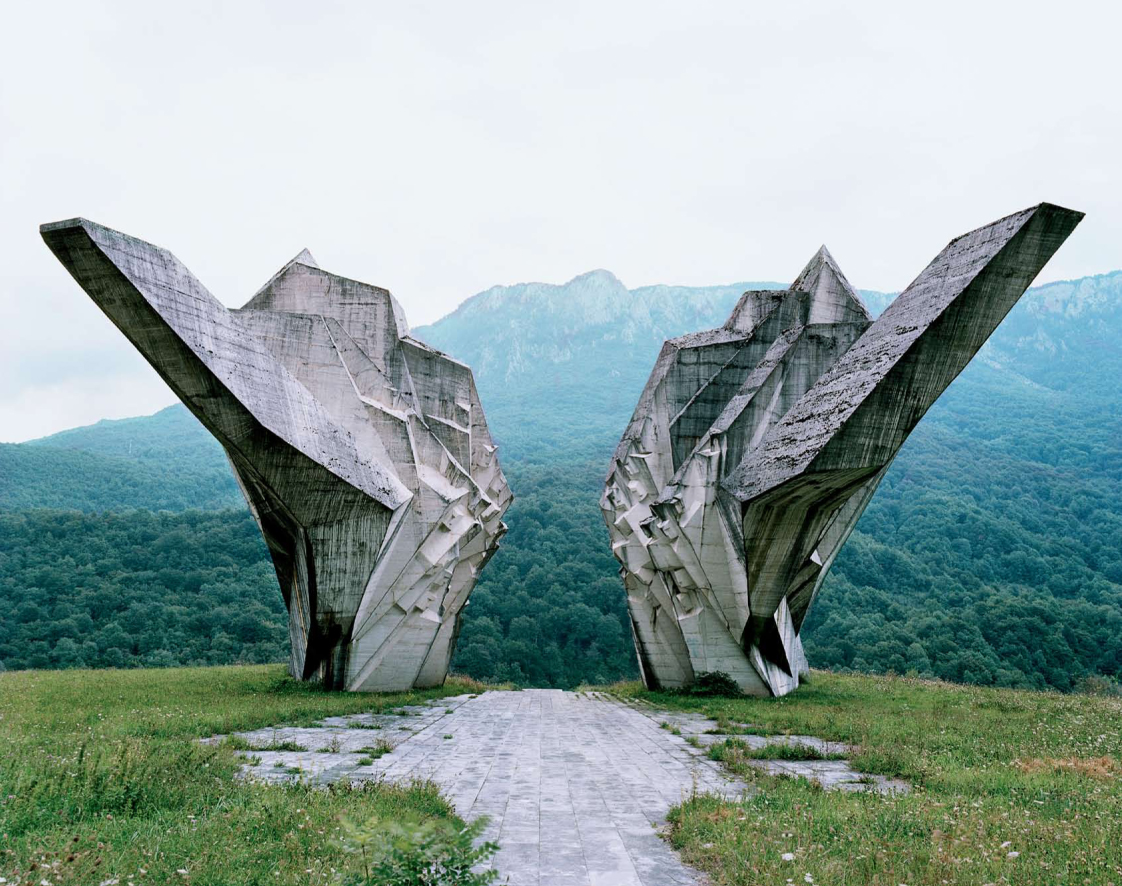
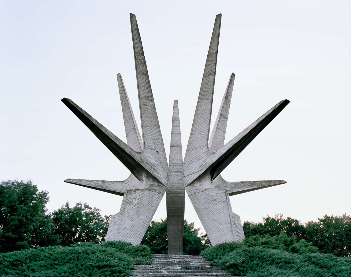
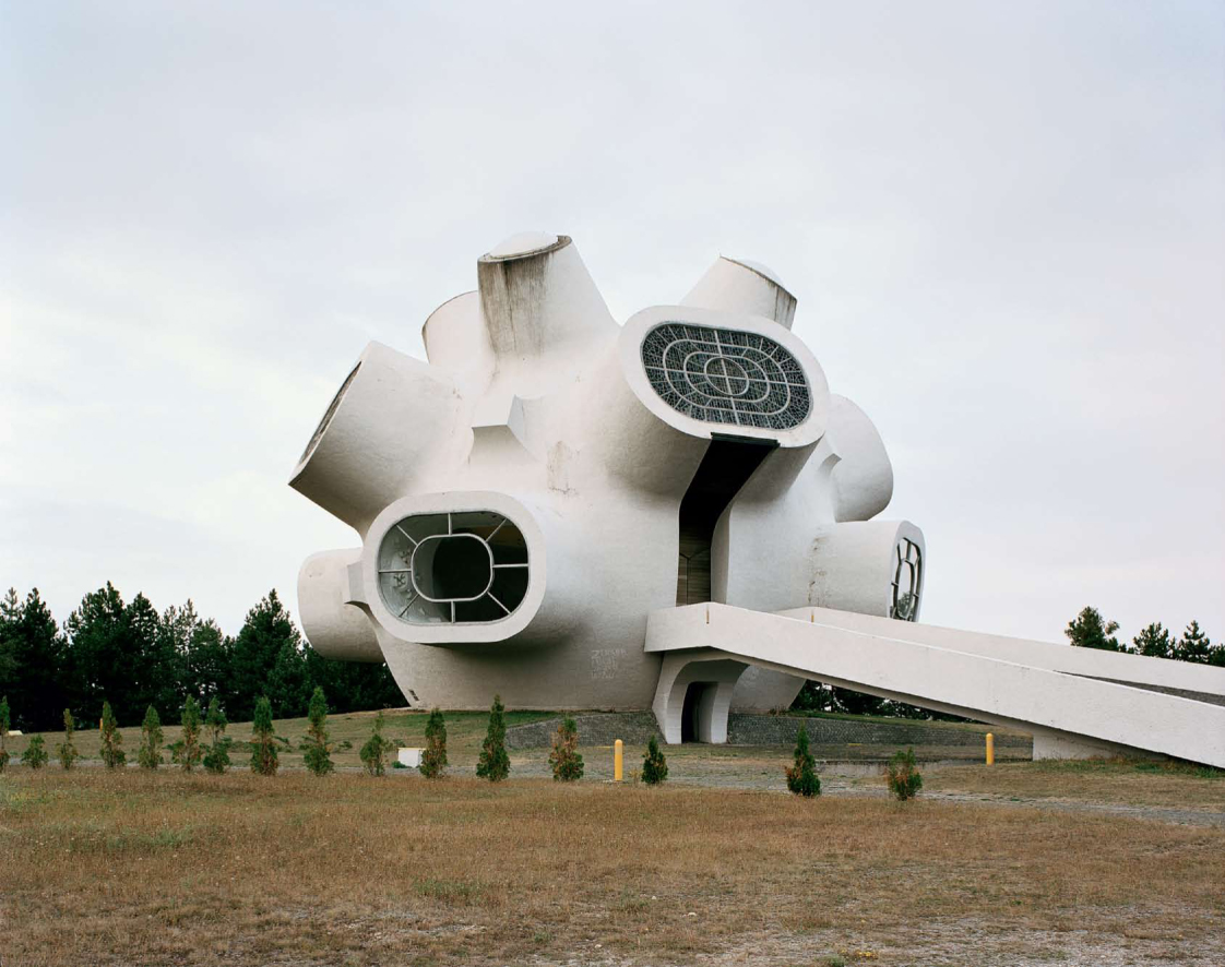
For my first post I wanted to share these striking retro-future-ish memorial sculptures shot by Jan Kempenaers in the former Yugoslavia region. Very reminiscent of the Expo ’67 stuff.
These structures were commissioned by former Yugoslavian president Josip Broz Tito in the 1960s and 70s to commemorate sites where WWII battles took place (like Tjentište, Kozara and Kadinjača), or where concentration camps stood (like Jasenovac and Niš). They were designed by different sculptors (Dušan Džamonja, Vojin Bakić, Miodrag Živković, Jordan and Iskra Grabul, to name a few) and architects (Bogdan Bogdanović, Gradimir Medaković…), conveying powerful visual impact to show the confidence and strength of the Socialist Republic.
Swiss Airlines has a rich history that has been hidden in the archives for quite some time. On March 26th, 1931 when Swissair formed, I doubt anyone at the time really considered the history that they were going to be making with the company’s design. Balair and Ad Astra were the two companies that merged to form Swissair. Throughout the years they’ve changed logos many times but there was one that was most memorable (above). Quite possibly it was the best logo that the company has ever used.
Thanks to SR692 for collecting this information so that we’re able to walk through past logos used by Swissair. Some great, some not so great and a few that were very, very experimental. Hit the jump to see how the company logo changed throughout the years.
If you’re a fan of the 60’s style illustrations I’m fond of posting sometimes, you will love this book: Naïve: Modernism and Folklore in Contemporary Graphic Design. I picked it up the other day to assist me in an illustration project I’m working on now (more on that later). It’s been especially great for sourcing inspiration about color palettes. Could use a little more text though (there isn’t a word in there). There are a lot of familiar favorites inside (was nice to see Siggi Odds make an appearance), and also a ton of artists I had never seen before. Highly recommended if you’re on an illustration kick.
Naïve documents the extraordinary renaissance of Classic Modernism, from the 1940s to 1960s, in contemporary graphic design. This compilation introduces a new wave of young designers who are rediscovering the stylistic elements reminiscent of classic graphic design such as silkscreen printing, classical typography, hand lettering, woodcutting and folk art and integrating them into their work. [Link]