The Science Behind Fonts
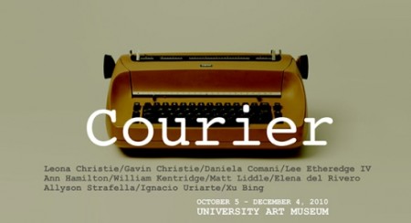
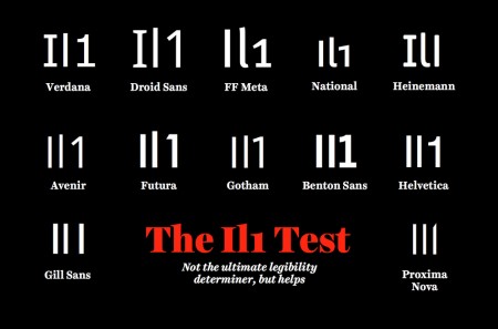
A nice read on how the various facets of typography can influence us.
The science behind fonts (and how they make you feel) on TNW


A nice read on how the various facets of typography can influence us.
The science behind fonts (and how they make you feel) on TNW
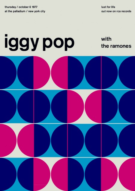
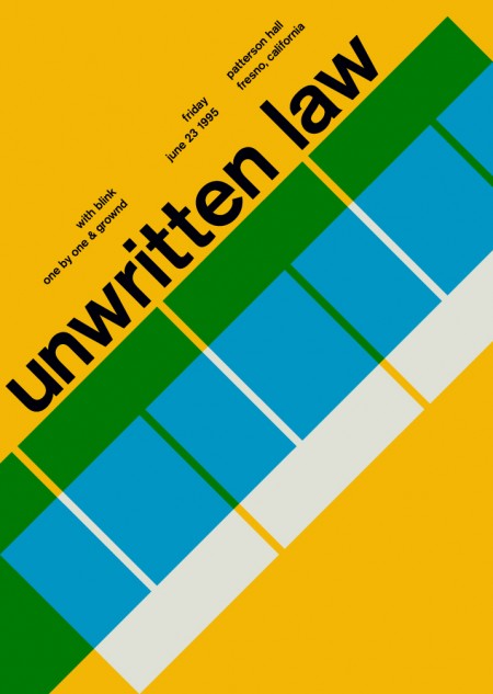
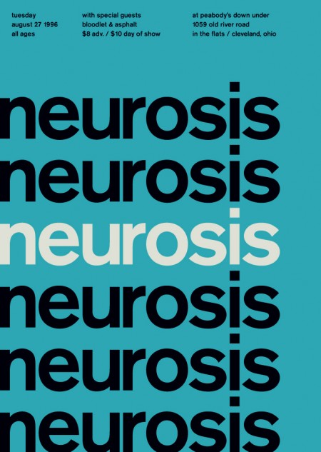
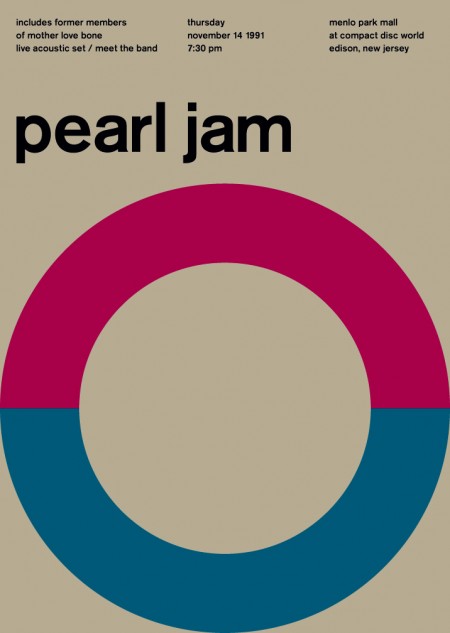
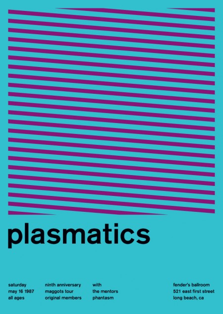
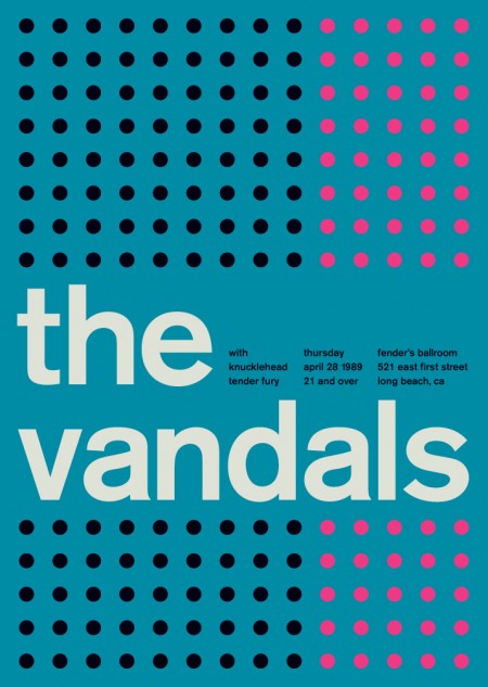
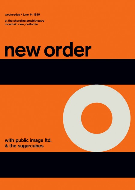
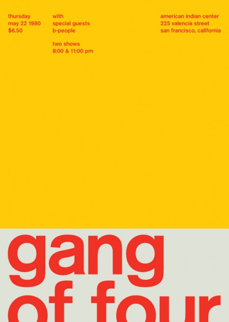
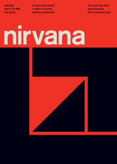
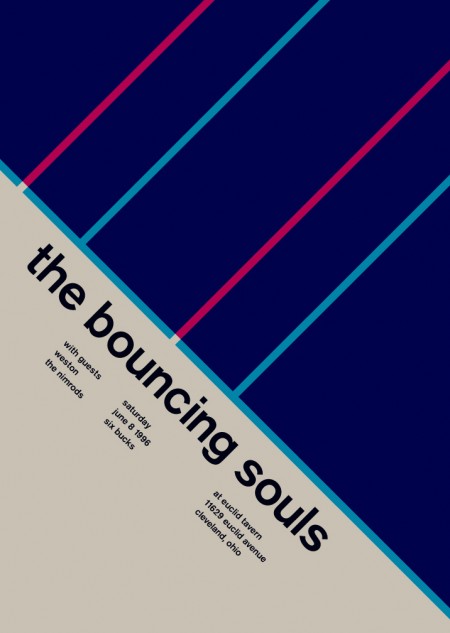
Mike Joyce has created an excellent — and rather extensive — collection of re-imagined vintage punk / indie rock posters in the International Typographic Style. Beautiful stuff, you can even score some prints from the Swissted Shop.
Albin Holmqvist, Gustav Johansson and Niklas Johansson are really killing it with these new EF Live the Language videos for EF International Language Centers. If you saw the first few, you’ll notice that they’ve really gone above and beyond with this new set. The new locations include Sydney, Australia; Vancouver, Canada; and Los Angeles, California.
Stay tuned for more work from these guys!
Directed by Gustav Johansson
D.O.P: Niklas Johansson
Typography: Albin Holmqvist
Music: Magnus Lidehäll
VFX: Goodmotion

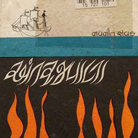
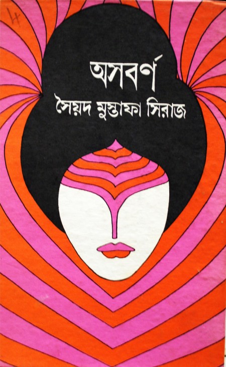
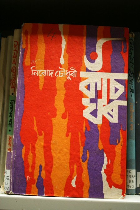
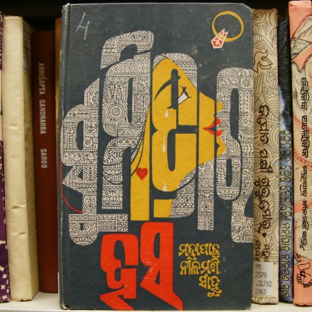
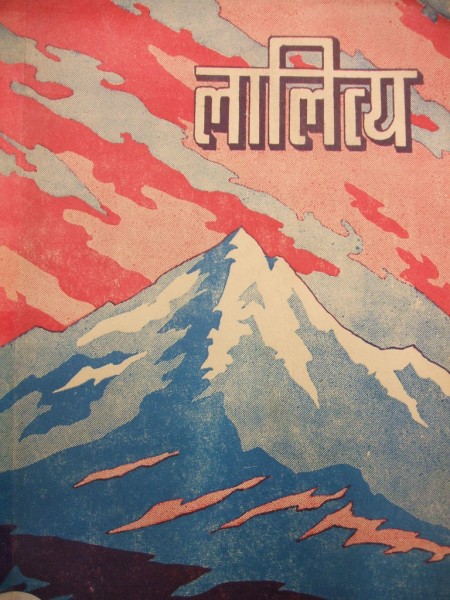
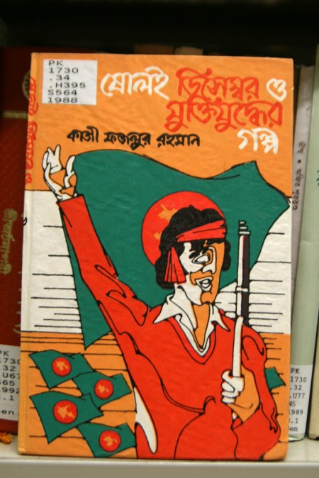
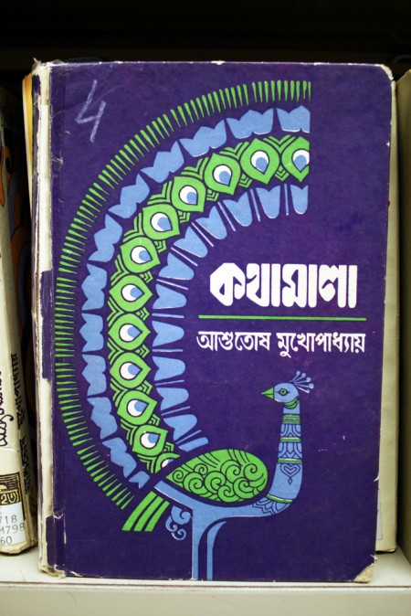
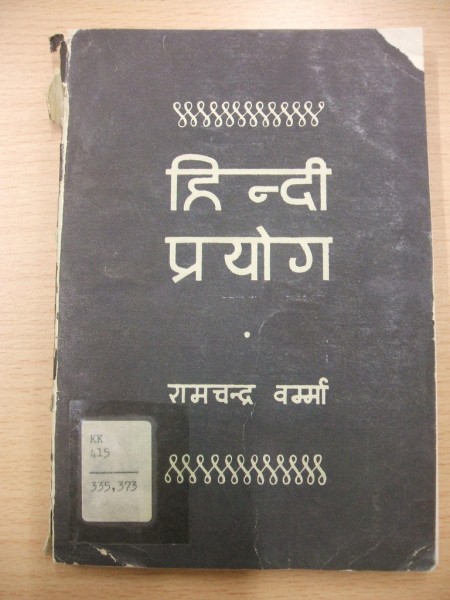
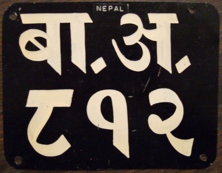
Flickr Pools can be a great resource for delving deeper into a visual theme or style and the Indic & Indian Scripts Pool is no exception. At least here in the US, the Latin Alphabet is pretty the only game in town when it comes to design so it’s easy to forget that their are whole other character sets out there. And while I’ve never encountered a project that called for any of these, it’s definitely inspiring to see such fluid characters and layouts.
From the Pool description:
“Indic scripts are Brahmi-derived scripts, This includes scripts used outside India, like Tibetan, Sinhala, Thai, Khmer, Burmese. Is this group for Indic scripts, or is it just for scripts used in India? If it’s the latter, then Arabic would count but Sinhala wouldn’t.”

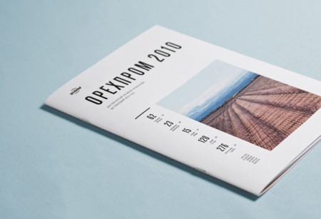
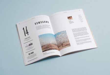
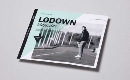
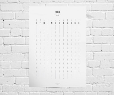
Qus Qus is the design studio of Dima Kuzmichev. This work is super clean — I feel like if I ran a corporation of any kind, I would have Dima do my annual report. Especially if we were based in Iceland and wanted to make our wind power turbines seem sexy. There is a cold perfectionism at work here. Great grid work, some beautiful type, pretty much everything you need. I was also really impressed with the logowork. The one for Artisanale was my favorite (and the name sounds awesome to boot).
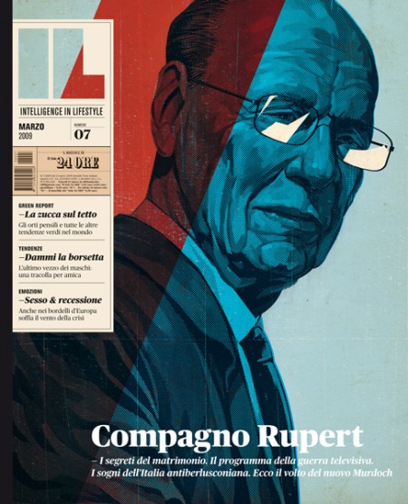
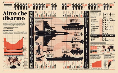
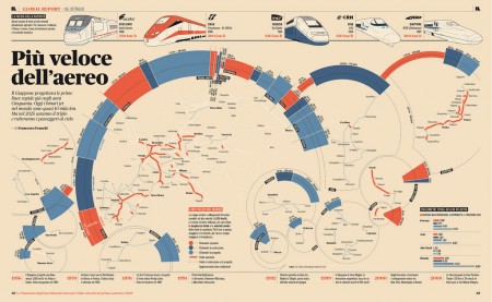
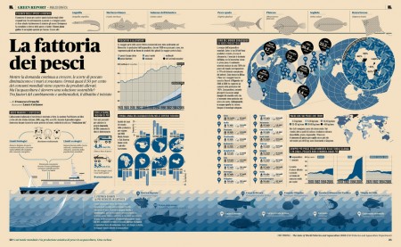
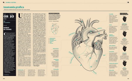
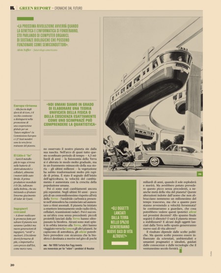
Intelligence in Lifestyle magazine is the new holy grail of infographic greatness. It is a high-end Italian magazine aimed at men. The magazine is equipped with a beautiful design by the art director Francesco Franchi and the creative director Luca Pitoni.
For some of us, getting ahold of the magazine could be difficult. However, several several of the layouts from the interiors spreads and covers are archived on Flickr. Check out the larger sizes, they may compliment your desktop nicely. If in case you’re wondering, the magazine utilizes Publico, a serif face that fits perfectly into the design is much less ubiquitous than say Helvetica or Archer.
On another note prior to being introduced to this magazine via Colorcubic, I was starting to become overwhelmed by the amount of infographics being pumped into the designosphere. Infographics about infographics were being designed for crying out loud. It just seems like it has become trendy very quickly. It’s not to say its a bad thing, but it sure makes me appreciate great design like in this magazine or Nicholas Felton’s works more than ever before.
I’m curious to hear what your thoughts are on this topic.
Do you feel there is an influx of infographics and is it a good or bad thing?
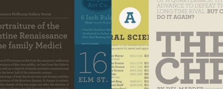
One of the very first articles I ever wrote for this blog lamented the careless proliferation of Archer, the slab serif from H&FJ. At the time, I was specifically reacting to the unfortunate redesign of the San Francisco Chronicle. That was in February of last year. Since then, the typeface has spread itself ever further, and continues to pop up just about everywhere.
Lauren Adams wrote a article about this very topic over on the AIGA blog. She states, “Archer’s instant stardom raises questions about its appropriateness. Can a font with such a defined character properly suit so many purposes?” She goes on to point out numerous recent examples of Archer’s continued domination of the ‘friendly’ typeface sphere. I was excited to see her article, as this issue continues to bug me the more I spot those little ball terminals. (Be sure to check out the blog she mentions, Archer Alert, for recent examples of Archer in the wild.)
At the end of my article back then, I asked if “Archer was the next Papyrus” — a polarizing contention to be sure — but maybe now my question doesn’t seem so far fetched. Before you get all crazy on me, let me say again that I am a *fan* of Archer. It looks good. I have nothing against the way it is drawn and actually think that it is quite amazing (like all of H&FJ’s work). Though as Lauren states, “an elegant typeface doesn’t simply translate to universal functionality.” I would add that such a distinctive typeface shouldn’t translate to ubiquity.
Like Papyrus, Archer shares a unique personality and the aforementioned “defined character”. Just as Papyrus became the go-to font for “exotic” or “earthy”, Archer has become the easy choice for “friendly” and “approachable”, which makes its misuse all the more prevalent. The more Archer is used in scenarios where it’s vaguely appropriate, the less effective it becomes in situations where it actually makes sense. As Christopher Simmons points out in the comments over there, “In unskilled hands even a Stradivarious will only make noise”. With Archer being clumsily wielded as frequently as it is, it’s this “noise” that has rendered unbiased viewings of the typeface impossible.
So I’ll ask again and this time duck for cover, is Archer the next Papyrus? Is it just a matter of time before the next summer blockbuster uses Archer for the movie poster?
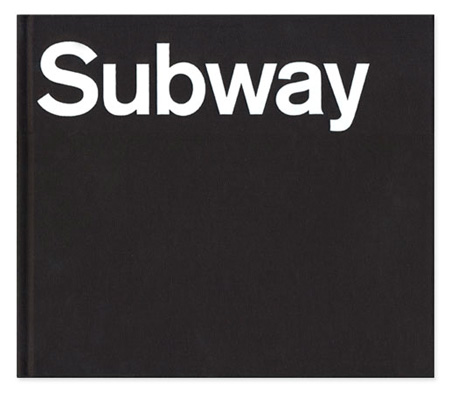
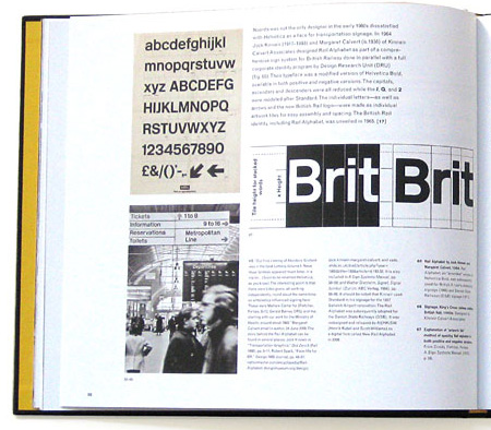
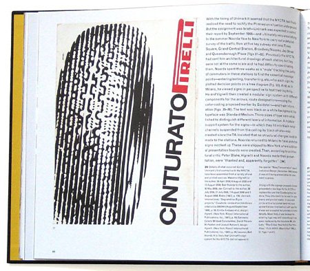
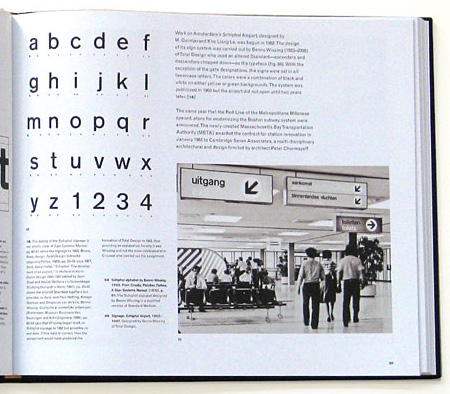
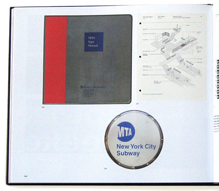
Helvetica and the New York City Subway System by Paul Shaw — which examines the Helvetica’s role and history in the New York City Subway system — looks like a must have for any design collector. It’s currently sold out of it’s initial limited edition but Shaw’s site says they are looking for a publisher. Let’s hope that works out.
Also not to be missed is David Heasty’s One Color Subway Map featuring, of all things, Helvetica. You may still be able to score a print, details are here.