I hope some of you are sketch comedy fans here, i’m sure if Scott and I could add one more element to the site we would post youtube videos of Tim and Eric or other Adult Swim shows. For me comedy started with the Canadian show Kids In The Hall that was produced by SNL’s Lorne Michaels. The theme song to this show was by a group called “Shadowy Men On A Shadowy Planet” I’m sure many of us here that grew up close to Canada can hum the bassline to this theme song flawlessly.
I usually check out every release on Plug Research since they put out quality artists like John Tejada, Dntel, etc. I found this classic jam really catchy, it would of probably been huge in the 70’s but it reminds me alil too much of the song “We Will Rock You” but if you can get over that then this track has some parts to offer.
I look back and I don’t think I posted one Animal Collective song here and that blows my mind alil. So without posting one of their hit singles here is “Visiting Friends” a 12 min entrancing psych-folk song.
Small Sins is a very easy listen, super simple for a indie rock song in my opinion and I can’t help myself comparing the songs to Yo La Tengo or even Brendan Canning of Broken Social Scene.
Shadowy Men On A Shadowy Planet – Having an Average Weekend (Kids in the Hall)
I hope you don’t mind if I go on a tangent here? I know the baseball season is over but enough is enough on these redesigns that look like the Mountain Dew logo. Who are the graphic designers that are doing these? The new logo looks like its going 80 miles per hour. The old classic Toronto logo had such strong pieces holding it together especially the color scheme, separated shapes and the leaf. The new one strips away the only Canadian element about it the maple leaf and even the color red, what on earth was the designer thinking?
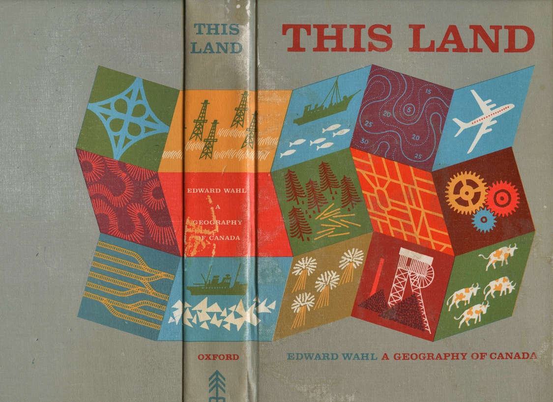
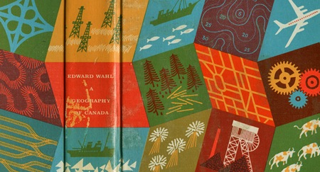
"This Land – A Geography of Canada by Edward Wahl c1961 Hans Kleefeld cover designerGreat book discovery by Rosemary Travale. Hans also designed the original logo for the Toronto Zoo."
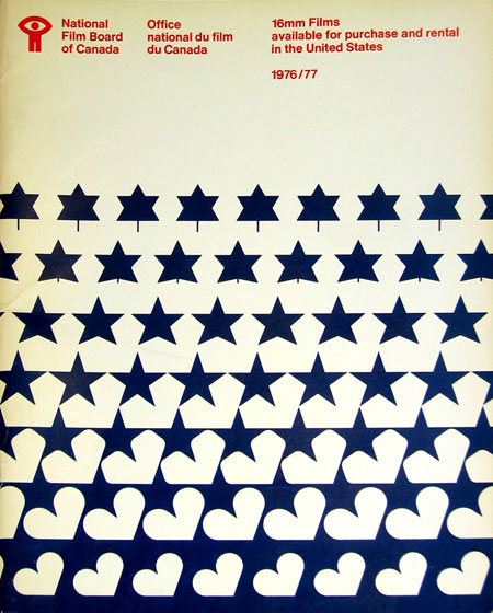
“I’m in the process of moving and I came across an old National Film Board of Canada catalogue that was made available for American residents wishing to order 16mm films from the NFB in 1976/77.”
These evolving, MC Escher style designs are great. Especially love the motion metaphor tie in with the NFB. The bowed text at the top is an artifact of correcting for the angle at which the photo of this piece was taken.
I never realized it until I started posting all this stuff, but Canada seems to have a very strong legacy of graphic design, something for which I am not quite sure they are getting their due credit. I didn’t study design in school, is Canadian design a part of the curriculum of most design programs? If not, it should be. Just scroll through the recent entries here and you’ll see lot’s of great examples. I have a lot more coming too.
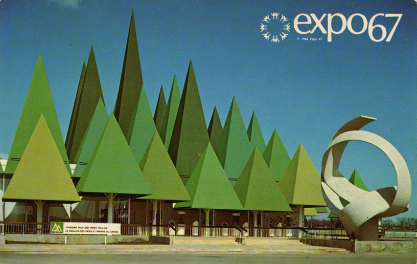
This incredible image came my way via Jakub … Not sure if they have the world expo anymore, but I doubt it would look this good. Click through for more pics – Image above now links to larger version via George. Continue reading →


 Very nice book cover via