")
")
")
")
")
")
")
")
")
")
")
")
")
")
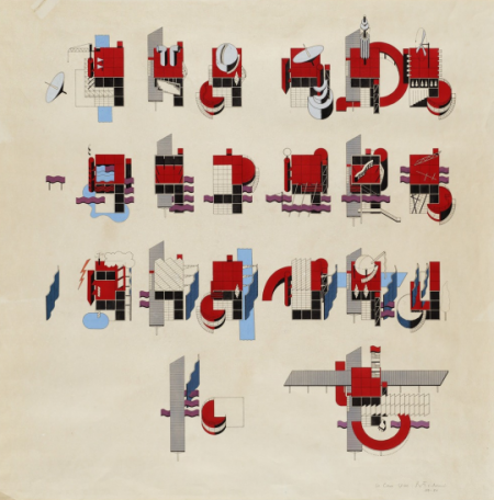
Just came across this great Flickr set of The Canadian Architect covers from 1964-67, designed by Laszlo Buday.
Also, sorry for the abscence of this weeks’s Weekend Inspiration post. I’ve been helping out Tycho with the first leg of this summer tour dates, so haven’t had much time to post, but next Friday it’s back to business as usual.
Posted by Jonathan (B3PO)

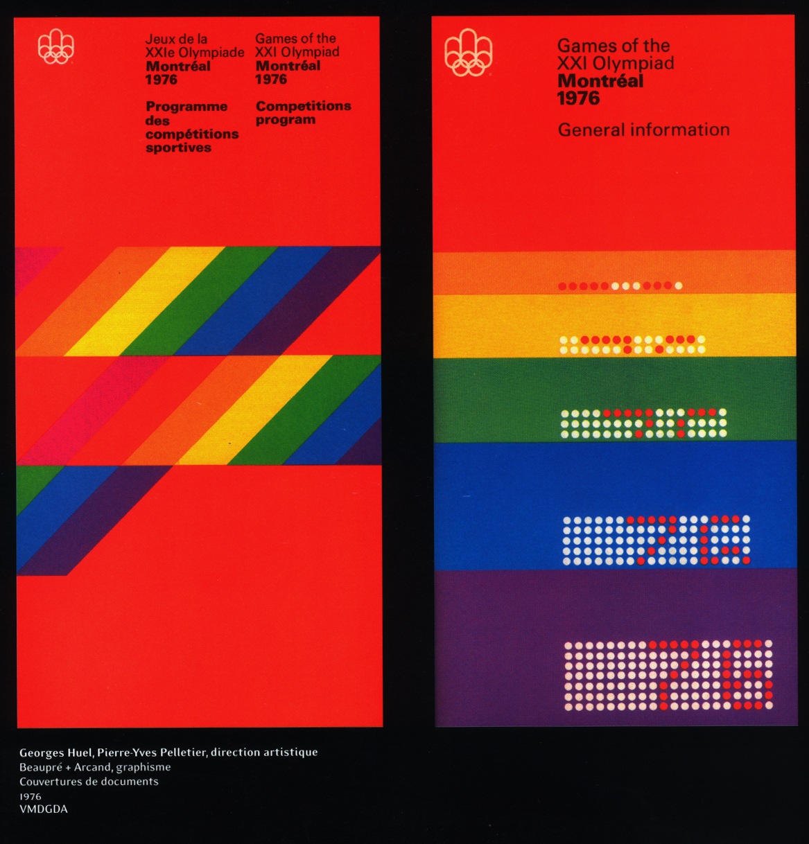
When will it end? Apparently never. I think it’s time I just give in and nominate the Canadians as completely owning the mid-late 70’s. The more I look at this sort of design, the more I realize how much it has influenced my own style. It’s funny because I don’t remember really being aware of design when I was younger and I certainly wasn’t fortunate enough to be alive (much less conscious) during the ’76 games. I guess these sorts of things just kind of seep in to your consciousness over the years through random, passing exposure without you completely realizing or understanding it’s impact.
At any rate, I envision my dream space as a large, concrete floored, open room with 3 story ceilings, all white, with these printed massive banner size hanging all along one side. I think the other side would be wood paneled in a light walnut with a flush installed Bang & Olufsen circa 1976 Beo system right in the center. Sprinkle in a healthy dose of vintage Hermann Miller, some Dieter Rams-designed Braun appliances here and there and things would be starting to look right. Maybe a wax figurine of Jakub in his ATMSPHR promo photo get-up and Jarvis Cocker glasses would be encased in a Perspex cylinder somewhere, perhaps animatronics would be involved, budget permitting.
by Bernard Tschumi
This could have been a Mood Hut 12″, so nice to see the 1080p label sinking in their claws into music like this. With every listen it gets friendlier and friendlier, I hope it becomes more popular.
Who better to kick off the inaugural release of SOBO [Sounds Of Beaubien Ouest] than Patrick Holland, best known as Project Pablo. Affiliated with the Canadian Riviera’s 1080p troupe, as well as Seb Wildblood’s Church and Lone’s Magicwire – Holland now adds Beaubien Dream as the fourth instalment to his 12″ series. The Beaubien connection comes from Montreal’s Rue Beaubien, of which Holland is a resident. SOBO is headed up by fellow longstanding citizens of the Beaubien Ouest hood, Arbutus Records and their extended family – of which Holland is an instrumental part.
An initial teaser of the EP’s opening “Closer” was aired publicly during Holland’s BR London set back in October, as well as his NTS appearance with Lone and Gabriola earlier this year. Now, after a patient seven-month wait, we can finally wrap our mitts around it in its entirety. Alongside its two subsequent components, the track acts as a homage to Holland’s home. With its distinctive Dx7 melodies, jingly percussion provided by bells (of the cow variety amongst others) and an insatiable groove growing lazily throughout – “Closer” is instantaneous happiness.
Catch Beaubien Dream in full on 3rd June via SOBO.
via Boiler Room


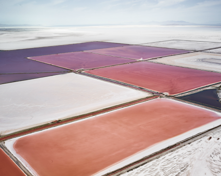

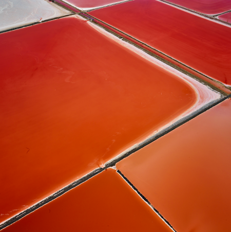


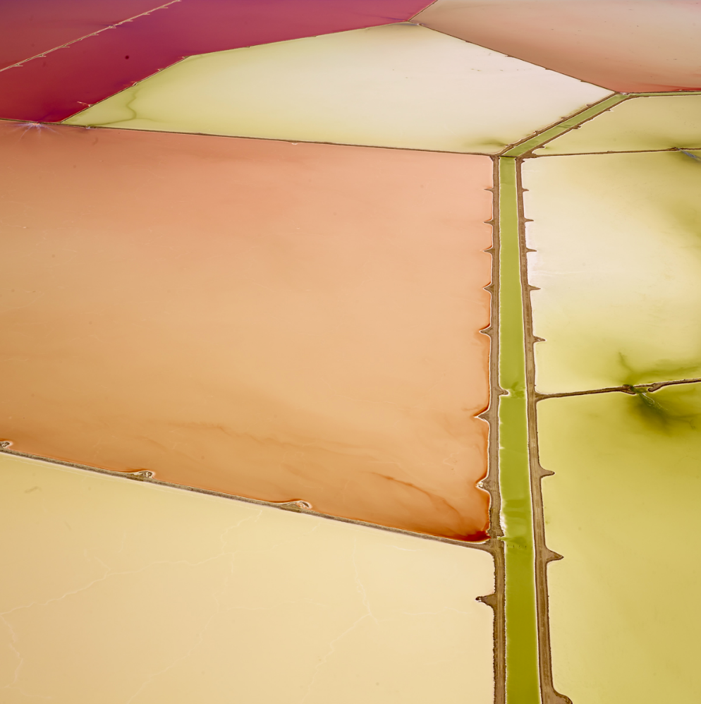
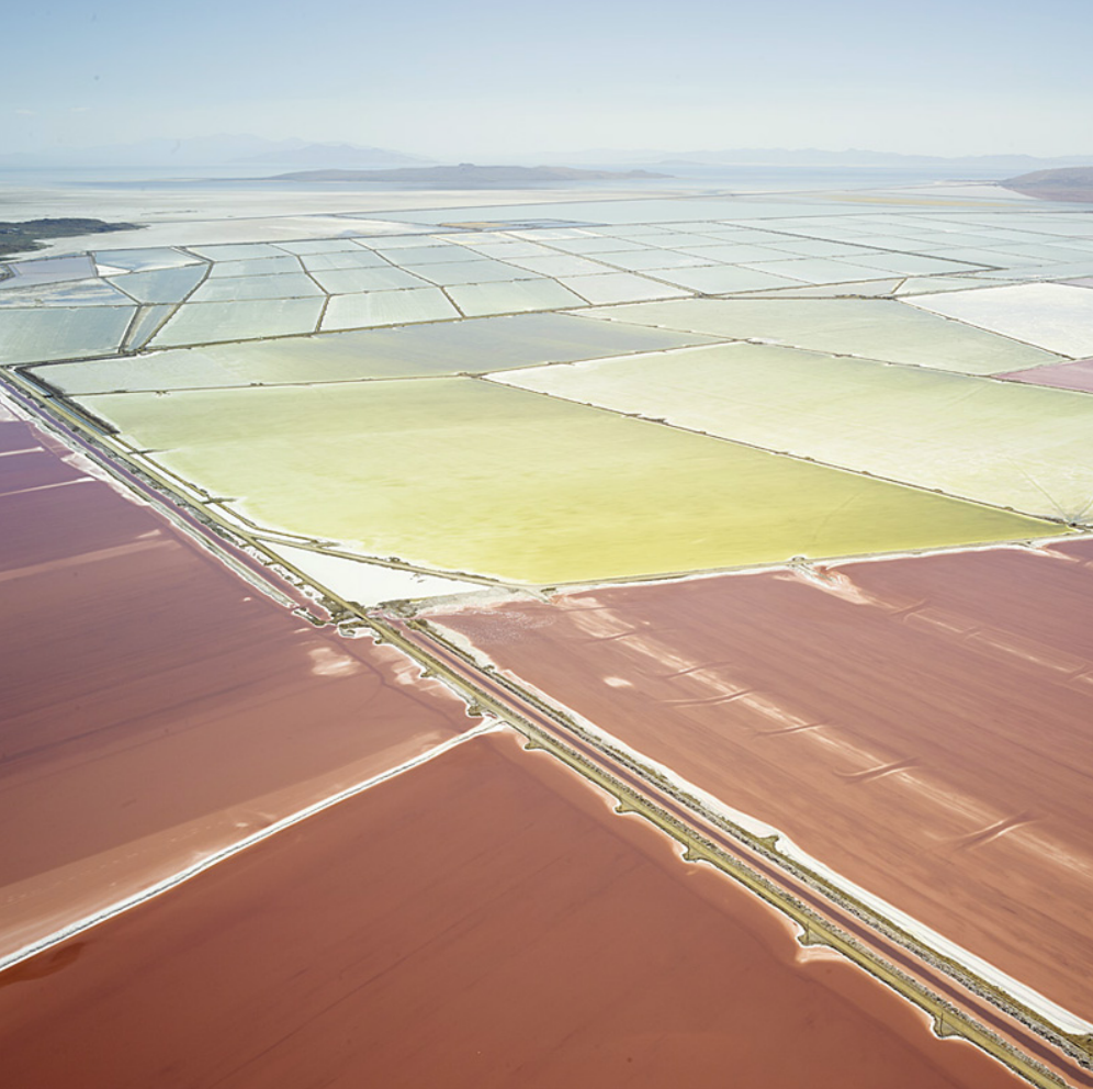
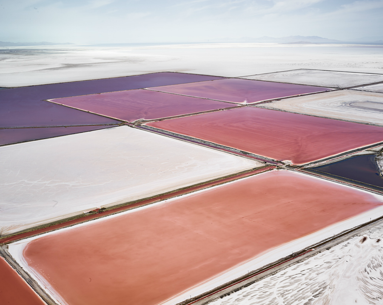
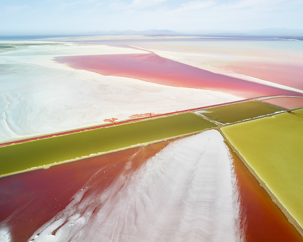
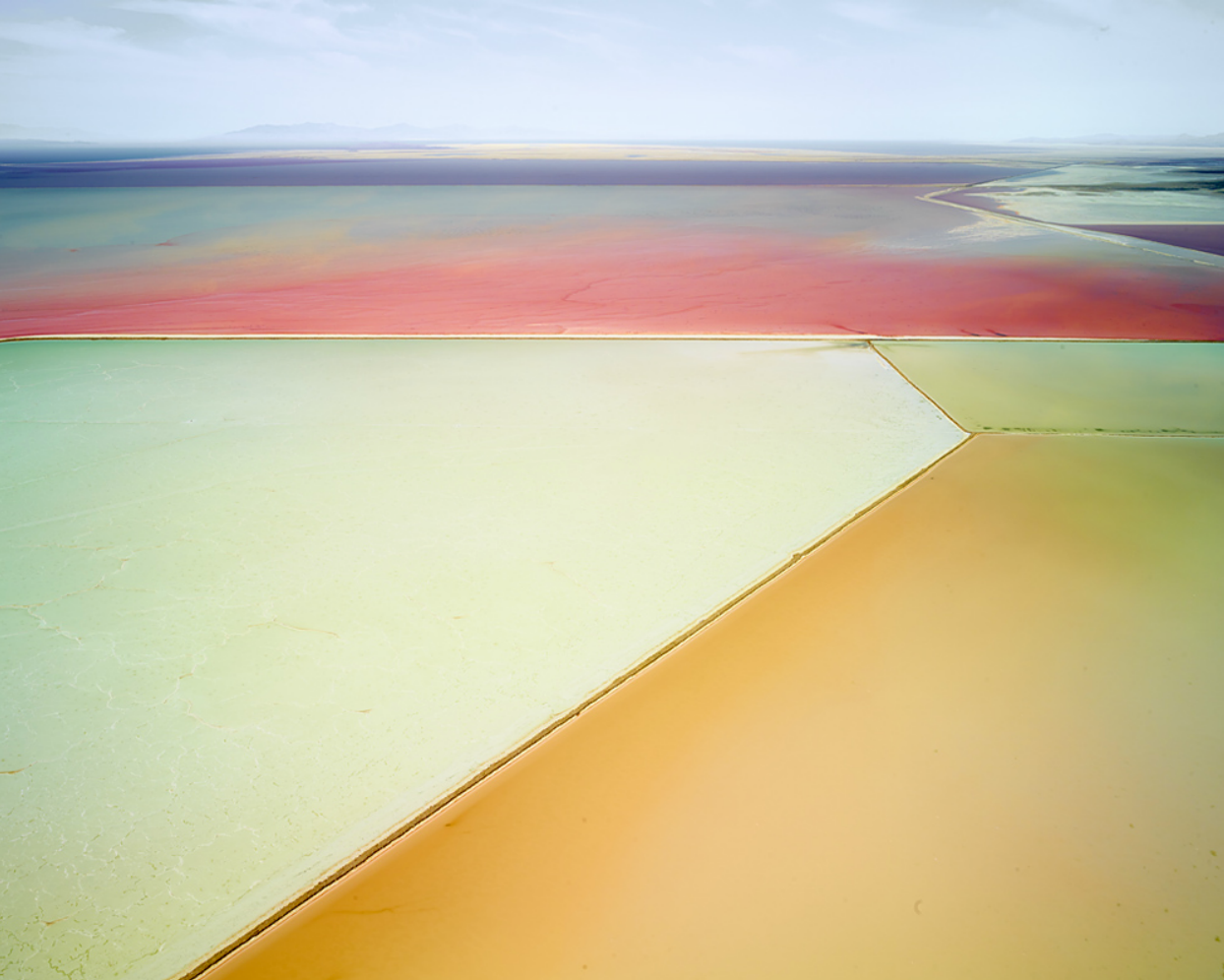
Salt is an ongoing new project from David Burdeny, a Canadian photographer hailing from Winnipeg, Manitoba. Reminds me a lot of Edward Burtynsky’s Australian Mine project (link). Aerial photography exploring human environmental impacts is disturbing, yet never ceases to awe and amaze me.
More of Burdney’s work can be seen on his website, as well as in person at various gallies around the world (see ‘representatives’ page).
Posted by: Owen

This is a pretty passionate subject for me, probably one that I could argue over for the rest of my life so I decided to finally make a series of posts. Lets start with the NHL aka the National Hockey League. Who has the best and worst logo and why is the question, if you want to join the argument, here is a list of logos.
I will be doing the best NHL logos in a different post and we will go through a few other sports as well.
TOP 5 WORST NHL LOGOS

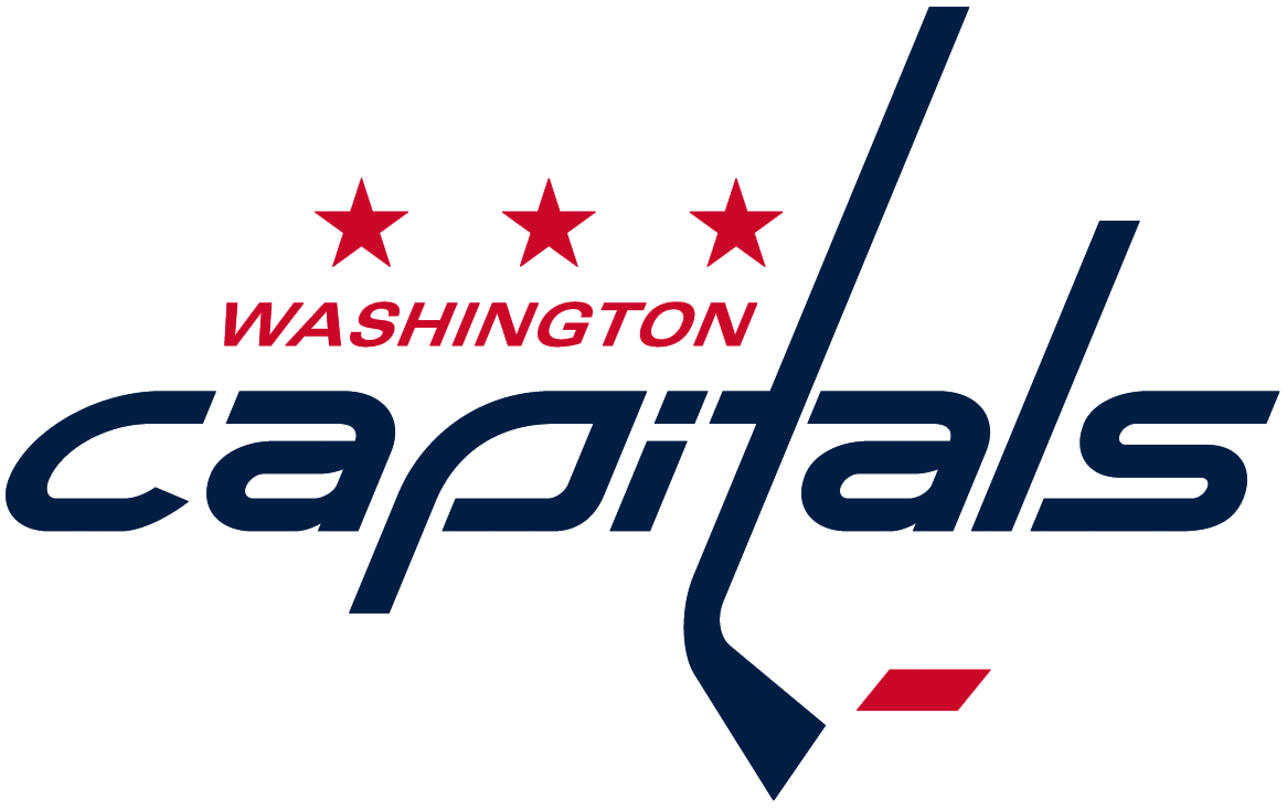
#5 Washington Capitals
Let me point out a few things before I start explaining the problems I have with it. First off, not a boring font, not a great font but hey i’m actually alright with the ITA situation with the stick and connections its making. Now step away from it and stare, what is it? I want to sell merchandise for my hockey team and make something special for the city that will support it. What is this though? a love for a font and i’m adding a hockey stick because hey its hockey?? It honestly looks like a rushed college graphic designers homework assignment that was turned in without a passion or connection with the sport. An agency maybe doesn’t even care for the sport? could that be what happened here? I’m not going to question the 3 stars or the color scheme but seriously if I was from DC i’d just sort of feel bummed out by this.

#4 Winnipeg Jets
I’ll start off with 2 nice things to say, first off nice work on fitting in the Canadian maple leaf and second i’m happier with this than their old logo which isn’t saying something that nice.
Okay now, i’m into an icon that represents an organization but that has to be a pretty low effort in the jet icon world. Also, why so literal with the leaf and the jet? I also have a problem with its something hard to get excited over, as a fan i’m already excited about the team why not add some cherries on the top for the people of Winnipeg? its like a vague statement without any effort for surprise. I mean this city JUST got their hockey team back and they revealed that…the city was in tears announcing they got their team back and a designer turned in a C- / D+ effort, you give a graduate design class this project and 2 to 3 students in each school across the continent would turn in hands down better executions for a team in 2015 that has the word jet in its name.
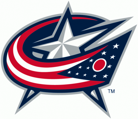
#3 Columbus Blue Jackets
Ooooooooooh boy, now we get into the portion of the list where the pros column gets a little thin. We have a star with a flag whizzing across the front like a Miss America ID ribbon strap. You want generic? here is something pretty generic. You already made the average sports fan happy by using colors that most people would wear and I guess the patriotic angle works BUT who made this rule on why things need to look 3D and more importantly angled and tilted?? I completely understand its better than their old logo which is a ribbon cutting disaster but if you’re building a city from scratch to fall in love with hockey then this 2nd step forward on the logo front is full of hesitation and conservative ideas, someone with an imagination needs to step in and start working with them, they aren’t a lost cause.
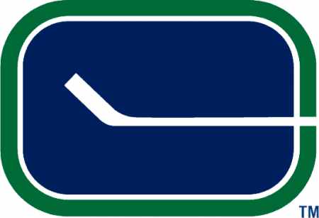
#2 Vancouver Canucks
My beloved Canucks, my first sports team that I completely adored. I never was a fan when this logo came around in the past and in the present because I was pretty much a fan only in the 90s during the Pavel Bure era. Some people might argue with me that I just like a simple logo, this…I don’t know… who let this out in the public? I’m sure more than one person is in the decision making of a logo out in public, I don’t think there was much thinking going on. Again with the fascination with the hockey stick, we understand one is used to play them sport but putting over a hockey rink and saying thats your cities logo…no, no you can’t turn that in. Its almost frightening that adults were in charge and approved this.
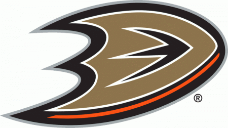
#1 Anaheim Ducks
Well well well, look how far you’ve read into this rant, i’m surprised you stuck around.
Look at this logo… maybe blow it up full screen i’ll wait… and gaze at the glory of it and imagine the confused faces across the country when they saw this the first time.
Its a D for Duck THAT. IS. MAYBE? A BACKWARDS DUCK FOOT?? or a chubby boomerang that would never work because of the surface area and die-cuts. Maybe a shield!?..no, no its not, its just a copper D that was abused in illustrator by a Mountain Dew loving bro. I can’t wrap my head around it and I don’t expect anyone else too either especially anyone in California that showed up to the unveiling of this logo. You go from team colors of teal and purple with a duck mask into this batman weapon made of Taco Bell ingredients.
Jam City pushes away from the Night Slugs club usuals and embarks on a more experimental emotion, I definitely have it on repeat.
Expecting a slow disco Woolfy single and stumbled on this happy accident from Canadian producer Wolfey. He has that deep melodic house groove that captures that live take from a session, raw and smooth heat.
TEIFII & IZELIKA collab for a compilation by SOMICO, SOMICO is an electronic music collective for artists age 18 and under. Laying the foundations for young artists futures. This is the stuff that makes me feel like kids under 18 should be allowed to sample music just to sort give them a deadline to get comfortable with production then give them a reason to switch up out of sampling to then recording.
Earlier this year, Rafael Anton Irisarri (aka The Sight Below) and his wife had all of their possessions stolen while moving across the country. This theft included Rafael’s gear and entire library of music and data.
Here’s a chance to help Rafael help rebuild and as a bonus, receive awesome music and art in the process.
Donate here.
Out of this awful situation comes lovely music already, please click the link above while you enjoy this Biosphere remix.
")
")
")
")
")
")
")
")
")
")
")
")
")
")