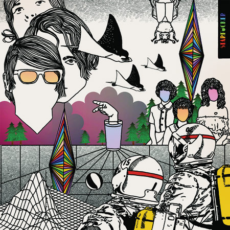
You may remember Fujiya & Miyagi’s phenomenal animated dice video for “Ankle Injuries” from last year (view it below). Well they’re back with more bodily harm in the form of the Wade Shotter directed “Sore Thumb” video. Can anyone remember what game they based this on? They had it in the arcade by my house, you looked through a periscope type thing and fought wireframe tanks. Anyways, very cool video, although not feeling this song quite as much as Ankle Injuries. I heard these guys spent almost the entire marketing budget for the Ankle Injuries album making the video (below) in the hopes that it would go viral and blow everything up. I wonder how that worked out.
The holidays are here again and so is the ISO50 Winter Sale. Everything at The ISO50 Shop is 20% off for a limited time. This includes the new “77” shirts and thermal and all of the prints are back in stock and ready to go. The snowboard giveaway is still on too so if you were waiting on scoring some new gear, now is the time.. Head over to the ISO50 Shop!
Portland has a lush music scene, I might even say that it might be more exciting than it is here in Brooklyn. During the CMJ festival Portland’s Starf*cker played a couple times and I never got to catch them live but picked up their album and definitely found a few songs on there that I really like. With the name Starf*cker I thought it was gonna some wild Dan Deacon kind of music but it wasn’t at all which isn’t a bad thing but the name just threw me off.
Eliot Lipp continues to blow me away, he has started his own label called Old Tacoma Records and has been touring non stop like a proper busy musician in 2008. His new single is what i’m guessing how Hip Hop will sound in 2030.
Le Baron was given to me by none other than Tom Croose, this whistling song puts Peter Bjorn and John to shame.
I know I post some Techno/House on this blog and its probably not very fitting to listen to the songs just on your computer especially if you don’t listen to much of it but DJ Koze this year was elite. Listen to those shakers! just brilliant production and sequencing, if you ever hear this on a big system you’ll fall in love.
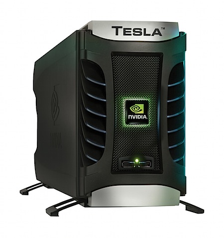
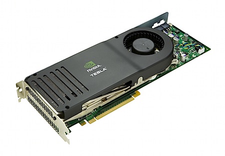
With the release of Adobe CS4, many of us are seeing the power of software leveraging the GPU for the first time. I have personally seen a rather significant increase in redraw performance when zooming, seemingly a direct result of GPU acceleration in Photoshop. But this pales in comparison to what’s on the horizon for desktop computing. Pictured above is the newly announced Tesla desktop “supercomputer” from graphics chip manufacturer Nvidia. Around $9,000 will buy a configuration delivering 4 teraflops of performance and sporting nearly 1,000 processor cores (4 GPUs @ 240 cores ea.). Yes, $9,000 is way more than most of us ever plan on spending for a computer, but this number is significantly lower than even the lowest entry point for previous so-called “supercomputers”. The point is that this signals a sea change in the relative performance of desktop computing. In the near future we could be seeing performance leaps by factors of hundreds or even thousands as opposed to the incremental bumps we’re getting now. As with all technology, the prices will come down and the technology will become mainstream (apparently Dell already has plans to begin manufacturing a consumer version). This is really exciting news for us in the creative sector, while most people would never need this kind of performance at any price, this could fundamentally change the way we create and edit graphics, audio, and video. This is also a potential boon for society in general as low-cost machines like these could enable scientists and researchers to run computer simulations and experiments that once took a year in a single day leading to new breakthroughs in science and medicine.
More info on the Tesla can be found here, and if you’re wallet is getting too heavy you can actually buy one here.
On a side note, who the hell designs this hardware? Why does it all look like the old Xbox? Why does it all look like some bad late-nineties rendition of what alien hardware might look like? Why is there always so much green involved? Hopefully Apple designs one soon.
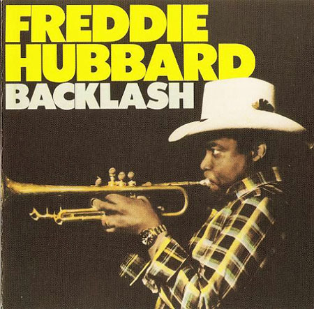
I would never deny a song that has this intro from this Freddie Hubbard song, so if anyone starts a song out like this then I am all yours until the end.
D. Lissvik is one half of Studio which have produced one of my favorite albums of 2008 so this must be good. I’ll post that list closer to January for everyone.
One of the sleeper records this year is the Twine album, if you haven’t seen the cover then you need to it’s right here and that’s also where you can find this song Endormie for free to download.
Grouper is band that i’m still checking out but this song stuck out for me among the rest. I read about them earlier today in an interview with Telefon Tel Aviv, so it must be good hah.
I wasn’t sure if this new shirt and thermal were going to get printed before the new year, but we were able to get them out this week. The new Black on Black 50/50 American Apparel Tee (pictured above) and cotton AA Thermal are now available at The ISO50 Shop. These are going to drop in the ad on Monday so get them while they’re still around (as always, I’m posting them here on the blog a little early).
On a somewhat related note, I’ve always found it difficult to photograph black objects and this shirt was no different. The contrast between the paint and the shirt is a lot more subtle in real life (and the paint isn’t grey, it’s black), some more accurate pictures are here (taken by the guys at Merchline who have been shooting all the recent model shots for the ISO50 storefront). Apparently I need a gray card because I’m using the same lights as them: The Calumet Quattro (more on that later) and a tungsten Smith/Victor photo flood. The picture above was overexposed for effect, but even when I’m trying to be as color accurate as possible I’m still running into trouble. I was definitely happier with how these shots came out and it’s getting frustrating because I was using the same lighting setup, same exposure settings, and same room to shoot them. Does anybody out there know much about this phenomenon or how to correct it? Any advice would really be appreciated in the comments.
In other news, Alex brought by his Wacom Intuos 6×8 today. I really enjoyed working with it, I’ll be posting on that more tomorrow. Thanks again to everyone who took the time to respond to the Wacom: Which Size? post. It really helped a lot.
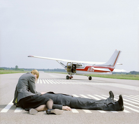
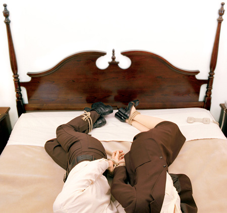
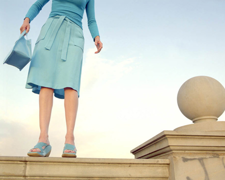
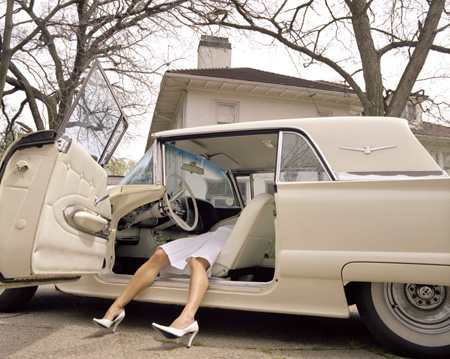
I’ve always been a fan of Nicola Kuperus photography so I had to share a few of my favorites. If you recognize her name it’s probably because of her band Adult.
After all the talklately about logo redesign failures I thought I’d post something about a potential success. I happened across Aaron Draplin’s post on the new Denver Nuggets logo and thought it came out pretty good. At first glance the pick axes seem a bit over the top (we get it, people mined for gold in ye olde times Colorado), but it grew on me. As Draplin pointed out in his post, the mountains are the best part of the whole deal. Below the new logo are the two preceding versions. The most recent was pretty much gross in every possible way. The old school one is of course awesome in that nostalgic way, very cool for throwback jerseys and all that (or if you really, really like Tetris), but it just wouldn’t cut it in today’s game. The typo is heavy-handed and the logo is too busy and detailed to be useful in small formats.
This new version is clean and strong; even if you don’t really like it you’d have to give them points for steering clear of, as Jakub puts it, the “Mountain Dew logo style”. I’d have to imagine fans are going to be pretty happy with the new look, can you imagine wearing that last one on a shirt? It looks like the logo for a pizza place up in the hills somewhere, I half expect it to say “Uncle Mike’s Pizza” or whatever. So what do you think, did they nail it?
P.S. While the logo may be nice, I’m not sure how I feel about the typography for the new jerseys. Something about it reminds me of an off the strip South Lake casino.