Daydream on Better Propaganda

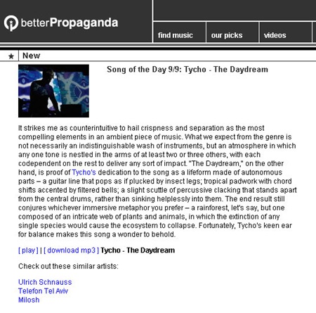
Music site Better Propaganda picked recent Tycho single The Daydream as song of the day today (9/9/08). They’ve posted a review and a free MP3 download. Check it out here

Music site Better Propaganda picked recent Tycho single The Daydream as song of the day today (9/9/08). They’ve posted a review and a free MP3 download. Check it out here

These last couple of days i’ve been going to shows and heading to a few more this week. The one i’m most excited about is Deastro, he has great energy to his music but keeps it together without getting too noisy and replaces it with catchy looping of synths. I saw Flying Lotus and Daedelus Sunday at Le Poisson Rouge
in Manhattan where all these shows are going on, both of them are unreal live, they take their album songs and strip them down and make the songs really come alive on stage. Tonight is Deerhunter, haven’t heard much of this band to he honest even though they’re everywhere, i just liked that the lead singer listens to Markus Guentner so it should be good. The last track is a Kooks cover of the ever popular MGMT, i think this acoustic cover is almost competing to be better than the original.


Since Fall is right around the corner, i’ve kept my eye open for an all around shoe that will last me a long time and that i can wear with anything. My friend Ryan Elliott sold me on Common Project shoes, i’ve seen them before but didn’t know much about them. They have no branding and are all leather and a very simple design, i especially love the stamped faded gold serial number on each shoe. For now, they’re a little over my price range but i’ll start saving my pennies.

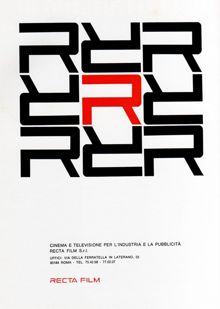
1969 Magazine Advertisement
Recta Film
"Cinema e televisione per l’industria e la pubblicitá"
Italy
Via Pink Ponk

An interesting CG clip from Discovery’s Miracle Earth depicting our destruction via giant asteroid set to Pink Floyd’s Great Gig In The Sky. The song is apt for many reasons, not the least of which being that the vocalist sounds like she is actually being burned alive and/or crushed by a giant asteroid. But I’m a sucker for that 70’s bass sound so I can’t hate. It’s actually a pretty sad video to watch, and the final sentence of the titles is rather ominous. Although 6 events in 4.55 billion years isn’t really much to worry about considering the cosmic blink of an eye humanity has occupied in the universal timeline. Also, I am pretty sure you don’t really notice/care when you’re instantly vaporized, you just turn to vapor, and so does your Macbook Pro.

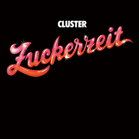
I might have to put this at album #2 right behind New Age of Earth. Unfortunately, I don’t have an original pressing, but the 180g re-press sounds great.
Cluster (then Kluster) was formed by Dieter Moebius, Hans-Joachim Roedelius, and Conrad Schnitzler in 1969. Schnitzler had recorded Tangerine Dream’s debut Electronic Meditation just two months before Kluster’s debut Klopfzeichen.
After Schnitzler’s departure three albums later, Moebius and Roedelius renamed the group Cluster and continued recording starting with Cluster (aka Cluster ’71), and following that Cluster II.
A year before Zuckerzeit, Moebius and Roedelius joined up with Michael Rother of NEU! and released two albums under the name Harmonia (which I will be posting very soon). After Rother left Harmonia, Moebius and Roedelius went back in the studio to record Zuckerzeit, and if you listen to Cluster’s previous releases, you can hear Rother’s influence practically bleeding through the tracks. Mmm!
Zuckerzeit has a very interesting structure. Each track was written solely by either Moebius or Roedelius and, except one track, cycles between the two. It gives a very interesting mixture of light and fluffy to a much more experimental noise-centric sound. I tend to like Roedelius’s tracks much more, but “Caramel” is the exception.
[audio:cluster-hollywood.mp3]
Etón’s Porsche-designed P’9120 clock radio is a must for any self respecting minimalist / design aficionado with a schedule to keep. I’m loving the knob / speaker combo, so efficient and a great interaction metaphor to boot. This thing could sit comfortably beside some the the jewels of Braun modernism and Porsche even kept it old school with the remote. My only gripe with the design is the sore thumb Etón logo that breaks up the clean lines of the face. It feels misplaced and cheapens the aesthetics; it also clashes badly with the wonderful typography of the Porsche Design logo. I guess that’s what Sharpies are for though. Now if DWR would just make a matching Herman Miller walnut pedestal I’d be set. Unfortunately, at $600 it’s prohibitively expensive; but then again, dedicated design geeks wouldn’t let half a grand stand between them and waking up to such a specimen of functional art.
Via Dvice

While digging up facts for the recent Saul Bass branding post, I came across an interesting analysis of the AT&T logo redesign on Speak Up today. As you probably know, a few years back AT&T axed their original, Bass-designed mark in favor of a new, more modern version. Check out the comments of the article for an earful of various opinions on the transition.