Montreal ’76
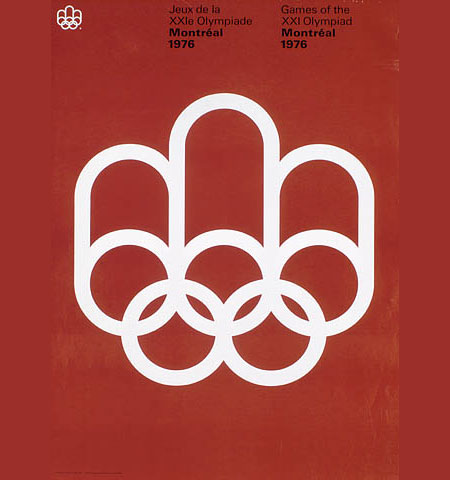
Had this laying around for a while, classic Olympic poster. This is a perfect example of how much the core ethics of design have changed. Take this one in, then have a look at these olympic logos…. what happened to design?

Had this laying around for a while, classic Olympic poster. This is a perfect example of how much the core ethics of design have changed. Take this one in, then have a look at these olympic logos…. what happened to design?
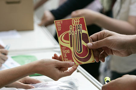
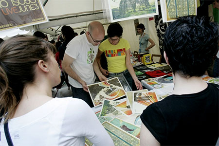
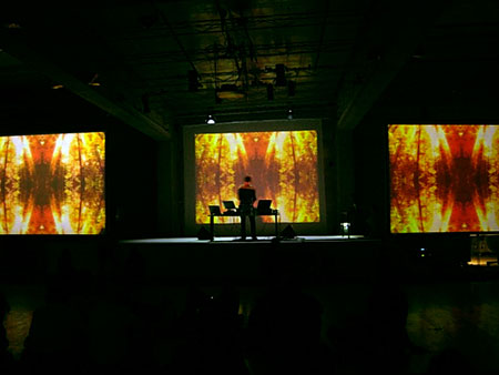
The OFFF festival in Barcelona was amazing this year, a lot of incredible work on display and some great speakers too. Above are a few images from the fesitval, click the following link to see some more: Continue reading →

A lot of wonderful things going on in here. The logotype is incredible, the layout perfect, and the imagery spot on. Love the weight of the font and the subtly distinctive modifications. I am really averse to the modern trend of forcing a logo mark. This image recalls the time when they knew how to create a proper logotype.
Director Will Joines did a video for the Tycho song “Dictaphone’s Lament” from the Past is Prologue Abum. Check it out >

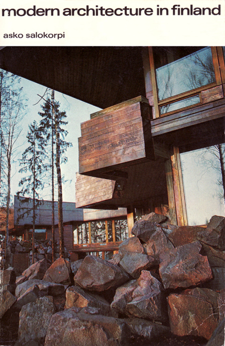
Anyone have a copy? I would think these guys must.
UPDATE: Via Keith Guerin in the comments: Some info on the architects responsible for this structure.
Tycho now has a page on Virb . Virb is sort of like Myspace, but it actually looks good. There are some exclusive ISO50 artworks up in the gallery and lots of Tycho MP3s to stream. Check it out >
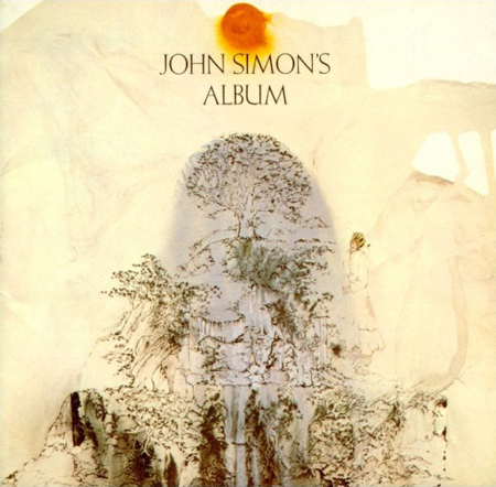
I wonder if the music is as good as the cover. Love the organic transitions and the seamless flow through each media. Particularly love that sun, amazing.
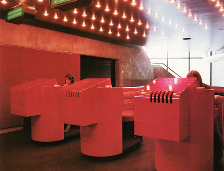
I don’t get how you could tear something like this out of a building!?!