Best of Custom Lettering
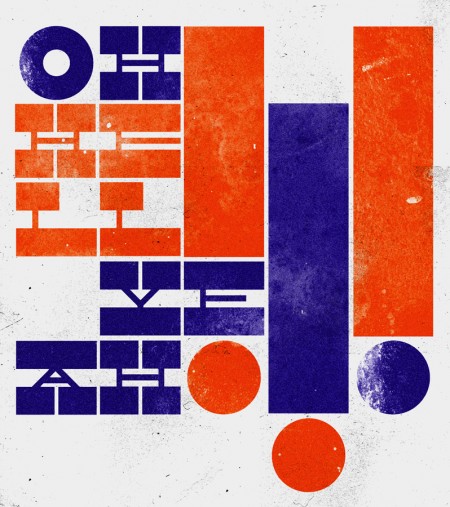
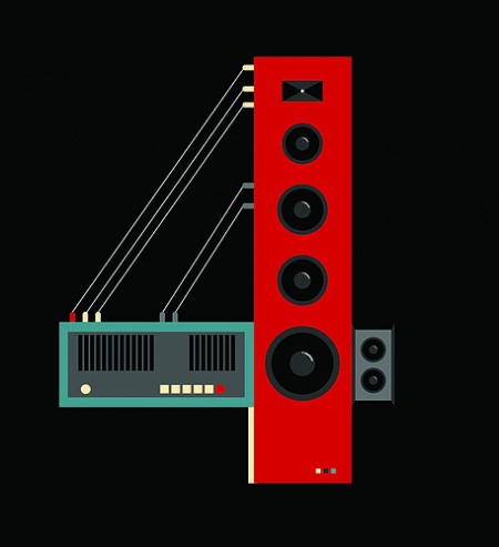
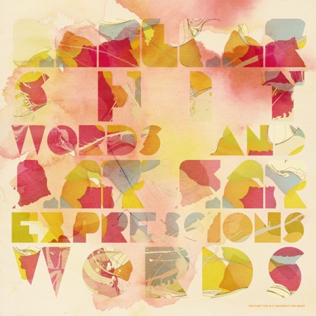
Lettercult — site dedicated to “custom letter culture” — has posted a “Best of the First Half of 2009” list containing many great examples of custom typography. Some inspirational stuff in there: Part 1 & Part 2.


Lettercult — site dedicated to “custom letter culture” — has posted a “Best of the First Half of 2009” list containing many great examples of custom typography. Some inspirational stuff in there: Part 1 & Part 2.
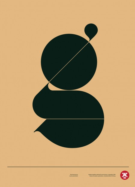
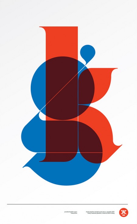
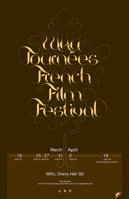
I had seen Aron Jancso’s “g” poster on Buamai earlier but just recently saw more of his work. Very impressive mastery of typography. Check out his Flickr for more.
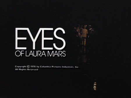
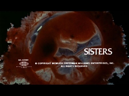
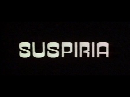
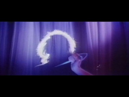


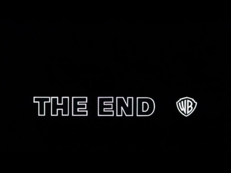
Came across this today via @grainedit’s Twitter. The I <3 Hot Dogs Blog has some great stills from classic films up. I love how type renders when it’s hand set and transferred to celluloid. If someone could make a filter that lent that perfect edging effect to type in Photoshop I’d be the first in line for it. I once met a guy who printed out all his type first, then photocopied it with an old Xerox, then scanned it back in. He got great results, I need to find a way to do that with film.
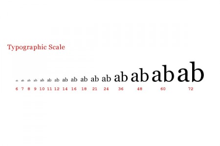
Antonio Carusone from the always excellent Aisle One Blog has written a great article covering the various problems we as designers face when setting type and how to best approach them. The article focuses on using web-based CSS solutions for type layout, but the concepts covered are universal to typography and can be applied to print layout as well. The hanging quotes part is great, but they’re missing the part about “hanging T’s”, I always have trouble with that one. Link

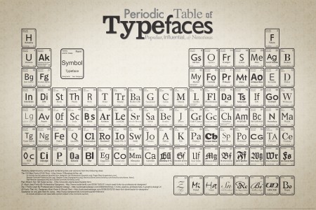
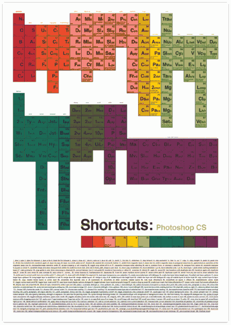
I’ve been seeing these 2 Periodic Tables floating around, the larger version of the typeface one is pretty fun to look over and I guess the Photoshop CS shortcuts one is a poster and there’s also ones for Illustrator and InDesign as well.
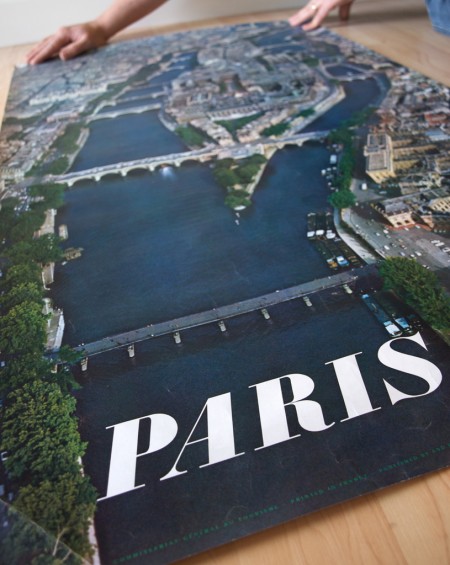
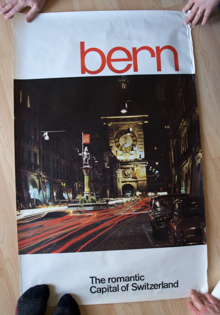
Stephen over at Mid-Century Modernist posted shots of some great European travel posters sent to him by his late father. Apparently the posters had remained in the shipping tube for a few years until discovered during a move. Thanks for sharing Stephen, and thanks to all your friends for holding them down in the shots! (what is that like 3 people holding the Bern print down?) Link
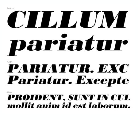
And in case you were wondering, the “Paris” font seems to be URW Bodoni Extra Bold Extra Wide Oblique. There are some slight differences but I am assuming these are artifacts of the digitization perhaps? I hate it when I see a classic font used like this and then find the modern version and it’s just a bit off. “Bern” seems to be PL Brazilia Three.
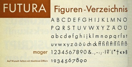
MyFonts released an iPhone version of their WhatTheFont identification tool last week. It has a very simple and easy to use interface. You basically just take a picture of a font, crop and upload it, and it will run the characters through a recognition database and give you possible identities for your mystery font. Works well so far (at least it was able to recognize Futura above), but it will be interesting to see how it does with some more challenging typefaces.
Image via 20th Century Type
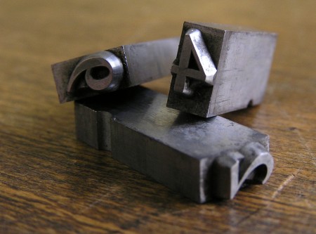
A great article by Michael Bierut about how things have changed in the world of design since the incorporation of the computer. An excerpt:
Design work that would have taken me a week in 1980 can now be done on a personal computer in less than an hour. Cutting and pasting, when needed, is done in the basement, often by interns. I get the impression that this kind of work, to which I once applied myself with the pride of a master chef, is now viewed as a chore like dishwashing. (The New York Times)
image via threedots