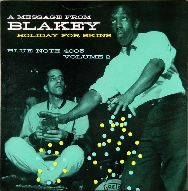
You see this typeface a lot in the concert poster world but it was also very popular with mid-century designers as illustrated by this Blue Note cover from the Vanguard Archive. Bonus: Name the modern day variants. Comment on this post
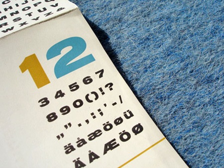
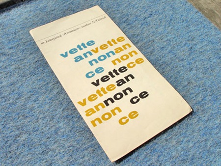
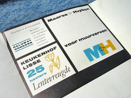
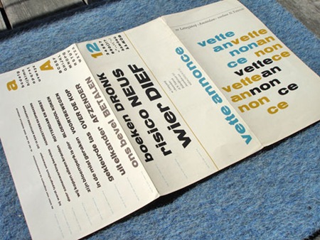
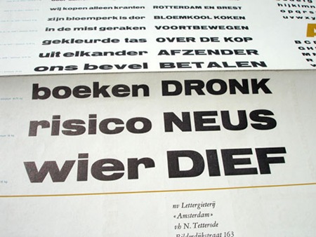
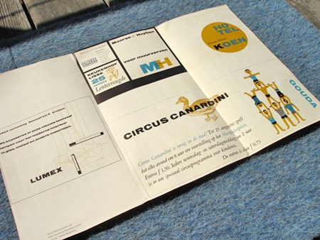
Via Grain Edit: "Dutch Type specimen sheet from Lettergieterij in the Netherlands. Most likely from the late 1950s / early 1960s." Another example of great Dutch design, loving these colors
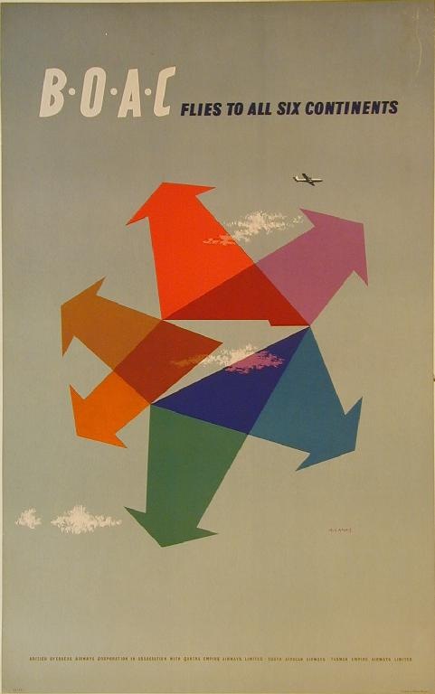
Very nice colors from an old BOAC campaign. Could do without the clouds and the airplane but I suppose a concept like that would never make it past the marketing people without some of the obvious thrown in for good measure. Note the BOAC logo that is formed in the middle by the arrows, love it. Great fine print line at the bottom, perfect kerning. Unfortunately no info on the designer, anyone?
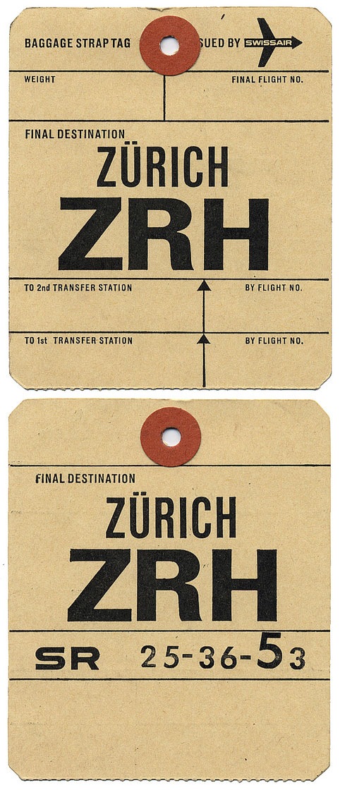
Been posting so much photography lately thought I’d throw in some design related stuff that was also travel related. This has to be the best airline tag I’ve ever seen. Love the "SR" type on the back side. When I saw cool stuff like this back when I was a kid I would always try to take the whole stack. I ended up with boxes of it by the time I left home for college. I think the majority got tossed out over the years, no big tragedy though, I grew up in California so none of it was anywhere near this good. Image via alistairh on Flickr.
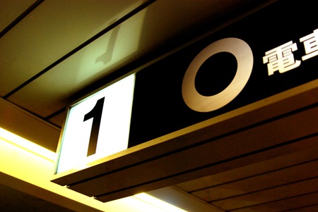
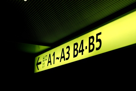
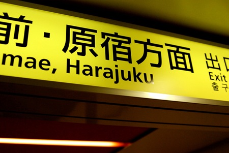
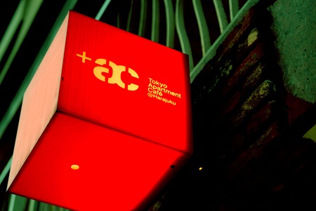
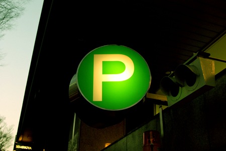
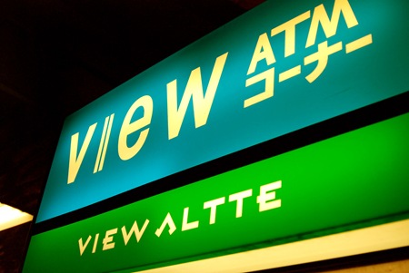
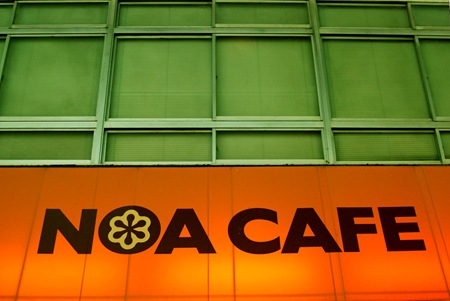
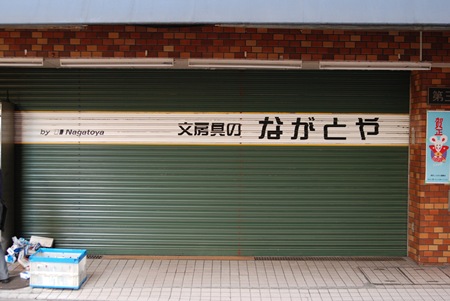
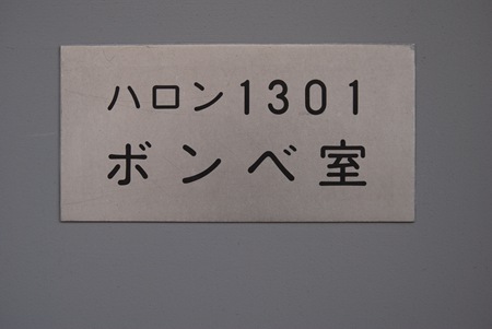
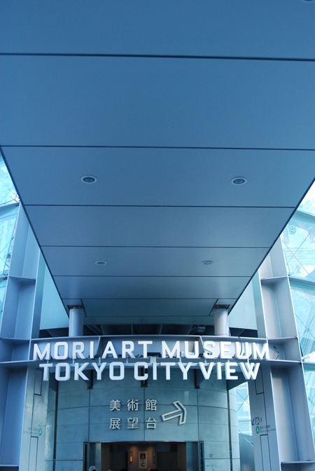
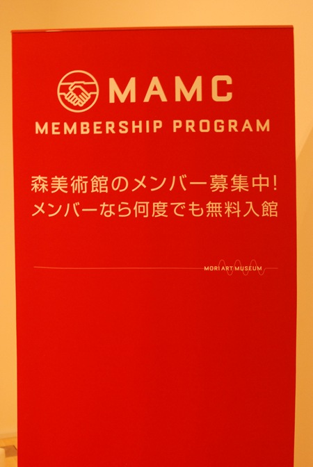
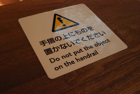
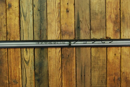
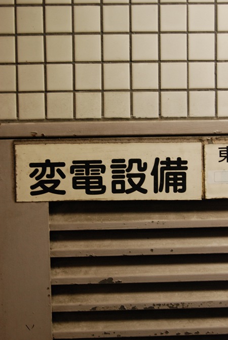
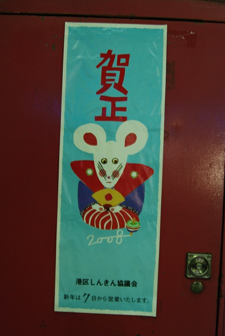
Some more wonderfully designed signage from Tokyo. Most of these were taken in the Harojuku area, a few are from Shibuya. The type and design of the subway system is incredible, so well thought out. More to come….
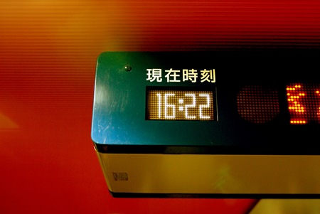
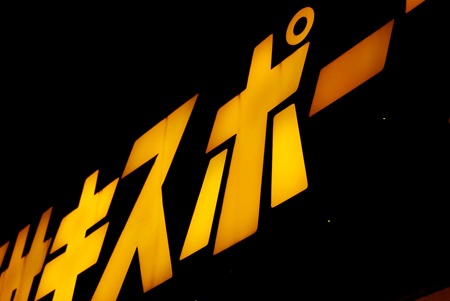
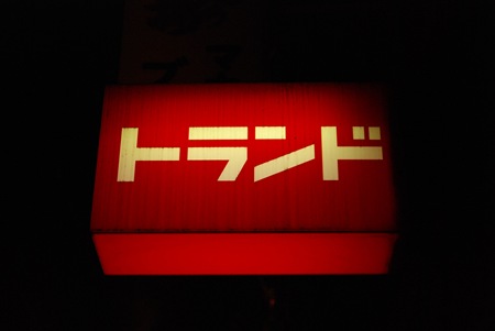
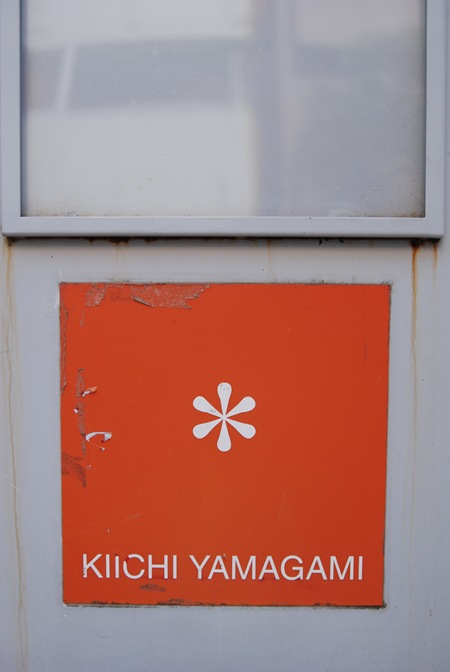
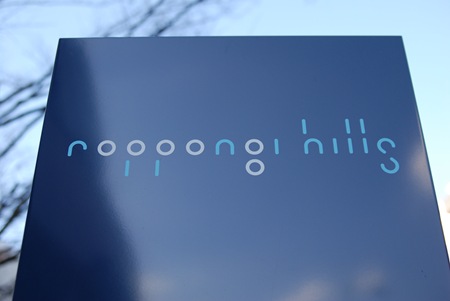
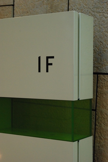
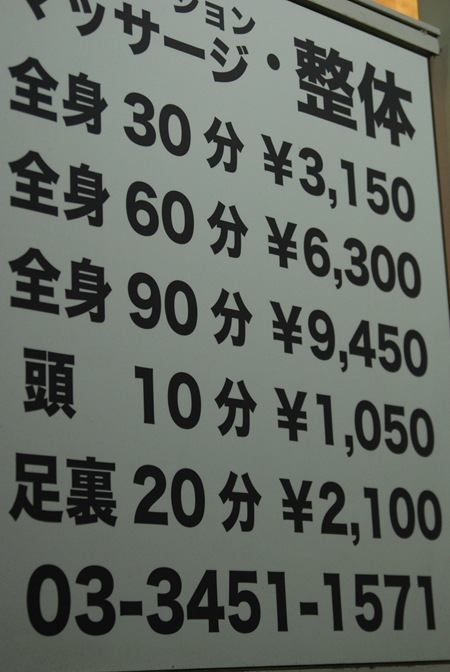
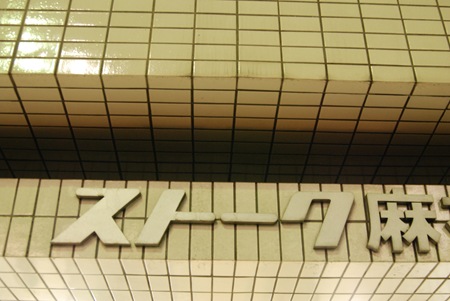
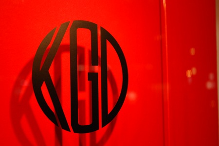
The typography in Tokyo is absolutely incredible. Everywhere you look you’ll find great examples of type usage. The images above are just a random sampling, mostly from the Roppongi Hills area of Azubu-Juban Tokyo. I wish I had more time to take some better shots with film, but I’ve been using my Nikon digital for quick posting. I will try to get the Lomo out in the coming days, it seems to be the only camera I can get consistently good results with.