Graphis 121: 1965
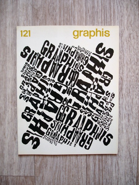
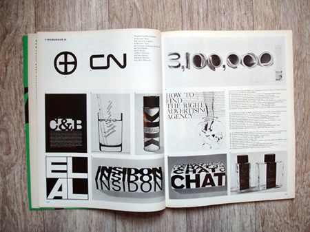
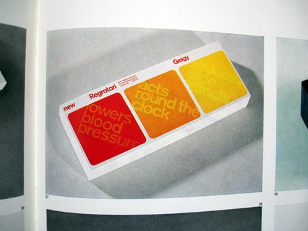
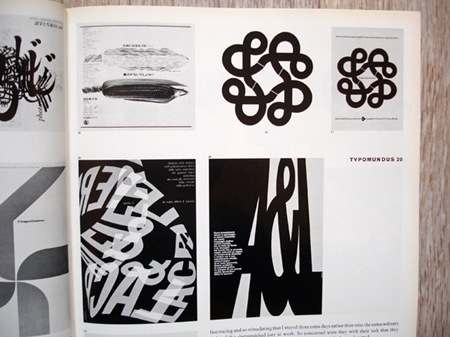
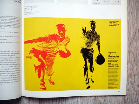
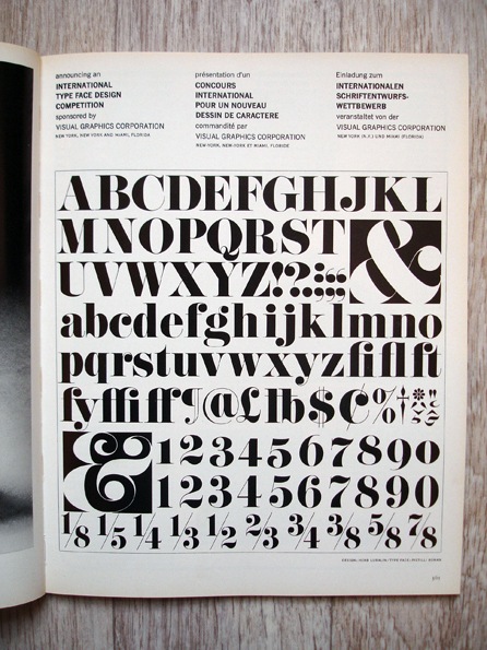
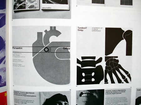
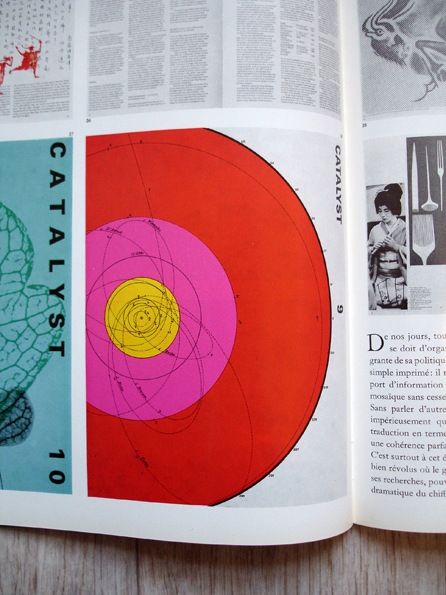
Some great shots from Graphis 121 (1965) via Insect54’s Flickr. I’ve been meaning to start collecting the Graphis annuals but haven’t got around to it yet….Someday.


Some great shots from Graphis 121 (1965) via Insect54’s Flickr. I’ve been meaning to start collecting the Graphis annuals but haven’t got around to it yet….Someday.

Not sure if this vintage Playboy action qualifies as NSFW, but it seems pretty tame by today’s standards so thought I would post if not just for that amazing psychedelic swirl going on.
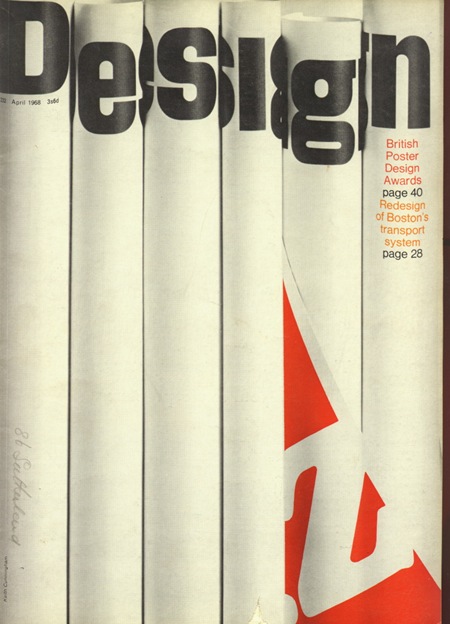
Cover of Design Magazine 232; pretty damned clever. I’ve been planning on experimenting with printing then photographing certain elements for projects then recompositing them back into an image. This makes me realize I need to start working on that sooner than later.
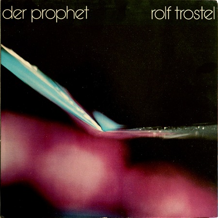
Another one from the Dream Chimney "Sleevery" archive. Loving the type, I would call that Avant Garde if it weren’t for the rotated ‘e’. Can anyone identify this or is it a custom job? Let us all know…
Not sure what’s going on in this photo, but it’s incredible and the colors are just about perfect. Wish I had some more background on this piece but perhaps someone can fill in the blanks.

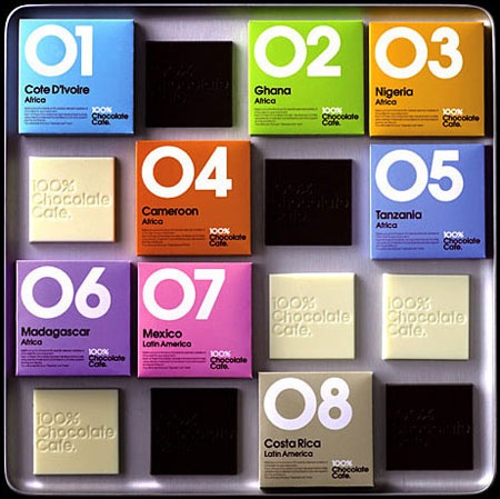
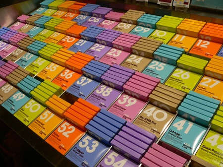 At least someone is getting packaging design right these days. These shots are from the 100% Chocolate Cafe in Tokyo. I somehow missed this while I was there, would have been nice to bring some home.
Via Dieline
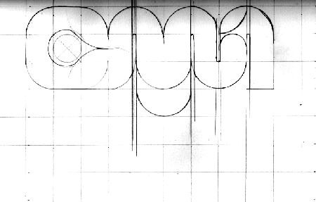
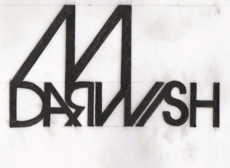
Came across the blog of Sarah France today, really liking how she keeps it old school with the hand drawn concepts. Long live Pen & Ink! She also has some cool photos along with a really clean page layout.
I really wish I spent more time with the pencil, I have become pretty lazy over the years. It’s come to the point where writing a full page of text makes my hand hurt so bad that I have to stop. Pretty sad, but I guess with computers there’s less and less need for handwriting.
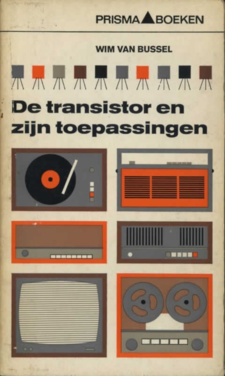
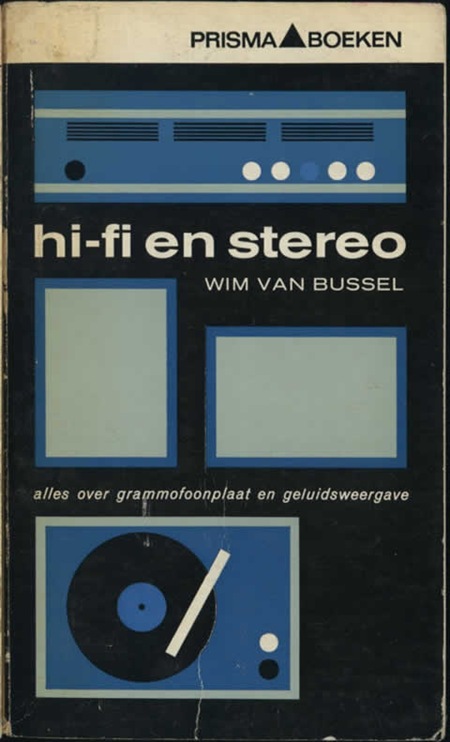
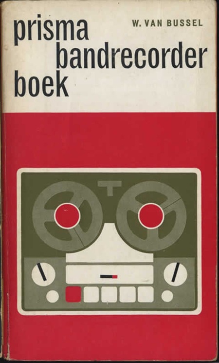
Some really nice modernist book covers featured over at Defunkt. I love this style of illustration, Mike Mills took a similar tact for the Beastie Boys Stereo Speaker poster. And of course, you really can’t lose with Trade Gothic.
Via Monoscope
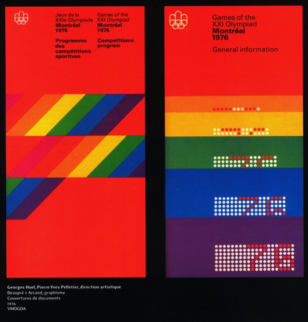
When will it end? Apparently never. I think it’s time I just give in and nominate the Canadians as completely owning the mid-late 70’s. The more I look at this sort of design, the more I realize how much it has influenced my own style. It’s funny because I don’t remember really being aware of design when I was younger and I certainly wasn’t fortunate enough to be alive (much less conscious) during the ’76 games. I guess these sorts of things just kind of seep in to your consciousness over the years through random, passing exposure without you completely realizing or understanding it’s impact.
At any rate, I envision my dream space as a large, concrete floored, open room with 3 story ceilings, all white, with these printed massive banner size hanging all along one side. I think the other side would be wood paneled in a light walnut with a flush installed Bang & Olufsen circa 1976 Beo system right in the center. Sprinkle in a healthy dose of vintage Hermann Miller, some Dieter Rams-designed Braun appliances here and there and things would be starting to look right. Maybe a wax figurine of Jakub in his ATMSPHR promo photo get-up and Jarvis Cocker glasses would be encased in a Perspex cylinder somewhere, perhaps animatronics would be involved, budget permitting.