Jauna Gaita 90/115/131/133
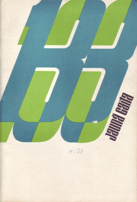
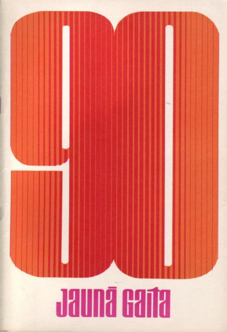
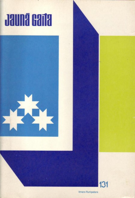
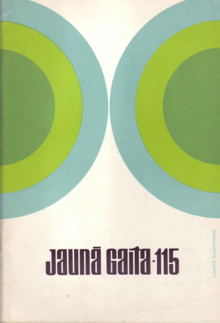
Some more great covers from Mikus Vanag’s Jauna Gaita archive. Sooooo good.


Some more great covers from Mikus Vanag’s Jauna Gaita archive. Sooooo good.
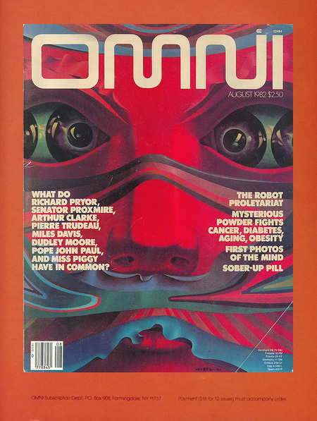
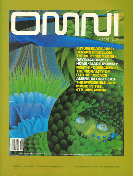

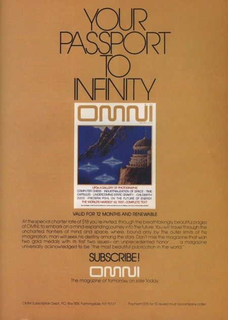
I remember seeing Omni magazine when I was a kid and wanting it. For some reason I was never able to get my hands on an issue, so I still don’t know what it’s about, something to do with sci-fi apparently. Anyways, the covers and style are excellent regardless of the content. You can find an archive of all the issues here, although the images aren’t very large.
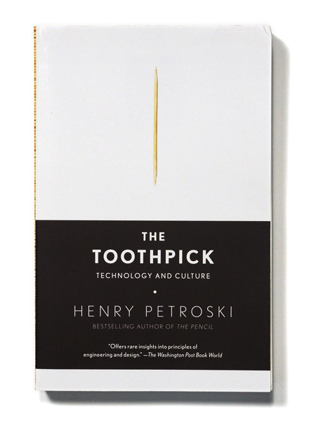
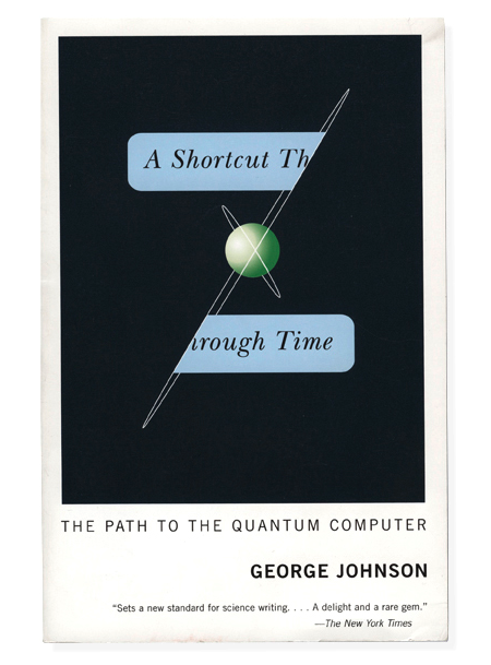
A few beautiful pieces by Buchanan-Smith, a New York City based design firm. I love their type sensibility, especially on the first image, and I find their image style very effective in its simplicity and subtleness. Much more work can be found on their site.

Just a few gems from the Modernism 101 collection. Modernists in the 50’s had it down and it’s images like these that remind me it wasn’t all garishness back then. Not everything had bubbles and fins and bulges; some people were hiding out in the woods quietly appreciating their straight lines and right angles. Unfortunately, most of them stayed in the midwestern United States. Out here in San Francisco, apparently they decided that the height of architecture was the victorian age so all we got is a bunch of ugly houses with 400 rooms in them and Mel’s Drive In.

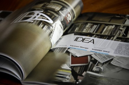
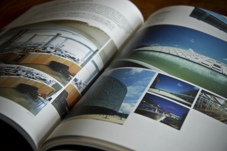
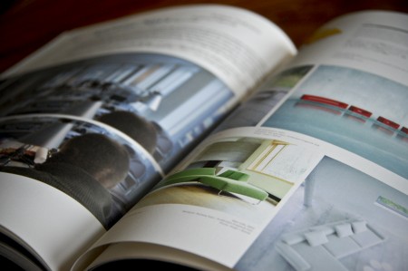
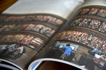
I had a chance to travel to Japan last June and I came back with many new sources of inspiration. I spent a lot of time digging through little design shops and actually had to leave some clothes behind to fit all of the great books I found. One of my favorite finds was +81, an interview driven magazine about graphic design, fashion, photography, cities, etc. They present a ton of work in each issue and it can be a great source of visual inspiration when you are looking for something stylistically very different than what you see in most American design publications. With articles presented in both Japanese and English, you see a lot of very creative layouts and unique type treatments. They experiment quite a bit, and with each issue focusing on a different theme, you never really know what to expect. Definitely worth checking out if you’re looking for a change.
You can usually find it at Japanese language bookshops here in the States (I know Kinokuniya carries it in SF), or you can check out their website for subscription information. (Currently about 40% of their readership is outside of Japan)
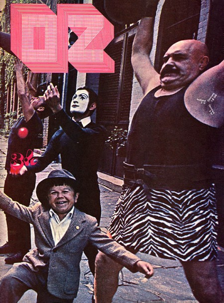
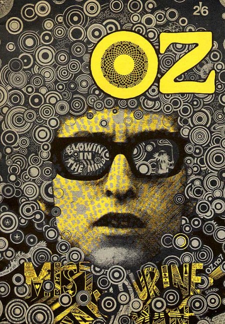
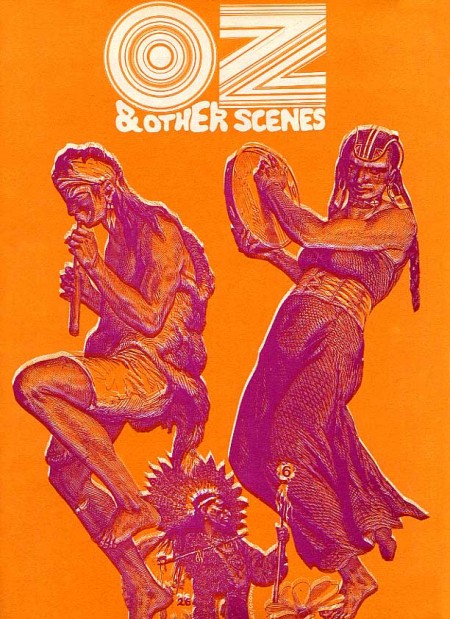
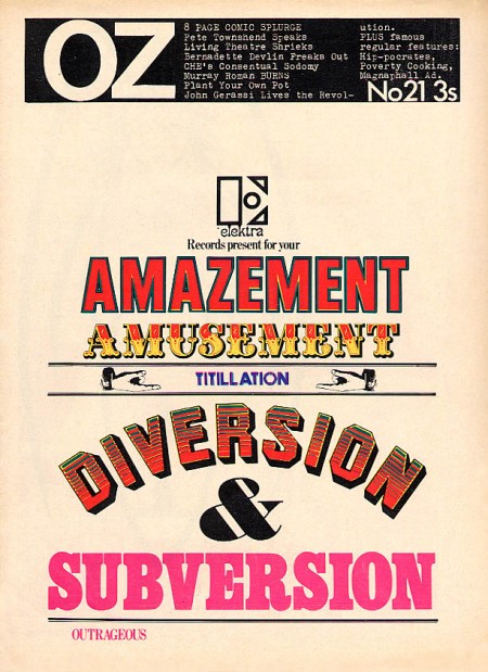
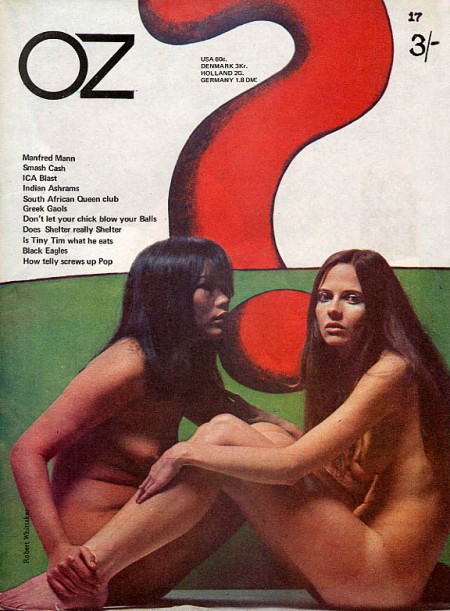
I love the 60’s because everyone was tripping balls all the time and then they would come out with crazy magazines to prove it. Case in point: OZ. These covers need no explanation, they are simply incredible. The overall idea of the magazine is definitely reminiscent of Avant Garde, but a lot of Herb Lubalin’s work seems somewhat tame and reserved compared with the over the top stuff (at least for the time) we see in OZ. My favorite cover is the one featuring The Doors “Strange Days” album photo with maybe the most awesome magazine logo ever slapped right on top of it. Also, the date and cover info are printed in the weight lifter’s armpit so that’s a bonus. It must have been nice back then when all you had to do to “freak out the establishment” was put some naked girls or a midget with circus people on your cover.
OZ started out as an Australian satirical humor magazine but then moved to the UK and began life anew as a “psychedelic hippy” magazine (I am sure the genre was overflowing at the time). Featuring art by Hapshash and the Coloured Coat and design direction by Martin Sharp, issues of OZ have become collectors items in the years since it’s demise [source].
You can browse cover scans of all the of UK issues of OZ here. On a side note, Google books features the some of the text of “Graphic Design: Reproduction & Representation Since 1800” which makes mention of OZ and Sharp.
 Die Neue Gesellschaft issues 7-12, 1974. This was a German political magazine art directed by Helmut Schmid. These scans were obtained by AisleOne through the curators of Schmid’s work. I love the color coding, apparently this design continued through 1981, would love to see the full spectrum of covers. There’s some more info over at AisleOne and some larger scans at their Flickr page. If I was German I think I would spend most of my weekends digging through my parent’s house for stuff like this.
Artist Bob Stake used Photoshop 3.0 on Mac OS 7 to create this cover for The New Yorker recently. I guess you use what you know… The video above shows Bob progressing through the design, it’s a nice glimpse into another artist’s process. The whole story and more details are here. Via Gizmodo