Avalanche Magazine
Posted by Scott
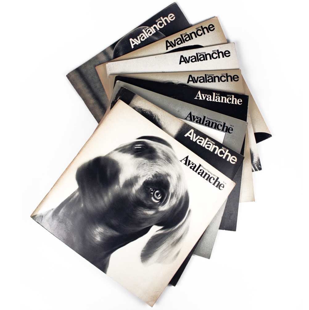
Loving these Avant-Garde-Esque covers. Via FFFFOUND
Loving these Avant-Garde-Esque covers. Via FFFFOUND
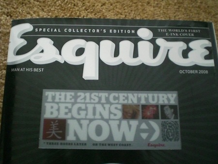
100,000 copies of Esquire’s October 75th anniversary issue will sport the "World’s First E Ink Cover". The video is pretty amazing; I’ve seen Kindles and other E Ink-equipped gadgetry before, but this is a pretty stunning application of the technology. Whether it is relevant and/or functional as a concept remains to be seen. There are already some people raising interesting questions as to this potential trend’s impact. Whatever the case may be, that cover is pretty damned cool looking.
Via Engadget
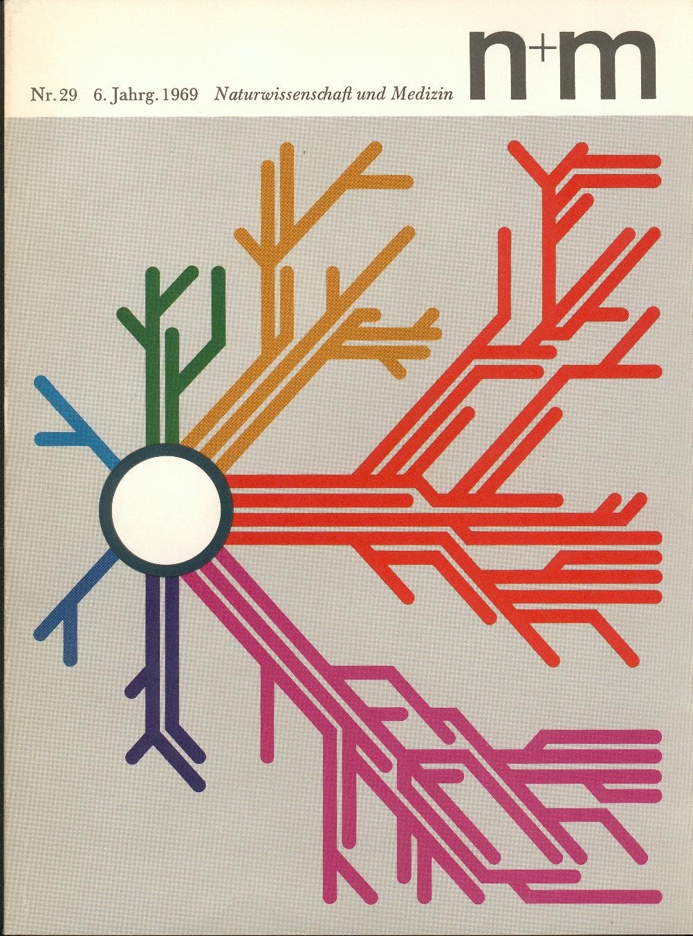
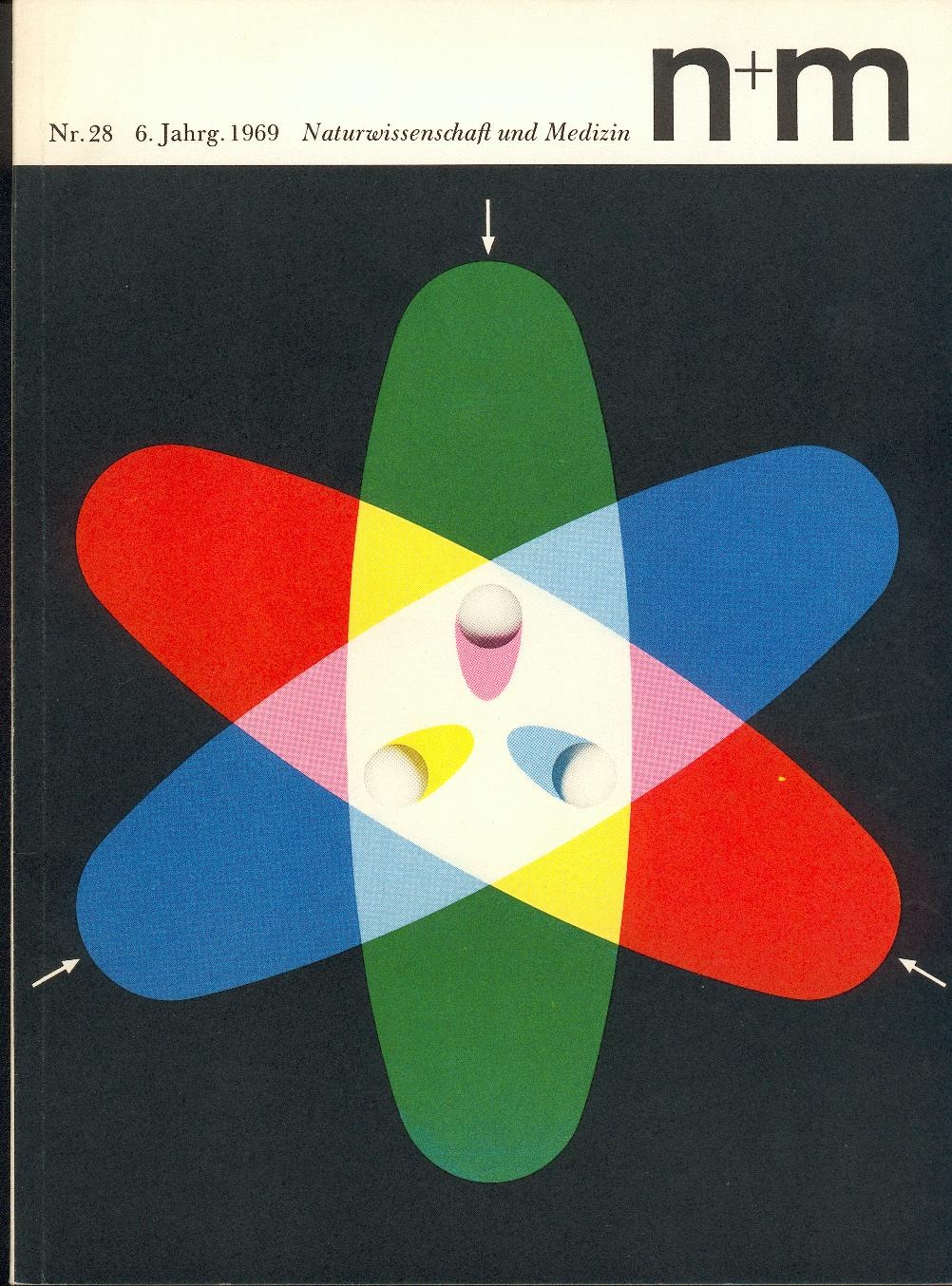
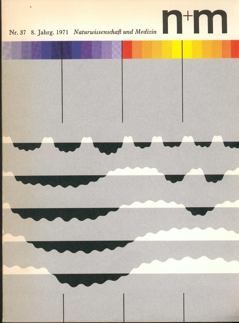
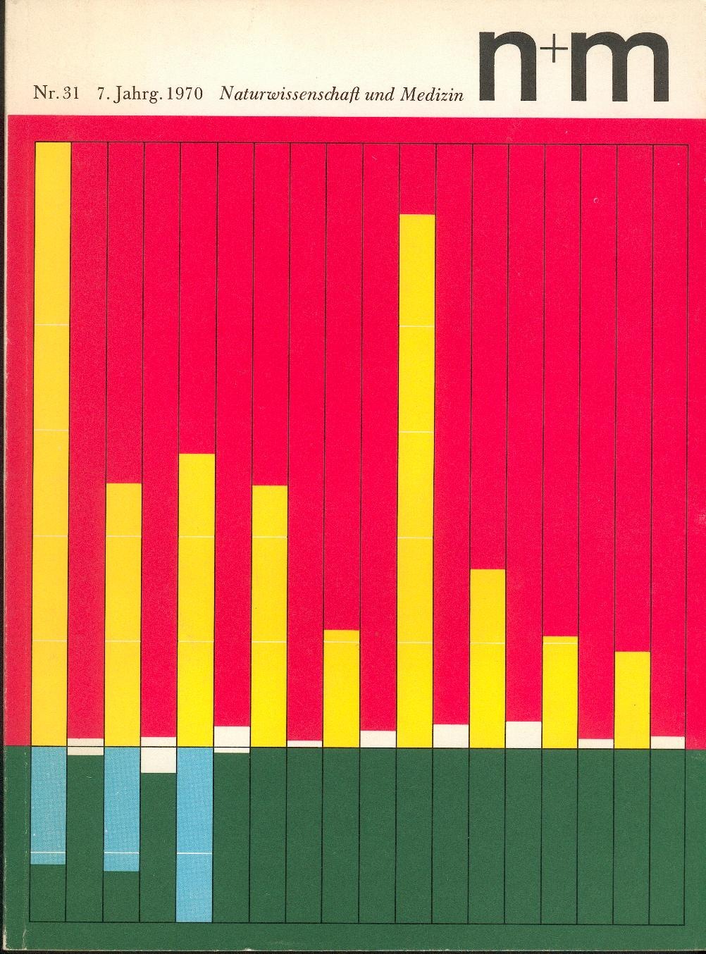
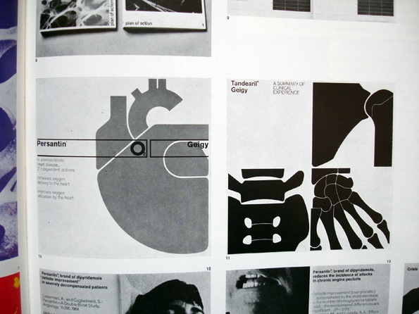
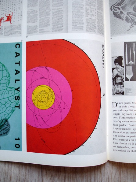
Some more brilliant covers from N+M (Naturwissenschaft und Medizin) Magazine. They were designed by Erwin Poell in the late 60’s. These are such incredible examples, not only are they beautiful, but they are no doubt conveying some extremely complex concepts through information design. There is apparently a book covering Poell’s work (via Thingstolookat):
Title: Entwürfe für den Alltag. Typografie, Grafik-Design, Art Direction
Author: Erwin Pœll
Year: 1992
Publisher: Birkhäuser Verlag Basel
ISBN: 3-7643-2758-8
Also check out Things To Look At’s article on Poell and the N+M covers.
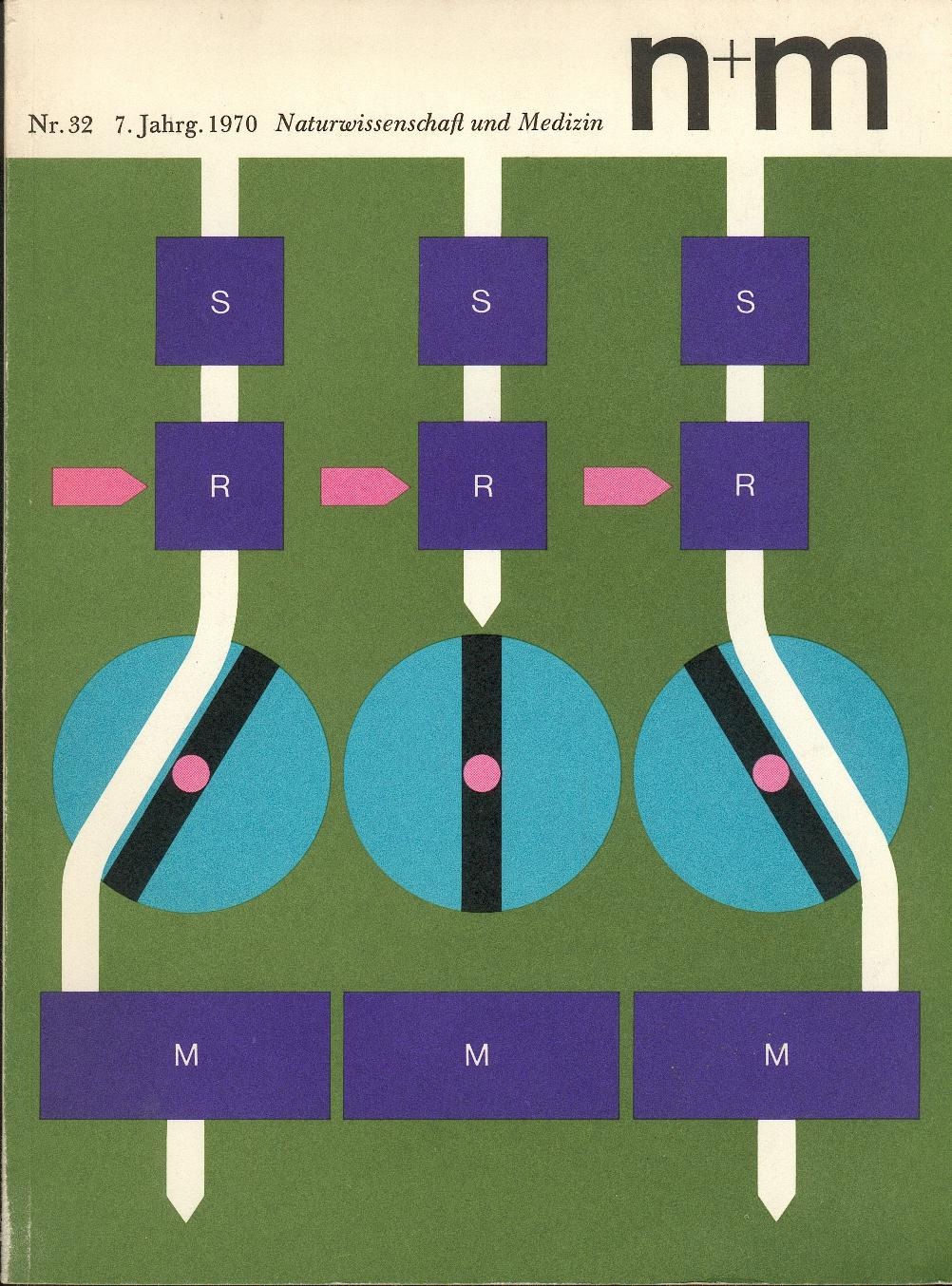
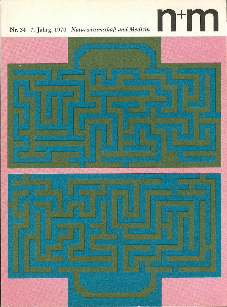
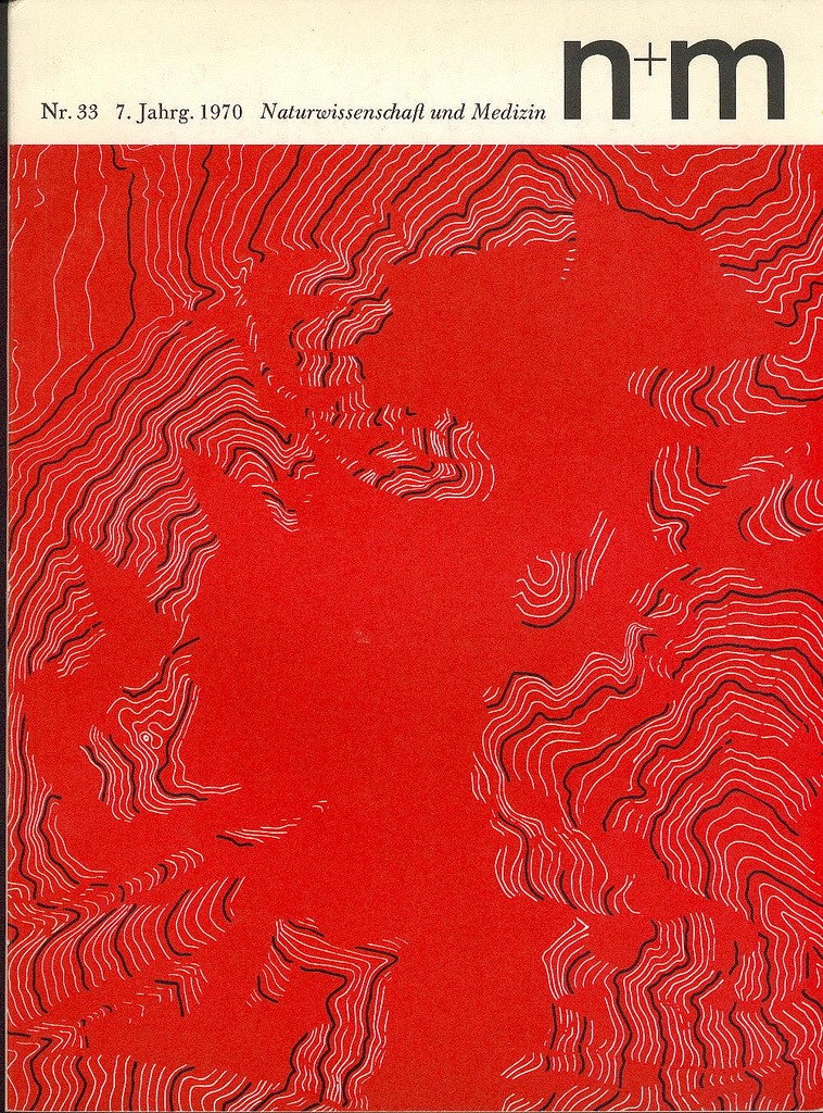
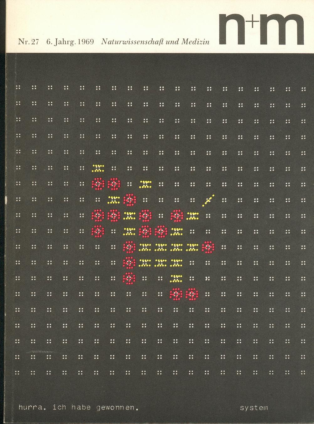
These incredible N+M (Naturwissenschaft und Medizin) covers are from ekusupo on Flickr. They were apparently designed by Erwin Poell but I couldn’t find any more information on him to post along with the images. At any rate, this is some classic design done to perfection. Ekusupo says of them on the Flickr page:
"I share these as one of the best examples of graphic design as a methodic communications system I am aware of. Engaging and varied, as singles or as a set work tremendously well. The inside of the magazine may be considered disappointing if you want more of the same as the cover – but actually is delightful simple. The cover does its job really well selling the contents while the contents is true unto itself."
Indeed, this set is an amazing triumph of design for many reasons. You may recognize the name and some of the images from the Graphis Diagrams book.

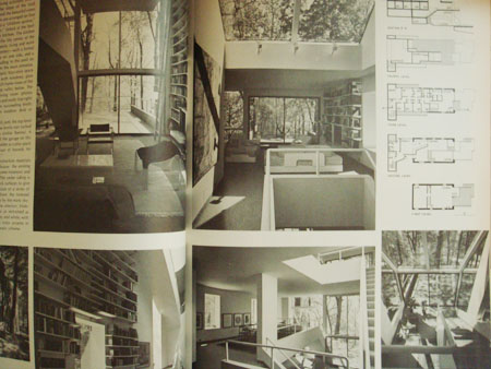
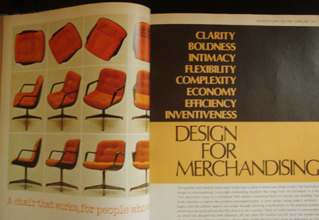
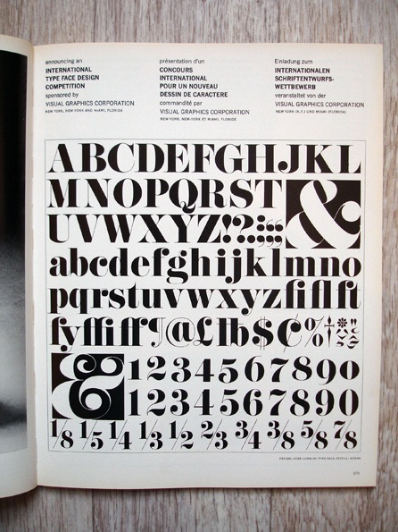
I grabbed some copies of this magazine because someone was going to throw them away. I’ve had them for awhile now and i thought i could share a few. I really love the red dot one, the dot just shows up randomly thru the magazine on black and white photographs. When i look at these older magazines i always wondered where they got all their typography, did these designers meet up and share? was there a mail-in ordering company for different types? hopefully i’m not treating the 1960’s-70’s like the stone age or anything to anyone but i always wondered about the process of graphic design was during that time to put out a well layed out higher end magazine.
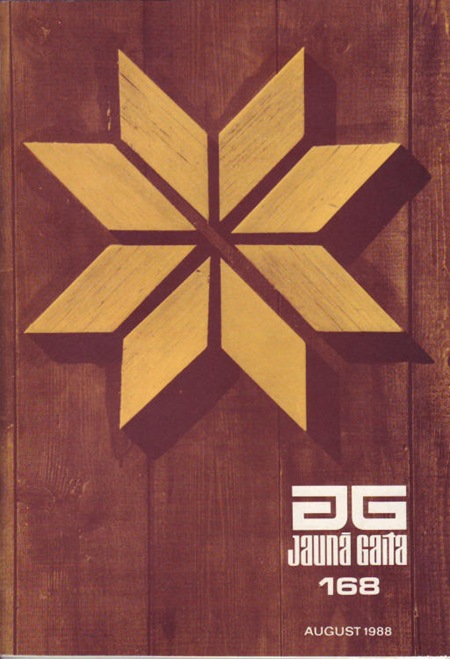
I came across a nice cache of Jauna Gaita cover scans on Mikus Vanags’ Flickr. Some of the scans are better quality than the ones on the official JG site which I posted yesterday.
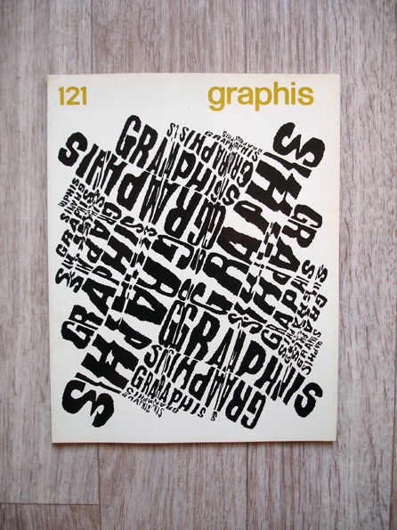
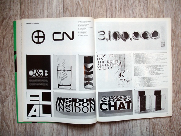
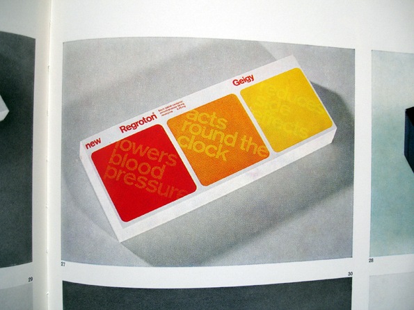
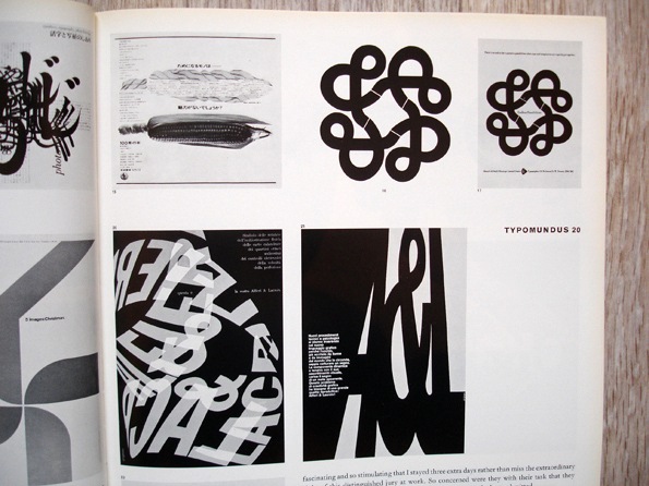
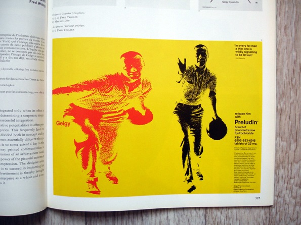
Some great shots from Graphis 121 (1965) via Insect54’s Flickr. I’ve been meaning to start collecting the Graphis annuals but haven’t got around to it yet….Someday.