OZ And Other Scenes
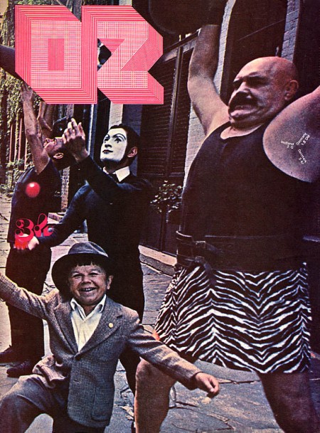
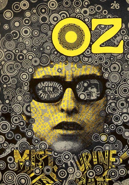
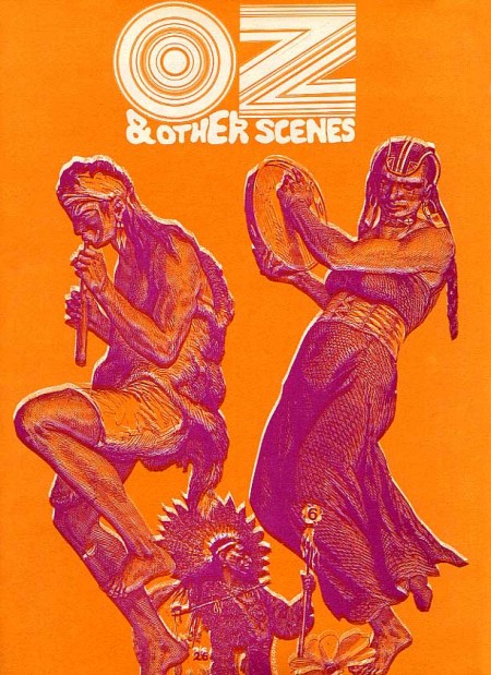
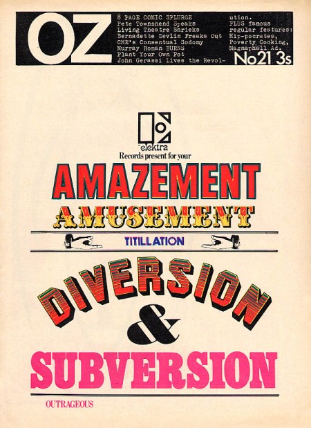
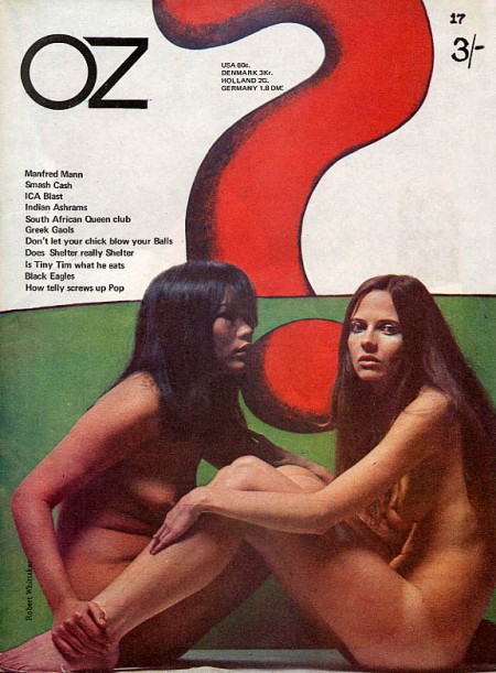
I love the 60’s because everyone was tripping balls all the time and then they would come out with crazy magazines to prove it. Case in point: OZ. These covers need no explanation, they are simply incredible. The overall idea of the magazine is definitely reminiscent of Avant Garde, but a lot of Herb Lubalin’s work seems somewhat tame and reserved compared with the over the top stuff (at least for the time) we see in OZ. My favorite cover is the one featuring The Doors “Strange Days” album photo with maybe the most awesome magazine logo ever slapped right on top of it. Also, the date and cover info are printed in the weight lifter’s armpit so that’s a bonus. It must have been nice back then when all you had to do to “freak out the establishment” was put some naked girls or a midget with circus people on your cover.
OZ started out as an Australian satirical humor magazine but then moved to the UK and began life anew as a “psychedelic hippy” magazine (I am sure the genre was overflowing at the time). Featuring art by Hapshash and the Coloured Coat and design direction by Martin Sharp, issues of OZ have become collectors items in the years since it’s demise [source].
You can browse cover scans of all the of UK issues of OZ here. On a side note, Google books features the some of the text of “Graphic Design: Reproduction & Representation Since 1800” which makes mention of OZ and Sharp.

12 Comments Leave A Comment
Daniel Carvalho says:
February 9, 2009 at 4:36 amBoobs.
jamie says:
February 9, 2009 at 7:46 amHey Scott, after seeing this collection i now get a better understanding of where you got your inspiration for the poster ‘nightvision 2005’ for CA magazine. Am i right in making that connection?
koneyn says:
February 9, 2009 at 10:33 amWow, I really thought those concentric circles pattern was a recent invention (so enormously exploited)!
koneyn says:
February 9, 2009 at 10:42 amWERE a recent invention – sorry for the double post :)
Jakub says:
February 9, 2009 at 11:27 amWow putting font in an armpit, just blew apart the design layout part of my brain
Scott says:
February 9, 2009 at 11:39 amjamie & koneyn-
yes, that was the idea, computer arts gave me the dylan image and asked that I use it as the basis for an illustration. I go into more detail on the process here: https://blog.iso50.com/2009/01/27/iso50-design-tutorial-1/
Moka says:
February 9, 2009 at 1:17 pmThose Oz magazines were amazing, I happen to have 10 original prints of the mag which an uncle gave to me. He must have been batshit insane or drunk when he gave them to me as I’m sure this must sell at a good price over at ebay.
Today I found over at reddit a pdf file with the design guidelines and presentation of the hideous new Pepsi logo. The bullshit the advertising agency throws in here is ludicrous. Keep reading till the end it just keeps getting better and better:
http://sharebee.com/4c9ba6b1
matchas says:
February 9, 2009 at 3:32 pmsome nice nudity on this blog ;)
jefta says:
February 9, 2009 at 6:42 pmso the second OZ cover looks alooooooooot like something you made!
Scott says:
February 10, 2009 at 2:05 amjefta-
see my above comment, and this article:
https://blog.iso50.com/2009/01/27/iso50-design-tutorial-1/
chris says:
February 11, 2009 at 9:44 pmoff topic, but important. what happened to that new tycho single that was supposed to be coming out?
Scott says:
February 12, 2009 at 1:00 amchris-
we decided to add some remixes to the single so that delayed things a bit while we wait for them to finish.