Tycho – Awake Album Artwork
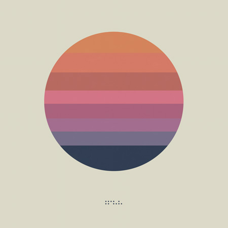
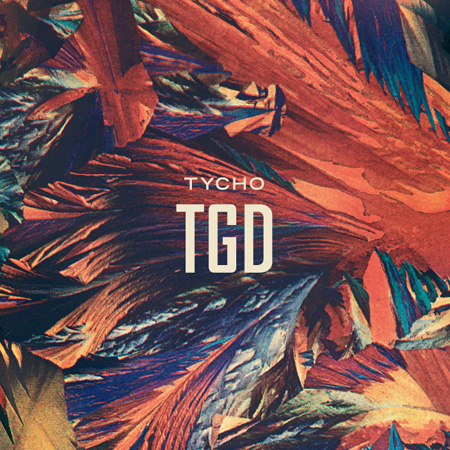
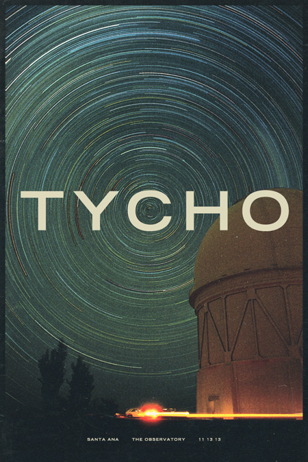
As you may have noticed I haven’t been very active on the blog over the past year. This is because I had decided to focus solely on my music project, Tycho for a while. I spent the last 9 months or so working with the band on a new record which is now complete. Of course, Tycho is very much an audio / visual project so I’m still working consistently on design whether it be album covers, show posters, or online assets. I was working on the cover art and developing the packaging in parallel with the recording process this time around. We recently shared the final artwork for this LP, entitled Awake (listen to the title track here). I’ll go more into the reasoning behind and making of the artwork later, but for now here is a quote from this Reddit discussion of the cover art that I commented on:
This design was mean to be a flag; more of a symbol than what I would think of as traditional album art. I felt that, with physical mediums disappearing, album art didn’t necessarily have to fit a given format and I wanted something that could be readily transported.
If you look at earlier artwork you’ll see that I was pursuing a more maximalist / photographic direction for Tycho (e.g. http://imgur.com/a/kk93f ). But this album has a more stripped down, visceral thing going on and I wanted that reflected in the artwork. Really this is meant to be an inconized form of the sun / circle motif present in a lot of the Tycho cover art to date. Kind of like a unifying symbol for all the output that preceded this release. I see this, for various reasons, as the first true Tycho album and so wanted to focus everything into a simple form that encapsulated that idea. On a side note, there are eight color bands in the circle, each one representing a track.
The beauty of creating the artwork for the music over all these years is that I am free to develop a cohesive lineage with the imagery. From what I have seen of my peers over these past 13 or so years as a designer, we generally tend towards simplification as we go along and I think that is an important part of design: efficiency of communication. Whether this particular design is effective in that respect obviously isn’t something I have the objectivity to comment on, but that was the goal at least.
The album will be released on March 18th, 2014. Here is the track listing:
Tycho – Awake (2014)
1. Awake
2. Montana
3. L
4. Dye
5. See
6. Apogee
7. Spectre
8. Plains
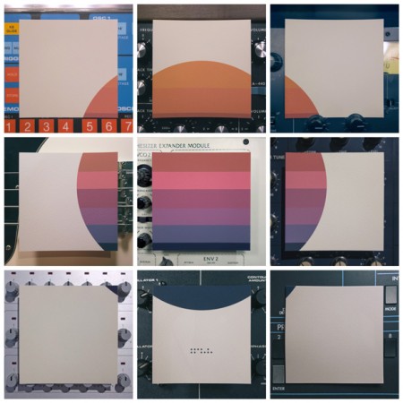
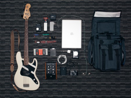
And those who were following along on Instagram, Facebook, or Twitter know that we released the artwork first via a 9×9 grid. I printed the artwork, cut it up, and photographed it using various pieces of musical equipment as backdrops. Here’s the grid in one image:
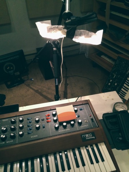
Makeshift lighting setup. All my camera gear was stolen recently so limping along with a point and shoot setup for now.
You can listen to the title track from Awake now on the Tycho Soundcloud page
More to come soon, thanks for the support!
