Skateboard Art
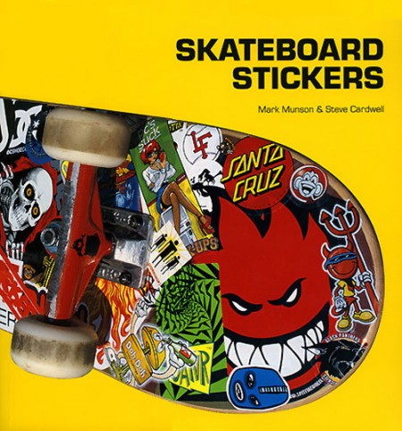
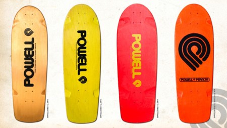
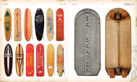
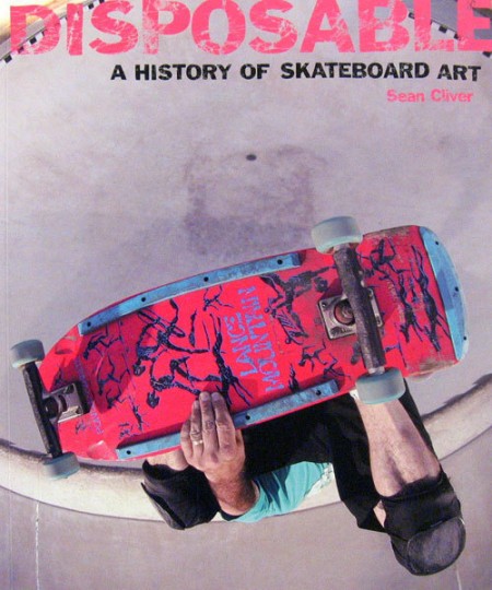
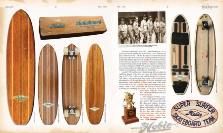
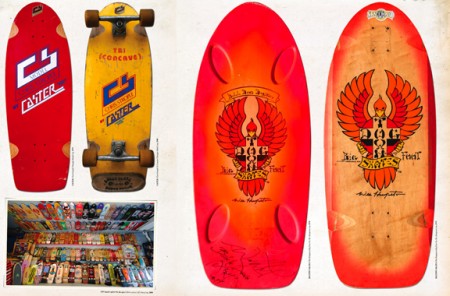
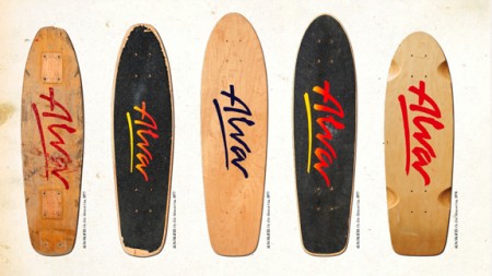
I spent a good chunk of my youth destroying my knees in the name of skateboarding; first during the 80’s as a kid and later in college. The contrast between these two distinct stylistic periods was stark to say the least. Decks went from the curvy whale-tail style with garish neon graphics to the simplified, unidirectional kind you see more often today. The graphics changed a lot with the shape, but each era had a huge influence on my visual tastes. The stickers, the shirts, the decks; I was obsessed with the imagery. I guess it was one of the few instances where a suburban kid could be exposed to non-traditional art and design created by outsiders.
While digging around for some interesting graphics I came across this article at Unodos covering a few books that feature some classic skateboarding designs. There are some old favorites in there (the Powell branding is still about as good as it gets), but I missed Hook-Ups (which you’ll catch a brief glimpse of on the Skateboard Stickers cover) and Alien Workshop (two of my 90’s era favorites). Most of the images are from The Disposable Skateboard Bible which definitely looks worth picking up. The publishers have an online gallery featuring decks from various designers and artists featured in the book.
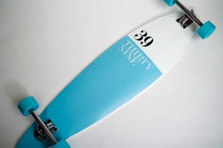
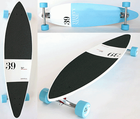
I also came across this Buddy Carr Pintail designed by Antonio Carusone (thanks for the heads up Derek. A great example of a contemporary design.

15 Comments Leave A Comment
Alex Penny says:
November 9, 2010 at 4:09 amThe P-P logo has a special place in my heart.
Tetsuo says:
November 9, 2010 at 5:21 amI got both books, didn’t like the stickers book too much, but Disposable is essential (there’s a second part out, too)
Blake Barton says:
November 9, 2010 at 6:49 amSkateboarding is highly responsible for why I became a designer. When I was younger, Brands like Alien Workshop, Chocolate, and Girl really got me interested in pursuing a design career.
Oh, how I miss risking my health in the name of landing a trick.
Derek Kinsman says:
November 9, 2010 at 7:04 amThat Buddy Carr board was designed by Antonio Carusone. He’s done a few boards for them. All of them are sweet. http://www.aisleone.net/2009/design/buddy-carr-39-longboard/
sasha says:
November 9, 2010 at 9:14 amnice. i went to high school with sean cliver. glad to see he’s still creating some excellent artwork.
Adam Morse says:
November 9, 2010 at 9:27 amSince I was already in the market, my brain is coming up with zero reasons why not to get one of these Buddy Carr Pintails.
Stu says:
November 9, 2010 at 1:56 pmDisposable is a fantastic book and you should definitely pick it up.
Seth says:
November 9, 2010 at 10:11 pmGreat post. I can’t get over how much this stuff appeals to me. I swear I watched this 80s skateboarding show every time it was on local TV when I was growing up. The name of it was “SK8 TV.” Horrible jokes, worse fashion, but beautiful old school decks and tricks.
Use the link below to watch some footage from the show:
http://www.youtube.com/watch?v=7Wfl9A3K770
Chris Freitag says:
November 10, 2010 at 3:22 pmI’m in the same boat. Was totally into the Powell Peralta team in the mid to late eighties. Got my fifth grade school picture taken in the Mike McGill skull/snake shirt. The art and iconography of that period still feels larger than life to this day.
Another company producing great skate artwork in that period was Santa Cruz. This book likes another great resource to get stoked on. http://www.amazon.com/Skateboard-Art-Jim-Phillips/dp/0764328077/ref=sr_1_8?ie=UTF8&qid=1289427419&sr=8-8
Have You Seen Him? -Chris
STOG says:
November 10, 2010 at 9:27 pmWith a lingering taste for early to mid-90’s Alien Workshop designs, I periodically hunt Ebay and other sites for the old clothes and stuff—I came across these scans of the CCS catalogs dating back to 1991:
http://rottenapplemedia.com/cheap_sk8s.html
Jon C. says:
December 6, 2010 at 9:41 pmNice post. Still skating and collecting them as art now to hang in the kid’s rooms. Jim Phillips and V.C. Johnson were a huge part of the history. They still do work separately and collaborate for Pocket Pistol Skateboards. Creature made a board recently called the Impaleya. You have to see it in person to appreciate the paint job, a metal flake graphic with palpable layers.
Anonymous says:
December 16, 2010 at 1:01 amsk8face is coming, and it’s gonna be good:
http://www.youtube.com/watch?v=SHX5JvZwIhM
Luke Dorny says:
January 13, 2011 at 5:05 pmI have that book and would love to get the sticker book.
…ordered.
Wonderful stuff.
Magicpantz says:
January 26, 2011 at 9:29 amI think the Powell Peralta decks were so effective because they had such great brand identity. I of course didn’t notice at the time because I was busy doing ‘Acid Drops’ off of the church steps. But you can see how well that font and design holds up to this day…
SMF says:
March 29, 2011 at 1:19 pmPretty cool to see the Dog Town Skates board. Very cool.
Check out ziphoodielife.wordpress.com for some surf/skate/other inspired art.