Type Driven
Posted by Scott
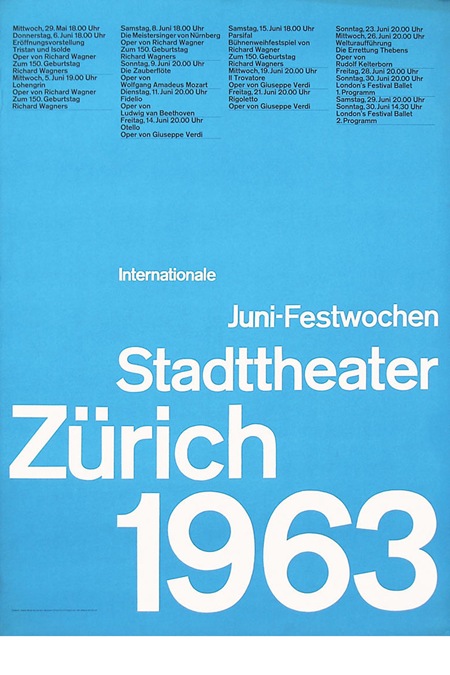
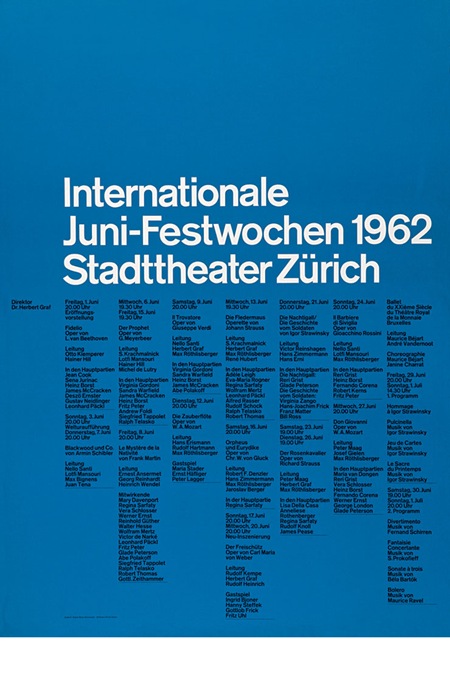
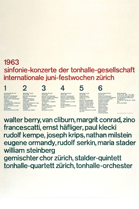
Some wonderful type / grid driven pieces here via helloairecords. There isn’t much info up there about the posters, perhaps someone can fill in the blanks.


Some wonderful type / grid driven pieces here via helloairecords. There isn’t much info up there about the posters, perhaps someone can fill in the blanks.

6 Comments Leave A Comment
M.H. says:
July 11, 2008 at 12:58 amStrict use of grids and colour palette. Much of the posters was produced by Swiss graphic designer Josef Muller-Brockmann. He produced Grid Systems in Graphic Design and The Graphic Artist and his Design Problems. Look for his books from YouWorkForThem or seek more information from Duane King’s website Thinking For A Living: http://www.thinkingforaliving.org
Best,
p.s. I’m a bit surprised your not familiar with Josef’s work.
mrcury says:
July 11, 2008 at 1:28 amYes, Müller-Brockmann! My favourite approach to type in posters. Oh, the font he used was almost exclusively Berthold’s Akzidenz Grotesk.
Antonio says:
July 11, 2008 at 7:22 amScott, like already mentioned, these posters we’re done by the legendary Brockmann. I write about him quite often on my blog, http://www.aisleone.net. He was a huge advocate of grid systems.
You can see more of his stuff at this online gallery:
http://www.imagenow.ie/gallery/flash.htm
As well as this collection at Blanka:
http://www.blanka.co.uk/Design/Muller-Brockmann
rafalski says:
July 11, 2008 at 3:49 pmImagenow should still have the neat catalogue from the Brockmann poster exhibition they had in 2004. It’s really worth getting.
Psychic Advice says:
July 12, 2008 at 12:02 pmToo bad i didnt come across this blog before. Great stuff you got here. Thanks.
Kelvin says:
July 13, 2008 at 10:12 pmHi Scott,
I was wondering,
since alot of your work is based on ultra tight typography and all,
it would be cool to have a post on the top 10 fonts that you use and some write up on them perhaps. Then in the comments we could discuss our favorite fonts and stuff.. Would be cool~