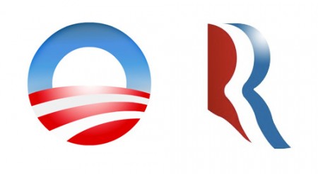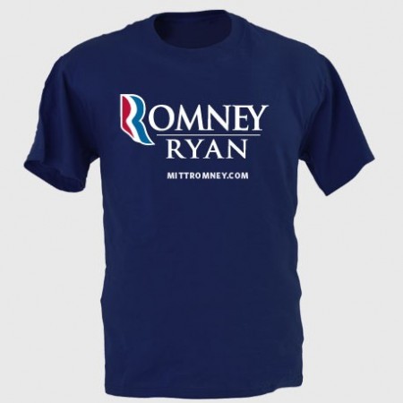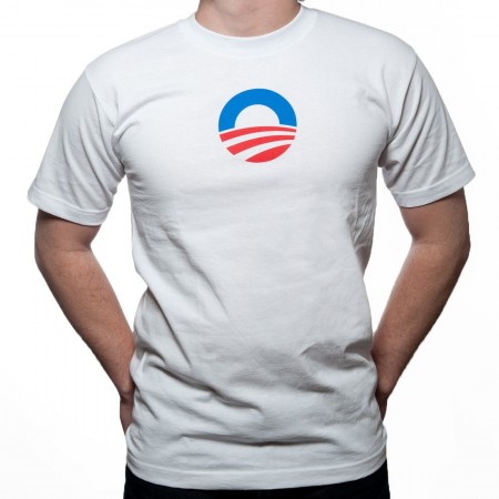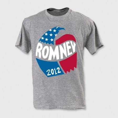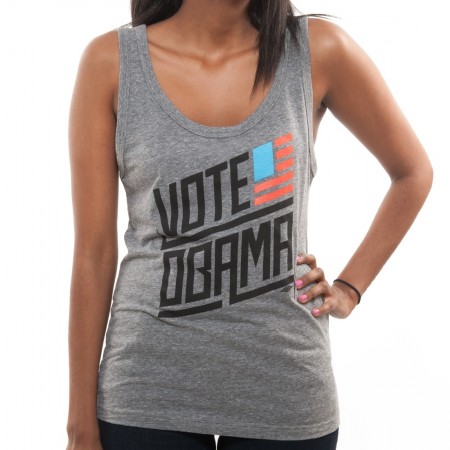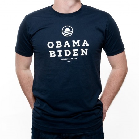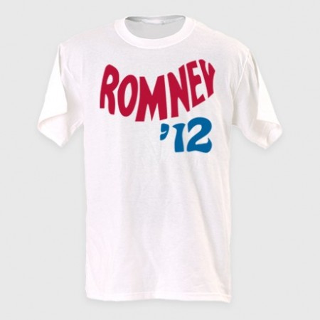
Now that most of us are familiar with logos both candidates are represented by for this U.S. presidential race in November, I wanted to take a second just to compare/discuss a few choices that were made. Below are links to their shops where a large collection of apparel, stickers, signs, etc. are available:
Barack Obama
Mitt Romney
**Please note, my views are strictly geared towards reviewing the merch/branding and nothing of the election, we are a design site and this post is just my opinion and not of Scott Hansen or any of the rest of the contributors.


“The Logo”
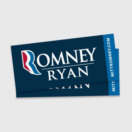
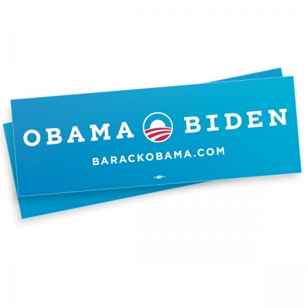
I for one am surprised by the Romney logo, its actually not awful, when I first saw it I thought it was too loose and it had weak traits that wouldn’t translate well once it started getting pressed on things and it didn’t hold well by itself. When you lay it on a shirt with an outline it turns to garbage like many things but on white it actually has some legs. As for Obama’s logo I think its been clashing too much with the Bank of America logo in my head but once I shake that thought its solid, if feels right any which way you put it. Its almost a self contained environment within an icon, he should be proud.


“The Designer”
Both sides see that there is reasoning in this day in age to actually put some thought behind designing a shirt for the people that are going to dish out $30 and actually wear the shirt because they like the design. Both sides came with something consciously stylized, i’m sure both candidates didn’t see these and approve BUT someone did. Both aren’t dreadful but Obama edges out Romney on this one as well and here’s why: Obama went after the goal/statment and makes you read it while Romney just threw something “retro” looking and the message isn’t there. From the “Keep Calm And Carry On” iPhone Cases to garbage like “Swag” tees, in my observations this years youth and shirt buyers want statements and type for the first time in a long time, its pretty shocking actually.


“Campaign Font”
I don’t think this is Romney’s “font” but it is landing on a few of the pieces he’s selling. I think its confusing or just overlooked. Why such a departure from the conservative look? who is it for? on the other hand Obama keeps it clean and uses his font well…but who needs a website anymore on a shirt? I mean come on? I do enjoy a small font sitting under the big font layout wise, there’s some comfort in it especially if you’re designing for the general public.


“The Don’t”
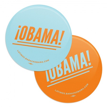
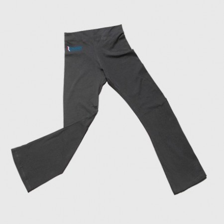
I had to add this section, I should have called it the “Head Nodding side to side” section. I mean COME ON! really? we’re bringing in Orange… “but its fun Jakub and the Latinos might like it”it’s confusing and throws a tiny wrench into the branding. The Romney yoga pants are just…blowing my mind, i’m not even laughing at them, its like I just swung myself over the swingset for the full rotation and landed hard. You don’t even benefit from someone wearing them, you hid the logo on dark grey on the hip, its joke by the merch team I get it, good work guys.


“The Classic Bumper Sticker”
Romney’s 2nd biggest failure in the merch department is the classic bumper sticker that every candidate needs… this thing is awful, its not 1988 and no one owns a Oldsmobile Cutlass Ciera to put this on. Obama’s is refreshing and more importantly brighter and only uses one blue and saved some cash by only printing with 2 colors which more cost effective, good choice.

I did an interview with Norway National Radio while I was there last week. It’s brief and you’ll have to speak Norwegian to understand most of it. They seemed to focus in on the political aspects of our conversation, most of the questions centered around the role of graphic design in American politics in the wake of the 2008 elections. Also, I had a cold so that’s why I sound like I just inhaled 3 packs of Camels.
On a side note, check out that logo! Love it.
NRK Radio Norway – Scott Hansen Interview
[audio:https://blog.iso50.com/wp-content/uploads/2009/10/nrk.mp3]

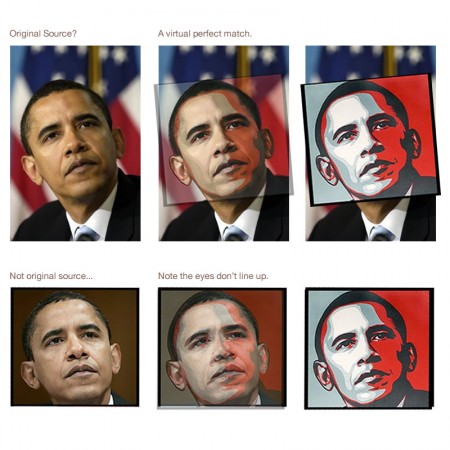
It was only a matter of time I guess. It seems like we just learned the source of Shepard Fairey’s iconic image for the Obama campaign and now Fairey himself is being sued by Associated Press for his appropriation of the image. This is when sorting out exactly what qualifies as “fair use” starts to get a little tricky. Fairey says he didn’t make any money from the image (frankly, I don’t see how that’s possible, but I’ll give him the benefit of the doubt), but AP alleges he made a boatload of it. Whatever the case may be, credit is due to the original photographer, but I don’t believe Fairey should be held liable for his use of the image. I think it could be — and hopefully will be — successfully argued that Fairey modified the image sufficiently. What do you think, does vecotrizing and coloring an image go far enough to differentiate the artistic product from the source? Sound off in the comments.
Update: Supertouch has posted a sort of official response to the general criticism Fairey has endured of late. Definitely worth a read if you took the time to read all the detractor’s sites.
Image via stevesimula

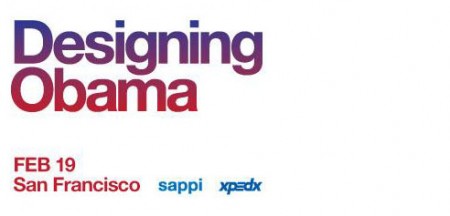
Sol Sender and Scott Thomas, the minds behind the Obama logo, will be in San Francisco in a couple weeks to talk about the process and development of the campaign. (Recall the Obama Logo Design videos that circulated a while back) I love hearing designers talk about their work, and even though I’ve heard just about everything possible regarding this logo, it should be interesting to hear them explain and answer questions about their process, in a live setting. The event is free. Register here.
Designing Obama
February 19th / 6-8:30pm
Morgan Auditorium
491 Post St at Mason
San Francisco, CA


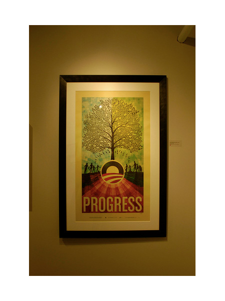
Apparently the Manifest Hope DC show was a big success with a great turnout. Theodor3 posted the pic above on flickr and Piecemaker has some up as well. Unfortunately, I don’t have any personal shots of the print as I didn’t get a chance to grab any before the framed version went out. The print sold so maybe the purchaser or someone else with shots from the show could send a full size head on of it. Notcot also has a lot of great shots from the show here and here. Thanks to everyone who came out and supported, wish I could have been there to see it for myself!

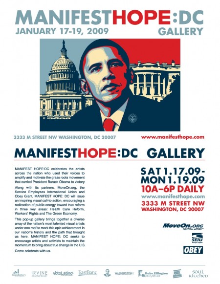
My “Progress” print will be featured in the upcoming Manifest Hope:DC Gallery as part of the lead up to the inauguration ceremony on Tuesday. The gallery runs Saturday, Jan. 17 through Monday, Jan. 19 in DC. I had #112 of the original 200 I signed at press framed and shipped it out last week. Unfortunately, I won’t be able to attend, hopefully somebody can check it out and let me know how it went. Here’s the details:
The MANIFESTHOPE: DC Gallery will be open to the public in Washington, DC for the days preceding the Presidential Inauguration, Saturday, January 17th, 2009 through Monday, January 19th, 2009 between the hours of 10:00 AM – 6:00 PM. Art exhibition management will be provided by our Washington, DC gallery partner, Irvine Contemporary.
MANIFESTHOPE: DC
January 17th-19th, 2009
10:00am – 6:00pm
3333 M Street NW, Washington DC 20007
http://www.manifesthope.com

