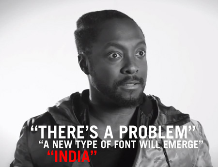
I dare you to watch this all the way through; I still haven’t made it. Is this a joke? If so, who’s in on it? I have to imagine that someone at WSJ, at some point between filming and uploading the video to Youtube, realized this man was completely insane but just decided to roll with it. Either that or Will.i.am has an incredible sense of humor and this is just the first in a series of hilarious lectures where he just fires off random thoughts from the top of his head about various topics ranging from foreign policy to automotive design.
Who thought it would be a good idea to interview Will.i.am about logo design in the first place? What was that whole thing about India? So many questions…
To make it easier on you I’ve distilled the wisdom of this video down to some key concepts you need to be familiar with when developing a logo: “The New World”, “What India is going to do to the world”, “English, but with a different alphabet”, “Problems”, “Don’t use the word brand”, “New types of fonts”.
Lake logos have a tendency to be, well, fairly ugly. This project was created to rethink what they could be.
One Minnesota Lake. One Logo. Every day.
Should only take a little over 27 years to hit ’em all. Stay tuned and enjoy!
– Nicole Meyer
Who wants to get something similar going for California State Parks, which continue to be in danger of being affected by massive budget costs, some might even be closing soon? Just throwing it out there…
Matt Lehman is really good at logos, and illustrations. It’s been a long time since I’ve seen such a fun and well executed branding portfolio. There are some straight up classics in there, and that Warner Nashville one, wow. I’d love to see this guy get more into poster work, but simplified. I feel like some of his illustrations tend to get a little busy while minimalism seems to be his strong suit. The two included above are good examples of a nice balance of clean lines and texture.
Creative Review has a great post on their favorite logos. Each logo was chosen by different designers and writers, each giving their reasons for the choice.
Switzerland’s current national airline (no, not that old one with the best branding possible) has undergone a rebrand and Brand New has all the details. A lot of people have been grumbling that the original “cube” logo was better — and I certainly agree — but judging this at face value, I have to say I’m into into it.
Swiss Airlines has a rich history that has been hidden in the archives for quite some time. On March 26th, 1931 when Swissair formed, I doubt anyone at the time really considered the history that they were going to be making with the company’s design. Balair and Ad Astra were the two companies that merged to form Swissair. Throughout the years they’ve changed logos many times but there was one that was most memorable (above). Quite possibly it was the best logo that the company has ever used.
Thanks to SR692 for collecting this information so that we’re able to walk through past logos used by Swissair. Some great, some not so great and a few that were very, very experimental. Hit the jump to see how the company logo changed throughout the years.
The Museum of Flight displays an impressive collection of vintage airline logos. As I’ve just spent most of my young life traveling between DC and SF over the holiday, airline logos aren’t exactly what I want to be looking at right now — regardless, some of these are too good for me to mind. Lufthansa is still my absolute favorite (I gravitate towards anything with a stylized bird). The images are relatively high quality and they have a ton more over on their site.
")
")
")
")
")
")
")
")
")
")
")
")
")
")
")
")
")
")
")
")
")
")
")
")
")
")
")
")
")
")
")
")
")
")
")


