


The above are some examples of the flags of the various cities, towns and villages of Japan. After looking at these, the “logo” for my town is very depressing. If I had one of these instead, flying over the place I lived, I would feel infinitely cooler and forever at ease. I am amazed at 1) how many different logos there are and 2) how many of them are absolutely incredible.
The original post on Pink Tentacle has many more on display. You can also see the full (and massive) list on Wikipedia.


Some very nice scans of 1960’s and 1970’s Scandinavian logos from Oliver Tomas’s Flickr. As great as these logos are, it’s always amazing how much better things look when scanned from a well printed page. The texture and imperfect edges really take it to the next level.
Via Oliver Tomas
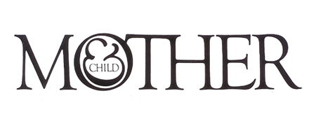
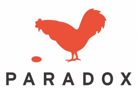
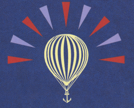
I am usually reluctant to list my favorites of anything. It’s hard to establish a consistent criteria with which to judge all items fairly, and even if you do, the list changes so frequently that it’s pointless to commit it to writing. My one exception has always been logo design, and Scott’s recent post got me thinking about it again. For as long as I’ve been interested in design I have always maintained the exact same favorite logos. They aren’t necessarily in any particular order, but the three pictured above are far and away my favorite marks of all time. I’ve never been satisfied with logos that gain their strength over time or with gradual brand association; for me, a successful mark works right away.
Mother and Child by Herb Lublin
The immediate cleverness of this one is probably what is most attractive to me. I remember staring at it for about five minutes the first time I saw it in the back of Area. I couldn’t believe how at once simple and wonderfully complicated it was. The ampersand has always been my favorite symbol, so to see it employed so unusually was also very exciting.
Paradox by Christopher Simmons
Another perfectly clever image. It needs no explanation and the “aha” moment occurs instantly. I’m still impressed how much wit was able to be squeezed into one tiny little mark. Like many great logos, it appears incredibly simple and seemingly obvious, but only after it’s come to fruition at the hand of another designer.
Modest Mouse by The Decoder Ring
What a perfect single image. This is one I can’t look at without feeling incredibly jealous for not thinking of it first. It encapsulates so many different feelings and emotions in one single mark, while still managing to be aesthetically pleasing at the same time (though I can’t stand the colors). The designer sums it up nicely: It’s an idea I came up with because it represents stasis — the balloon will never go up or down. It’s just a general feeling I have about everything: Every time we seem to cure or solve something, another problem pops up.
Of course there are many other wonderful logos out there, but this is a top 3 after all. List yours if you can think of them!


Abuzeedo has posted a collection of “15+ Amazingly Clever Logos” taken from Michael Evamy’s book, “Logo”. Some pretty cool stuff in there but mostly it’s just nice to see them in quality printed form. Many of these — such as the USA network logo — I tend to take for granted. But when I see them printed so nicely in black and white on the page I gain a whole new appreciation for them. Still nowhere near this though.
