You’re looking at the Xerox Star which “represented the most complete implementation of the ‘Desktop Metaphor’ of any system until the advent of mature Desktop graphical interfaces later on the Mac and PC/Unix/Linux in the 1990s” [source:digibarn] Digibarn has posted up several Polaroids from 1981 depicting the various facets of the Star 8010’s interface (a few of which are shown below). I don’t know what’s more amazing: how ahead of it’s time this GUI was, or how little the OS interface has changed in the past 28 years. This was nearly three decades ago and we’re still clicking folder icons and using archaic pointing devices. Where’s my Minority Report interface!? My wrist hurts.
Check out all the rest of the hi-res Polaroids here.
Just a quick summary of this case since the details and “facts” have been shifting so much: Designer Jon Engle cried foul and the entire internet rushed to his aid. Engle accused a stock art site of stealing his designs and then billing him $18,000 for them. But as it turns out, he may be the real culprit. Read on and come to your own conclusions. This is an epic tale!
DOUBLE EDIT!: It just keeps looking worse for old Jonny-boy’s case. Jo just linked to a nice summary of this whole disaster which can be found here. Frank also sent in this link to some side-by-side comparisons of Jon’s work and the StockArt stuff. If this turns out to be all wrong, why did this guy do it? Perhaps he didn’t think it would blow up so big? If in fact this is all some elaborate hoax, $18,000 is probably the least of Jon Engle’s worries now. What a mess!
Edit: Wow! This is a saga for the history books. After posting this article, a few astute readers pointed out this thread on Reddit. Pretty interesting information there. I guess it’s up to you to decide who’s at fault here.
The alleged story — in Jon’s words — can be found here. But in light of recent information, you may want to take it all with a grain of salt. Either way, quite an interesting train wreck of a story this will be if it all turns out to be as upside-down as it’s starting to look.
I finally took the time to check out Daft Punk’s latest film, Electroma, tonight and I must say it was pretty impressive. The cinematography and visuals are breathtaking and the sound design and music (which was, sort of ironically, not made by Daft Punk) is incredible. The plot is pretty much an afterthought though; your standard issue vague, arthouse storyline that didn’t really move me in any way. But I didn’t want that out of it, nor was I expecting it, so I can’t knock the film for it. The substance is in the imagery and it’s simply beautiful. When paired with the excellent sound design it achieves a 2001-esque vibe, a sort of retro-future as imagined in the 80’s. You can watch a Vimeo clip from the film below featuring the superb laboratory scene (from which the stills above were taken). It’s out now on DVD and I would have included the cover and title graphics, but they’re pretty bad, which is a shame because a film with imagery like this just begs to be wrapped in quality design.
I couldn’t help myself but these 2 bands are very unrated and deserve 2 songs posted by each group.
One Second Bridge seems to be a Spanish duo that makes lovely faint daydream songs, N°2 really grabbed my attention because around the 1:26 min mark this looped echo comes in and steals your attention and fades out, its what I can only describe as the perfect interruption. Sucio Cielo Azul is a little more slow going but still stunning and at a perfect length.
Don’t mix up Cloudland Canyon with Canyon Country, Canyon Country has plenty of slow post showgaze vocals and definitely a hint of The Doves and/or GOOD Air.
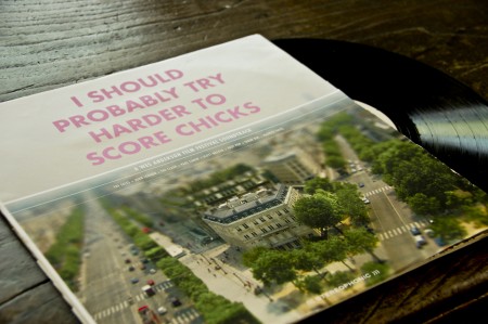
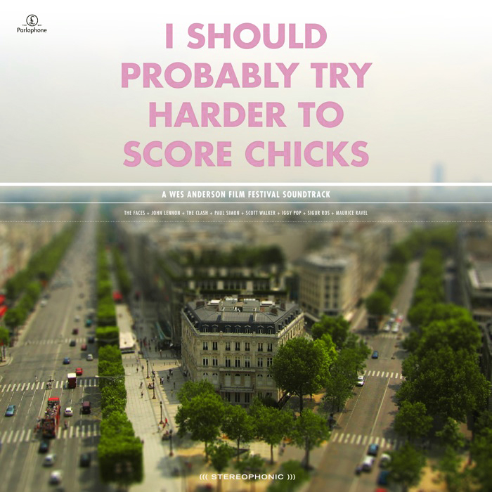
A while ago I mentioned a project I was working on for class regarding a film festival. The project is about halfway done at this point and I thought I’d post a little (tiny) bit of what I’ve been working on. The project is to create a hypothetical film festival centered around a director of our choice. We are to design all of the collateral that would support the festival; posters, catalogs, tickets, schedules, signage, products, a website, trailer, and DVD packaging to name a few. The style is to be reminiscent of the director, but we are not meant to copy the existing visual branding that surround the films.
As Wes Anderson is my favorite director, I decided to create my fictional film festival surrounding his work. His films are packed with beautiful imagery and all adhere to his very distinctive visual tendencies and style. Of all the directors I was considering (Gondry, Allen, Fincher) his work seemed to have the most exciting/appealing visual possibilities. I started out with a much different approach than what you see above, and was mainly just taking pictures of random objects and curiosities and slapping type over the whole thing. My first directions were really bad, fantastically terrible even. I was pretty much just poorly recreating shots from some of the films and not inserting any additional concept to the look and feel. (I’ll post some of these earlier directions in later process posts).
The direction I eventually landed on, and what you see a piece of above, was a combination of tilt-shift photography and Anderson’s typeface of choice. The use of Futura Bold is a direct tip of the hat to his style. I figured I needed to have at least one direct visual link, given that my image style was much more divergent, and Futura Bold would be immediately recognizable to anyone familiar with his work. The concept behind the tilt-shift choice was based on the observation that all of Anderson’s films seem to take place in a parallel social universe where people say what’s on their mind and things unfold in most peculiar ways. Anderson, being the auteur that he is, sort of curates this whole crazy universe. The tilt shift look, in addition to being visually captivating enough to grab attention, is meant to conjure this image of Anderson overseeing this unusual world that exists in his films. I have been tilt-shifting my own photography so far, with fairly successful results, and it’s been a fun technique to learn. I try to use my own photography whenever possible, and find the “Flickr look” (as in people sourcing images on Flickr) that pervades most projects at school exceptionally irritating. It’s hard to generate your own imagery for a project this big, especially if the concept is unusual, but I feel much more proud of the end result when everything is of my own creation.
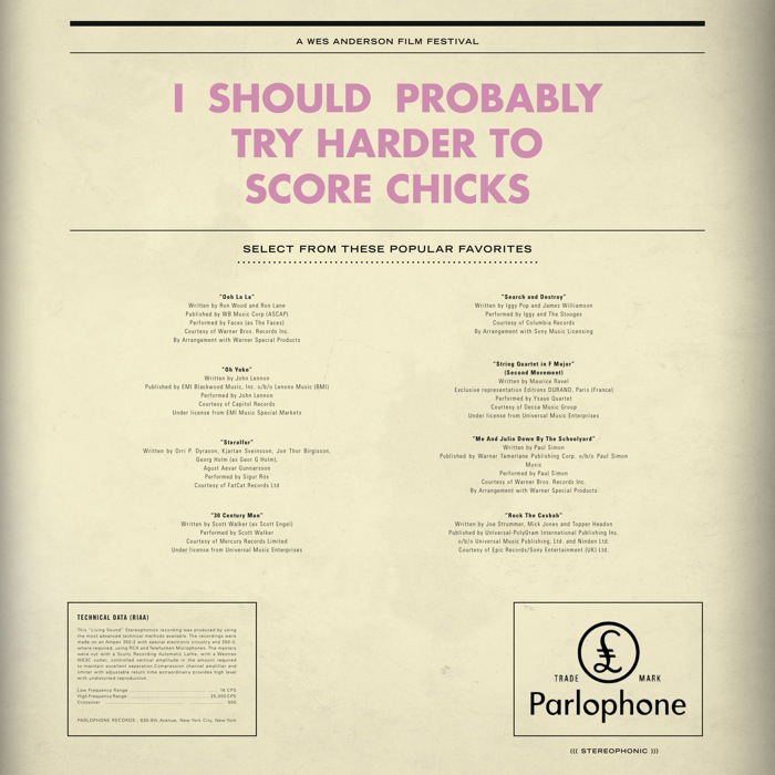
The centerpiece of the project is meant to be the logo. We spent the first couple weeks coming up with logo treatments and titles for our film festival (Just calling it the “Wes Anderson Film Festival” was not allowed). For my project, I have neither a title or a consistent logo mark. The logo and title unfold throughout my project, and are consistent in their type treatment and ridiculousness of the language. For example, the title of the LP above is “I Should Probably Try Harder to Score Chicks,” a line from Rushmore. The “logo” that appears at the top of the main film poster is “They Were Giving Each Other Handjobs While You Were Taking a Nap by the Pool.” When you see a lot of pieces of the puzzle, the lack one mark is not evident because the consistent type treatment and language tie everything together. It’s also fun to have super random sentences gracing the front of all of the work; makes for a much more humorous project.
Above is just one piece of the massive project that I am attempting to put together. It is a soundtrack of songs that are either in some of the films, or feel like they might be, and is still very much a work in progress. Having landed on a image/type style, with about a month to go, my motivation has trickled to a crawl. The hardest thing for me is conceptualizing what the project will look/feel like, and once I have this locked down (and it’s just a matter of applying it to all the different formats), I lose a lot of interest in what I’m doing. I’ll kick back into gear soon, and hopefully will have more pieces to show in the weeks to come.
It’s been a few weeks since we launched the ISO50 Playlist and now a brand new set of tracks is loaded up for your listening pleasure. Just hit play — top of the page, center column (RSS readers must visit site to listen). I am working on the code to allow loading of older playlists which will be archived in the future. Enjoy!
1. SKALPEL – SCULPTURE
2. CLOUDLAND CANYON – DAMBALA
3. BIBIO – ABERRIW
4. JIM O’ROURKE – FUZZY SUN
5. M83 – YOU APPEARING (ADDLED EDIT)
6. GROUPER – HEAVY WATER/I’D RATHER BE SLEEPING
7. TSTEWART – WHAT’S THIS COLOR
8. AMERICA – AMERICA – TIN MAN
9. MICHNA – DO WHAT YOU WANT TO DO
10. RATATAT – MONTANITA
11. STUDIO – LIFE’S A BEACH!
12. PETER BJORN AND JOHN – ERIK’S FISHING TRIP
13. TOM TYLER – DAYLIGHT ROBBED HER
14. CLOSER MUSIK – 1,2,3, NO GRAVITY
15. FARBEN – AS LONG AS THERE’S LOVE AROUND – ORIGINAL MIX
16. PAUL KALKBRENNER – AARON
17. THE CHAP – AUTO WHERE TO
18. MILOSH – COULDN’T SLEEP
19. MOUNTAINS – BLOWN GLASS TYPEWRITER
20. ANIMAL COLLECTIVE – VISITING FRIENDS
Hit play on the player at the top of the page (center column) to start.
@McCrothers pointed out the fact that you could find some very interesting vintage items on Etsy. I thought it was all about handmade accessories and trinkets, but the above examples suggest otherwise. They’re from the 26 Olive Street shop where you’ll find a few other interesting odds and ends along with a lot of nicely Poladroid-erized product shots. This comes via a Valet article breaking down the Etsy second-hand market.