Process Post / Student Project
A while ago I mentioned a project I was working on for class regarding a film festival. The project is about halfway done at this point and I thought I’d post a little (tiny) bit of what I’ve been working on. The project is to create a hypothetical film festival centered around a director of our choice. We are to design all of the collateral that would support the festival; posters, catalogs, tickets, schedules, signage, products, a website, trailer, and DVD packaging to name a few. The style is to be reminiscent of the director, but we are not meant to copy the existing visual branding that surround the films.
As Wes Anderson is my favorite director, I decided to create my fictional film festival surrounding his work. His films are packed with beautiful imagery and all adhere to his very distinctive visual tendencies and style. Of all the directors I was considering (Gondry, Allen, Fincher) his work seemed to have the most exciting/appealing visual possibilities. I started out with a much different approach than what you see above, and was mainly just taking pictures of random objects and curiosities and slapping type over the whole thing. My first directions were really bad, fantastically terrible even. I was pretty much just poorly recreating shots from some of the films and not inserting any additional concept to the look and feel. (I’ll post some of these earlier directions in later process posts).
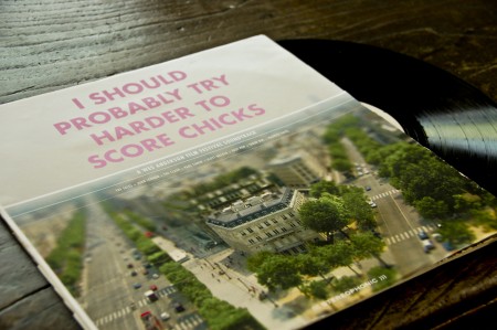
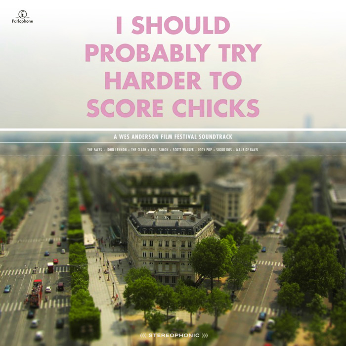
The direction I eventually landed on, and what you see a piece of above, was a combination of tilt-shift photography and Anderson’s typeface of choice. The use of Futura Bold is a direct tip of the hat to his style. I figured I needed to have at least one direct visual link, given that my image style was much more divergent, and Futura Bold would be immediately recognizable to anyone familiar with his work. The concept behind the tilt-shift choice was based on the observation that all of Anderson’s films seem to take place in a parallel social universe where people say what’s on their mind and things unfold in most peculiar ways. Anderson, being the auteur that he is, sort of curates this whole crazy universe. The tilt shift look, in addition to being visually captivating enough to grab attention, is meant to conjure this image of Anderson overseeing this unusual world that exists in his films. I have been tilt-shifting my own photography so far, with fairly successful results, and it’s been a fun technique to learn. I try to use my own photography whenever possible, and find the “Flickr look” (as in people sourcing images on Flickr) that pervades most projects at school exceptionally irritating. It’s hard to generate your own imagery for a project this big, especially if the concept is unusual, but I feel much more proud of the end result when everything is of my own creation.
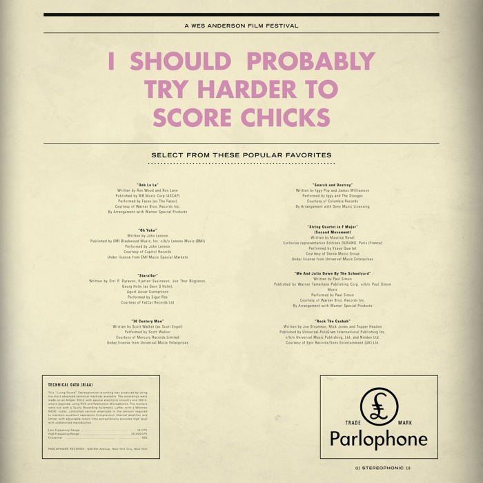
The centerpiece of the project is meant to be the logo. We spent the first couple weeks coming up with logo treatments and titles for our film festival (Just calling it the “Wes Anderson Film Festival” was not allowed). For my project, I have neither a title or a consistent logo mark. The logo and title unfold throughout my project, and are consistent in their type treatment and ridiculousness of the language. For example, the title of the LP above is “I Should Probably Try Harder to Score Chicks,” a line from Rushmore. The “logo” that appears at the top of the main film poster is “They Were Giving Each Other Handjobs While You Were Taking a Nap by the Pool.” When you see a lot of pieces of the puzzle, the lack one mark is not evident because the consistent type treatment and language tie everything together. It’s also fun to have super random sentences gracing the front of all of the work; makes for a much more humorous project.
Above is just one piece of the massive project that I am attempting to put together. It is a soundtrack of songs that are either in some of the films, or feel like they might be, and is still very much a work in progress. Having landed on a image/type style, with about a month to go, my motivation has trickled to a crawl. The hardest thing for me is conceptualizing what the project will look/feel like, and once I have this locked down (and it’s just a matter of applying it to all the different formats), I lose a lot of interest in what I’m doing. I’ll kick back into gear soon, and hopefully will have more pieces to show in the weeks to come.

21 Comments Leave A Comment
Serviceburo says:
April 6, 2009 at 1:04 pmI like the use of the tilt/shift image on the front, it gives me a feeling very reminiscent of “The Life Aquatic” particularly the scenes featuring the cutaways of the boat. The overall feeling of what you’ve shown here does fit in well with Anderson’s visual sense, but if I were to modify anything, it would probably be the hue of the photo. Perhaps adjust it a little more to the yellow side of things, I think that would help it blend in better with the vintage-style typography that you are using. Great start, definitely curious to see the final piece.
Alex / HeadUp says:
April 6, 2009 at 1:21 pmSounds like a great project, and Wes Anderson would most definitely be my choice. To go along with Serviceburo’s crits, I think the idea of paying homage to his style with Futura Bold (I picked up on it instantly, as you said fans would) is great, but your colors could be a little more on. That is, I see you’re hinting at Royal Tenenbaums with your choice of pink, but does that hue match up with the photo, or, more obviously in my eyes, with your choice of such a desaturated white/grey just under the main title on the front. I agree with Serviceburo, maybe a little more yellow, to give the pink a bit more warmth and age. Also, I’d consider increasing the sizes of the song titles on the back slightly, I know these are just small previews, but it looks like you have some room to play with.
Great project, thanks for sharing, and good luck, it looks like it’s on track to do Wes Anderson’s work justice!
Kyle says:
April 6, 2009 at 1:33 pmOh man, I love that typography on the back. Excellent work, Alex.
frank says:
April 6, 2009 at 2:53 pmI don’t think the white lines on the front cover are necessary.
Also,
I Should
Probably Try
Harder To
Score Chicks
feels weird to me. as does the back cover
I Should Probably
Try Harder To
Score Chicks
Maybe
I Should Probably Try Harder
To Score Chicks
or
I Should Probably
Try Harder To Score Chicks
I don’t know, you have a lot of horizontal room there though.
Otherwise, it looks great.
leslie says:
April 6, 2009 at 3:48 pmWhere are you studying? And, do you like your program (grad/undergrad)?
Rent says:
April 6, 2009 at 6:13 pmlooks great so far alex…please definitely update us when you finish this project cause I’d love to see it in its entirety.
Chris says:
April 6, 2009 at 6:39 pmI think it looks great! What’s the class and program you’re working toward?
Chris says:
April 6, 2009 at 6:40 pmNevermind… I really should read these posts first.. =)
jacob says:
April 6, 2009 at 10:00 pmAlex:
Just don’t let Hunter get you down!
;o)
Stoinov says:
April 7, 2009 at 12:36 amWhich city is that? really like it :)
alex says:
April 7, 2009 at 9:53 am@Stoinov- It’s a photo of Paris, taken from the Arc De Triomphe. The perspective of the photo made it a good candidate for tilt-shifting. The only problem with this photo is that it was taken with my tiny little Canon pont-and-shoot, so I cannot use it for anything to large. (The poster, for example, is 30″x40″) But alas, that’s why I have more photos..
Kevin Barrios says:
May 21, 2009 at 8:32 pmHello Alex,
Really great work here. I am a Visual Communications lecturer at the Raffles Design Institute in Singapore and I often deliver a module entitled, “Independent Research”, which is basically a self-initiated major project for final year diploma students before they enter the BA program. I find that your Wes ANderson project is a great example of the kind of work I expect out of my students, so I plan on showing them your project as a case study. I was wondering if you are fine with that, if you could send me the file with the trailer so I can embed it into my presentation.
Regards,
Kevin Barrios
alex says:
May 21, 2009 at 11:03 pm@ Kevin- I’ve sent you an email, but just in case- feel free to use the project as a case study, that sounds awesome. For the video, if you go here:
http://vimeo.com/4526218
On the right side of the page below “other videos” is an area where you can download “quicktime version”. This is full quality video file and it should be a good size to embed into you presentation. Thanks!
tbbhsdgzt says:
September 2, 2009 at 7:03 amgDxUzO hckilwybseom, [url=http://zqjubdxjjgmb.com/]zqjubdxjjgmb[/url], [link=http://giuivtijwebc.com/]giuivtijwebc[/link], http://egoctyljnova.com/
Design School says:
September 12, 2009 at 11:48 amThere’s a long list of issues that need re-examining and solved before taking admission or apply for it?