Beast in a Neon Cage / Process Post
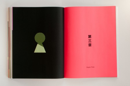
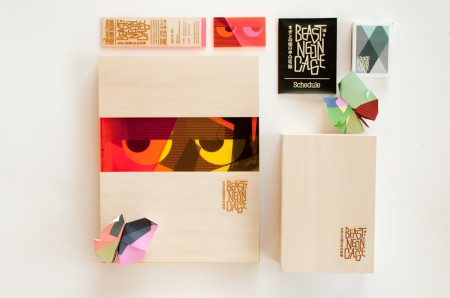
I’ve been meaning to write up process posts for some of the work I’ve created while studying at the Academy of Art University, and now that it’s a new year I figured it would be a good time to get started.
Beast in a Neon Cage is the name of a hypothetical film festival I created during the Fall 2010 semester. The assignment was to create a festival for a director of our choice and develop a brand and visual identity to extend across multiple pieces including: a poster, catalog book, DVD set, soundtrack, letterhead, schedule, tickets, signage, website and numerous products. Previously, Alex wrote about the process of designing his festival for Wes Anderson here, here and here. Instructors at AAU continue to use his festival as a benchmark for a successful project.
My list of possible directors included John Singleton and Paul Verhoeven, but in the end I chose legendary cult director, Seijun Suzuki. Suzuki made over forty movies in the 50s and 60s for the Nikkatsu Company before he was fired for his increasingly surreal visual style (the studio wanted him to make standard yakuza action flicks). He sued for wrongful dismissal and ended up blacklisted from the industry for ten years. I chose Suzuki because I was intrigued by his story and felt that his prolific career would provide ample material to draw from.
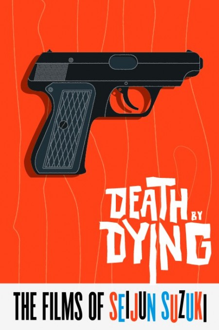
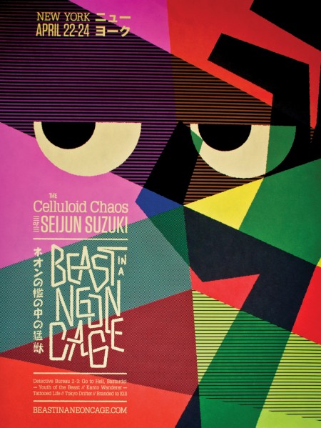
This was my first attempt at developing a visual style for the project, but for a director who was known for pushing boundaries the design felt dull and uninspired. Suzuki’s films embraced the freewheeling spirit of jazz, so I turned to sources like Project Thirty-Three for inspiration. I played around with abstract shapes and different color combinations, but things didn’t start to gel until I looked more closely at the director himself. In many ways Suzuki’s films were a metaphor for his own struggle within the studio system. Like the gangsters and crooks in his films, he followed his own code but found himself trapped by society at every turn. Based on this idea, and using language from the titles of his own films (names like Tattooed Life, Underworld Beauty, Tokyo Drifter, Youth of the Beast, and Branded to Kill), I came up with the title “Beast in a Neon Cage.”
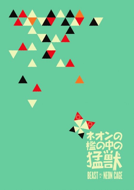
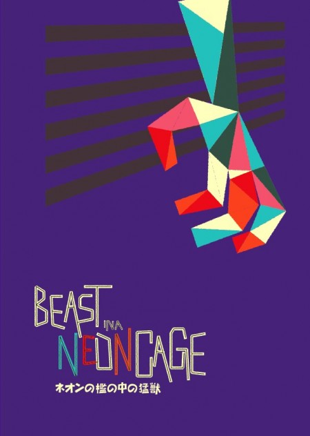
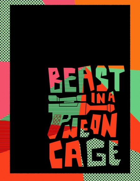
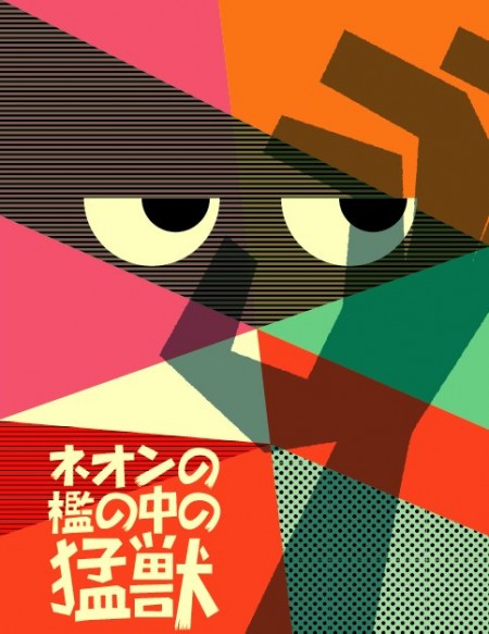
As the metaphor developed, the visuals started to fall in line as well. The series of images above shows a rough progression of my visual experimentation. Bursts of color are a trademark of his films, and I wanted to make color an important component of the visual language. Cartoon elements represent the dark humor that frequents his work. Another hallmark of Suzuki’s films are his larger than life characters (one assassin has an obsession with the smell of boiling rice), so I felt the eyes added a much needed human element that was absent from previous designs. Once I had settled on the name, I focused on the word mark. I looked to neon signs for inspiration and continued to refine everything until arriving at the layout, logo, and colors in the final poster.
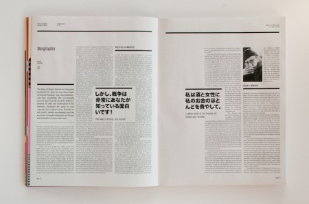
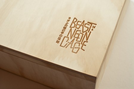
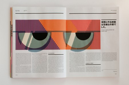
The design of the catalog book was meant to mirror the festival’s theme with adherence to a strict three-column grid for the body copy, while the color illustrations and Suzuki’s own quotes are the only elements that break the grid. The theme of being caged in extends to the packaging as well with simple raw wood boxes hiding interiors that burst with color.
To create this effect I used different colored sheets of plastic from TAP Plastics. The plastic I purchased from TAP came in rectangles, so I used an Epilog laser at Techshop to create the different angled pieces. This was my first experience taking a class from them, and I absolutely recommend their facilities if you are looking to do some laser cutting/engraving yourself. Monthly memberships are a little pricey, but they have package deals every now and then. If you plan your time well you can always pay for a single month and knock out all your projects in a few weeks. A benefit of learning to use the Epilog was that I could engrave my wood boxes rather than using a rubdown like I originally planned.
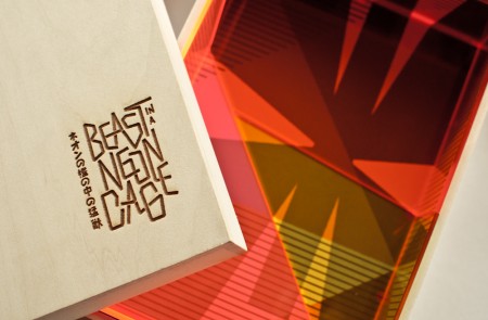
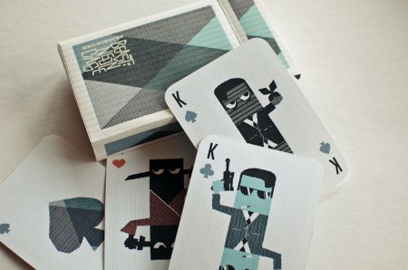
The last two images demonstrate how the visuals extend to the packaging and other products. Overall the project was a great learning experience. It pushed me to generate quite a bit of original artwork that followed the same visual cues. Apart from some silkscreening classes I took the semester before, it was also the first project where I really got my hands dirty with the craft side of things, and after a semester of designing it’s nice to see your work come alive as physical pieces. So that’s it, I hope that was informative, and for any AAU students working on their festivals as they read this, don’t worry, we all make it through in the end!

16 Comments Leave A Comment
Jakub says:
January 3, 2012 at 9:41 amInsanely good Jon
Abe says:
January 3, 2012 at 11:55 amBravo!
slofu says:
January 3, 2012 at 4:07 pmBrilliant work, Jon! Keep it up!
pirijan says:
January 3, 2012 at 6:35 pmThis is just jaw-droppingly, amazingly inspirational. Thanks for sharing this!
Jon says:
January 3, 2012 at 11:44 pmThanks for the kind words!
the professor says:
January 4, 2012 at 8:50 amvery nice work topped off by a well-artculated process walk-through. bravo. it’s nice to see the “interim” designs here, as well — something you don’t always get to see, but proves that it’s not a “rabbit out of the hat” solution. i trust you’re entering this into as many design competitions as you can…
Amy Stoddard says:
January 4, 2012 at 11:09 amwow! insanely inspiring mid-century form, palette and blend of textures.
James says:
January 4, 2012 at 12:18 pmThis piece immediately reminded me of a scene in tokyo drifter before i even saw the name seijun suzuki. This is a very good representation of his work.
Jon O says:
January 4, 2012 at 2:35 pmis everybody at AAU incredibly good at design? really great work!
did you design the whole deck of cards?
bossnotboss says:
January 4, 2012 at 3:20 pmWe all demand more process posts because they’re awesome
Jon says:
January 6, 2012 at 12:12 amThanks for the feedback!
@Jon O – Yup, the cards were designed as a giveaway for festival attendees.
And yes! I’m very fortunate to be in the program with many talented individuals!
kevin says:
January 9, 2012 at 10:37 amwhat the heck dude! your studies are just as awesome as the final! when are you going to make a poster set???
Alex / HeadUp says:
January 9, 2012 at 1:44 pmThis is the kind of project I wish we had at Parsons, thanks for sharing your process! Incredible work!
Clint says:
March 15, 2012 at 10:30 pmWould it be possible to purchase a version of your festival poster? I would love to have one!
johnny neill says:
March 28, 2012 at 9:18 amI am with Clint! Any of these items, an uncut sheet of cards, a poster, the book, would be great. I have a few original posters of Seijun Suzuki and have been a fan of his for years.
Anja says:
March 30, 2012 at 11:23 amFor me, this is as good as it gets. Your work is amazing. And yes, if you ever decide to make posters and/or postcards I´ll happily buy!