DEC PDP-8
Posted by Scott
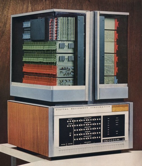 One of the greatest images I’ve ever seen. You think it couldn’t possibly get any better but then you realize that DEC logo is set in Hellenic Wide (zoom in).
One of the greatest images I’ve ever seen. You think it couldn’t possibly get any better but then you realize that DEC logo is set in Hellenic Wide (zoom in).
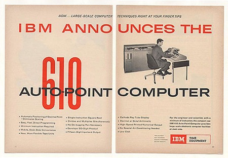
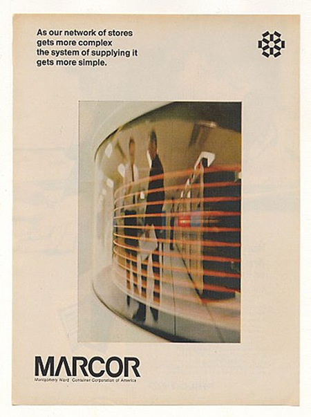
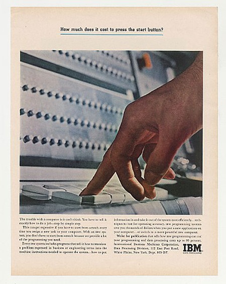
Rob Beschizza posted 101 Classic Computer Ads over at Boing Boing. I am recognizing a lot of them from my Newsweek collection, but there are some unfamiliar gems in there as well. Check out that Trade Gothic Extended action on the IBM 610 ad. And everything about that Marcor page is just perfect. Of course, a lot of it ranges into the camp / kitsch zone, but it’s still entertaining. Link
Bonus: Can anyone identify the face used for the condensed red "610" in the first ad? Let us know in the comments.
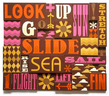
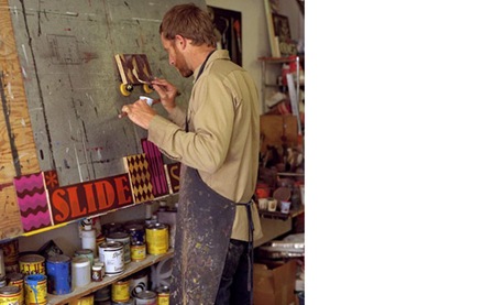
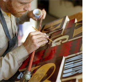
Jeff Canham is a sign painter / designer who hails from my very own neighborhood. Funny how I had to stumble across his site on a blog to realize this guy is operating right down the street from me. Such is the irony of internet I suppose. Anyways, it’s great to see that somebody’s still doing it the old school way; if it weren’t for artists like Canham, dying design mediums such as hand lettering would disappear completely. You can check out the rest of his work at his site.
I don’t know where I stumbled on to this video, but It’s amazing, hilarious, and insightful all at the same time. Judging from the title I thought I was about to be subjected to some sort of right-wing rant about morals and values in America, little did I know I was actually in for a very down to earth lesson in design. I really like this guy’s attitude and it’s rare that you hear someone speak so frankly and unpretentiously about design. In my opinion, he hits the nail on the head with this and I couldn’t agree more. Even if you don’t agree with him, you absolutely must agree with the Futura titling.
I don’t have much info on this, but apparently it’s a trailer from an upcoming series called The Draplin Project featuring a guy named Aaron Draplin. Aaron’s site is full of interesting stuff and some very nice examples of industrial modernist design. I’ve posted the poor quality YouTube version above for ease of viewing, but you can also download the hi-res Quicktime version from Jess Gibson’s site.


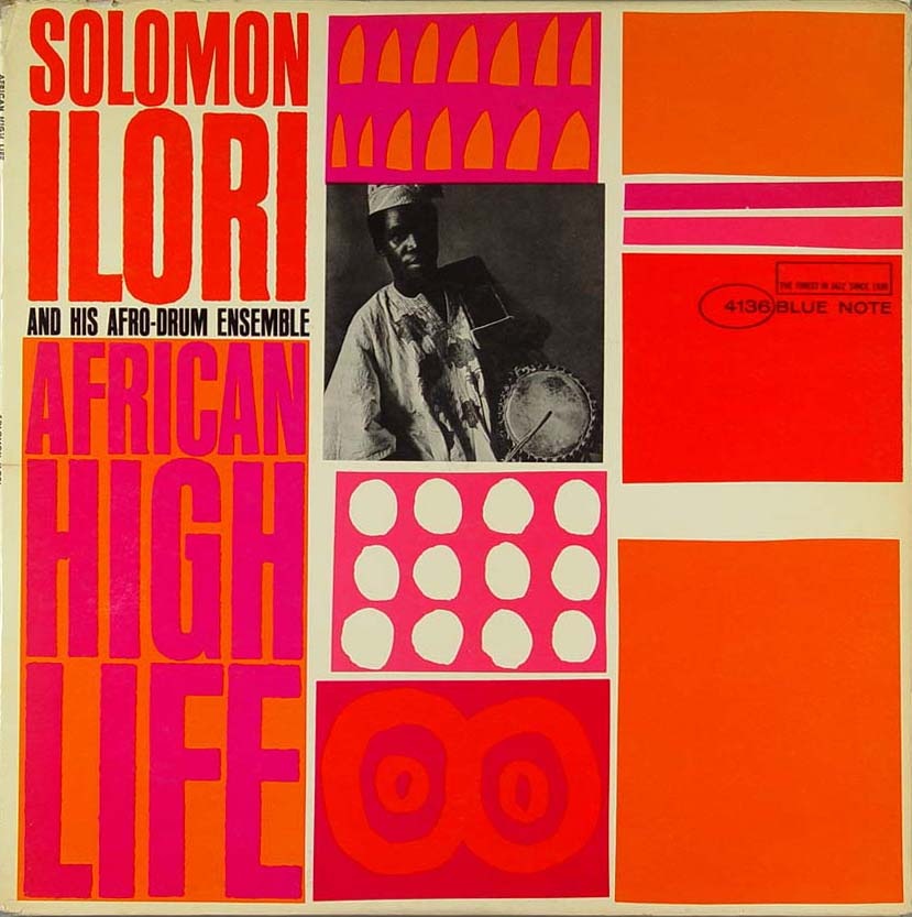
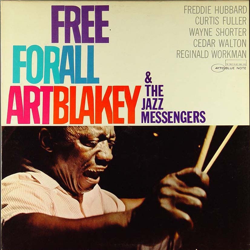
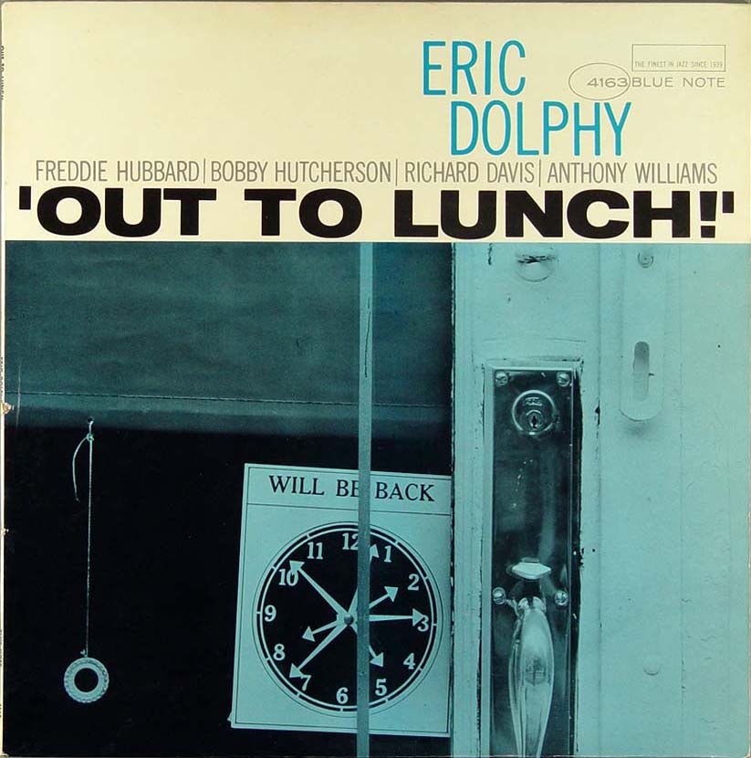
In the last Blue Note post I went with the more duo-tone offerings but with these 4 covers we see a bit more color injected into the compositions. That Dexter Gordon one is choice, this sort of stuff really needs to be offered in poster form. I always wonder who actually owns the rights to these images, I assume EMI does (they now own Blue Note), so that doesn’t bode well for future large format prints.
Massive bonus round: Name all the fonts used on these covers.
By the way, if you missed it last time, there was quite a nice debate running in the comments after the original Blue Note post. Worth a read, some good opinions from people in there. But no matter how good your opinion is, you can’t sway me from my original position: Cream > White!
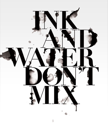
I just stumbled across Craig Ward’s site this evening. Really loving his type-centric design style. Check out the rest of his stuff here.
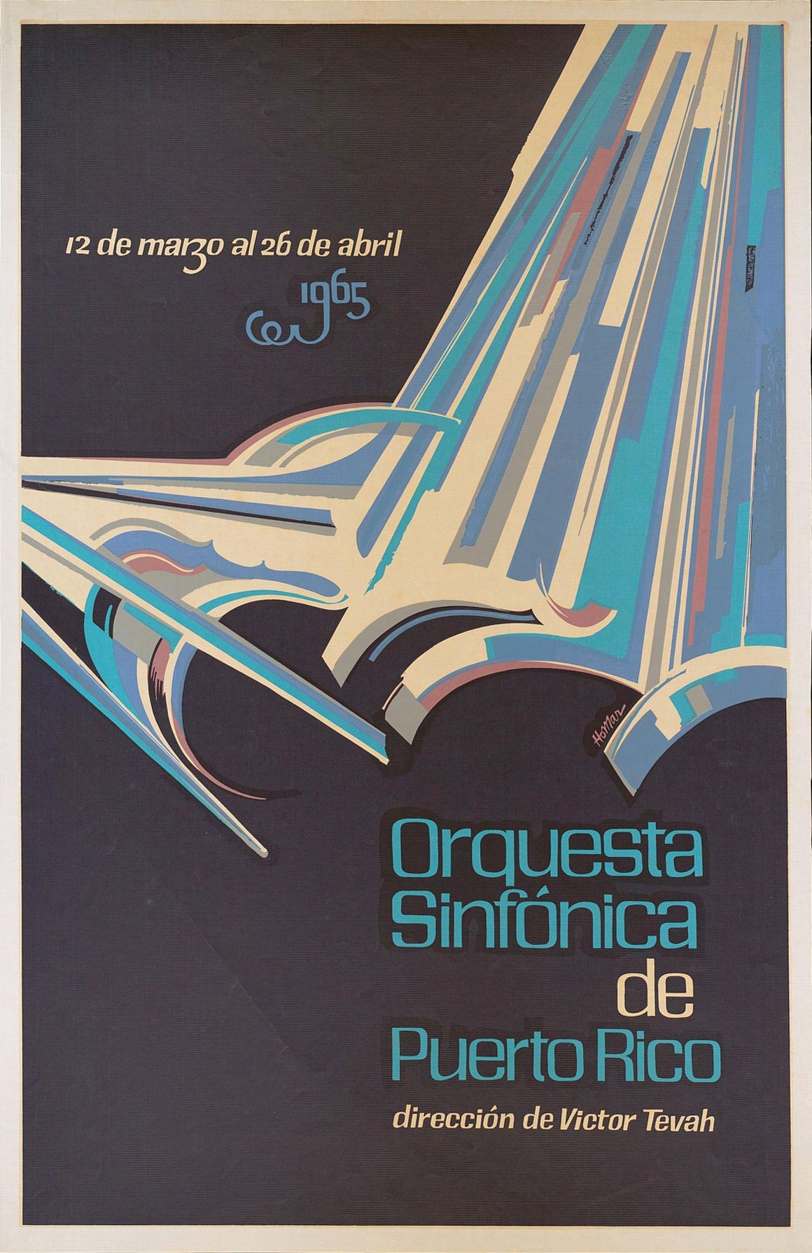
Some awesome typo going on in here, found it over at The Ministry of Type. It’s apparently by Puerto Rican artist Lorenzo Homar, there’s a full bio on him at the bottom of the page. Really very nice hand lettered style, The Ministry briefly discusses the possibilities of creating a digital typeface based on the top font up there, let’s hope that happens at some point. The bottom one, although obviously hand lettered, looks familiar…But I can’t put my finger on it. Any ideas?
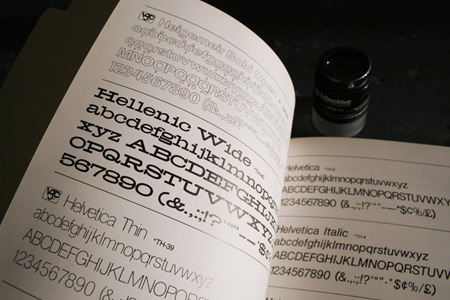
Thanks to Jared who identified the font in the last post as Hellenic Wide. Check out the comments in the original post for some modern digital reproductions.