101 Classic Computer Ads
Posted by Scott
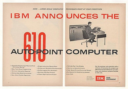
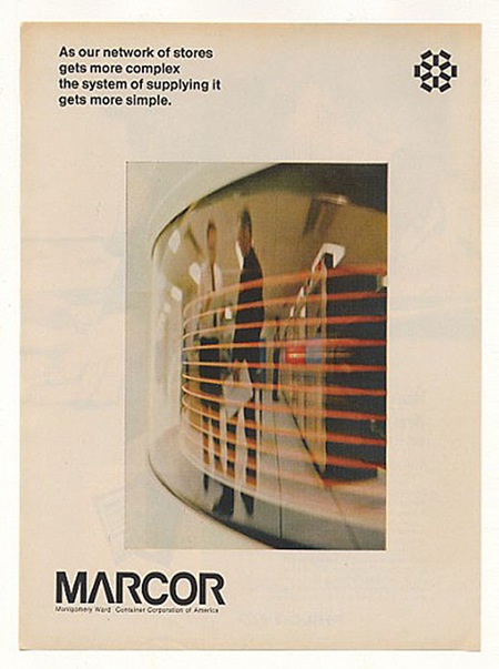
Rob Beschizza posted 101 Classic Computer Ads over at Boing Boing. I am recognizing a lot of them from my Newsweek collection, but there are some unfamiliar gems in there as well. Check out that Trade Gothic Extended action on the IBM 610 ad. And everything about that Marcor page is just perfect. Of course, a lot of it ranges into the camp / kitsch zone, but it’s still entertaining. Link
Bonus: Can anyone identify the face used for the condensed red "610" in the first ad? Let us know in the comments.

12 Comments Leave A Comment
Rob says:
August 19, 2008 at 7:04 pmThanks for the link. Most of those were gathered from eBay auctions, unfortunately, so I don’t even have the pleasure of viewing the originals.
Most people focus on the goofiness, but there is such wonderful typography, especially in the older ones.
Scott says:
August 19, 2008 at 10:42 pmRob-
no problem, thanks for posting all those… the originals are nice but we can all benefit from the digitized versions, such a great resource.
yeah, the type in adverts during the 60’s was pretty darned good, it started to fall apart around 69-72 though.
Jason Tavarez says:
August 19, 2008 at 11:44 pmI was about to guess Droid for the font, but it’s not the exact same…
Scott says:
August 20, 2008 at 12:02 amjason-
good guess, but droid is from 2001, that as is probably from the early ’60s.
Jason says:
August 20, 2008 at 12:32 amActually, according to the guy who created the font he was inspired by some early signage from the 70’s. I have a feeling he was looking at the same one from the ad; if that’s so the fonts can be considered distant relatives!
Are you quizzing your readers or are you trying to find out yourself?
Joris says:
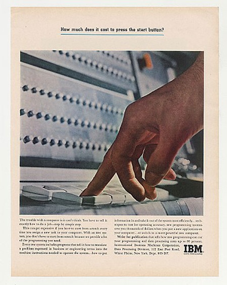
August 20, 2008 at 12:43 amWhy ‘s the guy in the last pic using his middle-finger to press the button?
Beautifull lay-out though, the Arcor reminds me of HAL & the whole 2001 ambiance.
Scott says:
August 20, 2008 at 1:53 amJason-
yeah, if a digitized version of the original isn’t available, an “inspired” face would be good too. But notice the “1”, it has a flat top in the original whereas droid has the slope on the protruding top edge.
I am trying to find out myself, I have been looking for a highly compressed, tall, very simple font (simple as it the clean lines, no slopes). I had been using Chalet Comprime for this purpose but this one is even taller and cleaner than Chalet. Although, this could just be a stretched version of some other face, or could be completely custom for this logo.
Baxter says:
August 20, 2008 at 5:52 amSome more that you might find appealing (higher-res, too):
http://www.dvq.com/oldcomp/oldads.htm
frank says:
August 20, 2008 at 9:25 amBee-heavy is close
http://www.myfonts.com/fonts/urw/bee/four-t/
nb3004 says:
August 20, 2008 at 10:20 amJust found these too, pretty awesome stuff.
http://pzrservices.typepad.com/vintageadvertising/
Scott says:
August 20, 2008 at 2:51 pmfrank-
cool, I will try that out.
baxter & nb3004-
thanks for the links!
Poster Printing | PrintPlace.com says:
November 27, 2008 at 8:31 pmWhat initially strikes me about these ads is that even in a low-res JPEG format, 40 some years later, these ads still translate. It’s a testament to the excellent choice of typeface and layout. Imagine designing an ad that would be discussed 40+ years later!
Thanks for the post. Check out some of these classic ads from Honeywell and Mac. They’re very funny but still demonstrate the importance of ad layout and type selection.
http://www.ministryoftech.com/wp-content/uploads/2007/06/honeywell_email_ad.jpg
http://www.macmothership.com/gallery/MiscAds/AdamAd.JPG