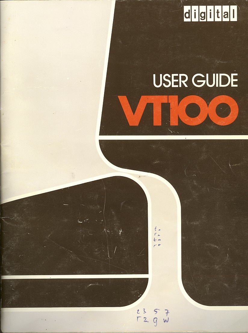
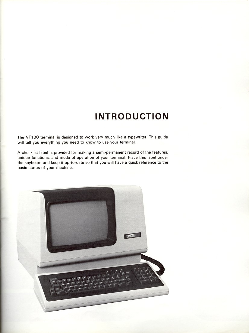
DEC VT100 user guide ca. 1978. That cover is vaguely reminiscent of the Eames Aluminum Group catalog from a while back and they’re even rocking some Avant Garde. The funny part about all these great vintage computer documents is that some engineer probably designed them as an afterthought on his day off.
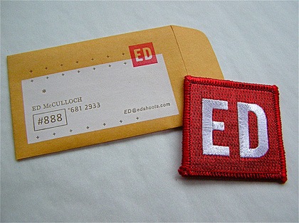
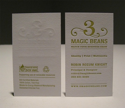
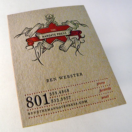
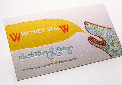
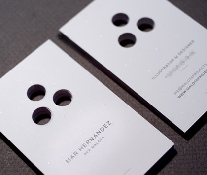
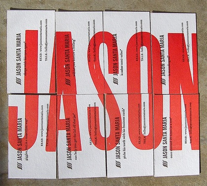
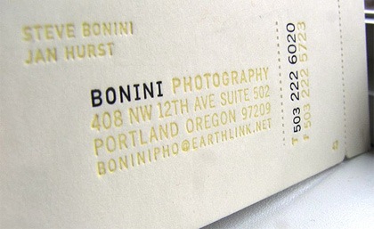
Fubiz has a post up entitled "70 Amazing Business Cards" and while I wouldn’t go as far as to call all of them "amazing", there are some nice examples in the list making it a good resource if you’re looking to make some for yourself. My personal favorites are the embossed style, I love that texture, it makes the card feel so much more substantial.
I have always been sort of torn on the subject of business cards. On one hand, I love the type-based examples, they’re so clean and to the point. But on the other hand, that doesn’t always say much about the work the holder of the card might expect to find on your site. For mine, I ended up settling on mini posters on each side with the pertinent info worked into the original poster designs, sort of a quick glimpse of my portfolio.
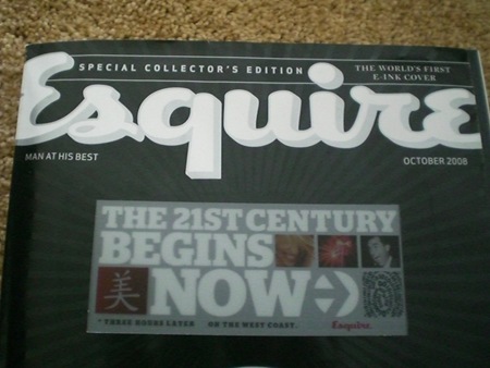
100,000 copies of Esquire’s October 75th anniversary issue will sport the "World’s First E Ink Cover". The video is pretty amazing; I’ve seen Kindles and other E Ink-equipped gadgetry before, but this is a pretty stunning application of the technology. Whether it is relevant and/or functional as a concept remains to be seen. There are already some people raising interesting questions as to this potential trend’s impact. Whatever the case may be, that cover is pretty damned cool looking.
Our friend over at Burnlab did this flyer a few years back, still to this day it might the best flyer to come out of Michigan. Michael Doyle runs an experienced music/culture blog called BURNLAB.
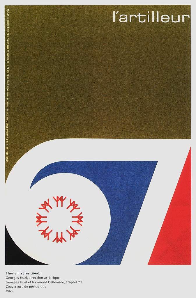
Some random perfection for a Friday morning; a beautiful poster by Georges Huel for Expo67. Can anyone identify that font in the upper right? Very nice. Enjoy the long weekend!
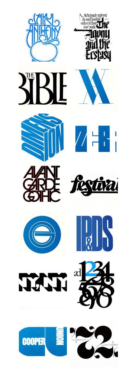
Peter Gabor has posted a Tribute to Herb Lubalin just to remind us all of how inferior our design skills really are. There are 11 pages of Lubalin’s work spanning all the way from his logos and branding up to his more conceptual art and photography. It’s a rather thorough collection and a good starting point if you’re looking for inspiration from one of the original masters of our medium. Link
On a side note, Gabor’s tribute prompted me to brush up on my Herb Lubalin Trivia by going over his Wikipedia entry. I was shocked to find that he passed away at age 63. Maybe seeing another of my design heroes, Wim Crouwel, looking fit and sounding sharp at age 78 in the Helvetica film gave me an unrealistic ideal of longevity, but I always thought of design as the sort of trade you could still be plugging away at and actually producing relevant work well into your 60’s and 70’s (desire permitting, of course). It’s a shame he passed so soon and it’s incredible what he was able to achieve in the relatively short time he had. I wonder what his thoughts on the digital revolution would have been? And perhaps more importantly, how would he have viewed the resurgence and near ubiquity of his famous typeface (Avant Garde) in the past decade of graphic design?
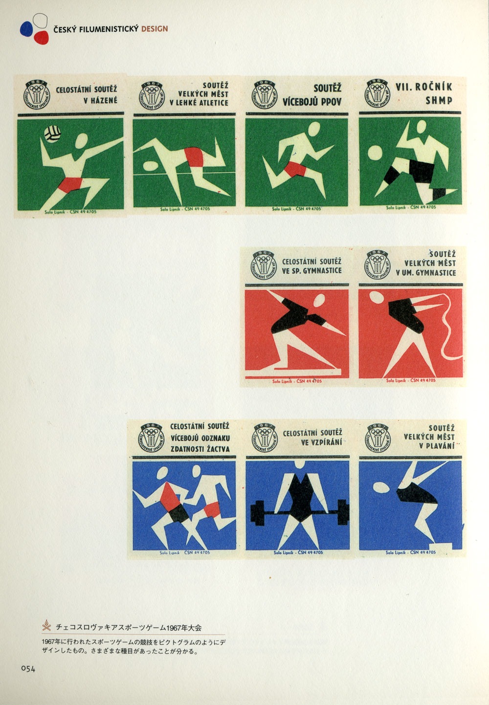
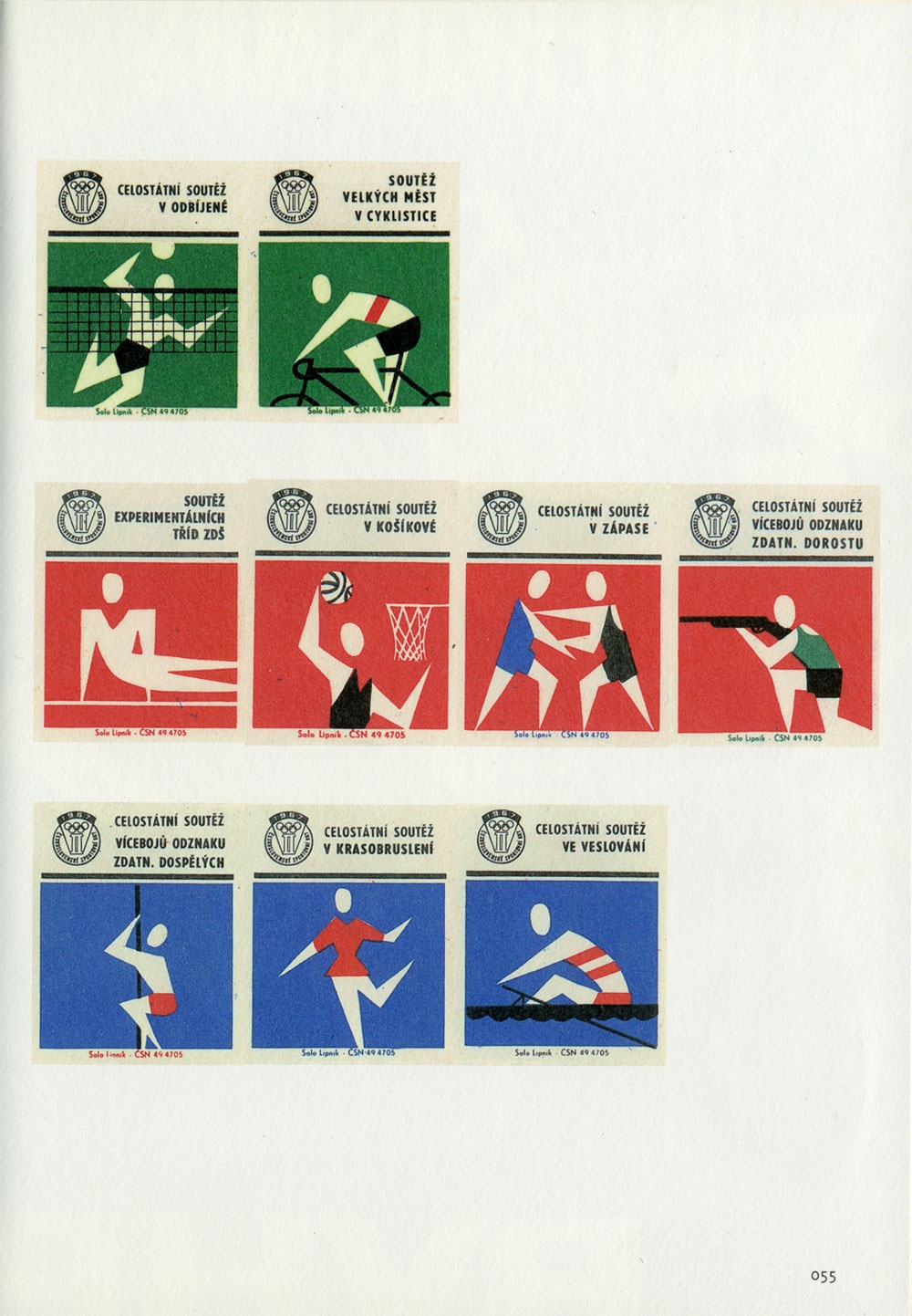
These Czech Olympic matchbooks are excerpted from one of my favorite design books, Cesky Filumenisticky Design. I don’t know much about these other than that they date from 1967. I’m also not sure who designed them since the book is in Japanese. I ran it by my friend and she said the caption says something about the name "Peter Togram". Not sure, fill in the blanks if you can read that caption.
 DEC VT100 user guide ca. 1978. That cover is vaguely reminiscent of the Eames Aluminum Group catalog from a while back and they’re even rocking some Avant Garde. The funny part about all these great vintage computer documents is that some engineer probably designed them as an afterthought on his day off.