SF Chronicle Redesign: Archer
The San Francisco Chronicle just unveiled a redesign of their print edition this past Sunday. According to them, the new look is “brighter and more modern” and retains “its distinctive, classic character.” I’ve never felt like the Chronicle was fantastically designed, but this most recent incarnation is definitely a step down for me. The colors give it a USA Today-esque vibe, and I don’t feel like I can take it seriously at all.
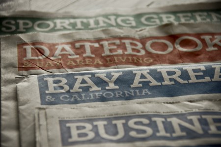
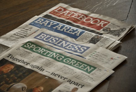
Central to the new look is the incorporation of Archer, the “colorful slab serif” by H&FJ, as their principal headline typeface. I like Archer, always have. I really like the ball terminals on some of the uppercase letterforms, and I think they did a great job crafting a distinctive and more exciting slab serif. I’ve found it very useful for clients that want to look reliable, safe and friendly, and still seem unique and exciting. Given my general fondness for the face, I was surprised to feel such disgust when I saw Archer staring back at me on Sunday morning.
I think it’s a combination of things that ruined Archer for me. First, it’s played out. As much as I love it, I see it everywhere these days (assignments at school, adverts for just about every paper company, home and garden magazine, etc). That sort of typeface proliferation is fine for something like Helvetica, but Archer is too distinctive to work in so many different scenarios effectively, let alone a national newspaper. It reminds me slightly of what happened to Papyrus over the years. It was distinctive font that was rendered completely useless by millions of people browsing through their font list and picking the most “unique” looking. Of course, Archer is not included on your computer when you buy it, or as specialized as Papyrus, but a similar thing seems to be happening at least to some degree. Either way, I was sad to see two things ruined for me on Sunday morning: Archer and the SF Chronicle.
What do you all think? Is Archer the next Papyrus? Any Bay Area readers still receive the print edition of the Chronicle and like the redesign? Let us know in the comments.


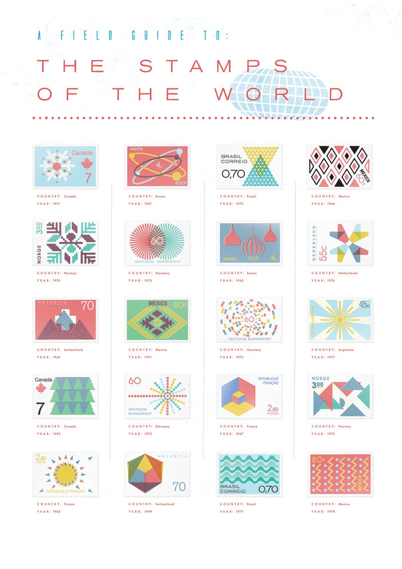
 Thought I’d post this nice follow-up to the last