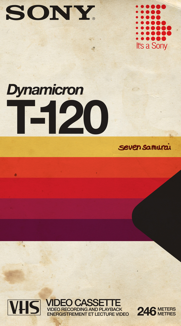
“Hell, you might just be the best damn girl in Texas.”
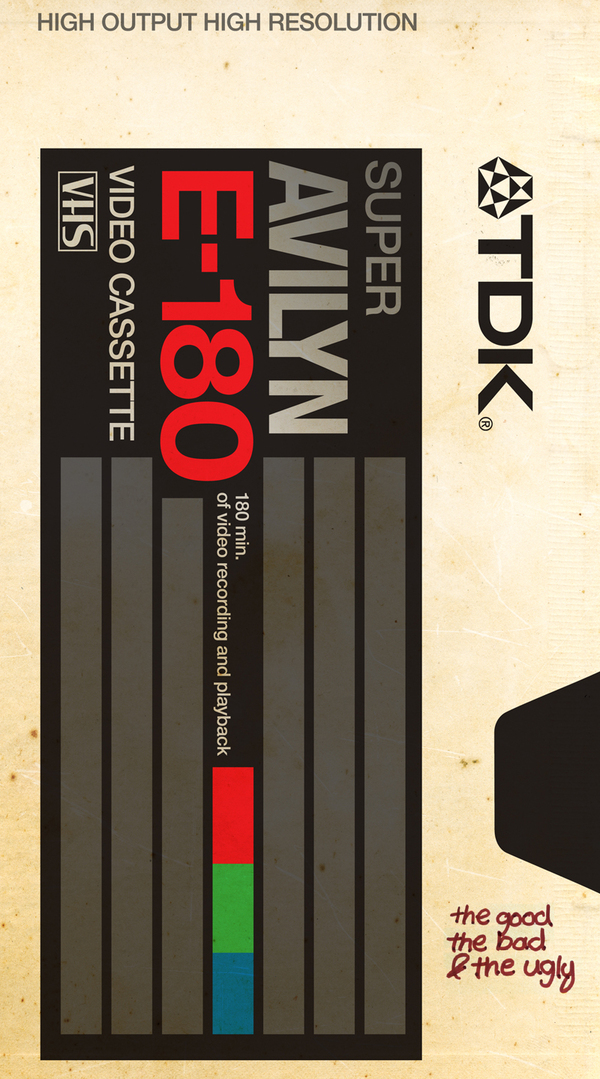
“Each and every man under my command owes me one hundred Nazi scalps. And I want my scalps. And all y’all will git me one hundred Nazi scalps, taken from the heads of one hundred dead Nazis. Or you will die tryin’.”
“Look Dave, I can see you’re really upset about this. I honestly think you ought to sit down calmly, take a stress pill, and think things over.”
“A beginning is a very delicate time. Know then, that it is the year 10191. The known universe is ruled by the Padisha Emperor Shaddam IV, my father. In this time, the most precious substance in the Universe is the spice melange. The spice extends life. The spice expands consciousness. The spice is vital to space travel. “
“I’m scared, Fif. You know why? It’s that rat circus out there. I’m beginning to enjoy it.”
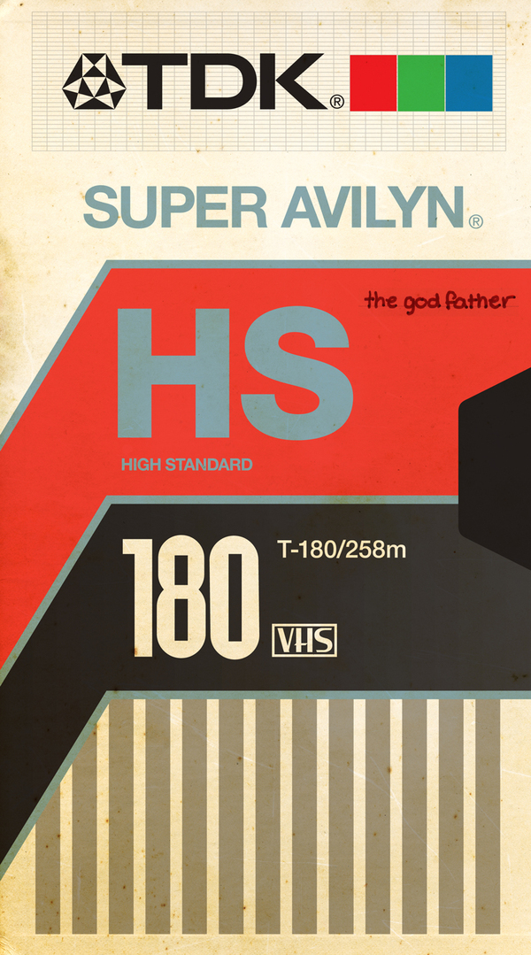
“It had been a wonderful evening and what I needed now to give it the perfect ending was a bit of the old Ludwig van.”
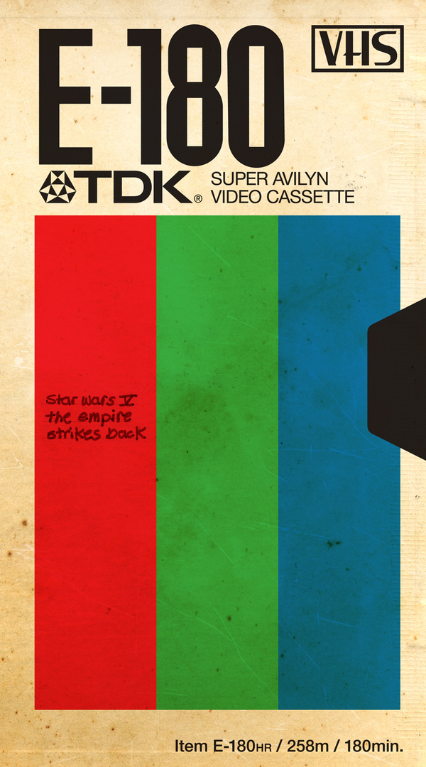
“You underestimate the power of the Dark Side. If you will not fight, then you will meet your destiny.”
“Can you keep a secret? I’m trying to organize a prison break. I need like, what, an accomplice. We have to first get out of this bar, then the hotel, then the city, and then the country. Are you in or you out?”
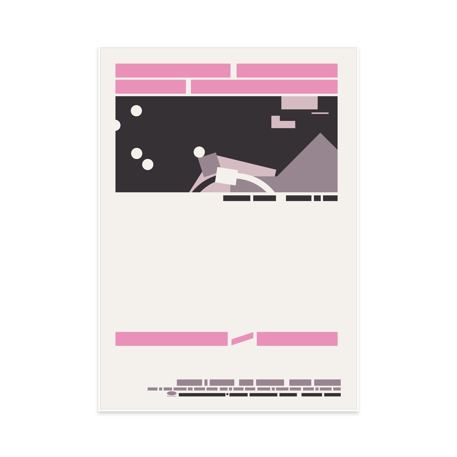
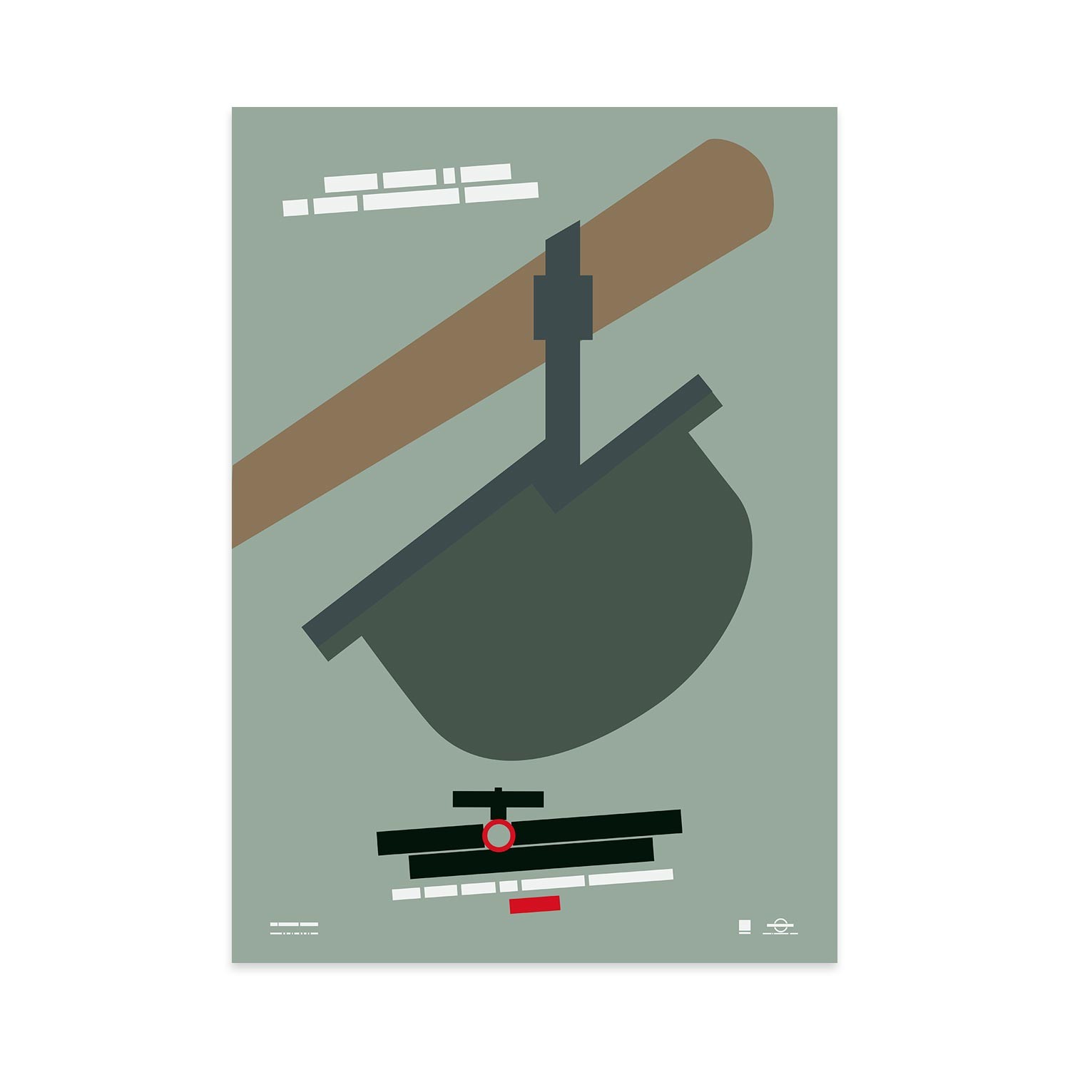
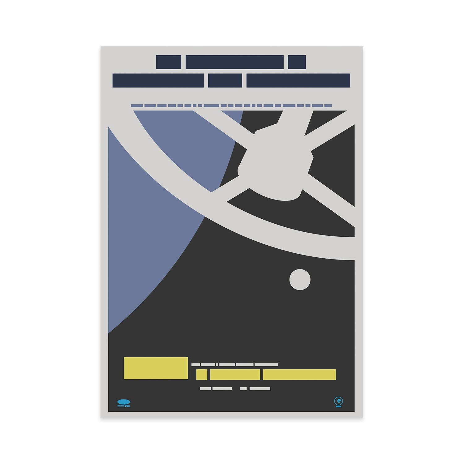
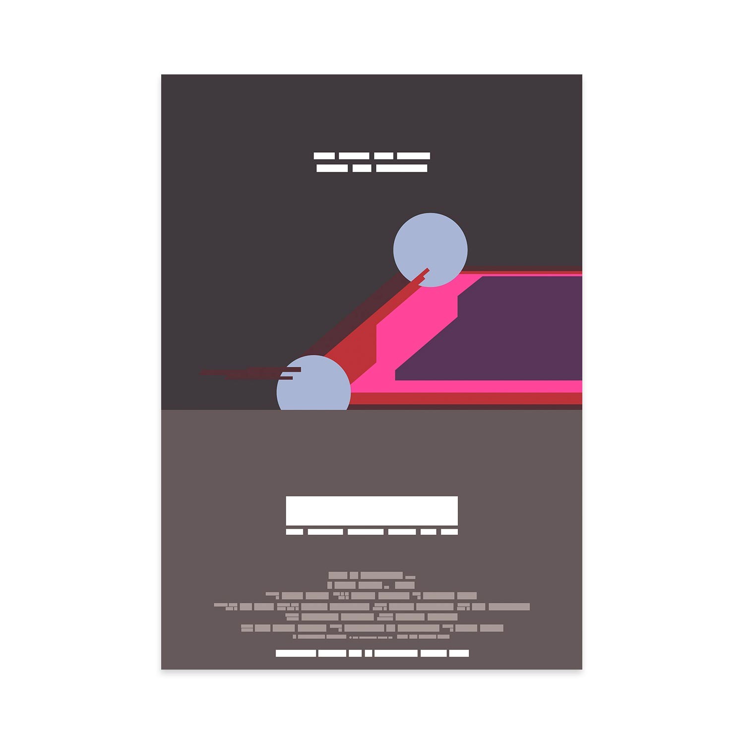
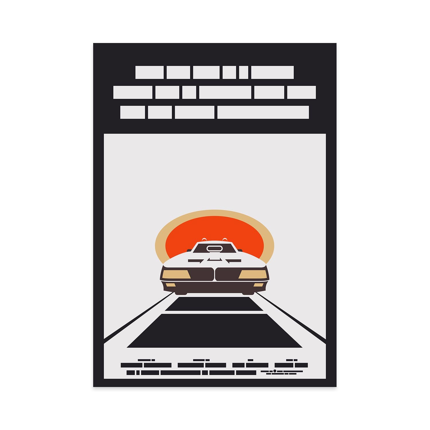
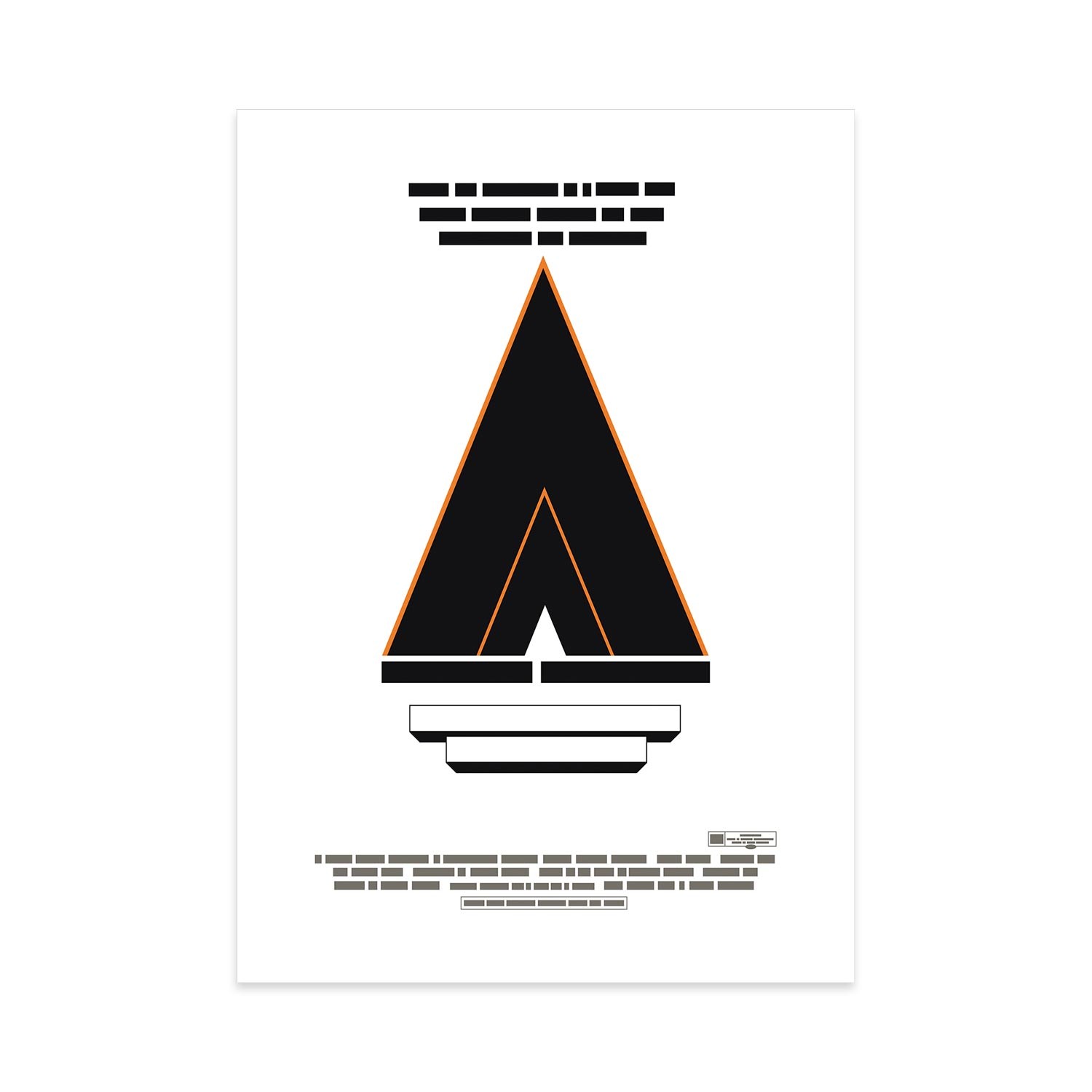
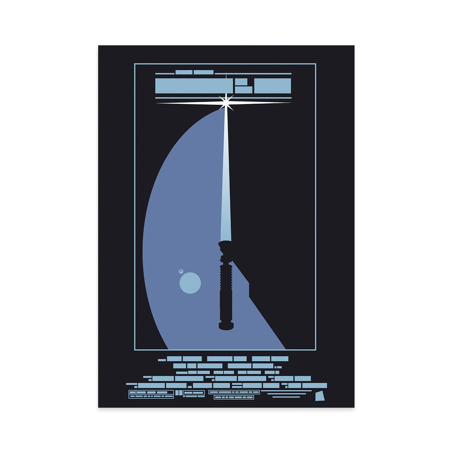
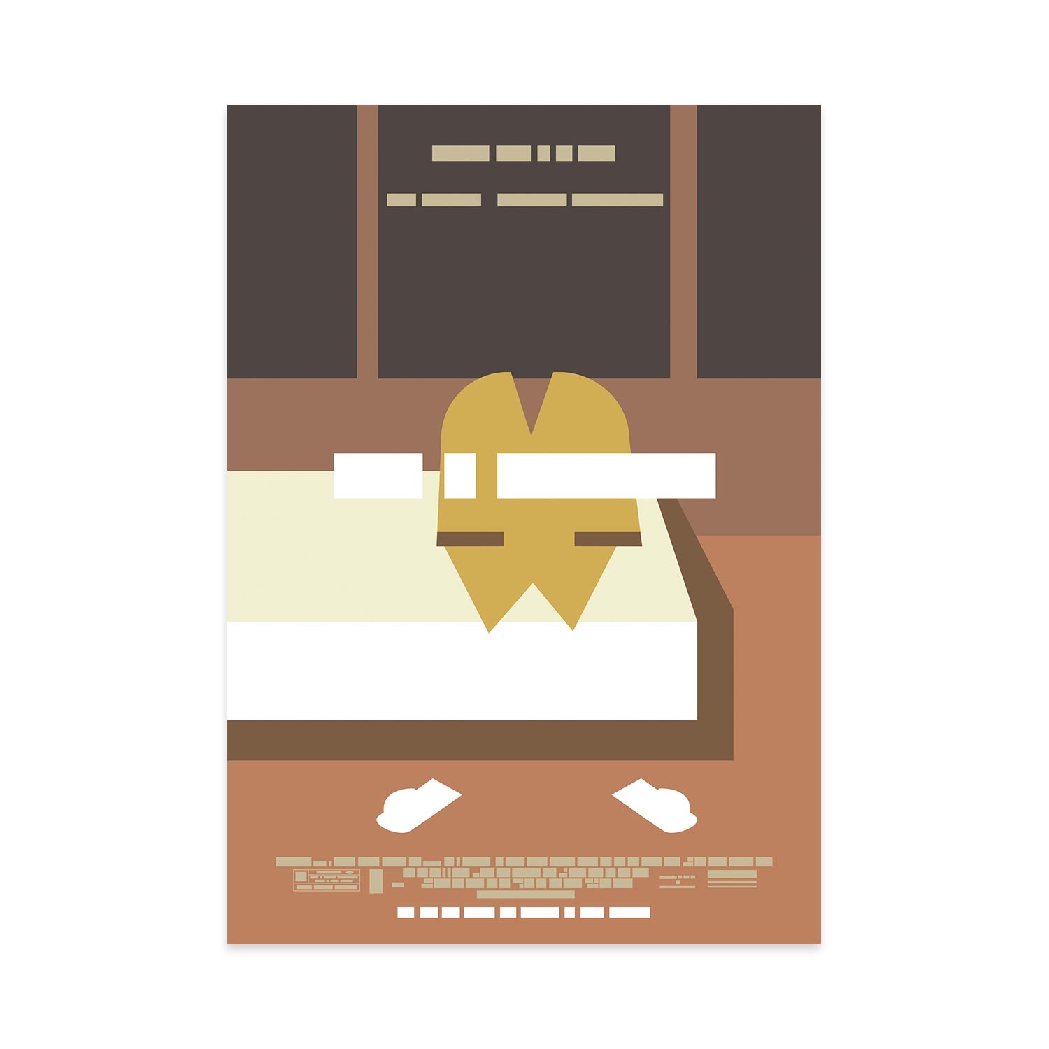
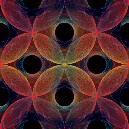
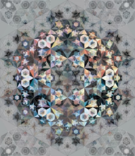
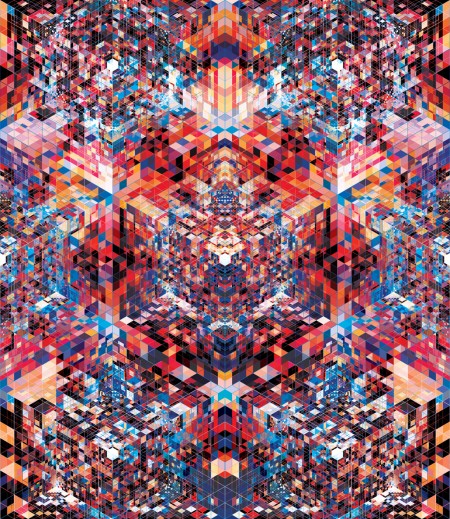
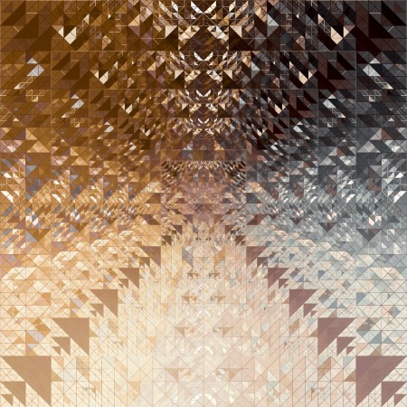
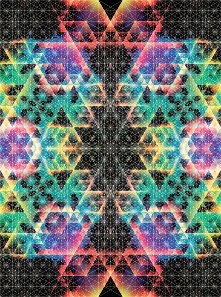
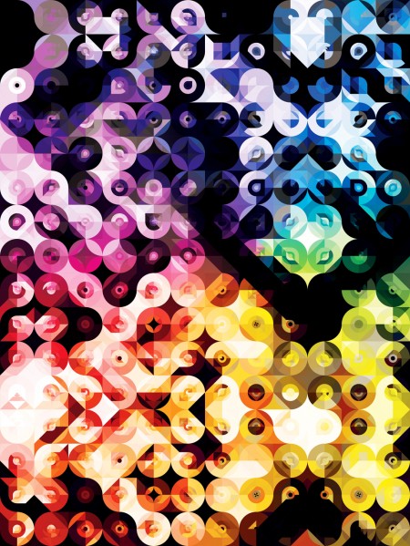
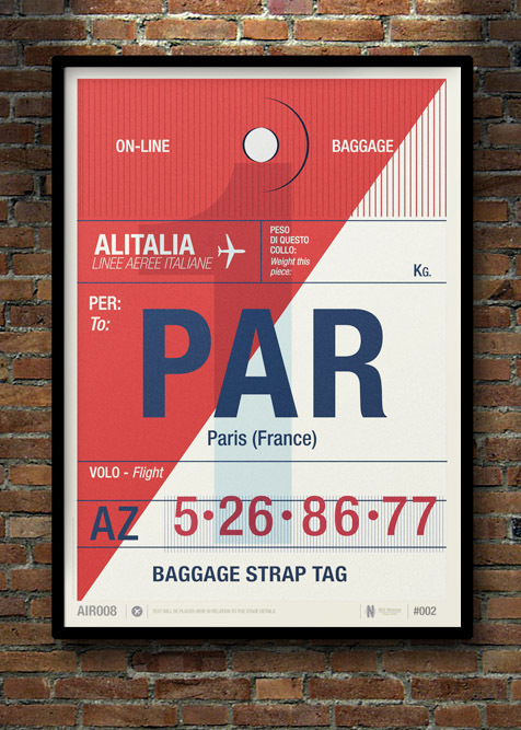
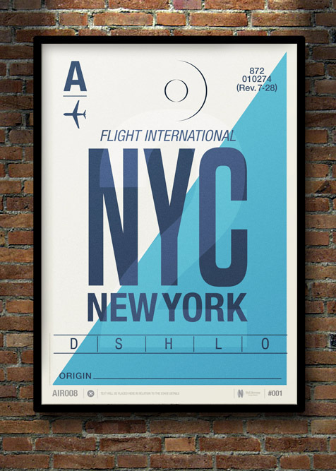
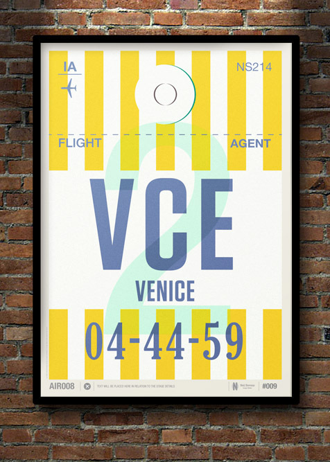
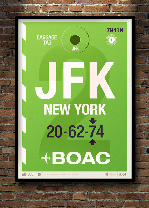
Film the Blanks, by designer John Taylor, is a series based on famous film posters, with the information deconstructed to a minimal blocks of colors. Can you guess the films above?
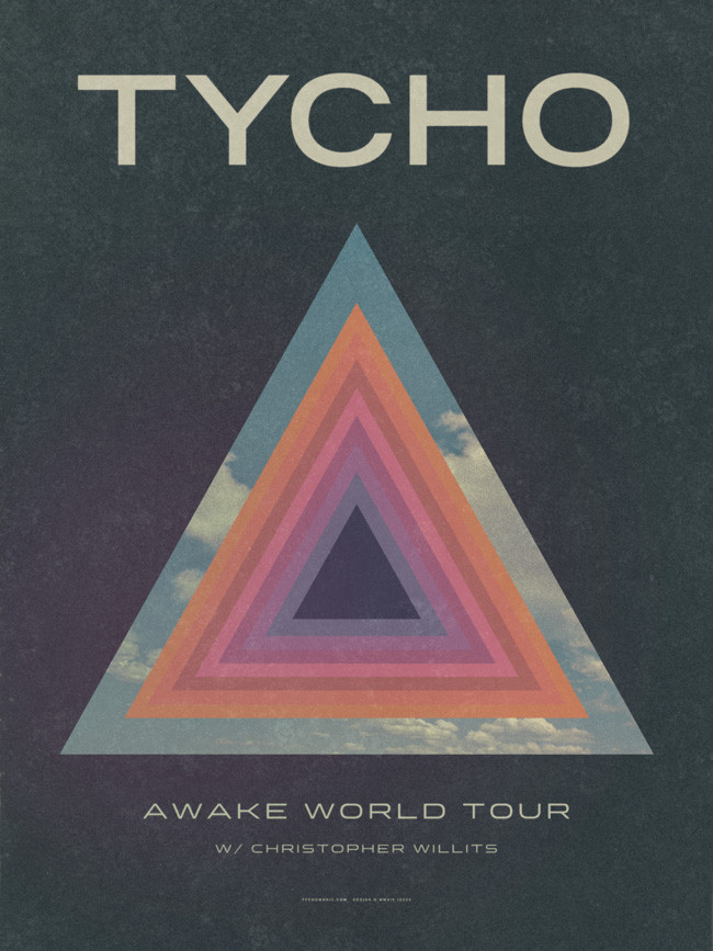
JUN 29 | Rothbury, MI | Electric Forest
JUL 05 | Snowmass Village, CO | Wanderlust Festival
JUL 18 | Benicàssim, Spain | FIB
JUL 20 | Suffolk, United Kingdom | Latitude Festival
JUL 22 | Manchester, United Kingdom | Gorilla
JUL 23 | Dublin, Ireland | Button Factory
JUL 25 | Padua, Italy | Radar Festival
JUL 26 | Vasto, Italy | Vasto Siren Fest
JUL 31 | Portland, OR | Crystal Ballroom #
AUG 01 | Seattle, WA | Neptune Theatre #
AUG 03 | Whistler, Canada | Wanderlust Festival
AUG 09 | San Francisco, CA | Outside Lands Music Festival
AUG 16 | Mexico City, Mexico | Ceremonia
AUG 23 | Los Angeles, CA | FYF Fest
SEP 16 | Reno, NV | Knitting Factory #
SEP 17 | Salt Lake City, UT | The Depot #
SEP 20 | Austin, TX | Emo’s #
SEP 22 | Dallas, TX | Granada Theater #
SEP 24 | Asheville, NC | The Orange Peel #
SEP 25 | Nashville, TN | Cannery Ballroom #
SEP 26 | Cincinnati, OH | MidPoint Music Festival
SEP 27 | Champaign-Urbana, IL | The Pygmalion Festival w/ CHVRCHES
SEP 29 | Boston, MA | Royale #
OCT 01 | New York, NY | Terminal 5 #
OCT 03 | London, United Kingdom | The Forum #
OCT 04 | Glasgow, United Kingdom | The Art School #
OCT 05 | Leeds, United Kingdom | Stylus #
OCT 06 | Bristol, United Kingdom | Trinity Centre #
OCT 08 | Paris, France | La Gaîté Lyrique #
OCT 09 | Brussels, Belgium | VK Club #
OCT 10 | Amsterdam, Netherlands | Melkweg #
OCT 11 | Hamburg, Germany | Uebel und Gefährlich #
OCT 12 | Cologne, Germany | Gebäude 9 #
OCT 14 | Berlin, Germany | C-Club #
OCT 15 | Warsaw, Poland | BASEN #
OCT 16 | Prague, Czech Republic | Roxy #
OCT 17 | Vienna, Austria | WUK #
OCT 18 | Budapest, Hungary | A38 Hajó #
OCT 20 | Bologna, Italy | Estragon #
OCT 24-26 | Las Vegas, NV | Life is Beautiful Festival
July 15th we’ll be shipping Awake World Tour Lithograph Posters which you can see above, printed as a limited edition lithograph on 130# Superfine Eggshell Cover at 18″ x 24″.
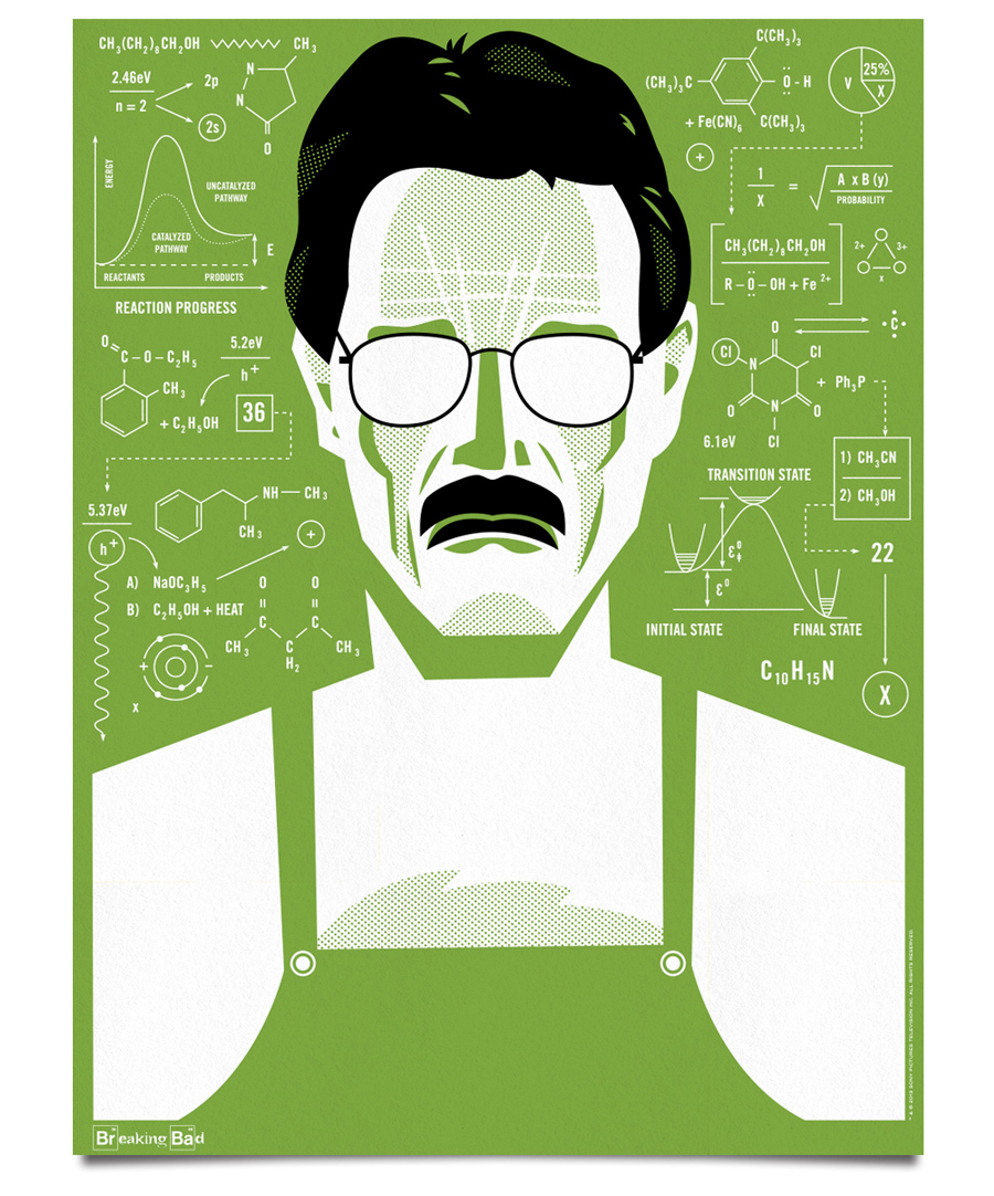
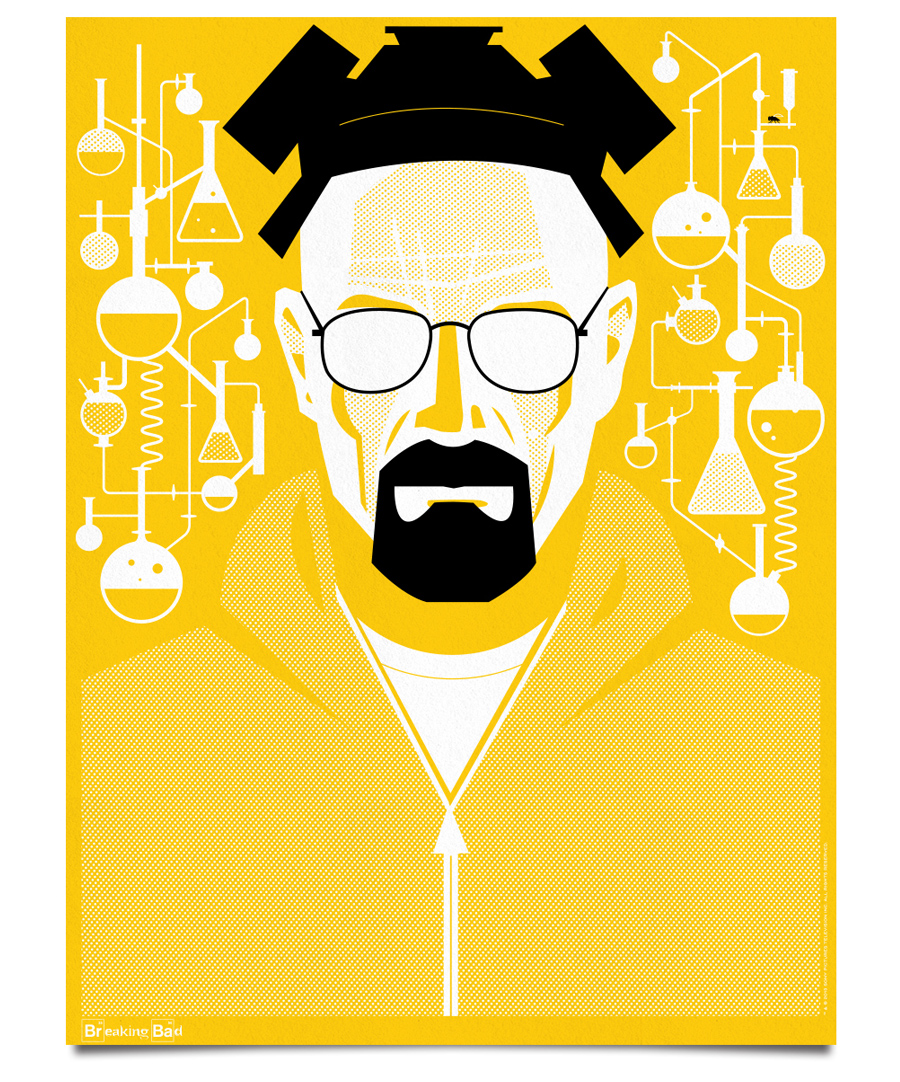
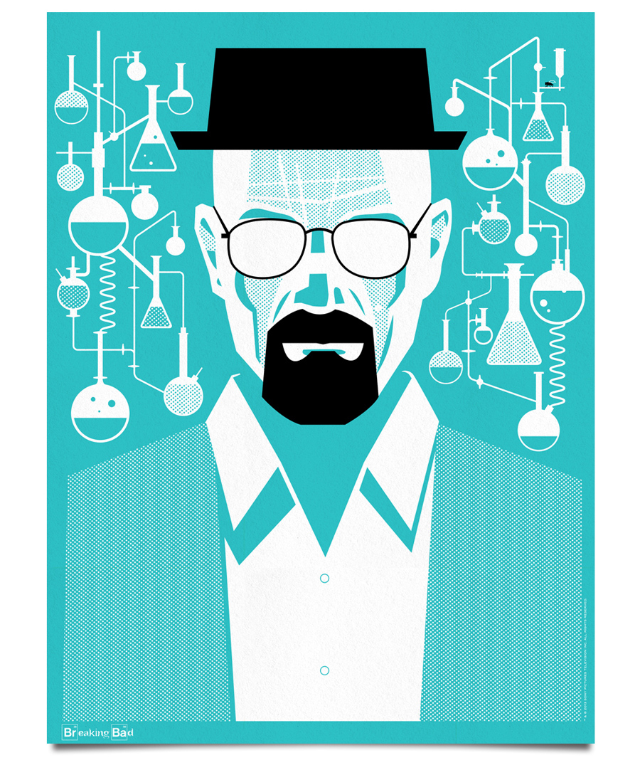
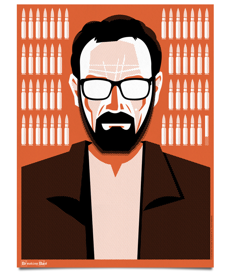
This one’s for my Breaking Bad brethren & sistren, who like me, are still reeling from the ending of one televisions greatest shows. A poster set by Ty Mattson illustrating the transformation of Bryan Cranston’s character, Walter White, over the course of the highly-acclaimed series.
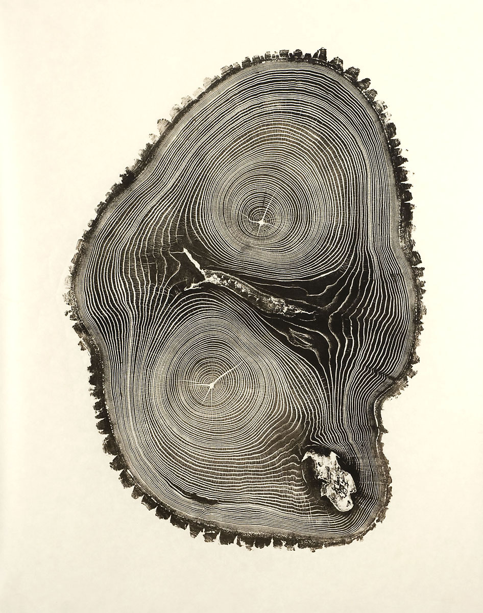
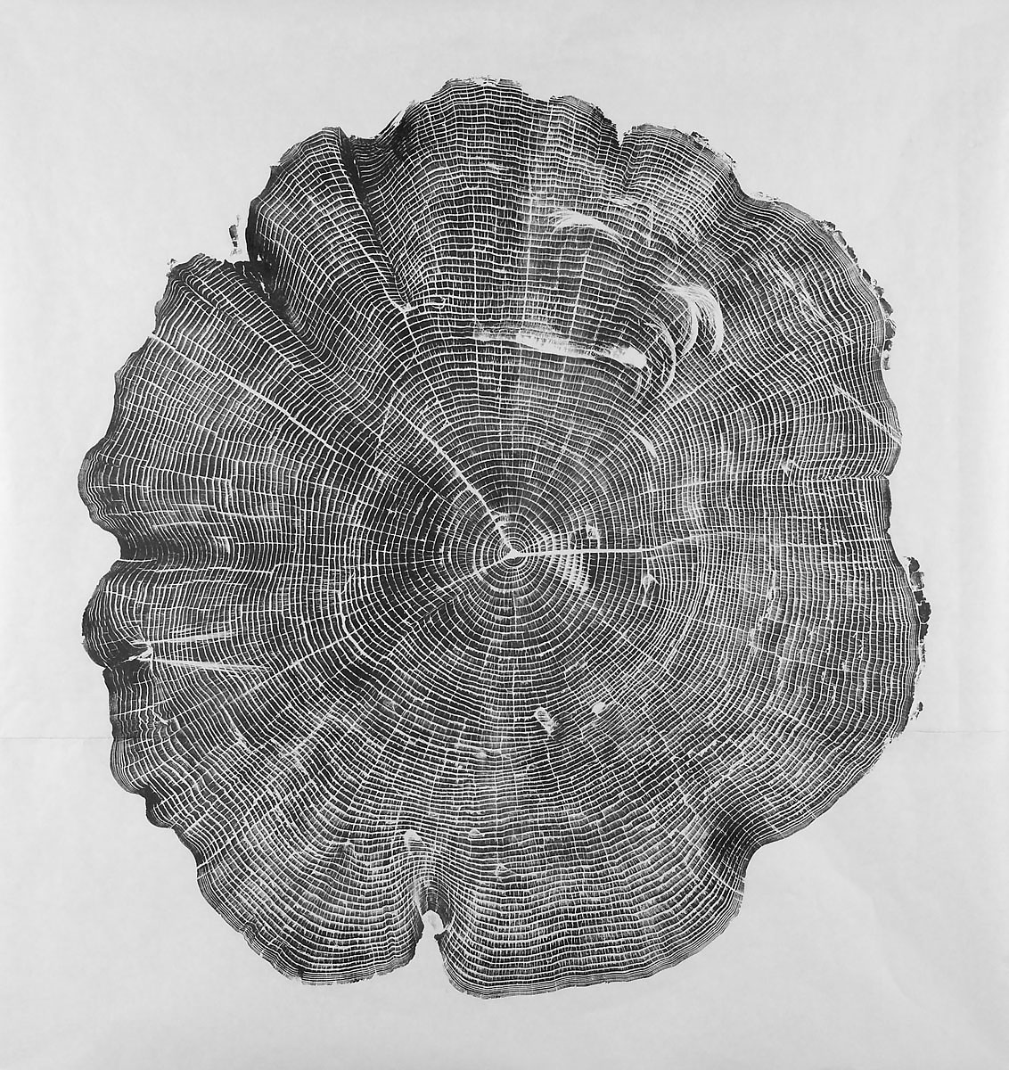
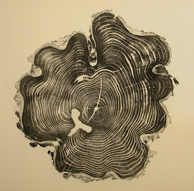
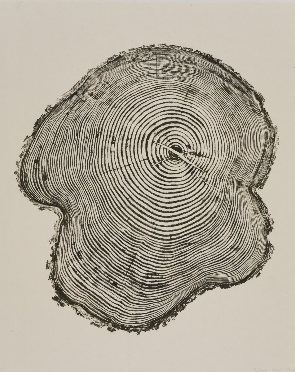
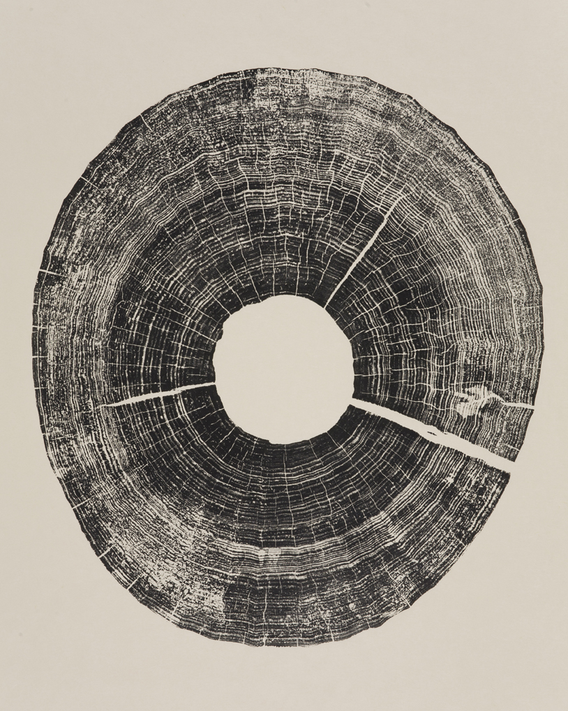
With my love for trees and my love for prints I think Bryan Nash Gill’s Woodcuts are the perfect marriage. I love the complete organic nature of his prints. Be sure and check out the video as well, as it shows some of his process.