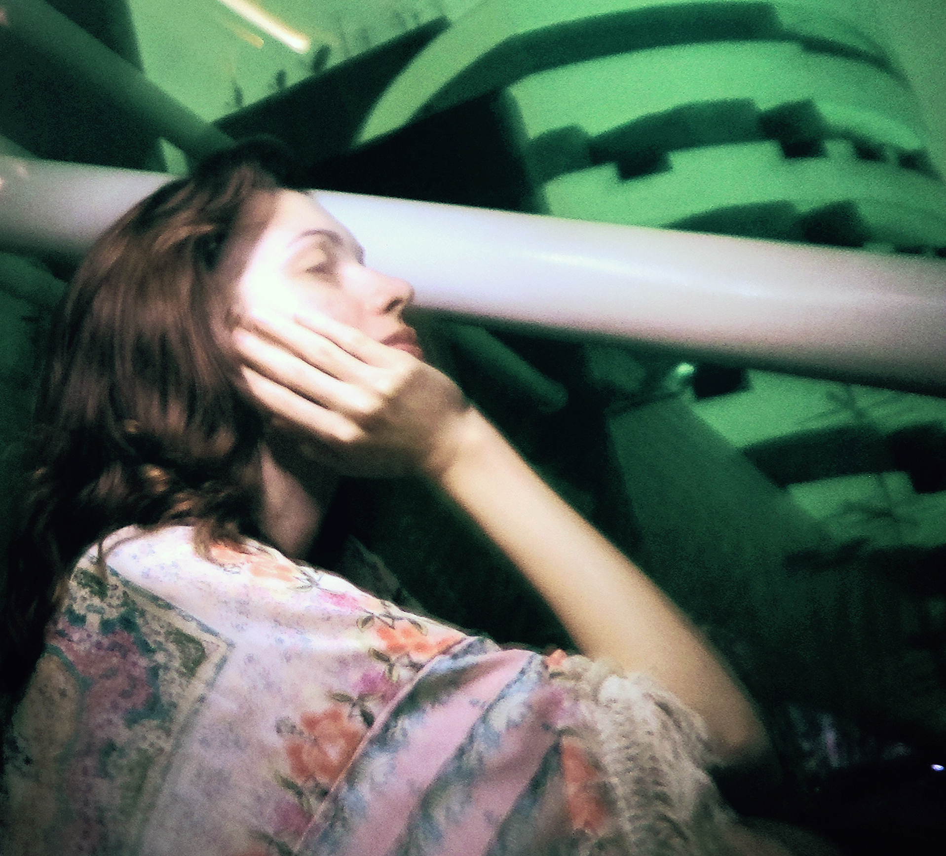
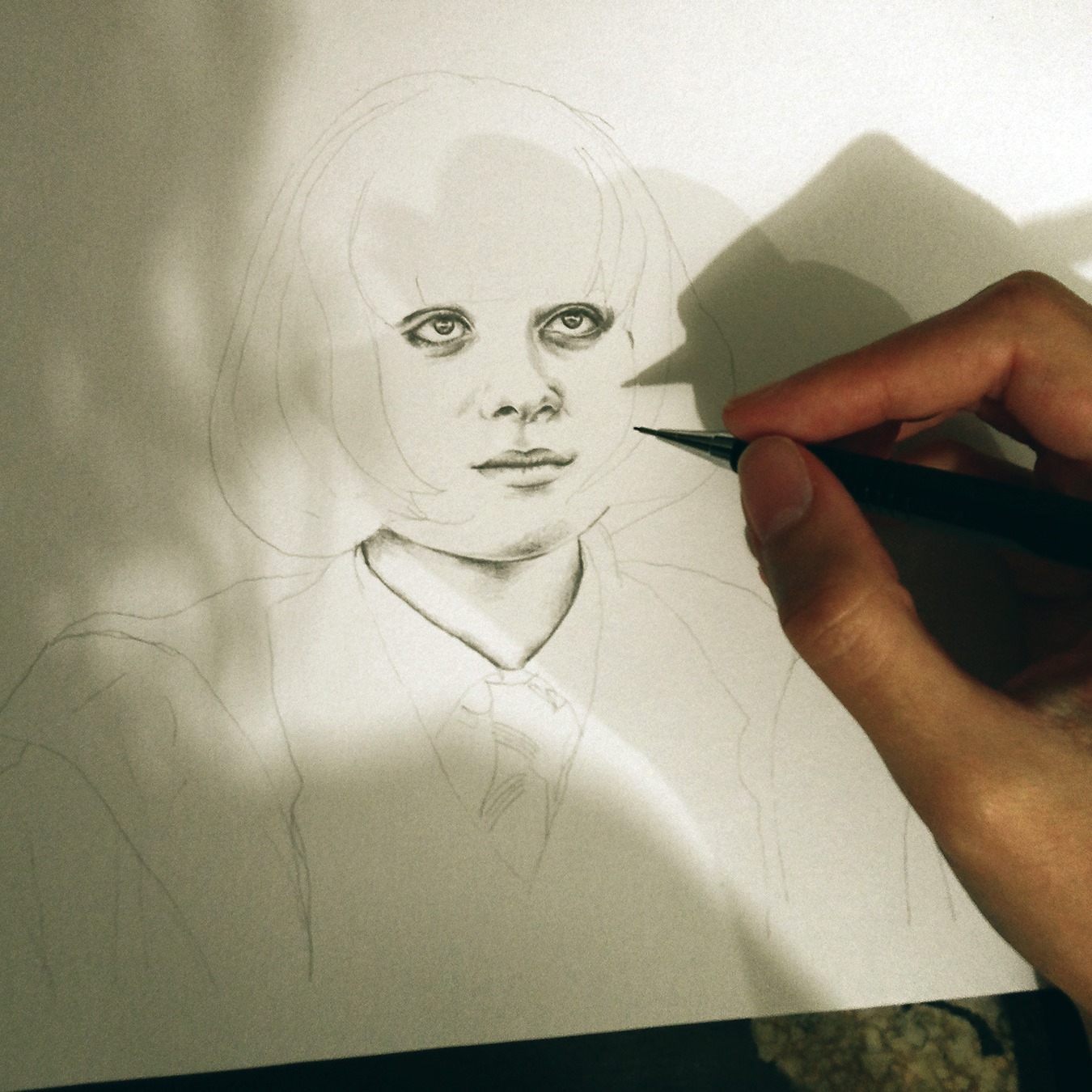
I recently had the opportunity to design some album art for Artisan Loyalist on the upcoming full-length album, Lonely Ghost, and the recently released teaser, The Ace EP. Initially, the artwork for The Ace EP was derived from pieces of the Lonely Ghost design: the gem-like cluster started in Illustrator as basic flat shapes that I had worked into 3D, and then overtop, layered a large number of photos I had taken to get the various textures.
This is the premiere streaming release of the the track Light Trail. Lonely Ghost is set to release on Tuesday, February 24th 2015 on Sky Council Recordings, and you can pre-order now on iTunes and Amazon.
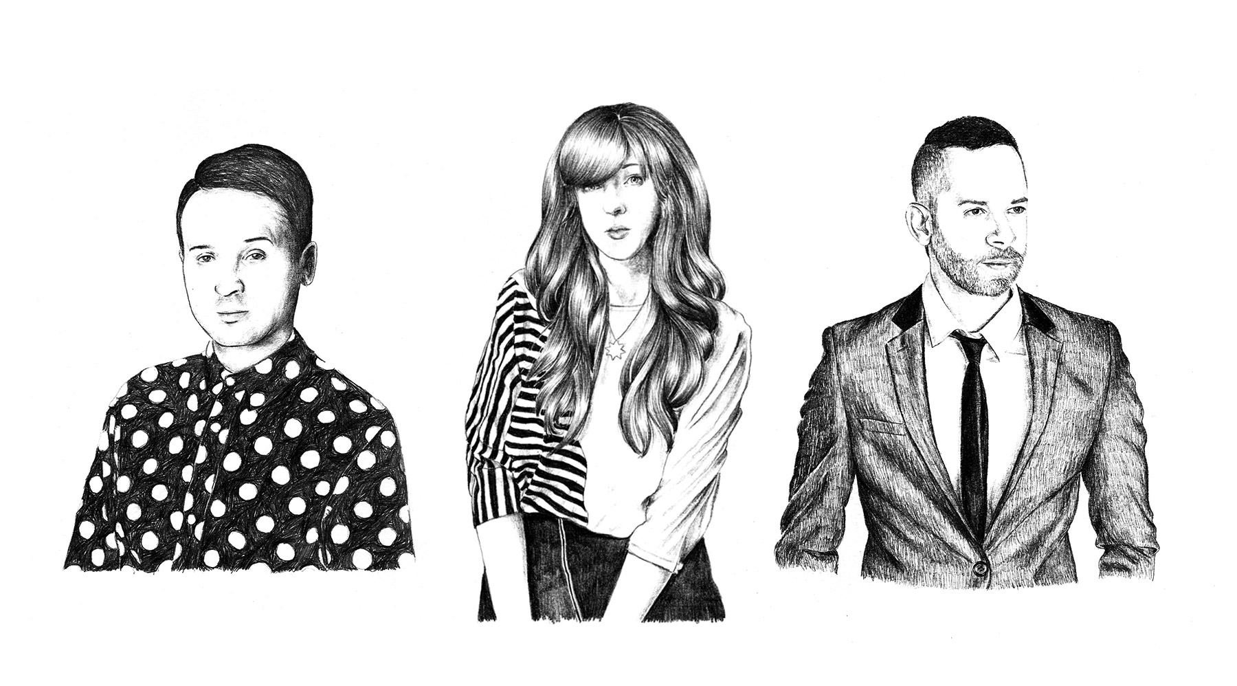
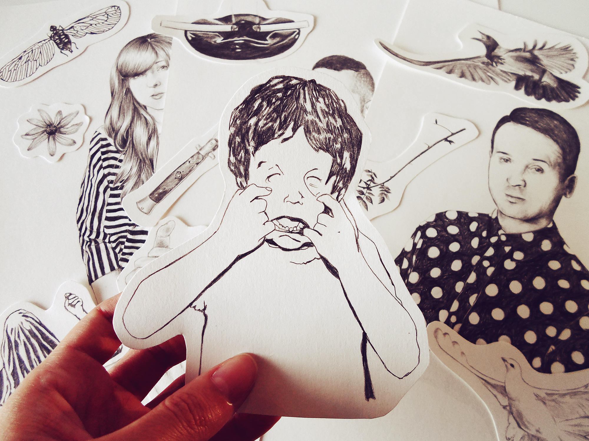
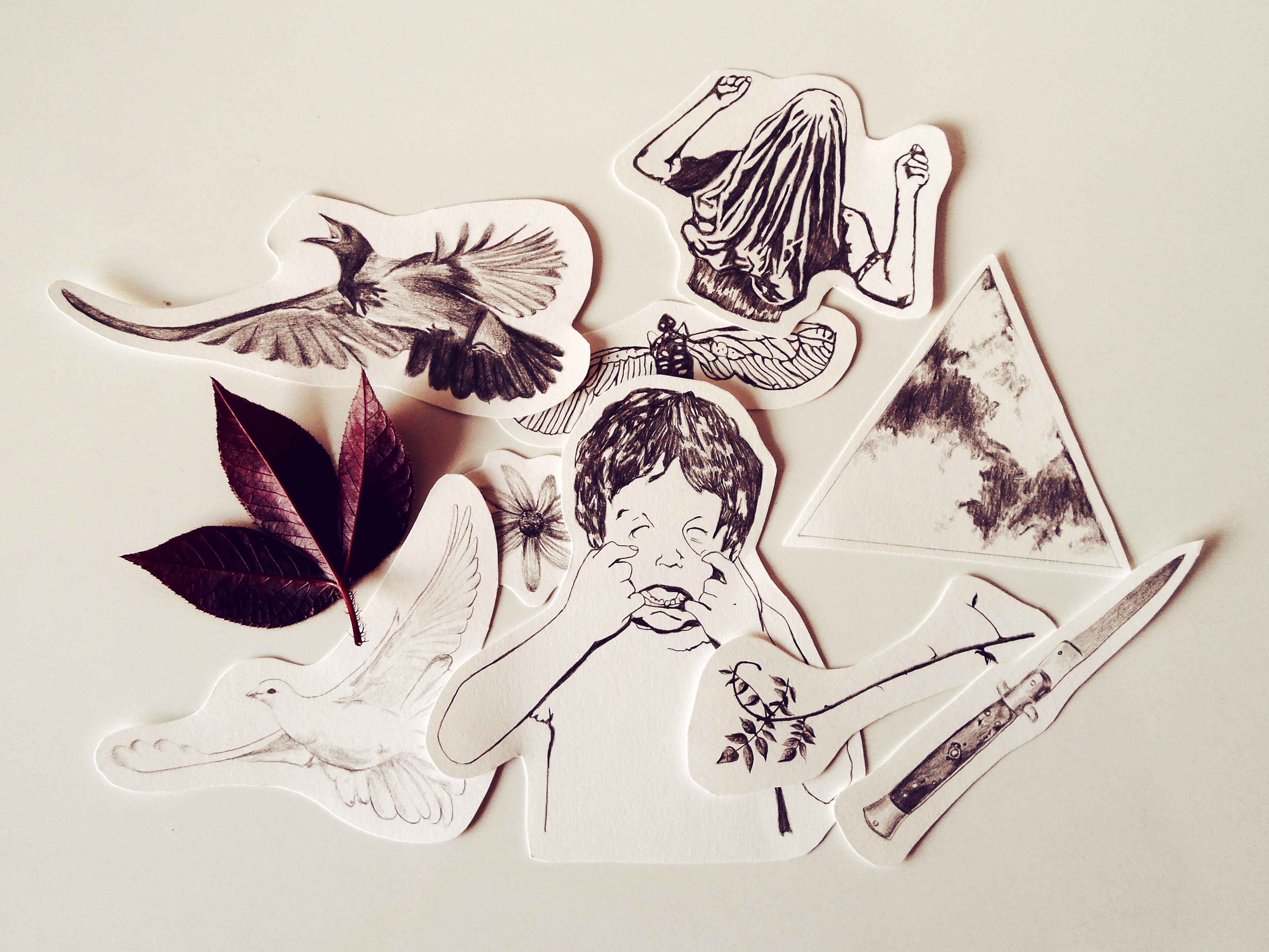
Lucy Salgado is an illustrator based out of Recife, Brazil. I first came across Lucy’s work when CHVRCHES posted an illustration she crafted of Lauren Mayberry on Instagram.
After trading emails back forth we talked about the possibility of collaborating on a project for The Artistree. We came up with the idea of illustrating elements from some of our favorite releases of 2014 and mashing them all together for what would become the imagery for our end of the year pieces.
“Hell, you might just be the best damn girl in Texas.”
“Each and every man under my command owes me one hundred Nazi scalps. And I want my scalps. And all y’all will git me one hundred Nazi scalps, taken from the heads of one hundred dead Nazis. Or you will die tryin’.”
“Look Dave, I can see you’re really upset about this. I honestly think you ought to sit down calmly, take a stress pill, and think things over.”
“A beginning is a very delicate time. Know then, that it is the year 10191. The known universe is ruled by the Padisha Emperor Shaddam IV, my father. In this time, the most precious substance in the Universe is the spice melange. The spice extends life. The spice expands consciousness. The spice is vital to space travel. “
“I’m scared, Fif. You know why? It’s that rat circus out there. I’m beginning to enjoy it.”
“It had been a wonderful evening and what I needed now to give it the perfect ending was a bit of the old Ludwig van.”
“You underestimate the power of the Dark Side. If you will not fight, then you will meet your destiny.”
“Can you keep a secret? I’m trying to organize a prison break. I need like, what, an accomplice. We have to first get out of this bar, then the hotel, then the city, and then the country. Are you in or you out?”
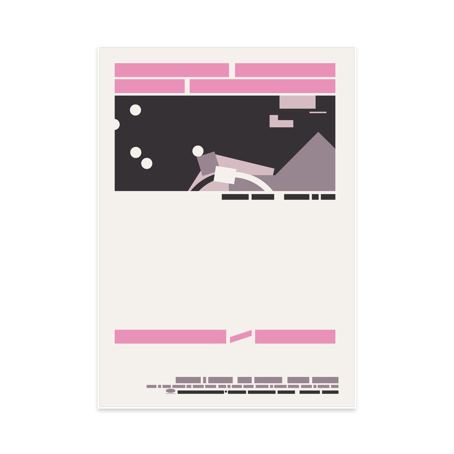
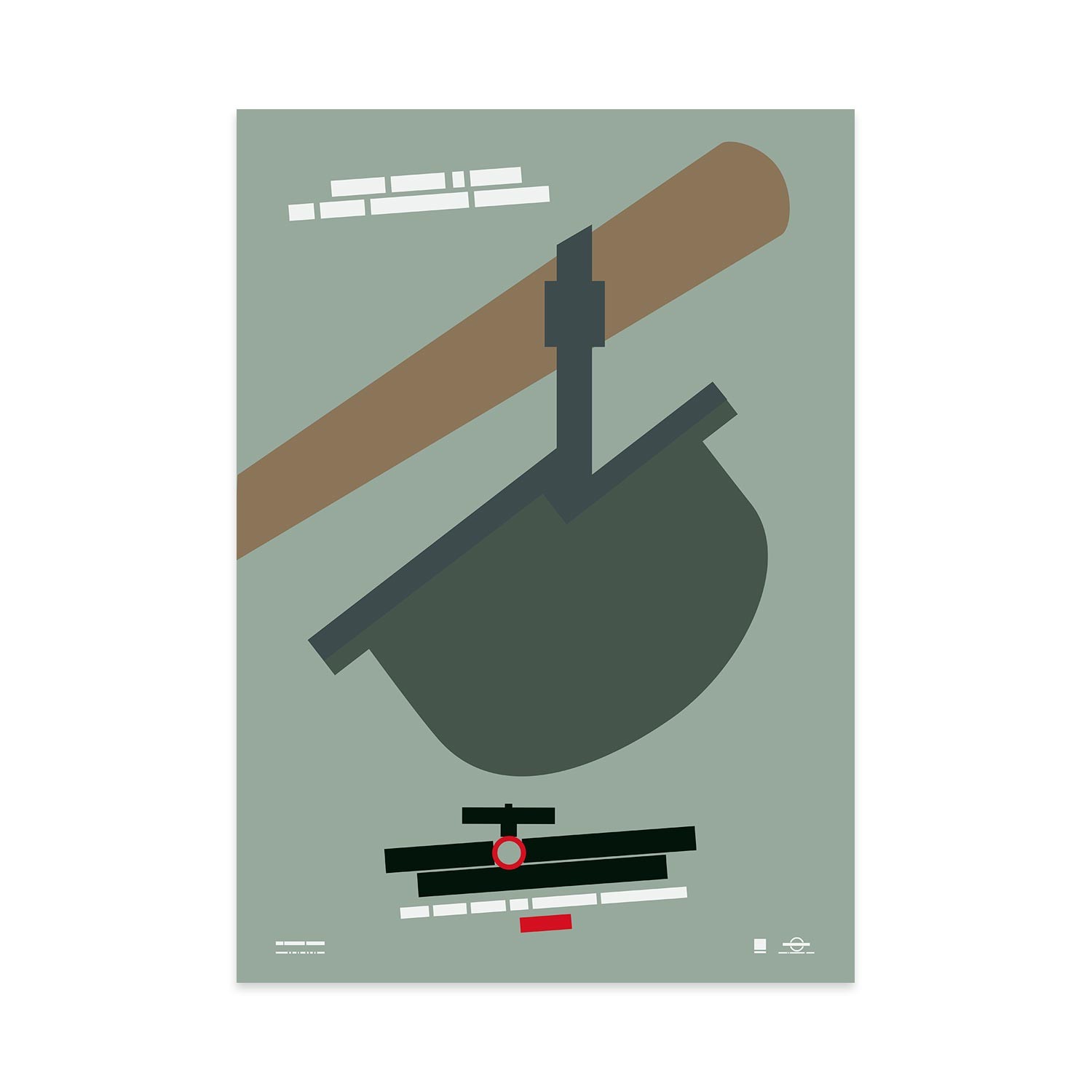
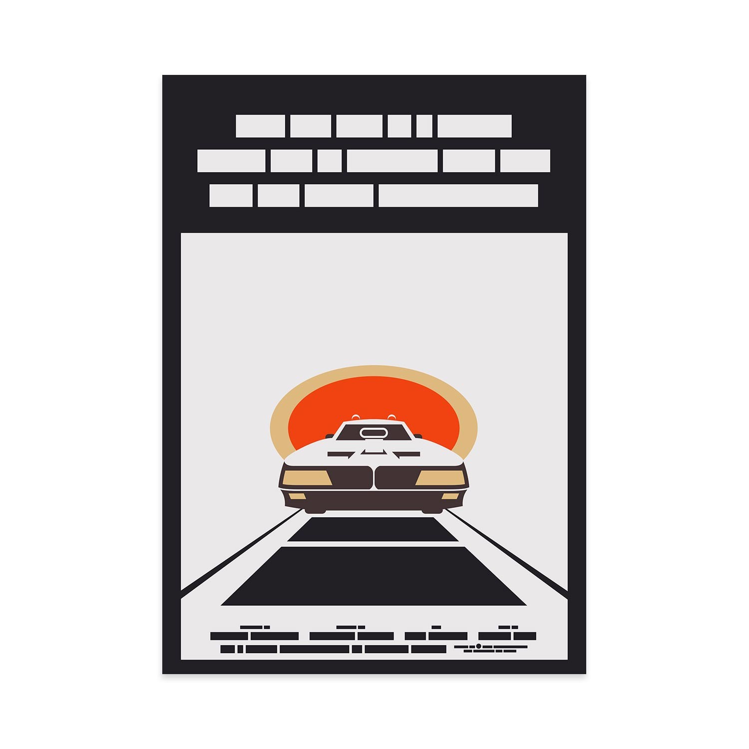
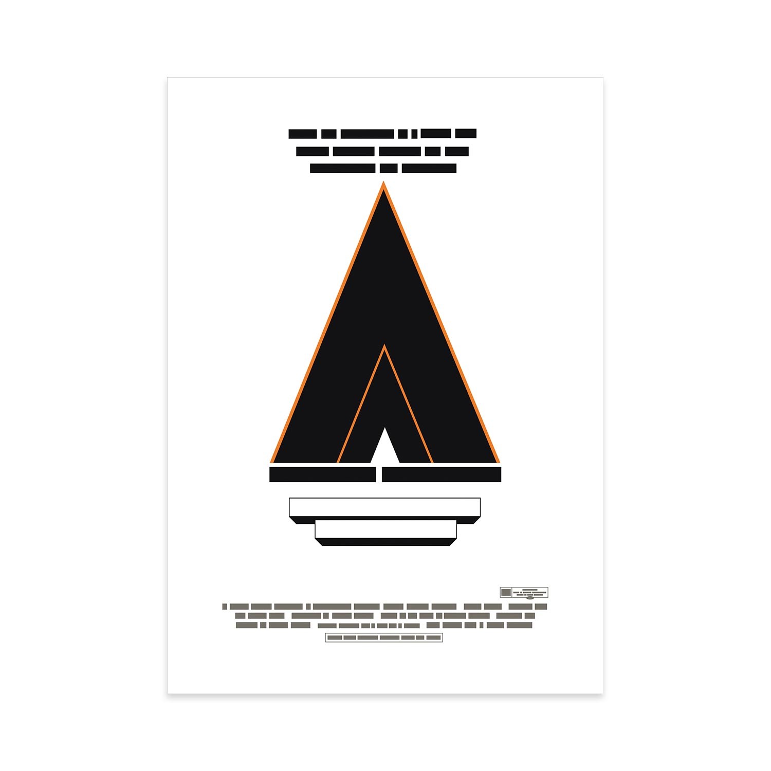
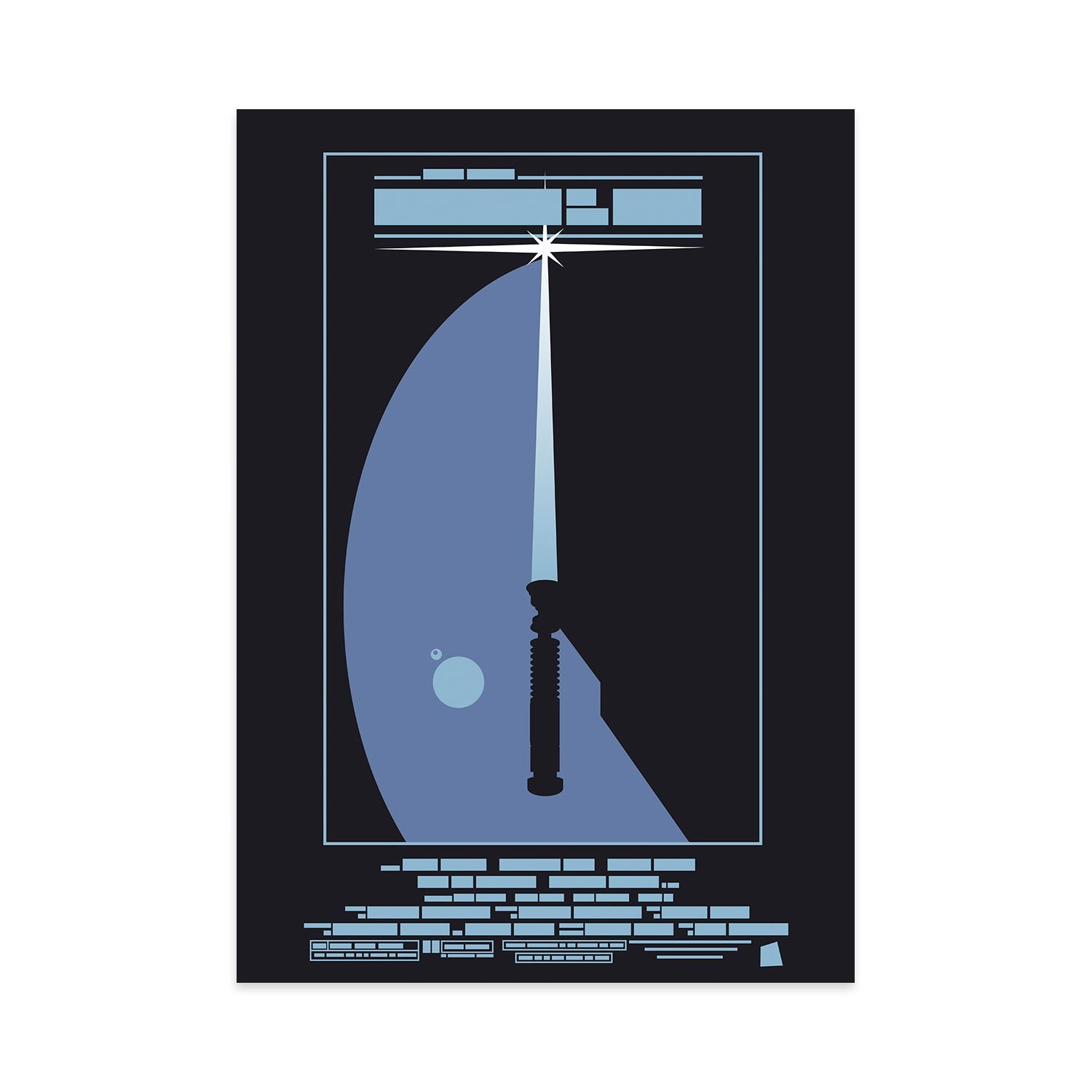
Film the Blanks, by designer John Taylor, is a series based on famous film posters, with the information deconstructed to a minimal blocks of colors. Can you guess the films above?
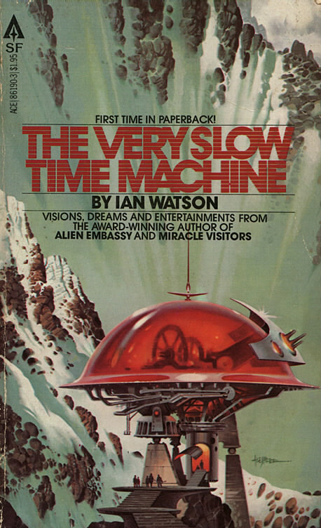
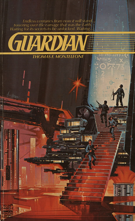
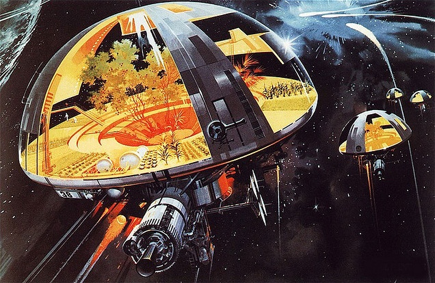
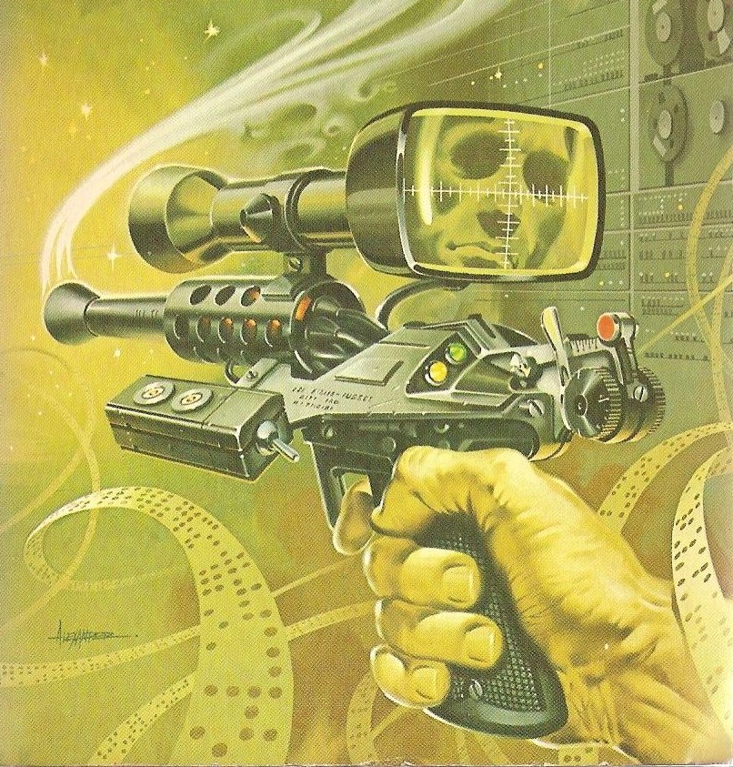
This week I decided to do a feature on Paul Alexander. He got his start working with architecture firms and advertising agencies, he then signed up with a New York City artists rep which got him on the radar with publisher ACE Books around 1977. ACE along with a number of other publishers for various books and magazines kept him very busy over the next two decades. He is very well known for his mechanical style and Vincent Di Fate called him “one of the top “gadget” artists currently working in the American paperback market”.
I really love illustration on that Guardian cover. I’m not a huge fan of most 80s sci-fi book covers but this one was released so early on in the 80s that it still feels like it isn’t too far gone. If you dig into some of his later stuff you will see what I mean about the heavy 80s style, I am talking raised lettering book titles with full mirror gloss finish. His early work really does differ from his later work, not so much in actual subject matter or quality but the style change is really evident. It’s clear throughout all his work he was an absolute master at the technical and mechanical elements.
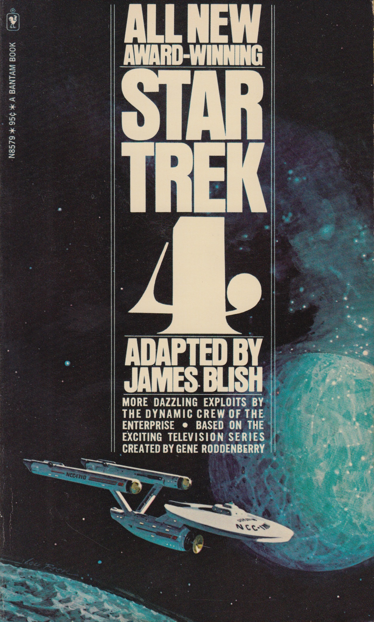
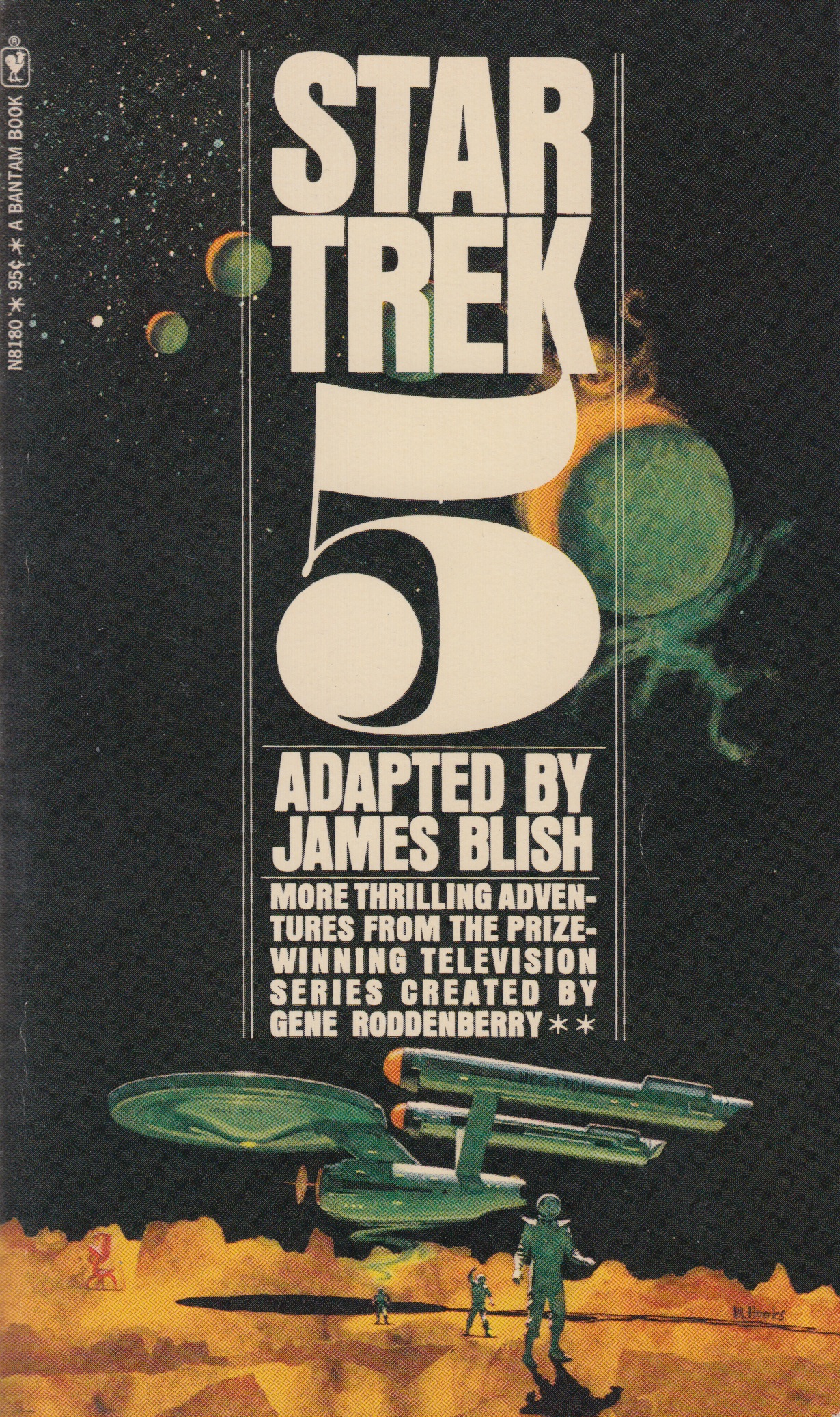
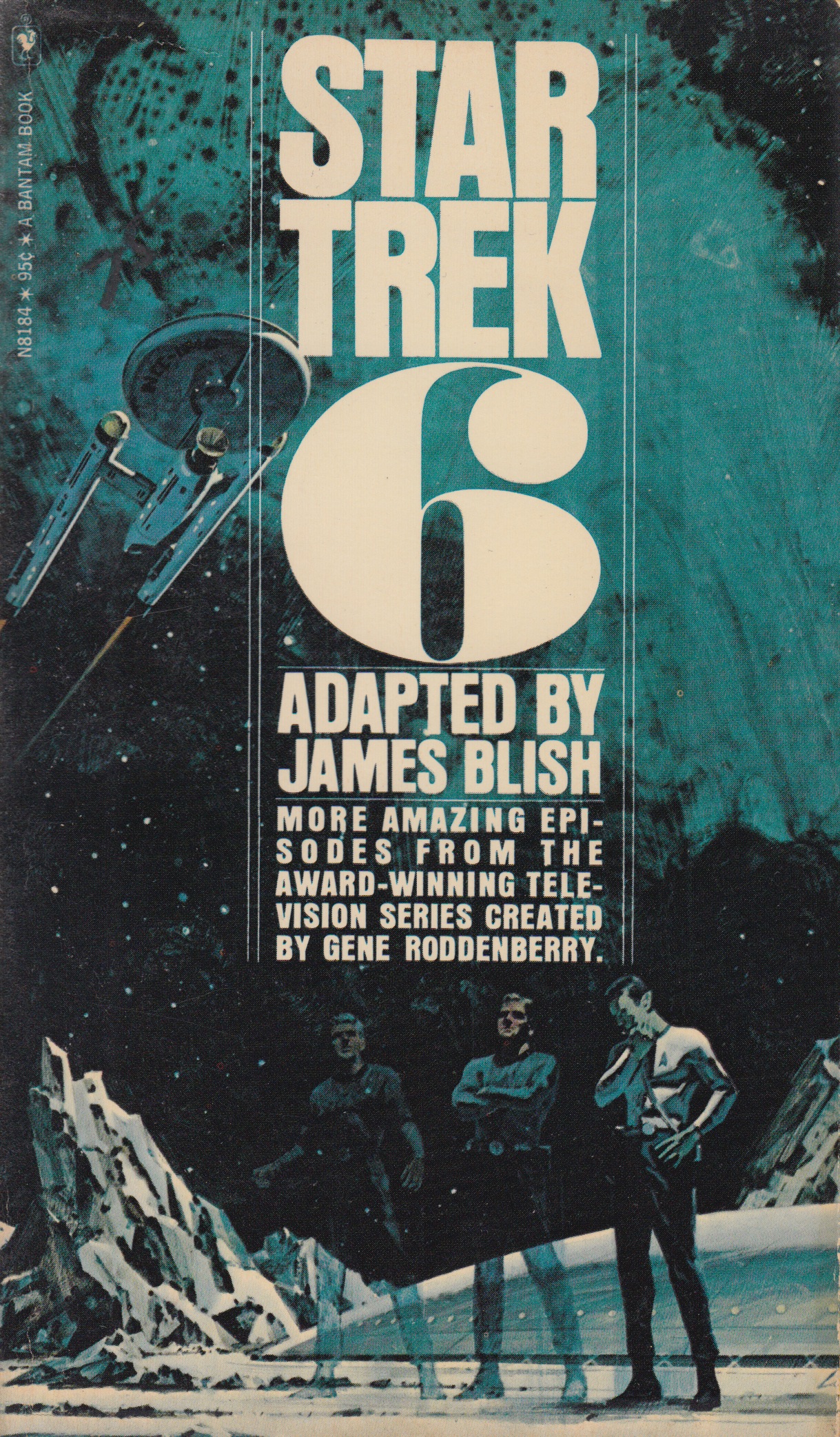
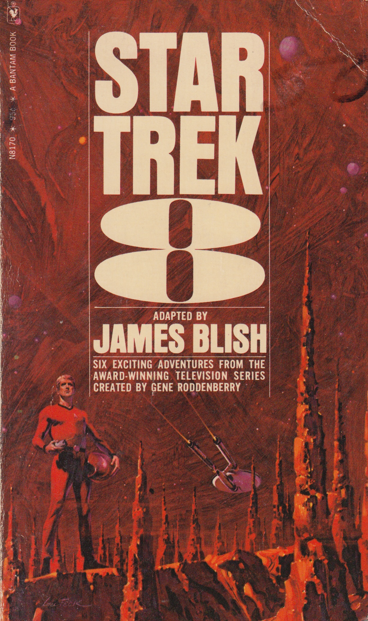
I’m following up last weeks post with one more series that I really like. In the late 60’s and early 70’s sci-fi author James Blish got commissioned to write a series of books that contained short story adaptations of the TV show. He started on volume one and made it all the way to twelve before he passed away, his run with writing this series was eight years long. Each book had a volume number and contained around ten short stories. Over the course of these twelve books there were many different artists that worked on the cover illustrations but the text treatments for the most part remained the same. How can you not love those big volume numbers on the cover, so good. I posted a few of my favorites from the series above but I encourage everyone to seek out the other covers and post personal favorites in the comments below.
My favorite would have to be volume six. This volume along with numbers four and eight (also favorites) were illustrated by Lou Feck. One reason I love Lou Feck is that his work is very easily recognizable when you are flipping rapidly through the paper back bins at your local used book store, high contrast and very dramatic. I am planning on doing a whole post dedicated to Lou, he is one of my favorite sci-fi cover illustrators and there are many other great ones outside of his work on this Star Trek series.
Number five was done by Mitchell Hooks, and I have to admit I didn’t know much about him before this post. When I went searching for more sci-fi work of his I really couldn’t find anything that came close to this one in terms of subject matter and style. A lot of his work seemed to be for mystery/thriller books and also some magazine cover work. Although much of his other work doesn’t quite fall under the sci-fi category I felt this image fits in well here so I included it. I hope you guys are enjoying this series.
A quick thanks to @jakekouba on instagram for tagging a few of these Star Trek covers a week or so back. Keep the #sundayscifi tags coming!
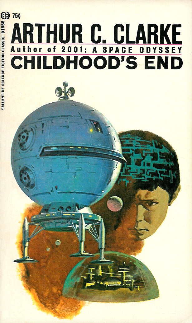
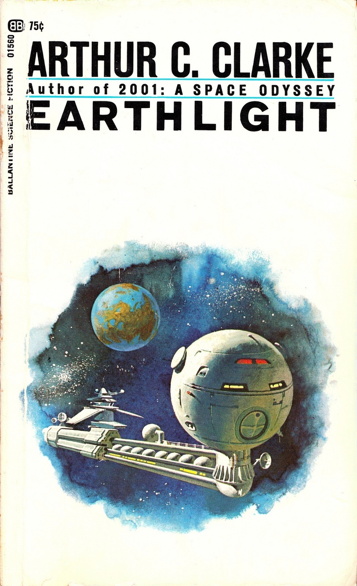
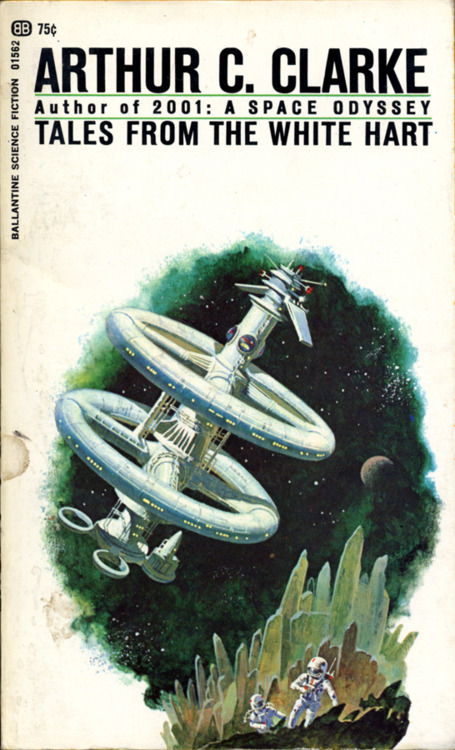
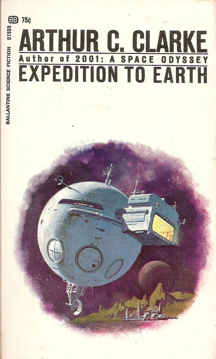
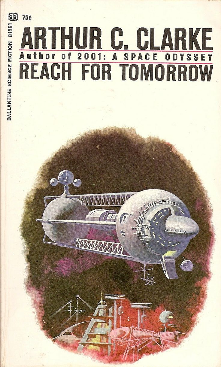
This week’s post starts with one of my personal favorite covers–Childhood’s End, which is also a great read. It’s pretty short and I think its up there with Arthur C Clarke’s best. On the back book cover I learned that Ballantine Books did a whole series of similarly illustrated covers–all just as beautiful. I love how the same illustration style and structure is maintained over the entire series of covers while each book is given its own dominant color. When I sat down to look into the series’ artist, everything unfortunately end in “artist unknown” or “uncredited cover art.” There is some speculation that the artist of the Earthlight cover may be Dean Ellis, but it’s not enough to tie him to any of them for sure. While I debated not posting this series after I found no conclusive artist, I decided they’re too good not to post. I am hoping a solid artist credit surfaces so that I can come back here to post an update. If anyone comes across anything, be sure to post in the comments below.
I’m happy to see the #sundayscifi tag on instagram is starting to get some posts. I will be pulling some ideas for future editions on there (in fact there is one I already know for sure I will be posting). As always, feel free to share your own favorite sci fi artist suggestions or thoughts on the post in the blog comments.
Ducking into used bookstores over weekends and after work, I have become a bit of a sci-fi paperback junky. I love the feeling of rummaging through stacks of forgotten paperbacks and discovering that hidden gem of a cover. There is just something about the idea of the future as illustrated by artists of the past that I find fascinating. If you do enough digging you can come away with some great covers for under a few bucks. Recently I began scanning and cataloguing my finds and this has led me to the idea for a new blog series I will be posting here on Sundays. Every week my post will be inspired by one of the covers I own or a new find. Some of these may be well known while others more obscure. I look at this as a way to learn about and resurrect some of the great cover illustrators and designers of the sci-fi genre. If you have suggestions or your own favorites, leave a comment or contribute to the collection of covers with a nice straight on shot of your find and tag it #Sundayscifi on Instagram. I started the tag off with a few of my own images but I would love everyone to include their finds.
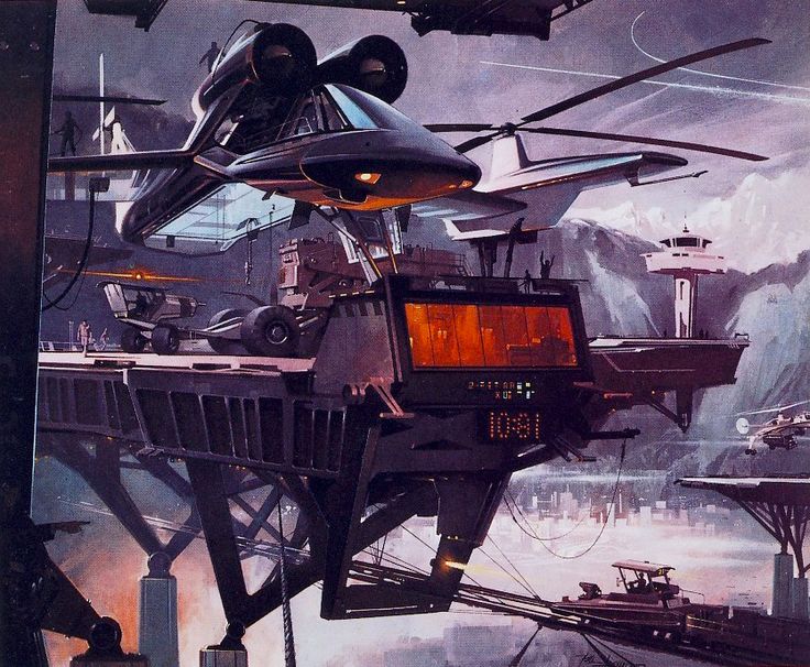
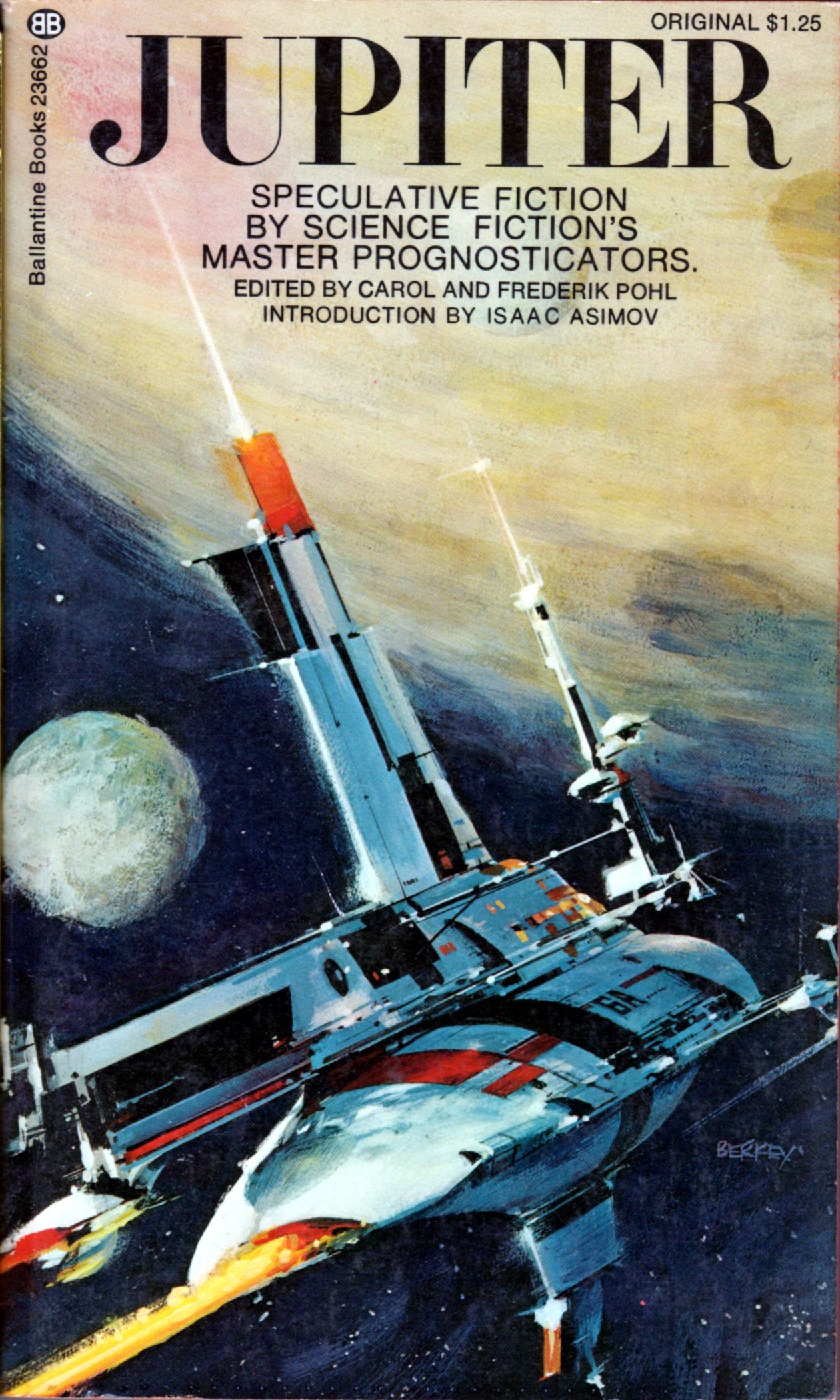
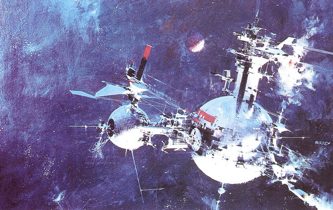
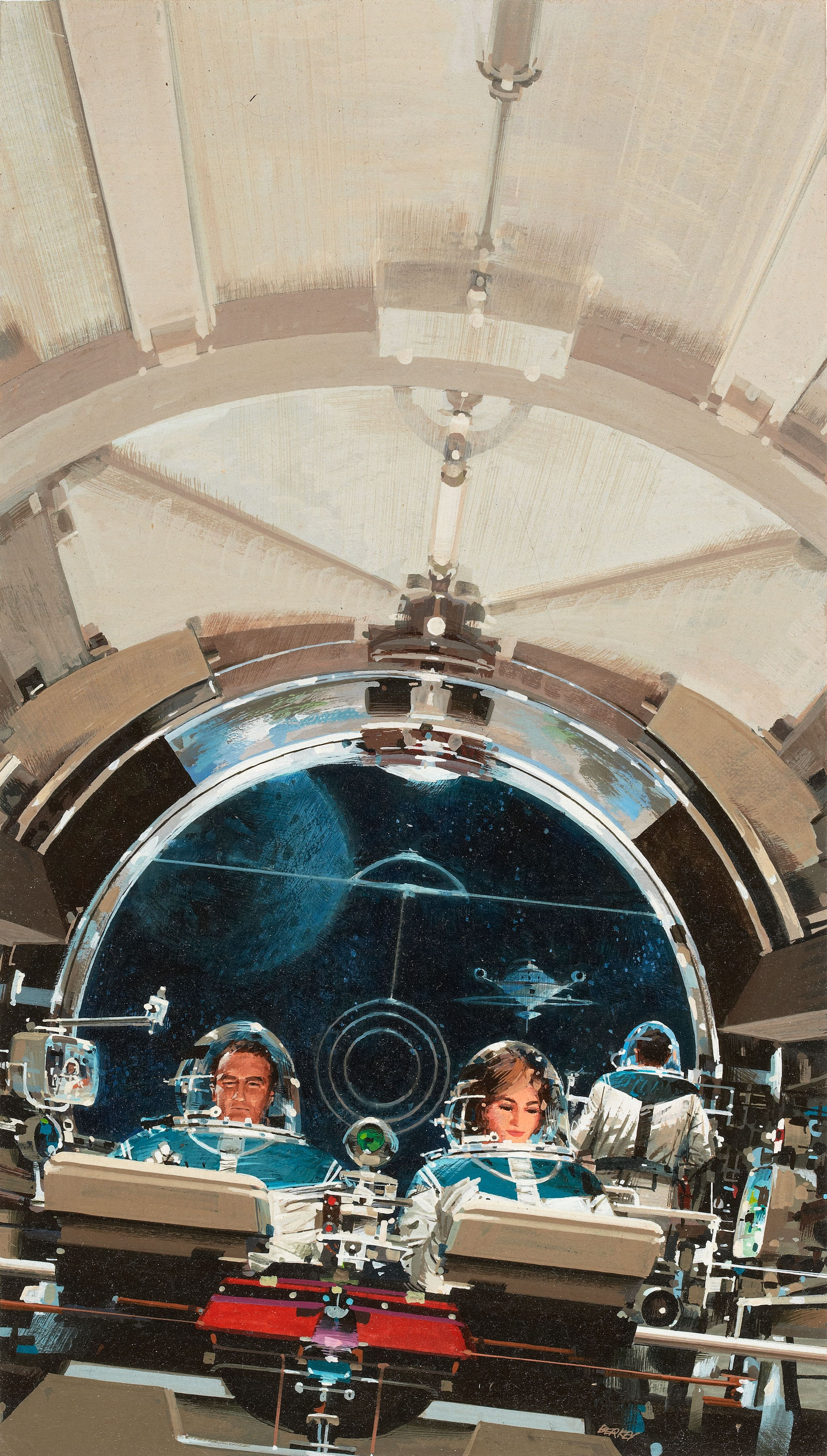
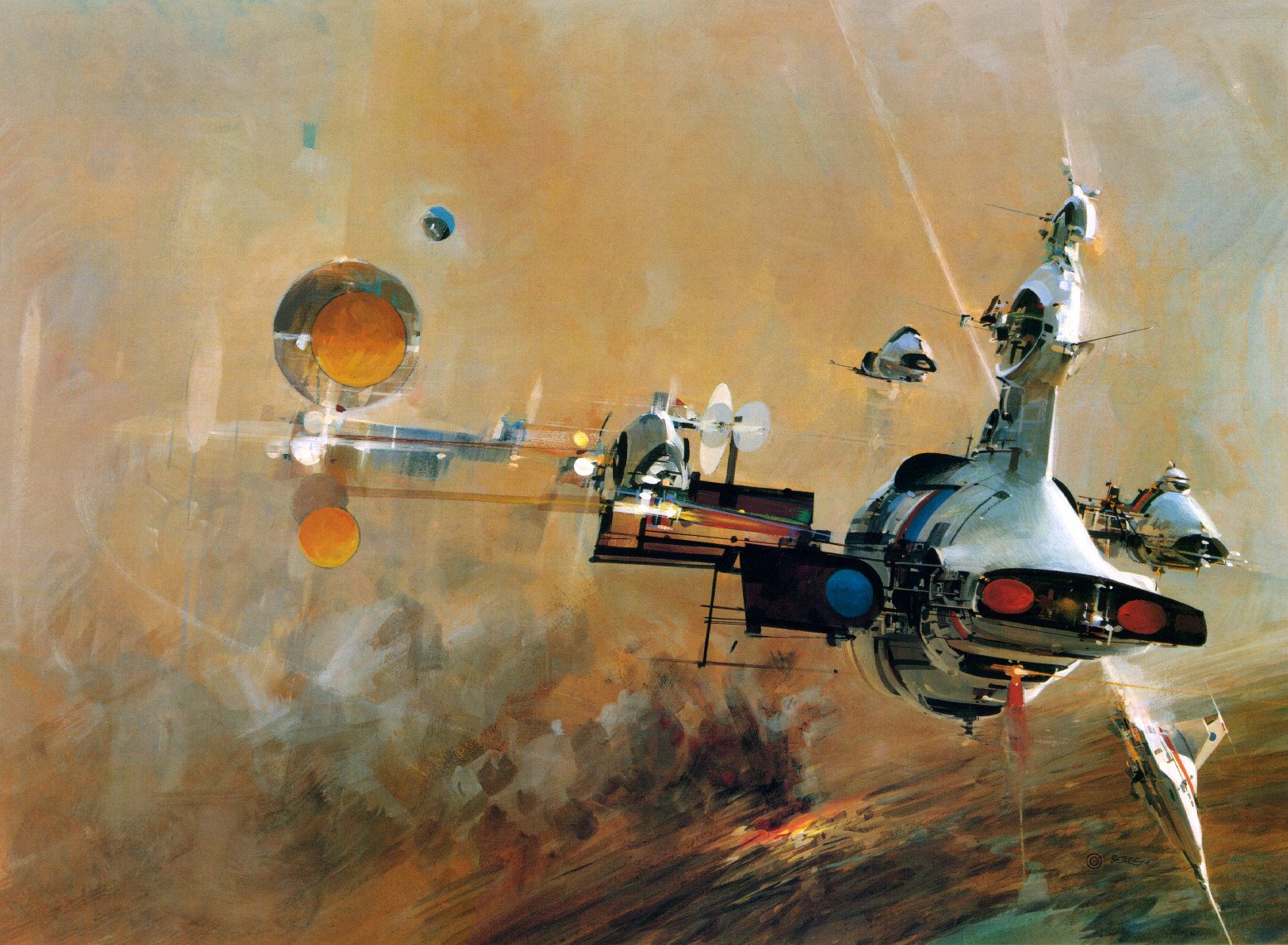
To start the post off, I am featuring one of the better known artists of the sci-fi genre. Most know John Berkey for his illustrations for Star Wars, but he holds a massive catalogue of varying types of work. Beginning in the 1960s, he was commissioned by NASA to further their space program as part of their efforts to travel beyond the Earth’s atmosphere and ultimately to the moon. No matter the type of work, I consistently love his use of color. My personal favorite thing about his work are his spaceships. The details of his images draw you in and you can get lost looking at every tiny detail he includes.