While i’m guessing some of us are counting down the minutes before WWDC 2013 starts off here’s a game you can play its called The 100 Meter Scroll, post your scores below, good luck and don’t break your trackpad or mighty mouse.
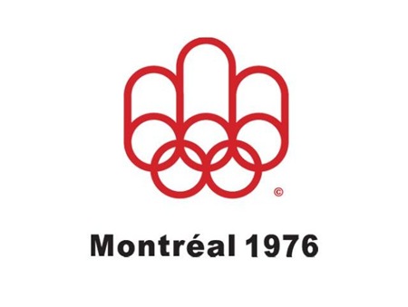
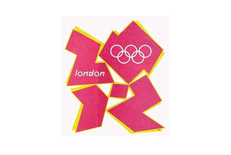
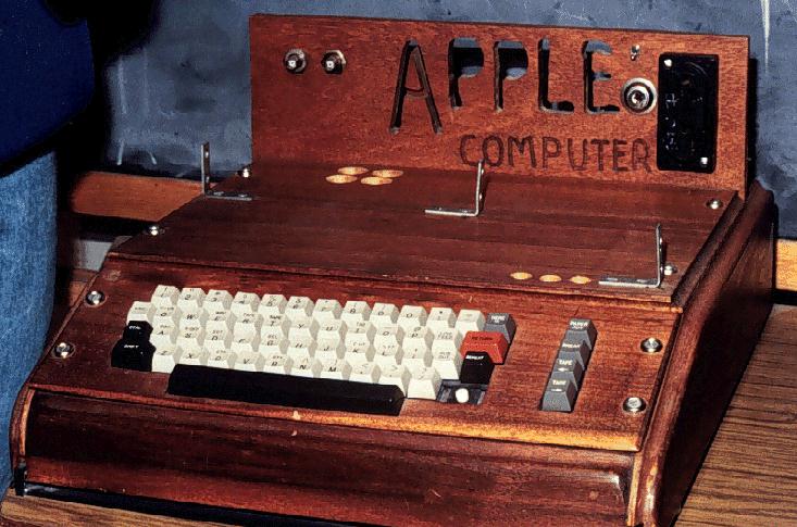
Ah, the 2012 Summer Games, now nothing more than the hazy recollection of infinite spoilers and borderline mental illness. While the overall visual presentation wasn’t quite as bad as a lot of people built it up to be (it was certainly better than this bullshit — but not this), London 2012 was an Olympics whose branding I seriously doubt designers will still be going on about 40 years after the fact. Perhaps it was just too advanced for our feeble 21st century minds to comprehend, so to ease us back into our stasis of perpetual nostalgia I present some more universally agreeable fare, from the simpler age of 1976, when everything happening in this picture was perfectly acceptable and also this crudely fashioned chunk of internet-free wood was your computer.
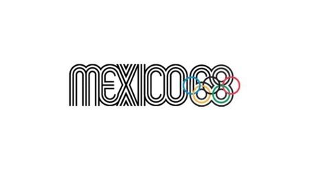
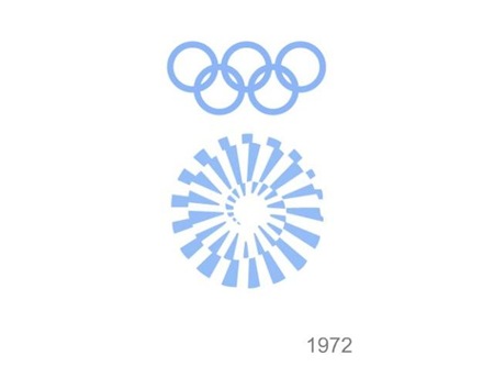
The 1976 Montreal Olympics branding sits right up there with Munich (my personal favorite) and Mexico on the pantheon of graphic design’s greatest achievements. I’m curious to see which of the more recent Olympics — if any — ends up being canonized by the design community in years to come. From the looks of things we shouldn’t hold our collective breath, it’s all been downhill since 1984.
If I was a right out of university for graphic design my first projects for myself before working on my own would be grabbing up a project like this for exercise. The olympics have a great history for amazing posters and branding and fine color scheme to work with so why not see what you could do and test out your skills. I personally like the empty pool swimming ones but the font couldn’t be any smaller which pretty much knocks it out of the running to be a real poster for the public.
I’m not sure why, but tickets of all kinds have always piqued my interest and this set may be the best I’ve ever laid eyes on. But forget the tickets, would just love some high-res copies of these photos for framing.
I’ve been geeking out on ’70s supercars lately and came across these gems depicting a BMW concept from 1972. The “E25 BMW Turbo” was commissioned to celebrate the 1972 Munich Olympics. BMW tasked famed automotive designer Paul Bracq to create the concept of which only two were ever built. Honestly, I love the front angles, but not really feeling that rear end. It feels very hatchback/kit-car-ish and the doulbe logos are killing me. Thankfully some of the finer points made it into production in the form of the M1 and some others.
That first shot is just off the charts; in the background you can see BMW’s Munich headquarters which was designed by architect Prof. Karl Schwanzer shortly before his death in 1975. In the other shots you can catch the games tent and the communications tower providing apt backdrops for the Turbo.
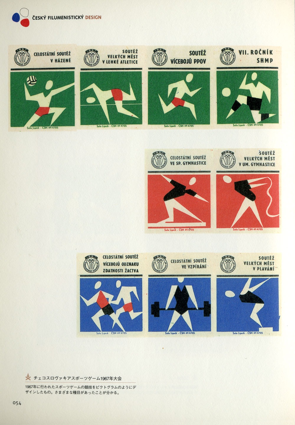
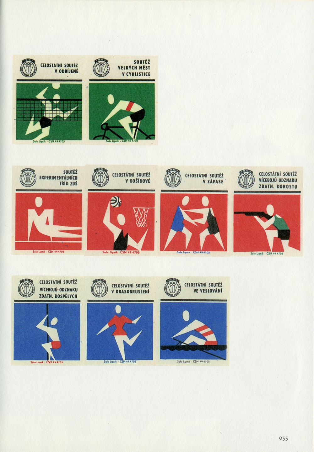
These Czech Olympic matchbooks are excerpted from one of my favorite design books, Cesky Filumenisticky Design. I don’t know much about these other than that they date from 1967. I’m also not sure who designed them since the book is in Japanese. I ran it by my friend and she said the caption says something about the name "Peter Togram". Not sure, fill in the blanks if you can read that caption.
So the much anticipated / extremely controversial Beijing Olympics are in full swing and despite the issues surrounding the host country, the games themselves have been incredibly entertaining. From a visual perspective the whole production is off the charts. If you didn’t see the opening ceremonies, do yourself a favor and watch the replay. I can’t even begin to describe it so I’ll just say there was a roll-up LCD screen about the size of a football field and a mass-scale drum display that looked like some sort of giant human Tenori-On.
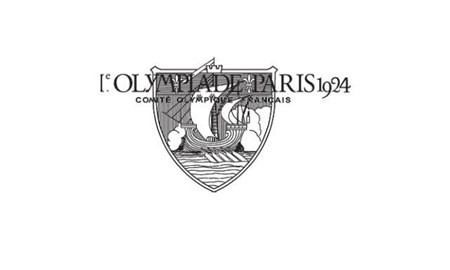
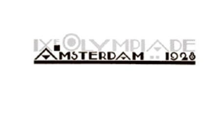
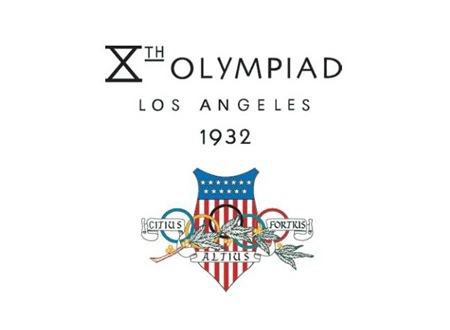
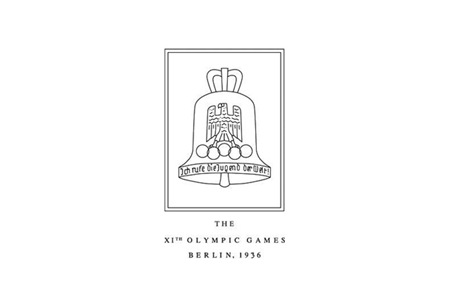
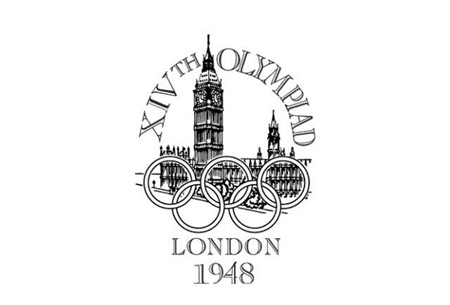
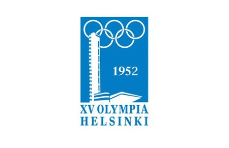
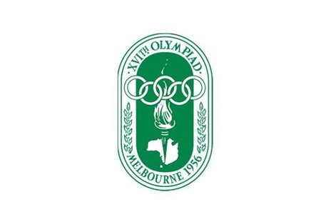
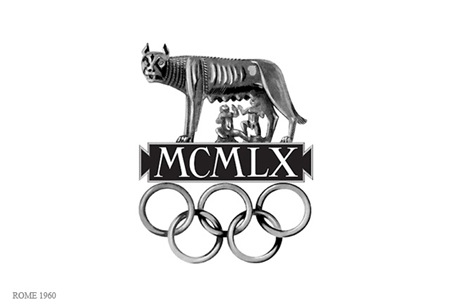
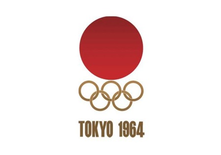
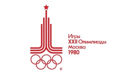
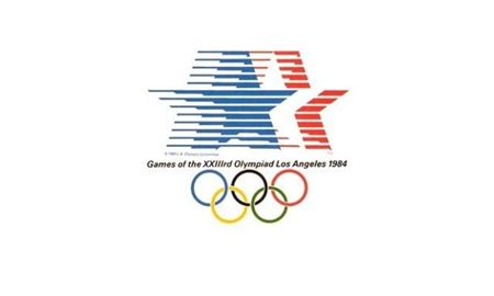
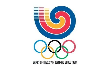
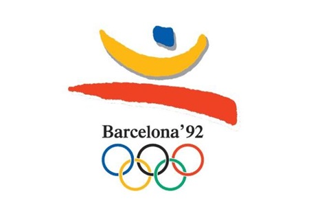
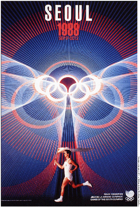
Obviously branding and information design are central to each Olympic experience and while I’ve posted a lot on past Olympics, I thought it would be good to get all of the logos together in one post. It’s very interesting to scan through these; the stylistic transitions say a lot about the country and historic era of origin. Helsinki kicked off the modern approach, but then Melbourne and Rome had to go and screw everything up for 8 years. Tokyo ’64 started what turned out to be a 24 year winning streak of incredibly well thought out, masterful logo designs which continued unabated until Seoul decided to kill the party with something that can only be described as inexplicably bad. From then on out it was a lowest common denominator free for all of middle of the road mediocrity. This, of course, coincided with the dawn of cheap, accessible desktop publishing where everyone all at once decided to forget everything they had ever learned about typography and color theory. I think this was also around the time that the Olympics was maturing into the massive corporate money machine it is today, so the shift in style makes a lot of sense given the new set of imperatives driving the branding (i.e. MAKE AS MUCH MONEY AS HUMANLY POSSIBLE).
Although there were 8 games prior 1924, I’ve started with Paris as it seemed to be the first of the modern games that had a specific logo mark associated with it. Most of the earlier games had posters but nothing you would consider a logo. Also missing are 1940 (Tokyo > Helsinki) and 1944 (London) which were both canceled due to World War II.
And it wouldn’t be completely without a peek into not-so-distant, yet oh-so-hideous future (London 2012). To tell the truth, something about this is starting to appeal to me. At the very least I can say I prefer the 2012 logo to some of it’s more boring ancestors (i.e. 1988-2008).
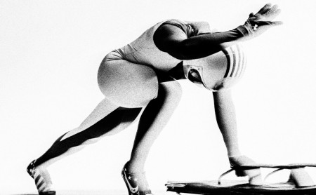
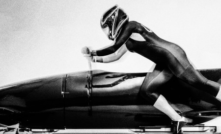
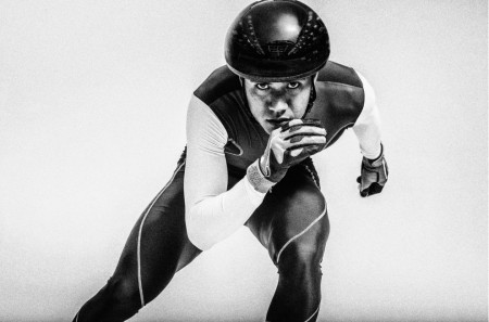
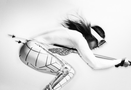
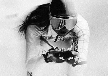
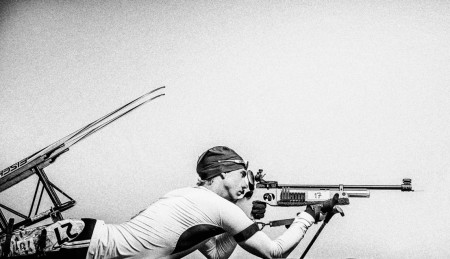
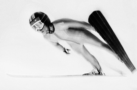
I know I’m a little late on this post since the 2014 Winter Olympics have ended but that doesn’t mean that these images from photographer Carlos Serrao aren’t badass. I’m really loving the ultra simple approach to these images that showcase each individual sport’s iconic form in action. If you’re not familiar with Carlos’ work, check out his website and, chances are, you’ll see an image on there you have seen before. The swimmer’s series is simply awesome.


