50 Amazing Gig Posters


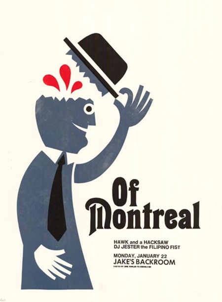
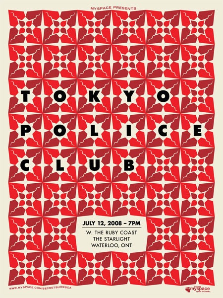
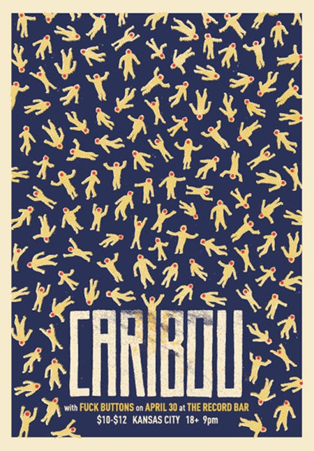
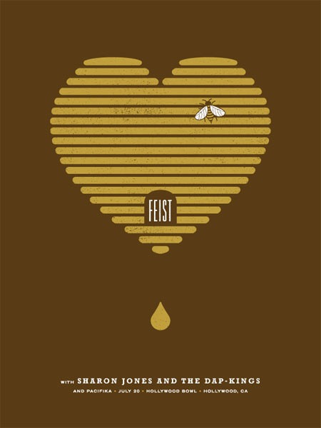
I have been meaning to do more posts with good examples of contemporary poster art and after seeing Well Medicated’s 50 Amazing Gig Posters Sure To Inspire article I thought now would be a great time to start. Concert posters were always my biggest inspiration for getting into art and design. I like to think of my work as sort of straddling the disciplines of pure graphic design and the more illustrative styles featured in the Well Medicated post so I’m always excited to see new work from these types of artists. It always amazes me how they do so much with so little and how they stay true to the classic modernist typographic ideals. It’s very rarely that we as designers get to be truly idealistic with our design so it’s a breath of fresh air to see work like this, unmolested by the hands of middle-men and marketing departments.
On a side note, seeing a large collection of stylistically similar prints like this always reminds me of the rather strange disconnect I’ve noticed between the world of gig poster artists and graphic designers. A good example would be FlatStock at SXSW; that whole scene always seemed to me to be quite insularly while a lot of the design festivals I end up presenting at seem to fall short in their representation of the poster art world. Perhaps I’m missing something, but you’d think there would be more overlap between the two worlds given how much the output has in common.

11 Comments Leave A Comment
sean patrick says:
September 17, 2008 at 3:23 ama few of yours should of been in there. along with some others i can think of. a list of hits and misses i do say.
Scott says:
September 17, 2008 at 4:34 amyeah, a few seemed a little out of place…. isn’t using the Porcelain font tantamount to Comic Sans these days?
Whether or not my stuff belongs up there is another discussion, but it sort of illustrates my point; it seems as if that whole gig poster world is it’s own sphere that doesn’t often look outside it’s own rather narrow band of style. it also seems that all the posters are for massive bands, I am sure there are oceans of great posters created for small-time bands floating under the radar.
sean patrick says:
September 17, 2008 at 9:05 ami couldnt agree with you more. first off, the word tantamount isnt used enough. secondly, your work is a perfect example of how you dont need to be selling out the hollywood bowl to get someones attention. there alot of artists that do great posters on small levels that get kind of ignored. you could of done a series of posters for a big band. along with you i put my friend, dan streeting in that category. i guess you need to be a design house to get gigs like that these days.
i also am getting bored with the resurgence of “hey look at this woodblock lettering i found” and overusing it. in my opinion, but some bands dont benefit from that kind of typeface….
joshua says:
September 17, 2008 at 10:36 amThese are really great!
I’d agree a few seem out of place. But part of the separation you’re speaking of seems to come from the strongly artistic slant that gig posters foster. Which always seems to be slightly arbitrary.
sean patrick says:
September 17, 2008 at 11:41 ami always liked rauschenbergs concert posters.
ben c. says:
September 17, 2008 at 1:00 pmhey thanks for posting my caribou poster. i’ve always been a big fan of your work as well as your music. and i agree with you on design festivals and poster art, it’s always a little sad. flat stock is intimidating to me though : ) cheers. -ben
frank says:
September 17, 2008 at 4:33 pmI love that Caribou poster! Great band too. There are a lot of other great posters on that list and I particularly like the way that many of them feel like Polish poster art from the ’60s or something.
As a professional designer (of the hack-ish variety) who has never done any poster, album or book cover work, I think there’s some level of jealousy involved. In a certain sense, a lot of that stuff is more art than design and maybe some more corporate designers look down on poster art as something done more by painters and comic artists who have never had to deal with a real client.
A lot of it fails from a strict design-as-communication point of view too. Something like that “Mates of State” poster with the thumbprints in a heart is clever and conceptual and is the kind of thing you might see in a corporate graphic design annual. But then a hand holding a bunch of balloons? It’s a great, striking image but kind of a non sequitur that doesn’t really have anything to do with Deerhoof. Which is great! And that’s the freedom of designing rock posters. But it’s understandable that some design snobs may ignore that work somewhat out of jealousy.
Collective Family says:
September 18, 2008 at 7:39 amThe Tokyo Police Club poster is really pretty, but the type on the Caribou poster really catches my eye. Good stuff, definitely makes me jealous.
toque says:
September 19, 2008 at 12:09 pmMODA had an amazing gig poster feature that toured the US a few years ago. it was a really nice grouping of the wide variety of gig work there is out there.
re: debate on the gig poster designer…i know a lot of designers that don’t deal well with the “rigours” of more corporate clients (“bigger” “browner” “more logo” “etc”) and as a result gravitate towards the more artisan client base.
gigposter'er says:
September 19, 2008 at 6:30 pmi have to agree with pretty much all of what is being said about gigposter designers v.s. the other graphics designers out there, but i want to add some other thoughts:
the main difference between the two worlds is that there is almost never any money being paid to the designers up-front. i can’t speak for the design houses out there (they may get guarantees), but the guys who are working independently are making their money on poster sales. in the few cases where you are paid up-front, the money is piss-poor at best.
so you asked why you only see awesome designs for huge bands, and the reason is that those are the posters that sell. you design a hell of a lot better for other people when you know your work is going to bring in money to pay for rent. the sad fact is the smaller bands are backed by small promotion, and therefore, less exposure, and less of a chance that your poster is going to sell. selling a poster on the design alone IS possible, but how many people (other than designers) are going to buy a rad poster with bands on it that they have never heard of?
gigposter designers gain fame WITH the artists they design for. most of the designers whose work you are seeing have been at it for a very long time, riding on the coat-tails of those huge bands.
i’m not trying to sum up the industry in one post, but this is at least one major reason for the differences in attitude and the perceived isolationism of both worlds.
geof says:
September 20, 2008 at 11:17 amThose are all Canadian bands eh?