1976 Olympics Graphics Manual


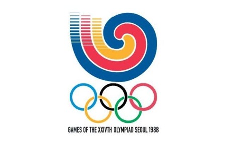
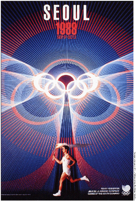
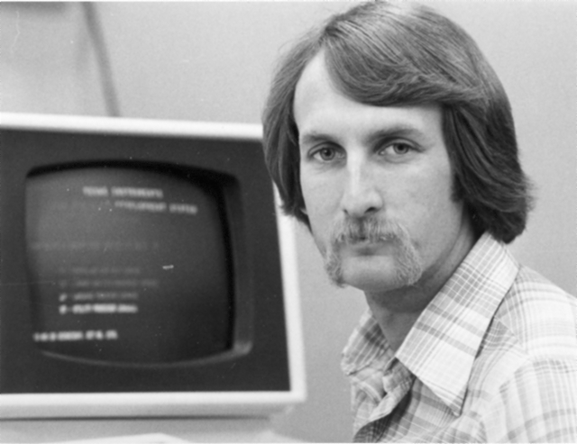
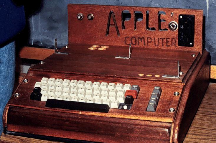
Ah, the 2012 Summer Games, now nothing more than the hazy recollection of infinite spoilers and borderline mental illness. While the overall visual presentation wasn’t quite as bad as a lot of people built it up to be (it was certainly better than this bullshit — but not this), London 2012 was an Olympics whose branding I seriously doubt designers will still be going on about 40 years after the fact. Perhaps it was just too advanced for our feeble 21st century minds to comprehend, so to ease us back into our stasis of perpetual nostalgia I present some more universally agreeable fare, from the simpler age of 1976, when everything happening in this picture was perfectly acceptable and also this crudely fashioned chunk of internet-free wood was your computer.
The 1976 Montreal Olympics branding sits right up there with Munich (my personal favorite) and Mexico on the pantheon of graphic design’s greatest achievements. I’m curious to see which of the more recent Olympics — if any — ends up being canonized by the design community in years to come. From the looks of things we shouldn’t hold our collective breath, it’s all been downhill since 1984.
Further reading / viewing here via AisleOne’s Flickr

4 Comments Leave A Comment
LoaRun says:
August 21, 2012 at 11:41 pmHaha great post. Not just acceptable but the cutting edge
Anonymous says:
August 22, 2012 at 6:08 amGreat post. Amusing read. Thats Scott. Doesn’t get much better than Montreal in my opinion.
Any opinions on Rio’s branding? Already plagiarism accusations flying around. Inevitable I guess…
i lol'd says:
August 22, 2012 at 7:49 amhillarious
Owen says:
August 22, 2012 at 11:54 amWhen you’re in Montreal, you should take a visit out to Parc Jean-Drapeau and see the remnants of the 1976 Olympics, as well as Expo ’67… It’s a nostalgic trip. Sad that many of the buildings and monuments are now overgrown and somewhat derelict.
Great post.