Daft Punk’s Electroma
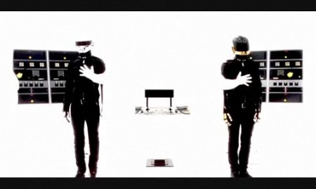
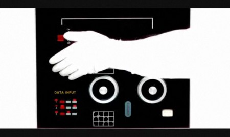
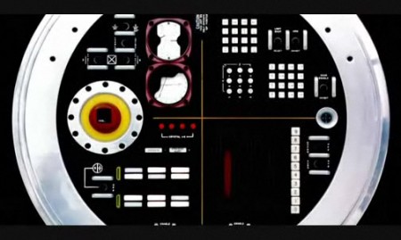
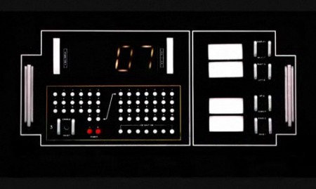
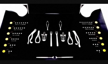
I finally took the time to check out Daft Punk’s latest film, Electroma, tonight and I must say it was pretty impressive. The cinematography and visuals are breathtaking and the sound design and music (which was, sort of ironically, not made by Daft Punk) is incredible. The plot is pretty much an afterthought though; your standard issue vague, arthouse storyline that didn’t really move me in any way. But I didn’t want that out of it, nor was I expecting it, so I can’t knock the film for it. The substance is in the imagery and it’s simply beautiful. When paired with the excellent sound design it achieves a 2001-esque vibe, a sort of retro-future as imagined in the 80’s. You can watch a Vimeo clip from the film below featuring the superb laboratory scene (from which the stills above were taken). It’s out now on DVD and I would have included the cover and title graphics, but they’re pretty bad, which is a shame because a film with imagery like this just begs to be wrapped in quality design.

12 Comments Leave A Comment
Renzo says:
April 6, 2009 at 11:57 pmThanks, visuals of the movie are simply gorgeous… The laboratory scene is really (huh) spectral (?) it is futuristinc in the way James Bond’s movies (series with Sir S. Connery of course) were at their time and there is such a strong sense of coreography and composition. Maybe there’s just one detail that helped ease a bit the tension. It was the way the two character were laying on the operation beds, they actually looked more as if they were at a barber shop this surely added a bit of irony.
empty says:
April 7, 2009 at 12:18 pmi really need to see this; i heard about the film, and completely forgot about it until reading this. i cant say i havent liked anything that daft punk has done, so im looking forward to it.
i didnt know they didnt do the music.
Scott says:
April 7, 2009 at 3:08 pmempty-
yeah, it’s worth a watch, especially on a large screen if you have access to a projector. and yeah, apparently this time around they decided to use other music, which I think was a wise decision, I am not sure anything they’ve done would have fit this film and it probably allowed them a lot more room to do something different with the pace and vibe of the movie.
johnsson says:
April 7, 2009 at 7:57 pmkind of weird to say the cover is pretty bad considering the images you posted are similar to it…
anyway have you checked out Gus Van Sant’s film Gerry? Electroma has scenes that look like copy/paste from it… here’s an early scene of the two main characters riding on a car…
http://www.youtube.com/watch?v=-_JiB4N-0Ro
couple more youtube exploring and you’ll find them walking on the desert in long silent scenes…
wayne says:
April 7, 2009 at 10:17 pmMy favorite part of this film is the understated, yet classy Ferrari 412 with the license plate ‘HUMAN.’ Like Scott said, any semblance of a plot is far removed from this film. As a huge Daft fan, I just have to sum up this film with the classic “WTF?” And I wouldn’t have it any other way.
‘Electroma’ used to be hosted on Google Video – you could watch the whole thing for free. I tried searching for it again on the ‘tubes, but to no avail.
Scott says:
April 7, 2009 at 10:49 pmjohnsson-
I don’t know what cover you saw, but the official one features two silhouettes on either side of a dark rectangle. The title typography is some hodge-podge of fonts slapped together with a random, poorly photographed metal disc. If they had simply treated the type a little better it might have flown, but seriously, doing a whole layout in black and white and then substituting the “O” in “electroma” with a photo? bad news. it just doesn’t sit well with me, and like I said, it’s a shame because this movies gives you all the visual goodness you could ever want to work with if you were commissioned to do the cover. Anyways, the cover and title scene just look sort of like an amateur-ish afterthought when compared with the brilliance of the imagery in the film itself. Which is maybe how they wanted it, I can’t say, I just know I would have done it differently. cover:
http://diggin88nine.files.wordpress.com/2007/05/electroma.jpg
interesting point about the van sant film, have people been drawing that comparison? I wouldn’t be surprised if they lifted it from him, that’s sort of their M.O. with music so I don’t see why it wouldn’t be the same with their films.
wayne-
looks like you can watch the whole thing on youtube now:
http://www.youtube.com/watch?v=gUJZhJFQSY0&feature=PlayList&p=773F751B935B3150&index=0
but that just wouldn’t do this film justice.
jdh says:
April 8, 2009 at 9:01 am@johnsson thanks for pointing out the Van Sant film reference — very cool to see that!
I saw Electroma in theatres, which was, admittedly, a little painful to sit through. But visually, yes, it’s stunning. The closing sequence with the Jackson Frank song is pretty amazing (linked below). I’m glad to see it get some exposure here.
http://www.jacobheftmann.com/news/2009/04/08/electroma-closing-sequence-daft-punk-x-jackson-frank/
jdh says:
April 8, 2009 at 9:05 am* sorry about the trackback and the link, didn’t know it would post the trackback too. Bad etiquette on my part.
David Auerbach says:
April 13, 2009 at 3:36 pmThe only DVD case I’ve ever seen was a pressed aluminum case (yes, it was made completely out of aluminum, with a few plastic hinges and innards), but I thought the case design was out of this world, and fully befitting of the movie. You can see some pictures of it here. It also included an AWESOME poster.
http://www.turntablelab.com/images/content/6/6/66661.jpg