MLK 64
Posted by Scott
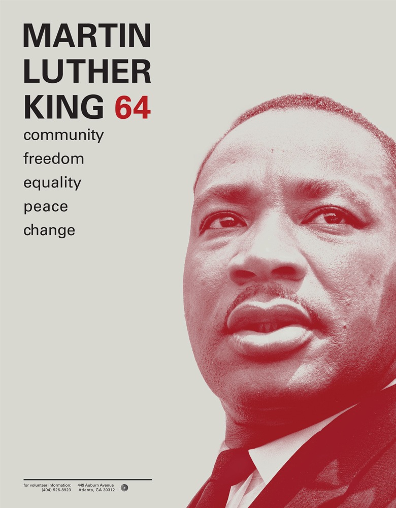
 This student project by Ryan Hageman caught my eye today. Very nice color / typo interaction and a clean, direct style. There’s more over at his site notfreelance.com

This student project by Ryan Hageman caught my eye today. Very nice color / typo interaction and a clean, direct style. There’s more over at his site notfreelance.com
10 Comments Leave A Comment
Bob says:
November 13, 2008 at 9:10 amwhy isn’t he freelance?
Scott says:
November 13, 2008 at 1:24 pmhe’s a student at minneapolis art & design. (see “about” section on his site) very solid work already with great focus, probably a good guy to watch in the years to come.
phil says:
November 13, 2008 at 4:41 pmoh cool what font is it???
thanks
greg says:
November 14, 2008 at 8:06 amNice work. He needs to pay more attention to the kerning, though, in the “community, freedom…” section. Otherwise, it’s excellent.
Greg Formager says:
November 14, 2008 at 9:08 amThe typeface is Univers.
roberto says:
November 14, 2008 at 9:30 amyeah, i think the only problem it’s the kerning. it’s incredible how the blank space in the left leads you to the photograph. nice work!
phil says:
November 16, 2008 at 1:16 pmthanks GREG ;)
Ryan says:
November 17, 2008 at 11:44 amClean work and great use of color. I would love to see him do his own photography, and get a little more experimental with the type like he did in his identity.
ryan hageman says:
November 20, 2008 at 6:21 amJust wanted to say thanks for the comments and critique. I am spending time revisiting this work and your words inspire me to tweak this design to its full potential. As a student, it is valuable to hear critical commentary outside of the classroom context.
-Ryan Hageman
NotFreelance.com
p.s. univers love.
Poison says:
December 4, 2008 at 7:49 pmMeh, sort of boring in my opinion. Seen it a billion times before.