CBC 1975
Posted by Jakub
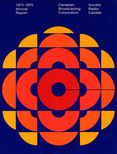
CBC Annual Report 74-75 graphic. The forms are incredible but the blue is a bit too royal-blue for my tastes. With a more muted color scheme and a shift of the blues into the aqua realm this would be on a whole other level. But I am assuming if you found a copy of this today, it would have faded just enough to look pretty amazing.

9 Comments Leave A Comment
Mathias says:
September 19, 2007 at 4:44 pmYou certainly have a real affinity for 70’s design. I do too, though. So I can understand.
This particular design is very cool; it’s bold and attention demanding. I agree with you on the colors, but they’re definitely a 70’s color combo. What were they thinking back then! What are we thinking now? Isn’t it great how design changes/evolves as a whole, over time, without designers necessarily doing it on purpose. It’s as if we’re maturing as a race and our collective taste changes, just like an individual as he/she matures. Or is it inspiration that changes, as society does, therefore altering the output of the design industry… an interesting topic I’ve often thought about.
Mathias says:
September 19, 2007 at 4:48 pmI meant to add, about the annual report cover, that I hate the typography, hehe. It doesn’t need to fight the focus of the thing for attention but it could use a little 70’s stylin’, don’t you think? It’s the only thing that seems essentially detrimental to the whole dezine.
Typography is my biggest current war. Used to be color, got a decent handle on color usage, now it’s type I feel the need to conquer… as if I ever will.
Scott says:
September 19, 2007 at 5:07 pmMathias-
Thanks for the comments….I personally like the type treatment here. The design itself is so over the top, I think taking a restrained, minimalist approach to the typography definitely balances the piece. I am also a big fan of the grid based Win Crowley-esque type placements you see in there, so that’s a plus as well.
Martin Paevatalu says:
November 4, 2007 at 5:03 pmThe poster looks very much like the works of the danish artist Per arnoldi..
He’s famous for the use of royal-blue og marine-blue color
oo says:
November 13, 2007 at 12:27 pmHave you checked out the cbc shop? They have a few tshirts with variations on this classic canadian icon.
http://www.cbcshop.ca/
Chrissy says:
January 25, 2008 at 4:20 pmWhat an eye-catching design!
Йогурт says:
October 9, 2009 at 10:16 amЧитаю Ваши статьи уже давно,очень интрестно пишите!Спасибо!Хороший ресурс.