Sports logos part. I
These are just some of the major league(NHL, NBA, MLB) sport logos that i’ve enjoyed over the years. Most of them i like for different reasons some simply just the color scheme, clever layout, or unique shape. Some of these I thought could’ve be done a tad bit better like the Minnesota Wild logo one where the trees really struggle but the forest elements are all there in pretty creative way like the path for a mouth is pretty genius i thought. I also was missing good versions of the Philadelphia Phillies logo that was bold light blue and maroon or the old Houston Astros uniforms that a lot of people rip on but they’re abit of a guilty pleasure for me.
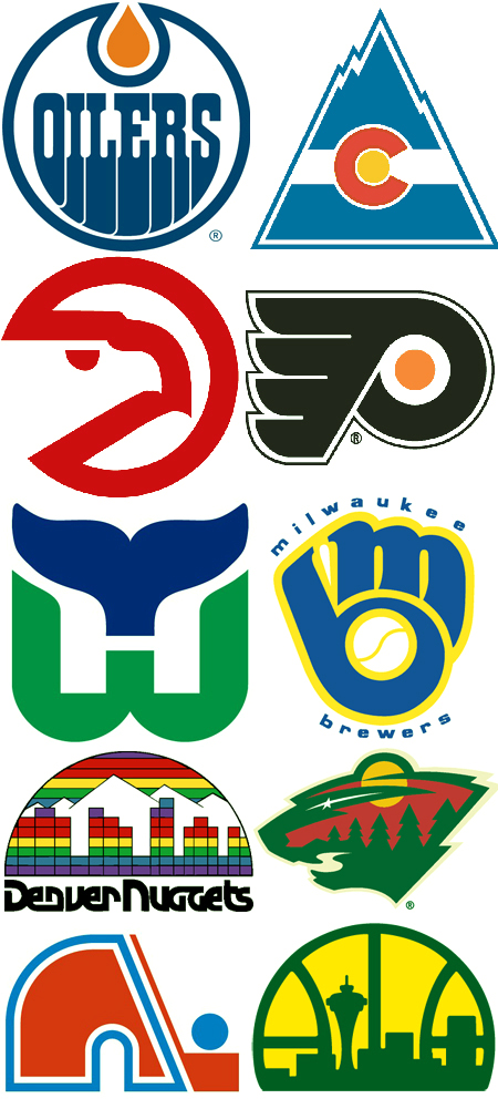
Logo identity from left to right and top to bottom: Edmonton Oilers, Colorado Rockies(the hockey one), Atlanta Hawks, Philadelphia Flyers, Hartford Whalers, Milwaukee Brewers, Denver Nuggets, Minnesota Wild, Quebec Nordiques, Seattle Supersonics

18 Comments Leave A Comment
Alex / HeadUp says:
May 28, 2008 at 2:59 pmHell yeah..throwback logos are awesome, especially the oilers and the nugs. I haven’t seen the Nordiques logo since I was lucky enough to see them play the Flyers when I was a kid before the franchise turned into the Avalanche in ’95.
Its funny, as a kid living in Philly and rooting for the Flyers back in the days of the Legion of Doom (Lindros, LeClair, and Renberg) I had never figured out what the Flyers logo signified. While I’m still not 100% sure, I originally thought it was a puck flying through the air. Others have explained it’s a letter “P” with wings. One of the few team logos that has been around since the very beginning, the orange in the center is meant to signify the NHL logo (which I guess used to be that shade of orange).
Cool post, looking forward to pt.2.
Here’s the Phillies logo I think you’re referring to, 1970-1991, it would go on that light blue jersey: Phillies Logo
Horacio says:
May 28, 2008 at 4:18 pmThe one from Seattle it’s great!
I remember the first time I saw your Dual group logo, reminds me of this. Which is great, of course.
Josh says:
May 28, 2008 at 5:07 pmhartford whalers. hands down, the best. but don’t forget the canucks!
http://www.pickuphockey.com/forum/avatars/vancouver_canucks_logo_yellow.jpg
Andy says:
May 28, 2008 at 5:37 pmDave Babych and the Hartford Whalers for life.
Jakub says:
May 28, 2008 at 6:06 pmJosh: Yeah, Hartford’s is amazing, i love that the negative space in the middle forms an H. I actually had a Canuck and Hartford jersey when i was younger, for the longest time i thought the Canucks logo was the side of a cliff or something of that nature.
Justin S. Meyers says:
May 28, 2008 at 7:42 pmNordiques was the first team I played for in the YMCA as a kid… obviously not the real Nordiques, just a fun thematic thing. We were the worst in the league much like the real Nordiques.
Philly all the way… Lindros #88 all time fav. They were the only team to have a goalie score a goal… Hextal I believe?…
Anyway… awesome logos. Mostly Hartford.
Erick says:
May 29, 2008 at 7:32 amCasualy, couple of days ago, i was working on a logo for a infography about Hockey in general, and of course i thought to create a logo like the style used to build logos on the major leagues of north american sports cause they are very characteristic for the shapes, colors and other aspects.
Will be good if you include some of story, or references in part 2, or please if you have info about the origins or story about all this logos or some of them, will be interesting to share, i’d like you could answer me.
By the way congratulations for the music, great boy
thanks
Markus says:
May 29, 2008 at 8:15 amOh, those are great logos! That reminds me…do you remember the old Houston Astros jersies? I love those. The Expos logo is fun too.
http://www.authenticsportscollectibles.com/store/images/49497.jpg
joshua says:
May 29, 2008 at 8:58 amNHL logos has always been tops for me. I thinks it what originally attracted me to the sport :)
Ben Z says:
May 29, 2008 at 11:12 amHell jyeah Scott! I’m glad you flagged the old Sonics 80’s logo for inclusion! This graphic made me wet my pants for a second…I have always had deep, unexplained love for the Sonics ‘cityscape’ logo as we call it up here, and the Brewers, Hawks and Nuggets logos are classics too. I always thought my friends simple 80’s blue/yellow fitted Brewers hat with the mitt and ball was the nicest baseball hat I’d ever seen…
The Hawks logo always made ‘Nique and Spud’s dunks just that much sicker, and they had Chicago beat on logo design at the time, if not dunks…but credit to both MJ and ‘Nique for sportin the gold chains during the classic dunk contests.
The Sonics ’70, ’71, and ’73 logos were classics too. RIP…SEATTLE SuperSonics. Next NBA team to move might be your old Sacremento Kings, eh?
Ben Z says:
May 29, 2008 at 1:11 pmwait…1970 Sonics logo sucks I think. I can’t find a decent chronology but, at the arena, they have team photos and jerseys from each year. most of the late 60’s to mid-70’s were pretty tight as they played on the BOEING/SuperSonic Jet connection (save for a few horribly simple and bad choices)…
Jason Warth says:
May 30, 2008 at 5:17 amI credit that Milwaukee Brewers logo with my being a graphic designer today. I still remember the moment, when I was 6 or 7 years old, and I realized that the mitt was also an “m” and a “b.” Man… it was that “ah-ha!” moment that we all chase after now, and from that moment, I was hooked!
I also grew up loving green/yellow, so that Supersonics logo was very close to my heart. I remember trying to recreate it in “GeoWorks” or some really weird drawing program on our first computer (not Windows or Apple… I have NO idea what that was). I think I may have also created it with those plastic beads that you lay out on a grid and melt together with an iron. Ha! Arts and crafts rule…
-J1
Alex / HeadUp says:
May 30, 2008 at 7:04 amCool sports logos resource I found:
http://www.sportslogos.net/team.php?id=803
Is anyone else sickened at the decreasing quality in terms of design of sports logos nowadays? It’s like the majority of them have seen a downward trend over the past 10 years.
A recent example is at my alma mater, Pitt.
http://www.sportslogos.net/team.php?id=803
Their original color scheme was a saturated, vibrant Blue and Yellow, script logo. Then in ’97 they did the cliche stylized panther…not bad, tho. However, as I was graduating last year, they unveiled a horrid new logo that looked more like a rabid otter than a ferocious panther.
http://sports.aol.com/fanhouse/2007/06/18/a-logo-goes-from-bad-to-worse-or-is-it-worse-to-bad/
What a shame…bring back the throwback!
Jason Warth says:
May 30, 2008 at 9:55 amAlex/HeadUp:
Agreed, but that fang logo (2002 alternate) is great!
mma says:
July 20, 2008 at 1:58 pmI find this blog very interesting, i will be here everyday till now. Greetings
Ebay hot items says:
July 21, 2008 at 2:48 amVery interesting blog, i have added it to my fovourites, greetings
SmoxyDorerero says:
November 27, 2008 at 11:10 amCheers!
I made with photoshop anime myspace pics.
have a look at them:
http://tinyurl.com/5aqbgn
Thanks for your website :) xxoxo