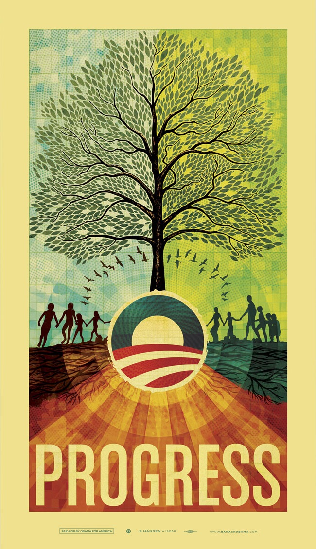
ISO50 Obama Print Out Now
 Update: This print is sold out.
As some of you already noticed, the Barack Obama site announced the arrival of the print today. You can purchase the print now for $70, all proceeds go to the Barack Obama Campaign.
After all is said and done, I am very happy with the finished product. Unfortunately the colors on the JPEG above don’t come through as well as they did in print and there’s a lot of fine detail that’s lost at this size, so you’ll have to stretch a little bit to imagine what the real thing looks like. I just got into Detroit, will be playing a set at DEMF tomorrow, so I won’t have time to put together a good case study on the process of creating this print until I return on Sunday. But I wanted to post this up in the meantime after holding it back for so long.
Comment on this post | Purchase Print

243 Comments Leave A Comment
Anonymous says:
May 23, 2008 at 6:53 pmmega yum.
David says:
May 23, 2008 at 6:57 pmThat’s gorgeous. Can we hope to see these around San Francisco like the others? I sure hope so.
Adam says:
May 23, 2008 at 6:57 pmlove it! im voting yes.
andy says:
May 23, 2008 at 7:16 pmWow.
Shepard Fairey’s was nice and all… but this…
Freakin’ love it. Hope I have $70 to spend soon :)
Rob Goodlatte says:
May 23, 2008 at 7:33 pmIt’s cool to see two people I admire come together like this. Absolutely gorgeous poster. Will be purchasing it for my new apartment as soon as I move in :)
Josh says:
May 23, 2008 at 7:55 pmThere isn’t any piece of your work that I don’t like, so I knew this poster would be as good as it is. Very Nice. It held up to tough expectations.
Brandon says:
May 23, 2008 at 7:56 pmThis is amazing! All the excitement about this piece was well worth it. I’ve been a long time fan of your work, would probably say you’re the reason I’m in the digital arts myself- and to see you working with history now is, as I said before, amazing. I already put in my order for one!
Sean says:
May 23, 2008 at 7:58 pmSir,
This is beautiful. Just beautiful. I still remember what it was like to be proud of an administration’s behavior and leadership, I KNOW Obama can restore America’s role in the world. Thanks for sharing your gift and helping such a noble cause.
Sean
Sean says:
May 23, 2008 at 7:59 pmPS I just ordered mine, so glad I didn’t miss out.
Brian says:
May 23, 2008 at 8:49 pmI have been waiting a while and practically on the edge of my seat for this poster to finally surface and I must say through all the anticipation I am completely thunderstruck. You capture what Obama and his campaign stands for in such a unique and wonderful way while also beautifully representing your personal style. Thanks for being such an inspiration and congratulations on an amazing feat.
mike says:
May 23, 2008 at 8:54 pmIt is a very beautiful and happy image that expresses the spirit of lifting hope for a better future. I hope that you can make this image as prevalent and Shepard has made his, so that this image gets seen in the background of all his rallies and events, just like Shepard’s do.
i think that making a “political” poster would be a tough thing to do, but you did a great job putting your own special feel into it and making a beautiful and effective piece of art.
I’m looking forward to hearing about the process!
James says:
May 23, 2008 at 9:59 pmYES! Love it!
Finally a big Hansen poster ;) hehehe
PT says:
May 23, 2008 at 10:12 pmIs this for sale outside of America?..
Evan Rogers says:
May 23, 2008 at 10:30 pmordered mine just in the nick of time.
Amazing Job! I am haapy to soon be the owner of an authentic Scott Hansen.
Vote Obama!
ZEEG says:
May 23, 2008 at 11:20 pmThe print looks great. I ordered mine earlier today! I can’t wait to see the details and the beautiful color in person! A great contribution to the campaign. Happy to know I’ve got one coming my way. Thanks Scott!
carlos says:
May 24, 2008 at 12:05 amsorry, not a huge fan: imagery is forgettable, graphic layout is boring. i am a huge Obama fan though.
DE says:
May 24, 2008 at 1:00 amwoah.
ejay says:
May 24, 2008 at 1:49 ambeen a fan for a while now, but i must say, this has got to be one of your best works. you serve as a huge inspiration and i hope to see more stuff like this in the future. congratulations!
Damo says:
May 24, 2008 at 1:54 amOutstanding! Layered with a textured depth, detailed and individual…you must have some weight now lifted from you that’s now rising to cloud nine! An amazing feat to produce a visual context to one of the most important historical electoral campaigns in the world…as all countries watch with anticipation. For you to be part of this must bring you great pride. I am always interested and inspired by your perspective on visual aesthetics. I hope to purchase one of these posters in the future. I congratulate you for your tremendous contribution to inspiring and discussing visual creativity with us all…certainly I cannot speak on behalf of us all as shown above…yet I cannot help but laugh at the one negative comment that stands out from all the other positive remarks, so it’s true you are always bound to get one! out of the many…life can be simply amazing! :) cheers to you Scott :)
Veerle Pieters says:
May 24, 2008 at 2:21 amAbsolutely gorgeous :) I love the subtle texture you’ve add in the background. The elements are perfect, and although I’m not from the US I still see the message in it: change, hope, togetherness… It’s strong and perfect. Congrats :)
I really don’t agree what Carlos is saying here, imagery is so memorable. I still have imagery from my childhood in my head that gets triggered when I see certain things and where I make the association. And it’s not only from my childhood, it’s everywhere. When that happens I have a clear picture in my mind of how it looked back then. Same goes from sound and smell.
Leggoz says:
May 24, 2008 at 2:22 amfinaly:D but it was worth the wait! awesome job scott!
sam says:
May 24, 2008 at 2:54 ami was really looking forward to this as well
but so disappointed!
it don’t think it comes close to anything you’ve made so far
i know i can’t see the details
but as a whole it doesn’t do me anything
sorry, i’m a much greater fan of your older work
this seems like a practice round you did 10 years ago or something
Joaquim Marquès Nielsen says:
May 24, 2008 at 3:14 amThe wait is over :)
Somehow I had to get used to it when I first saw it, but after having looked at it for a while now, I’m in love with it and the symbolics you’re using (especially HOW you’re using them!).
First thoughts: Obama is the center from which new things root and grow. A solid foundation. I get a sensation of omnipotence as if Obama is everywhere here, and you haven’t even depicted him… Nice. You’ve got a lot of things going on here: circle of life, tree of life (knowledge, family etc), ripples in the water, roots = solid foundation, nature in general and finally (but I think there’s more) some sort of duality in the way the tree divides but at the same time brings together the left and right side of the poster.
It can be debated weather or not the use of symbolics in this piece are way over the top, but I think you’ve managed a good balance here. Surely this is something you must have given a lot of thought yourself, and maybe also part of the reason why you’ve chosen not to depict Obama bu settle with the logo alone (or maybe he IS somewhere in the background greyscale with multiply and 30 pct. transparency, hehe).
He’s got a nice logo – you must’ve liked to play around with it :)
Unfortunately I wasn’t able to order the print via the campaign site – what to do?
Peer Lawther says:
May 24, 2008 at 3:42 amDamn – been waiting for this since it was announced and then find that I can’t buy it as I’m in England. Any chance of international shipping? This would go really well alongside my other ISO50 prints.
BTW, great poster as usual!
Justin says:
May 24, 2008 at 4:34 amHey scott this is amazing work . Sadly i’m canadian as well as an avid obama supporter and you supporter . There is no option for me to get this thing shipped to canada .
What are international buyers options here will you be selling them on your site ?
cheers
mark says:
May 24, 2008 at 4:53 amgreat work. i like the subtle reference to connecting the red and blue states (red on the left, blue on the right) with an obama-like figure leading the blue states on the right. i think this visual metaphor of unity across the political divide is very clever and well executed to avoid the typical cliches that would often come with that territory.
Geoffry says:
May 24, 2008 at 5:27 amIf art can determine the election, then Obama will be the winner. Wonderful imagery and execution. Also love the synergy between the unity message and preservation of earth. I’ll be purchasing one!
Corey Tegeler says:
May 24, 2008 at 5:40 amThis is an amazing piece of work, one of the best I’ve ever seen. It is also a huge accomplishment that your design is being sold by Barrack Obama for his campaign.
mark says:
May 24, 2008 at 5:43 amjust wanted to let you know that i wrote a post comparing this poster to shepard fairey’s obama poster: http://markforscher.com/blog/2008/05/iso50s-obama
Horacio says:
May 24, 2008 at 5:54 amTo be honest, the first time I saw it I was not very impressed. Mostly because I’m not a politics fan or something like that, and don’t know much about Obama. But if I talk about art, well, I have mixed feelings about it. First, it seems that you’ve lost that retro feeling that you put in all your works, it looks more “clean” and “soft”. Always like that kind of halftone texture that you use in the backgrounds, and the whole piece is full of details, which is great. But the poster reminds me of that “New Age” thing, you know, the sun, trees, the happy family and kids, the birds, etc. It looks like a “religious” thing, which I found it very weird.
It’s a nice poster, but it’s not your best work. Kinda weak in a word.
Have a nice weekend. Cheers!
Bernat says:
May 24, 2008 at 6:10 amAwsome…
Chelsey says:
May 24, 2008 at 6:59 amWow. Scott, it’s a beautiful piece of work. The colours and textures are perfect!
Steve-O says:
May 24, 2008 at 8:26 amWow man, you never disappoint. The detail on this poster is mind-blowing. Every time I look at this poster, ‘Here comes the Sun’ plays in my head. Seriously.
Steve-O says:
May 24, 2008 at 8:40 amAnd as for you Carlos (Fairey)….don’t hate because Scott’s poster turned out better than yours.
Speets says:
May 24, 2008 at 8:44 amBeautiful work. I love the amount of detail and the symbolic sense it shouts out.
Just one thing, it seems I can’t order the poster as I am not located in America, is there any way around this? I’m currently residing in Netherlands, Europe. As we in Europe are immense Obama fans (90% of us, for sure), there should be a way for us to contribute to the campaign and this would be a great way for us to do it.
-Speets
myer says:
May 24, 2008 at 9:31 amScott, this piece just looks like you applied every trick / technique you’ve learned…
Was that what the Obama campaign asked for?
holden says:
May 24, 2008 at 9:43 amIsn’t a bit pathetic to put trees, people holding hands and birds? Especially in president campaign, it looks very dishonest. I think the message (about brighter future) could be interpreted visually a little bit deeper.
Dan says:
May 24, 2008 at 9:54 amAs usual, simple and clean imagery but the textures really come and bring it to life.
Looks great.
Jess says:
May 24, 2008 at 10:22 amI keep going back to look at the artwork – most of your site hits are probably just me. I cannot wait to see all of the detail and color closely – I know you wrote that the online images don’t do the print justice, but it looks wonderful to me. The subtle “graph” texture and the texture on the logo are striking. I think I could go on and on about everything I love about the image :) What you have done is very different from what other artists have done with political imagery – it’s not in that Stalin vein that so many are commenting about. I’m glad that you applied your own aesthetic to the campaign. Your image cohesively expresses the progressive, hopeful, and peaceful sentiments that Obama embodies and that many Americans are searching for in a leader. You’ve accomplished something great, Scott.
Justin S. Meyers says:
May 24, 2008 at 11:16 amI think this is actually pretty different than Scott’s other pieces, but the same at the same time. I remember an argument about a guy (who will remain unnamed) was doing a lot of work that looked almost identical to Scott’s work. Same exact execution of metaphors paired with the exact use of aesthetic.
The synopsis of my own rebuke was that the uniqueness wasn’t in the aesthetic, but in the use and delivery of metaphors, i.e.; deer, rainbows, children, birds, etc. Point… This is how Scott sees and reacts to “hope, progress, change, etc.” and cannot be compared to someone like Shepard Fairey by a long shot.
So, yeah, just like Shepard, Scott kinda has an arsenal of metaphors and techniques. I think this project just reflects the intensity of Scott’s effort to execute his feelings towards Obama relative to his style, and done so pretty spectacularly.
When people start following someone like Scott or Shepard, you can get “burnt out” on what’s produced just like an album or genre. Not that I don’t admire his work anymore, but I can kinda build certain expectations for new work just as you would with a new release from Death Cab for Cutie.
In short, I won’t be voting for Obama. I’ve read parts of his book and was pretty baffled at some of the things he said and could not find anything to bring those comments into a positive context.
Anyway, good job Scott.
Steve says:
May 24, 2008 at 11:55 amWell worth the wait and anticipation. This is truly a great piece of work.
Matt says:
May 24, 2008 at 12:15 pmIt took me a while to like it. It was probably a better idea to stick with safer imagery and a simple message anyone can pick up on. I was hoping for something crazier as far as concept, typography, etc. but this isn’t a personal piece or band poster like most of the ISO work. So for what it is, I do like it esp. the stylized leaves. It’s a great piece for the campaign. Congratulations.
enrique says:
May 24, 2008 at 12:21 pmGorgeous work.. I love everything about it, and some insight to your process would be very welcome.
Jillian Davis says:
May 24, 2008 at 12:31 pmJustin S. Meyers,
Your portfolio looks SO excessively inspired by Scott’s aesthetics that you don’t seem to have your own “voice”..
Jason says:
May 24, 2008 at 12:38 pmGreat work, Scott! I just ordered mine. Who would of thought I could support a presidential candidate and a great artist at the same time?
Justin S. Meyers says:
May 24, 2008 at 1:24 pmJillian,
As an artist, I think it’s pretty natural to be inspired by others… Because of this, I can’t have an opinion?
Maybe I am not just understanding you?
I may have been confused when we skipped from the subject of his Obama poster to my portfolio.
John says:
May 24, 2008 at 1:29 pmCongratulations on what will surely be a great way for you to get the word out about your other work… I just bought 3 prints that I would have likely not seen otherwise. I’m interested to know why you kept Shep’s font and ‘Progress’ at the bottom and didn’t change that up at all since you seem to be quite an expert in typography?
jv says:
May 24, 2008 at 1:50 pmbeautiful, great work!
Evan Rogers says:
May 24, 2008 at 3:35 pm@Justin S. Meyers
You were even “influenced” by his line “the visual work of…”
lol
Think about the defintion of influence
Evan Rogers says:
May 24, 2008 at 3:39 pmFor those with criticisms to the strength of the piece and wether or not it exemplifies his style;
This is a commissioned piece by a client who I would imagine had a very loud voice in what they did or did not want to see in the piece.
Also bare in mind that S.H. doesn’t need my defense of his work… but just my two cents.
Jonathan Haggard says:
May 24, 2008 at 3:39 pmThis is asolutely stunning.
A+++ WOULD VOTE AGAIN.
Jillian Davis says:
May 24, 2008 at 4:04 pmJustin S. Meyers,
I was talking about your work.
Alex N says:
May 24, 2008 at 7:40 pmJillian, very right on.
Scott! BRILLIANT!
One question, did the campaign people object to the absence of Obama’s face in the poster?
Not that it matters, Did you and Shepard Fairey agree to the Progress thing?
Jeronimo Rex says:
May 25, 2008 at 12:57 amit is absolutely beautiful, the use of colors is so vivid and genious. i doubt few people in the world has scott’s spiritual relationship with colors.
just beautiful, and this is exactly my problem with it, because i feel it lacks a proper copywright, or a more sophisticated message, which is is necesary in such a poster. it’s aesthetic qualities are unmatched, and a rolemodel for design student and designers and artist worldwide, but i couldn’t help wondering if the use of symbols of a tree, roots and the children running around it, and the bow of flying birds are not too naaive. the thought behind it seems plain for me. despite the big “progress” typography, i strongly feel that the poster deals more with roots and the earth and nature connection, than a symbol for progress of an entire nation towards a better future. the problem here lies in the presumption behind the making of this poster – while design is an artform, and designing for music can involve more artistic and spiritual thinking and art, a poster for election needs to be more communicative, and more sophisticated. we can’t just make beautiful things. this poster should not only be eye candy, but thought provoking. why the hell should i vote to obama? this poster needs to make me think, but it doesn’t. if this was a design for a music band or a tycho preformance, my jaw would remain wide opened, because i know something about scott hansen’s spiritual connection to music and colors, and that this is a product of genial human imagination. but this client, obama, has firm roots in the ground of reality, which makes me more aware of the message of the poster.
i do like his daring of not putting obama’s face on the poster, which is an innovation.
Jeronimo.
BenHjort says:
May 25, 2008 at 12:59 amGreat poster!
International shipping?
Gareth says:
May 25, 2008 at 2:46 amoutstanding, not interested in the political message, but i do think this is your strongest work yet. Please make more prints in this style!
Jayden says:
May 25, 2008 at 4:16 amWhy oh why do they not ship to Australia!! Supreme amounts of GRRR happening right about now.
Nice work. Looking forward to getting this thing down under some how, soon.
Speets says:
May 25, 2008 at 5:42 amTo reply to Justin S. Meyers comments:
So you’re saying artists need to remain a status quo in their work? I’m an artist myself, but I’m quite happy to be not stuck inside a box.
Another thing is that Scott wants to reach out to a broader audience than his usual work. I think he balanced that in combination with his unique style quite perfectly.
Again, my compliments Scott.
hozae says:
May 25, 2008 at 6:59 amGreat work – it would be nice if you can expand this to wallpapers and print outs — there are younger people who cannot vote, but support Obama. Love the poster nonetheless…
Justin S. Meyers says:
May 25, 2008 at 7:15 amSpeets,
Totally misunderstanding me. Others were saying “it’s as if he used every trick he’s ever learned” which I understood as the use of trees, birds, typical iso50 colors, textures that were somewhat typical metaphors in all of his other work.
My point about “the other unnamed person” was that it not only made me less critical of others, it made me think about what’s actually unique to artists the most and my conclusion for the time being was the use and execution of metaphors.
Just like my work reflecting similar aesthetic (not metaphors), it will grow and change, just like Scott. This poster is completely different from anything he’s ever done before, it’s still familiar, but very different at the same time.
Something about the prestige of Obama makes me think people expected this print to be produced with Photoshop CS4, Tony Stark processors and the freshest Columbian beans delivered on a mule to Scott’s window every morning.
In my experience, posts about political art brings the hate like no other. Lighten up, be a little more supportive and enjoy this print. If you want to make cracks at me for being a little supportive, than be my guest, just try to make a point.
ed@dupe says:
May 25, 2008 at 8:48 amIt’s a great piece Scott, well done. Do you plan to offer it in any other format? The great thing about elections of late (though, not yet in the UK) is that one a piece hits the web it can multiply miraculously – if you’re allowed to, get it out there …
Will be interesting to hear more about the process you went through with the ‘client’ – did they have any feedback? Did the ‘reject’ any ideas?!
Thanks, Ed
Jesse says:
May 25, 2008 at 11:15 amDamn. I keep looking at it to take it apart in my mind how you put the piece together.
I do like it.
Can’t vote for Obama though… I’m Canadian.
Sam says:
May 25, 2008 at 2:20 pmHmmm, I like it except for the humongous “progress” at the bottom. To me at least, “progress” in the current parlance of the political climate sort of symbolizes the empty-promise kind of bush rhetoric we hear every time that dimwit shuffles up to the lectern and gives us [the public] an update on how the war is going.
I think it would be much more strong had you chosen one of the adjectives more associated with Obama’s brand promise (ie. Hope, etc), you know what I mean?
Sam says:
May 25, 2008 at 2:29 pmAlso the imagery to me, isn’t very strong, looking again. It doesn’t seem to say much about the candidate. I can make the connection of the tree symbolizing personal growth (although a tad obvious of a solution) and the people holding hands as a symbol of unification (and maybe unintentional, but the split blue / green halves?)
stylistically and executionally, however it looks fantastic. Another ISO50 piece for the shop for sure.
Mirwen72 says:
May 25, 2008 at 2:30 pmGreat picture! Pretty intense discussion. I am looking foreward to “the making of…” :)
vlad says:
May 25, 2008 at 9:40 pmWhat you said as a quote on his web-site really shows through. Such an amazing work. Its like your earlier work and latest inspiration come into one! In 40 years, future graphic artists will look up to you as the teacher.
Thank you,
Marcus Stade says:
May 26, 2008 at 2:42 amVERY nice! I’m so getting one (if ordering outside the states is possible that is).
burntdownhouse says:
May 26, 2008 at 8:17 amOutstanding both technically and aesthetically, but the message is not clear. Progress is being defined as a hippy-happy world where naked children dance around trees? Perhaps I’m being a literalist – but foggy metaphors aside – I just don’t think this image says anything meaningful about progress, or Obama, or is a rallying cry for anything other than retro-infused naturalism. I’m guessing that when seen out of context (e.g. on the street) most of the American population would need at least 10 guesses to know what the poster stands behind. Seems to me form has trumped function, which is a shame because ISO has talent, and it’s beautifully executed.
Sean says:
May 26, 2008 at 8:31 amCan the print really only be purchased if you live in the U.S.?
I find the print to be beautiful, and regardless of my living in Canada, I would have liked to have it. Think you will end up being allowed to release it on your own, further down the line?
belpin says:
May 26, 2008 at 8:39 amburntdownhouse,
You’ve read my mind!
revy says:
May 26, 2008 at 9:08 amLove the design, shapes and colours are grand. So many tasty messages that could be read in this.
Beth says:
May 26, 2008 at 5:26 pmJustin Meyers: Jillian & Speets just don’t like your politics. It’s not your work, which is beautiful; they’re just blinded by their anger at you for not falling in love with Obama. Ignore.
This particular poster isn’t my thing–burntdownhouse nailed it–but it is nice. I do love Hansen’s other work; this is just a bit of a departure, and conveys a message as burntdownhouse said. Kinda hippy-happy, with that whole Obama-as-messiah vibe. Like I said, not for me.
Congratulations and best wishes to Scott for this project! :)
Christopher Cox says:
May 26, 2008 at 8:49 pmCongratulations Scott. It’s great to see you lending your hand for an important cause. It’s a real honor to be selected by the campaign for something like this.
Justin S. Meyers says:
May 26, 2008 at 9:32 pmThanks Beth. Politics is an ugly business. I just take it with stride.
Scott says:
May 26, 2008 at 9:38 pmJustin-
apparently blogging is an ugly business too, this was insane to come home and read all these! people are getting ruthless in here, I enjoyed most of it, but seriously, this was a discussion about the obama piece, don’t know how it derailed into bashing other people’s portfolios and ideologies. ah the internet, always worth a laugh.
Anyways, I will be posting a case study of the process and included will be answers to a lot of the questions posed above. To the dissenters: I wholeheartedly welcome and appreciate your opinions, truly … and while I don’t think it’s really my place to stand here try to defend my own work, I would ask you to fully consider the circumstances of this project and maybe you’ll better understand my motivations and some of the design decisions that I made.
sam says:
May 27, 2008 at 12:25 amYeah, I think the circumstances would have been tough. Client expectations and all, the struggle we all have. Since most of the work we all find to be so amazing in your portfolio is not really client based and rather ‘free art’. I’m taking that as the reason this piece turned our rather bad. Mostly I would be interested in how you position this artwork compared to your previous pieces?
Scott says:
May 27, 2008 at 12:42 amSam-
I think you misinterpreted my comment. I am very proud of this piece and I think it came out exactly the way I wanted it to, and exactly the way the people who asked me to create it wanted it to. I wouldn’t “position” it with my other work because I don’t spend time ranking my work as individual pieces, it is a body of work and can only be seen as a whole, each piece expressing some small part of a larger, over-arching concept.
Jason says:
May 27, 2008 at 5:43 amAmazing…. Wish it was for Ron Paul… :(
Mark Wallis says:
May 27, 2008 at 6:13 amGUTTED !!! No international shipping :(
nando says:
May 27, 2008 at 6:52 amAs usual…
just GREAT!!!
Joslyn Jackson says:
May 27, 2008 at 7:07 amOH MY GOSH SCOTT!!!!!!!!!!
I am a SUBURBAN SOCCER MOM and I’ve been tracking your blog while in anticipation of the final product and I was not disappointed!
This back and forth reminds me of the banter between my kids and their friends!
Here is the bottom line. YOU ARE A PART OF HISTORY! For generations, people read about you and study your art. They will listen to your music and debate about what you were thinking and feeling when you created this piece. They will wonder what kind of man you were. They will study your techniques. What exactly was it about this man that the first black president chose HIM as only the second artist in the world to represent his historic candidacy? They will look for symbolism in every inch of this piece and write essays on their interpretations. HOW AWESOME IS THAT!?!?!?
No face of a candidate. This campaign is about us – the people. Our country is growing and continuously changing like the foliage on the trees. This grassroots campaign is infused and nurtured by a campaign that seeks to understand and meet the needs of everyone. We all deserve to be protected and covered by our government – in plenty and in want. This changed way of thinking will extend to every branch and every leaf of American life. We are divided, but this campaign seeks to unite us. Remember the story of the Giving Tree? That’s what I think of when I see this picture. What a visionary you are.
The average American doesn’t care anything about the technical criticisms – they are looking for the message. Unfortunately, many of the detractors here seem to be “drinking hater-ade” (as my kids would say) because they are not one of the chosen ones. That’s EXACTLY what it is. Nothing more. Nothing less.
Go forth in positivity, creativity and love. Soooo super excited to receive my piece, have it framed and hang it in my home. Thank you for your efforts.
Andrew Haynes says:
May 27, 2008 at 7:56 amGreat piece scott.
I really like the layers that force me to look deeper.. Ill have to pick one up.
You have a great style man, very unique, and I think you executed greatly on finding that ever so difficult balance between making yourself happy as a designer/artist and making your client proud and happy of the piece you’ve given them.
Keep doing what you do man.
kp says:
May 27, 2008 at 7:57 amI think this is amazing! I have 3 other pieces by you. Don’t understand the critics here. I want to hear if you’ve heard from Obama himself and what he thinks of it!
Brian says:
May 27, 2008 at 7:58 amI really don’t think Obama truly represents “Progress”… but great job on the poster.
The Honest Ape says:
May 27, 2008 at 8:38 amScott, great work. I just bought mine and put up a post on my blog. Thanks for the art and inspiration.
http://www.bigbadmedium.com/limited_edition_iso50_obama_poster
Darren says:
May 27, 2008 at 9:02 amThis is incredible. I think you may have outdone yourself.
Paul says:
May 27, 2008 at 9:39 amOn an emotional level:
This is pretty scary. It sort of big brotherish. Almost as if Obama was the all seeing eye – his glowy vision imposing on everything. The trees roots seem more like tentacles sucking the life from everything around it. The people remind me of the brainwashed Eloi from The Time Machine – happy to bask in the glow of ignorance.
On a pure design level:
It’s way over done.
Proportionally the piece flows well. But that’s where the accolades stop.
Scott in an illustrator. It’ obvious from this latest piece that his strength is NOT in creating meaning, but in creating pretty pictures. The message is childish at best. It looks like something a first grader would draw when the teacher says “draw me a picture of your favorite day” and the child responds by coloring his mom and dad standing under a rainbow.
Technically, a poster is supposed to POP, and this one will get muddy from a short distance. The excessive use of texture and the reuse of old imagery make this poster scream, “This was made by Scott!” I doubt that was the intention, but it goes to show that more Photoshop layers doesn’t add more meaning.
Perhaps now some of you are grasping the difference between a graphic designer working for a client and an artist working for himself.
booby says:
May 27, 2008 at 9:40 amlooks like you took a bunch of old elements and reworked a new layout…lookin good
Justin S. Meyers says:
May 27, 2008 at 10:10 amScott-
I just kinda laughed it off. Art and Design is not infallible, especially mine. So, no offense taken.
It’s a major faux paux to not side with Obama much like using a PC over a MAC. You’re just begging to be bashed.
Regardless if someone plans on voting for Obama or anyone else, involvement in the direction of our country lacks with individuals.
Anyway… moving forward… it’s an awesome print and I am proud of yours and others involvement in Americas direction, even something as seemingly insignificant as art or design, it still provokes change.
dos says:
May 27, 2008 at 11:25 amGreat work, got mine this morning… does anyone know if this will come signed?
nitro says:
May 27, 2008 at 1:15 pmYou should name this piece “THE REMIX”, Scott!
Joshua says:
May 27, 2008 at 1:18 pmMakes me want to buy the world a Coke.
Though the Obama campaign is all about optimism, the naivety of naked figures frolicking around a tree seems to wholly misrepresent the consequence of an Obama presidency.
keith says:
May 27, 2008 at 2:32 pmgreat print, to bad it’s for Obama, who is nowhere qualified to be the commander in chief.
Ben says:
May 27, 2008 at 4:49 pmStunning, I’d love to see the print in real life and have a proper look at the detail, in the UK though so I don’t think I’ll be able to get hold of one. I think it’s a brilliant piece, and the aims you stated in your rationale have been achieved.
I’m fascinated to read what the process was like from a point of dealing with the client; did they want to see the design at frequent stages, or did they leave you to it? Did they ask you to make changes to the finished piece, or is it very much unchanged from your original vision?
Once again, great work.
Jake says:
May 27, 2008 at 5:03 pmCan somebody call boards of canada and let them know they are getting ripped off?
only says:
May 27, 2008 at 7:08 pmLooks great! I’d only replace the obama logo and “PROGRESS”
nomes says:
May 27, 2008 at 10:37 pmBrilliant as as allways
Patrick says:
May 27, 2008 at 10:44 pmGreat work Scott… the fact that you’re donating the proceeds to the campaign is awesome… much respect.
patrick james says:
May 27, 2008 at 11:05 pmart=excellent obama=blows ass. is this who you believe in? or is this just a money thing. i dunno. i love your art, but putiing any political affiliation on your art just deppreciates it. but that’s the beauty of America. people are free to speak their voice, and that’s the most important thing.
Scott says:
May 27, 2008 at 11:19 pmpatrick-
I donated this piece, all proceeds are collected by and go directly to the Obama campaign.
brian says:
May 28, 2008 at 4:14 amso, we’ll all be nude and holding hands in the Obama era?
Claudia says:
May 28, 2008 at 11:09 amscott hansen, i’ve never heard of you before. but after checking out your art on obama’s website i’m a fan. at first glance i wasn’t sure…but i kept returning to the website just to look at this piece. something hypnotic and calm, a brief mental escape, when i look at it. and then i just bought it, because if something grabs my attention like this i figured i’d better get it before it’s too late. this piece is soft, subtle and deceptively simple and will add a nice touch to my home. can’t wait to receive it. glad to finally meet you! i’ll be back for more….
Dan S says:
May 28, 2008 at 1:19 pmScott,
You could have added a nuclear reactor or 2 below “PROGRESS” or really could have replaced it with “BUSINESS AS USUAL”.
I feel really let down by your decision to mix your “progress” as an artist, with politics. It’s not really politics per se, but rather supporting a presidential campaign/platform that doesn’t reflect AT ALL my relation, perception, and freedom of your work. For me, on an emotional level, the two don’t mix, they don’t relate. For others, they have responded with their disappointment on a technical/artistic/design level.
Do you think Mr Obama gives a shit about your work? Well, Scott I sure did, but I don’t anymore.
Dan
Kyle says:
May 28, 2008 at 2:33 pm^^What an unnecessary comment.
Love the poster, Scott. I ordered one and can’t wait to see the real thing in front of me. Even have a space on my wall cleared for it’s arrival. Even though I do mostly web work, you’ve kept me driven to continue exploring the print side of design. Thank you for doing what you do!
Deidre says:
May 28, 2008 at 6:25 pmWow – amazing work. I think you have inspired me my whole life and I didn’t even know it. I discovered you from the OBAMA release. Amazing. The OBAMA piece is provoking and beholds the spirit of him – enlightening. Glad I have my print reserved. Much Love from Iowa. Deidre
Kyle says:
May 28, 2008 at 8:10 pmOh btw – I posted on my blog about this if that’s alright:
http://kumo-art.blogspot.com/2008/05/iso50-obama-print.html
Also, I ordered mine to be shipped rolled up in a tube. How would you or anyone else here recommend flattening it out? I don’t want to have it framed. I want the texture of the poster visible so in order to hang it, some flattening is required. Any suggestions?
Kevin Crawford says:
May 28, 2008 at 8:42 pmthis print is awesome =]
Terry M. says:
May 28, 2008 at 8:55 pmI’m an Obama supporter, love the guy and I hope he wins the election… but this piece is really shameful. You have captured an image that is reminiscent of false expectations… Shepard Fairey’s approach is much more successful since he didn’t fill up his poster with bullshit imagery such as this.
Design-wise, it’s OK… but just OK. Nothing new, nothing fresh. Change the channel Scott, it’s getting old.
Scott says:
May 28, 2008 at 9:50 pmTerry-
I was going to wait and address all this when I posted the “making of”, but after hearing a few people echoing the same misconceptions I thought I would reply now to try and shed some light on the decision making process that went into creating this piece. And while I don’t really feel it’s my duty to stand here and defend my work, I felt like some background on the poster might clue everyone in on why the piece looks the way it does. If this comment looks way too long to read, just skip to the last paragraph for the bottom line.
You talk as if you are familiar with my work, but I don’t think you are. If you were, you’d know that I “changed the channel” a long long time ago, look at all of the work I’ve released over the past 3 years, none of it even resembles this style. When I was starting on this piece the campaign specifically requested that I pursue my “old ISO50” style for this piece. They also suggested that I not include his face in the image. I didn’t create this piece to echo shepard fairey’s original poster; he already did two and they stand on their own, there’s no need for another one in that vein. And the reality is that this is not a campaign poster, it is a fund raising effort, it’s not meant to sway people one way or the other so the imagery is somewhat inconsequential.
This was not created for designers to enjoy or appreciate on a technical level, it was created to raise funds for the campaign. Most people who will buy this print aren’t seeking out some high-brow graphic design based on principal. Most of the people who will buy this have never heard of me, and will never hear of me again. They don’t care who I am and they don’t care about my other work; they just want to contribute to the campaign. So this poster didn’t neccessarily need to be fresh or new, in fact, in the context of my work, it wasn’t really supposed to be. It was supposed to be modeled after a period in my design career that was very accessible and appealing to a broader range of people than my current style. This is specifically what the campaign asked for.
When I look at my body of work, if I were to pick out the pieces that I thought were the most well designed, they would probably all fall in the bottom half of an ordered list of my best selling prints. My most popular prints are still the older ones, the bucolic, nature-themed sorts of compositions that I was creating during that period. So apparently it isn’t, as you say, getting old. Regardless of that fact, long ago I chose to move on from that style and try to evolve, which I feel I did, but if someone from a cause you believe in tells you they want that style and by doing it you can help them, well, in my opinion you should do it.
So yes, I reverted back to my older style and retread some of my earlier steps in creating this, I did that to cater to the desires of the client. I would normally never do that, in fact, that is why I have all but quit doing freelance, so I can pursue my own ideas without any outside interference. But in this case, I saw the opportunity to contribute to a cause which I happen to think is a good one and so I seized it.
At the end of all that, if you still don’t like the poster, that is totally acceptable and understandable. It just seemed to me that your comment, and those of others, was made in total disregard for the circumstances and requirements surrounding the project. And I am glad you think the Shepard poster was successful, I totally agree with you, but it might interest you to know that this print is selling out faster than that one did.
Obama's Knights says:
May 28, 2008 at 11:23 pmHi Scott.
I just want to tell you that this is an exceptional piece that complements Fairey’s “Change” images very well. I’ve been bothering the Obama store to produce another piece that focused on the environment. Your piece captures that “Environmentalists for Obama” niche extremely well. Again, this is a magnificent image. I can’t wait to have it in hand (I ordered two).
Unfortunately, you will get all sorts of exasperated comments from critics of all stripes. These should be ignored.
As an Obama supporter who collects art, I for one will continue to follow your work and your career. Thank you for your generous contribution to the Obama movement.
Justin S. Meyers says:
May 29, 2008 at 7:34 amScott-
You shouldn’t have to respond to the pretentious on this post. But you’ve got class, thanks for being “bigger.” That’s the difference between indie efforts towards art and those that are of the traditional ilk, advertising agencies, etc. You’re Si Scott video was spot on, two different attitudes, one of appreciation and one of pretentiousness.
Off subject…
I mentioned CS “next” or stonehenge to a couple of Adobe reps at a conference and they were livid and wouldn’t answer any questions about it. Maybe that post about stonehenge was not intended to be released. If the feds bust your door down anytime soon, I gave them nothing!
Scott says:
May 29, 2008 at 11:26 amJustin-
I don’t work at adobe anymore, haven’t for about 2 years now, so none of this info is coming from any privileged source, it’s just gathered from various outlets on the internet. One thing is certain, CS4, or CSNext, or whatever it’s called, is coming later this year. Whether it will have GPU support remains to be seen, but they sure seemed to be admitting to the GPU thing in that presentation. I am thinking they just slipped up and said a little too much and now they are trying to backpedal considering the product isn’t due out for some time..gives competitors a chance to catch up if they know what they’ll be dealing with come sepetember.
Gerry Mandering says:
May 29, 2008 at 2:34 pmWhen I first saw your creation I felt anxious. And now I’m considering your creation dangerous. Why? First forget the fact that you are a talented visual/graphic/musical artist (the positive responses from the blog are overwhelming) and I respect the artistic talent involved in this piece and your other work that I’ve seen (and purchased).
However, if you are completely informed and convinced about Obama’s political platform and proposed future direction for America, then the visual content, symbols, metaphors, and whatever else you’ve created for this piece in relation to Obama’s political vision are openly rendered into logical fallacies, nothing more than propaganda.
“Progress”, “Hope”, or “Change”, they all sound positive no matter what political candidate uses them. But they’re used because they are simple, straightforward, and influential. The idea is to attract the masses to form a thick shiny top-coat that conveniently masks underlying political issues, which is the core of democracy.
In another perspective I see this particular piece in a way that, you know – we’ve spent enough time in a soma-induced state merrily holding hands and running around the peace tree – Progress, is digging down past the topsoil and flowers into the shit and garbage that we’ve been burying for the last 40 years and begin solving the real problems.
Justin S. Meyers says:
May 29, 2008 at 3:05 pmScott-
Yeah… gotcha. They were about ready to give me a story… “what you saw was not CS3, but a hot air balloon.”
Anyway… I could totally see the need for tight lips. I remember apple taking out a lawsuit against a few guys that were finding out stuff before it was officially “released”, their intent was not to hurt apple, but to get other apple folks pumped up about the future of apple.
Money man, terrible thing sometimes.
Scott says:
May 29, 2008 at 3:30 pmGerry (Dan S.)-
From what you said way up top in the comments I already know you are opposed to this work and how it was executed, I get it.
I was approached to create something that reflected the idea of Progress in my mind using a similar style to that I had already developed. It’s primary purpose is to raise money for the campaign, and the prettier it looks, the more it will raise. I seriously doubt anyone would see this poster and decide that voting for Barack Obama means we will be magically transformed into a utopian society. If you view each component as a metaphor it simply paints a picture of the ideals that I feel the Obama cause stands for. Anyone can have ideals, it is acting upon those ideals and accomplishing them that matters. I doubt any one administration can completely change the course of American politics, but I feel this would be a step in the right direction, hence, Progress.
darrin wiener says:
May 29, 2008 at 5:53 pmI bet these wasteful haters probably won’t even vote. I don’t care who they vote for, but I hope they vote. I hope they understand what it takes to be part of change, and to be part of progress, and addressing people, not just their “elite” crew of peers.
darrin wiener says:
May 29, 2008 at 5:55 pmI got so mad at them, I forgot to say how awesome your poster is, and how awesome it is that you believe in something, and you went for it! Thanks man.
PKayne says:
May 31, 2008 at 1:25 pmI love the print and I am a big fan of Obama. But because ive in Canada I won’t be able to purchase one from his site and I am not into giving my money to the eBay fiends. But great work Scott.
PKayne says:
May 31, 2008 at 1:27 pmOn another note it’s just sad the politicos have stormed your site.
Luisa says:
May 31, 2008 at 2:08 pmSad — and yet perversely fascinating ;~)
Ordered my print a week ago. I think it looks terrific. Thanks, Scott!
John says:
May 31, 2008 at 8:30 pmScott,
Can you please comment on the decision to use the same exact font for ‘PROGRESS’ at the bottom? Seems like that is a pretty obvious copy from the Fairey print and with so much typography in your background, why didn’t you choose or develop a new/different font?
Don’t get me wrong, I love the print, but I really am interested in that process, so perhaps if you don’t comment here you will put it in your case study.
Also, will these be signed by you since you were in such close proximity to the print at time of printing?
JM
Scott says:
May 31, 2008 at 11:14 pmJohn-
sorry, missed that one the first time around…I will go into all this in the study…, but for the time being: As you may know in political campaigns continuity and consistency of message is very important. The font I used is not the same font as the shepard poster, but it is of course very similar. I believe he used the official font of the campaign, which you may notice is used for almost all media produced by the campaign. they are using HF&J’s gotham, while I used House’s Chalet comprime (as I so ofetn do in my posters, my favorite font) They didn’t want me to deviate too far from that font so I proposed a typeface that was close enough to keep the feel the same but was just a little different. Also, for those asking about why it says “progress”, again, this was not really an option. the campaign has various key words , “hope”, “change”, “progress” etc… I simply chose the one I felt I would be able to best represent visually. So yeah, to answer your question, it wasn’t really a choice, when doing this sort of work there are certain things that are set before you even start.
Scott says:
June 1, 2008 at 11:15 ampkayne-
thanks… since this is a limited I won’t be able to offer this same format again but I will do my best to offer some version of this in the future for the people who can’t get in on this one.
On that same note, the reason it’s not available outside the US is that the price of the print is considered a campaign contribution, therefore only U.S. residents can purchase, since it is a U.S. election.
noel says:
June 1, 2008 at 12:02 pmScott you do really great retro themed work, not sure this really works as a political poster though, mainly because it’s as wishy washy as the politics it supports. What exactly is Obama gonna do that is different from the corporate duopoly that run America? Yes it will be great to be rid of Bush, but it seems from the comments left here that many Americans simply don’t get the bigger picture of how your political system (like all political systems) is there to enrich the rich and keep them in power and this will be true whether tweddle dum (Republicans) or tweddle dee (Democrats) are in power. If Obama was gonna bring real change he wouldn’t be allowed anywhere near the whitehouse – WAKE UP AMERICA!
Andy B says:
June 2, 2008 at 2:03 pmScott-
I’m DYING to read your process post…any idea when you’ll have time to post it all? Awesome work, this poster is absolutely stunning!
Andy
Andrew Dyjak says:
June 3, 2008 at 1:13 amScott, I have a one question: Did you did all those leafs by yourself?
PS.
It is superb.
Jason` says:
June 3, 2008 at 8:35 amIt would have been more fitting if it were a Ron Paul or Aaron Russo poster. Not so sure Obama reps progress. ; )
AndresM says:
June 3, 2008 at 9:33 pmI’m really surprised no one caught the influence of Aaron Douglas in this piece. Being inspired by the Harlem Renaissance takes this piece to a whole other level that some of these people might not have even known. I hope the visual reference is intentional because that would make me hate you even more ISO50! I hate to love your work so much! I’m surprised no one commented on this.
F.D. says:
June 3, 2008 at 9:40 pmhttp://www.brown.edu/Courses/HA0293/images/Pereira_fig2.jpg
http://www.brown.edu/Courses/HA0293/racializedbodies.html
AndresM says:
June 3, 2008 at 9:59 pmps.. you can see a comparison between a Douglas piece and ISO50’s piece here,. They compliment each other well. again. nice work ISO. There’s bound to tons of negativity from your viewers. It’s political and you could have created ANY poster for Obama and you’d still fight some misconceptions. ANYWAYS. I get it. I love it. good job.
noel says:
June 5, 2008 at 1:02 amFrom Kennedy to Obama: Liberalism’s last fling
Writing in the New Statesman, John Pilger refers back to his travels with Robert Kennedy to describe the false hopes offered by those, like Barack Obama, who exploit the appeal of liberalism then present a very different reality.
“The objects of these uncontrollable passions are as one in their support for America’s true deity, its corporate oligarchs. Despite claiming that his campaign wealth comes from small individual donors, Obama is backed by the biggest Wall Street firms: Goldman Sachs, UBS AG, Lehman Brothers, J P Morgan Chase, Citigroup, Morgan Stanley and Credit Suisse, as well as the huge hedge fund Citadel Investment Group. “Seven of the Obama campaign’s top 14 donors,” wrote the investigator Pam Martens, “consisted of officers and employees of the same Wall Street firms charged time and again with looting the public and newly implicated in originating and/or bundling fraudulently made mortgages.” A report by United for a Fair Economy, a non-profit group, estimates the total loss to poor Americans of colour who took out sub-prime loans as being between $164bn and $213bn: the greatest loss of wealth ever recorded for people of colour in the United States. “Washington lobbyists haven’t funded my campaign,” said Obama in January, “they won’t run my White House and they will not drown out the voices of working Americans when I am president.” According to files held by the Centre for Responsive Politics, the top five contributors to the Obama campaign are registered corporate lobbyists.”
http://www.johnpilger.com/page.asp?partid=489
Dave C. says:
June 5, 2008 at 9:44 pmI delayed and missed out on the Shepard posters. So not to be left behind a third time, I snatched mine up. Damn, though, $50 extra for flat box shipping? I’ll have to stick with the tube.
Dave C. says:
June 5, 2008 at 9:53 pmOh, and Noel, you bring about all this info saying that he’s not the answer, but you’re not offering any of your own solutions. Obama isn’t the second coming of HOPE, but he’s the best we got. There are two candidates going on that November ballot and if Obama isn’t about change, then McCain is Really, REALLY not about change.
But I digress, this post is about a really kick ass poster, not partisan politics.
n8 says:
June 6, 2008 at 5:16 pmHi Scott, this is really an interesting bit of work. My first reaction was positive — I was impressed by the depth of the textures and the intricate detail work of the leaves and roots. I was very happy to see a poster *without* Obama’s face on it. I love and respect the man, but I don’t want to build a shrine to him. Let him stand on his numerable merits, spare me the Stalinist iconography.
And yet I also had a reaction that echoes Joshua’s comment[1] above. The arc of birds, the naked children — isn’t it all a bit much? But after a bit of reflection on the nature of the Obama campaign I think the design is entirely appropriate, even inspired. Obama’s campaign is predicated on a singularly naive, idealistic notion: in America, *anybody* can become president, even a black man named Barack Hussein Obama. Most of us have been through enough elections to know that that’s just impossible, and yet… it’s happening. We know that politicians promise “change” at election time and then prove ineffective in implementing their promises, and yet… just days after gaining the nomination Obama’s made a substantive improvement to the fundraising policy of the Democratic party[2]. Obama’s changing the rules and the old cynical expectations don’t seem to apply any longer.
Obama’s success and effectiveness has forced me to rethink my cynicism. It seems appropriate that your poster does the same. I’ve placed my order and look forward to hanging the poster on my wall.
[1] – https://blog.iso50.com/?p=1669#comment-19801
[2] – http://www.npr.org/templates/story/story.php?storyId=91226631
Innovation Apprentice says:
June 7, 2008 at 9:33 pmHi Scott,
Great Progress poster, the detail is incredible!!
I wanted to make a suggestion for a possible follow-on as you mentioned you might do something for those who cannot buy a poster through the Obama Store. For example, those outside the county (e.g. Canada and Europe) and those that have maxed out their US contribution limit, and those who don’t like buying from aftermarkets like eBay.
Reporting on Barack’s capture of the Democratic Nomination in Montana, the San Francisco Chronicle (06/04/08) ran a fabulous picture of Barack with a US flag centered behind his head and his arms spread out like an eagle’s wings with his finger spread out like feather tips. There is also the “CHANGE” poster in front of the podium.
(http://www.sfgate.com/cgi-bin/blogs/sfgate/detail?blogid=15&entry_id=27018) .
After calming down from the power of the image, two thoughts crossed my mind. First, Barack does look like an eagle in the picture. Second, who could capture this change or metamorphosis in an image? I thought surely the superb artist Scott Hansen could!
Other interesting symbolism is that Barack was honored with the Native American Indian Crow surname of “Black Eagle.”
The image from the Chronicle has three main components: the American Flag, Obama himself, and the Change poster on the podium. You may wish to create an image that replaces these three powerful images with symbols. For example, the flag could be replaced with the Obama logo. Obama himself could be replaced with a silhouette of a bald eagle wings outstretched. The change poster could be replaced with a nature scene (perhaps things in bloom).
Just an idea to consider. I have a better picture of the event, if you would like me to send it to you, just send an email.
Great Work!
Innovation Apprentice
John says:
June 7, 2008 at 10:14 pmCongratulations!!! SOLD OUT!!!!
John says:
June 7, 2008 at 10:56 pmOnly the HOPE and CHANGE posters are using Gotham… the original PROGRESS (http://obeygiant.com/blog/wp-content/uploads/2008/01/obama.jpg) is using a font almost identical to Comprime if not exactly that. I know it sounds like I’m harping on this, I don’t mean to. It’s just that Fairey did his print on his own originally, and you’re indicating this was a campaign preference… so maybe they just wanted the same look as Fairey’s first PROGRESS version.
Fantastic any way you slice it, again, just very interested in the process. Will be looking forward to your analysis.
Innovation Apprentice says:
June 8, 2008 at 10:45 amHi Scott,
Congratulations on the SOLD OUT! In about 15 days, 4300 of the 5000 Hansen Progress posters were sold. That’s approximately 287 per day, Wow!
Thank You and Great Job!!!!
n8 says:
June 8, 2008 at 7:25 pmWhew! Got mine just in time. Makes me wish I bought a few extras…
Hammer says:
June 9, 2008 at 1:36 pmLook at me I’m voting for a black man! there goes my white guilt. Obama’s gonna change the world ’cause he’s so savvy and cool. We know he can fix everything. I’m so glad we get another Jimmy Carter.
CforO says:
June 10, 2008 at 9:15 amPlease please release more. Don’t let the ebay folks steal Obama’s money.
olsenj says:
June 10, 2008 at 12:15 pmthe public definitely loves the poster so hopefully there is either another in the making or a re-release of this print!
John says:
June 10, 2008 at 7:03 pmdon’t put out another version, I bought this as a collectible and would like it to appreciate in value as part of history.
Scott says:
June 10, 2008 at 7:19 pmjohn-
as you may know, the shepard fairey piece before this was released in various forms, but the original limited edition still held it’s value as it was a special run printed in a unique format and will not be repeated. But many more were produced in other formats on different paper with different imagery etc..
Innovation Apprentice says:
June 10, 2008 at 8:57 pmWhat is happening with Obama’s “Artists for Obama” posters is a phenomenon called the network effect. The posters are more desirable, the more supporters Obama gets. The current rate of Obama supporter growth (those who want Obama posters) is greater than the supply of posters available. Therefore, the more success Obama has the more valuable all the posters will be. By the way, 5000 is a huge run. I cannot believe they sold out so fast. The buyers are either supporters or collectors of Obama Art and add in the sheer impressiveness of Hansen’s work equals SOLD OUT.
Most importantly, these first two posters, Hansen’s “PROGRESS” and Fairey’s “CHANGE,” are made with Love. Yes, Love. Both artist donated there work to help a movement that is challenging us all to pursue our better angles for the good of the USA and World.
Scott and Barack inspire me! They are doing what is right, not for personal ambition, but for a better World. Thank you.
Finally, these limited-edition posters are worth $200 to $380 anyway. Therefore, those who bought at $70 are getting a bargain to start. Are they worth more than that? Ask again after November.
Innovation Apprentice says:
June 10, 2008 at 9:06 pmPlease excuse any typing errors, ‘angles’ should be ‘angels’ as in “the better angels of our nature” from Abraham Lincoln’s Inaugural Address.
kp says:
June 11, 2008 at 4:40 pmany idea when the prints will be arriving?
Marco says:
June 13, 2008 at 6:53 pmThat’s very nice. I saw it on the Barack Obama site. I’m glad you’re donating proceeds to the campaign.
By the way, we make very stylish Obama t-shirts. People really love them all over the world. Check them out… http://www.barackstar08.com
mirc says:
June 17, 2008 at 9:32 amthank you
H says:
June 17, 2008 at 5:35 pmNice work.
Though I’m not at all a fan of Obama, I appreciate the aesthetic of this poster, and I think it nice to see a “campaign poster” with something besides a huge face or overpowering text. (yes, I know, this is art developed for a campaign, not a yard sign.)
That “Progress” will eternally be something that man will strive to accomplish , with or without Obama, gives your poster a staying power that wouldn’t be there with some of the other party buzz words you could have chosen.
Despite centering around the O logo, this remains something that can hang on a wall for years to come without looking tacky or like an old ad. Though obvious, it’s not like the nike ‘swoosh’; lots of people don’t or won’t even recognize the O, so the poster’s appeal as art reaches beyond the Obama superfan. That would not be the case with another face poster. It seems a lot of people are knocking this for it’s calm imagery, but, c’mon, many people don’t want a huge face, or something else visually agressive, screaming from the walls of their homes or offices.
People like trees.
While still promoting the campaign through the imagery, this is clearly a production which was done in order to raise funds for the campaign more than it was to, at this late stage, to get some sort of face or name recognition for Obama..
I am curious.. I saw some of works had “how it’s made” bits about them, but didn’t see anything for this poster. Did the tree element of the print come from prior artwork, or is it original?
Marilyn says:
June 21, 2008 at 5:17 pmHi Scott,
I bought 2 prints as soon as I saw them on the store. I went to get another and saw that it’s sold out!! There was something so powerful and refreshing about it that I just loved. I did not know your work before, but once I visited your site, I found that I do like your style. Congratulations and thank your for your contribution!
Kyle says:
June 26, 2008 at 1:40 pmYes, I received mine as well. Spent a few minutes studying the details, very beautiful work. Now to find a frame!
VillainJACK says:
July 14, 2008 at 10:11 amAre they really going into the O Green and coming out Brown?
Becca says:
July 15, 2008 at 9:03 amI would love to see this on a tshirt!!!
red says:
July 28, 2008 at 7:18 pmAs much as I love the design, it reminds me vaguely of Communist propaganda art. The party symbol, the idealized background … reality is not this pretty or easy.
John says:
July 29, 2008 at 11:32 amScott: Are you planning on releasing a “second edition,” which you said may be of a lesser quality or differnet size? I am definitely interested in purchasing one or more.
In my opinion, political posters (especially if they are good and communicative) should not be merely confined to just limited edition prints. After all, don’t you want to communicate to as many people as possible? This is for an election, afer all.
Anonymous says:
August 28, 2008 at 12:46 pmYou have to get more prints to the website…..congradulations high demand!!!
Greg Archuleta says:
August 28, 2008 at 10:09 pmI recently purchased one of your prints “Winter poster”, but I am also interested in the artwork you made for Obama. Are you planning on printing additional copies of the “Progress” artwork. I hope so.
Greg Archuleta
Cherie says:
August 29, 2008 at 1:00 pmhello I would love to purchase the progress portrait on Obama.com but its sold out when are you getting more
Rin says:
August 30, 2008 at 6:19 pmWhen will the progress poster be available on a tshirt?
Megan says:
September 1, 2008 at 12:49 pmI am also wondering when I would be able to get a print of this! I find it bizarre that people are selling the posters on ebay for $150 at the cheapest…this seems like it is going against the whole purpose of the funds going to the Obama campaign!
Asha says:
September 1, 2008 at 3:12 pmI would love to have a copy of the Progress poster. Can you let me know if you’ll be making more prints??
kimba says:
September 14, 2008 at 2:56 pmPlease, more! I would love to buy this.
lis says:
September 30, 2008 at 5:23 pmPlease more echoed! This is an amazing piece, and I wish they weren’t sold out already!
J.D. says:
October 8, 2008 at 9:44 pmScott, I am a huge fan of your work. I need this poster. Please print more.
Michael Lehmkuhl says:
October 10, 2008 at 1:38 pmI’d love to own this print, too. More, please.
luvtreect says:
October 10, 2008 at 3:06 pmHow can i get this inspiring beautiful poster? Seem to be sold out everywhere.
thanks…ct
Anonymous says:
October 20, 2008 at 5:55 pmWOW!!! this is absolutely BEAUTIFUL
Sydney says:
October 22, 2008 at 5:21 amPlease make more of these posters. I love this one. I know it’s late in the campaign – but would love to purchase it.
emoboy says:
October 24, 2008 at 12:43 pmhy, i’ve got photos of my new emo haircut
in http://tinyurl.com/59ps64
Oen eyes says:
October 27, 2008 at 11:28 amProgress!? Obama is pro-war and part of the upper lodge families. He’s also an agent of the Rothschilds and the exact same corportae sponsors are backing him as they are backing Mc Cain. Both parties are bought and paid for scum, who represent nothing for the grassroots people. How people can be fooled endlessessly into following PCism astounds me.
And just because Obama has the novelity of being a mullato, hardly counts as “progress”( that term orginating as a catch word for invading countries on the pretext of the industrial revolution). Get rid of the totalitarian two party ballot of Democrats and Republicans– then we shall see “progress”.
cheritycall says:
October 27, 2008 at 3:20 pmHi, Give something to help the hungry people from Africa or India,
I added this blog about this subject:
in http://tinyurl.com/6p6lb8
Alex RPM says:
October 30, 2008 at 2:01 pmFantastic work!
Keeley says:
November 4, 2008 at 11:03 amIt’s a very good site !! Very nice work, admin :) Good luck !,
Helena says:
November 4, 2008 at 11:59 pmSimply beautiful. Is there a way I can still get this in poster form?
Debbie says:
November 5, 2008 at 11:16 amVery beautiful. I need to get one to frame for the family room – but I just can’t spend the $500 asking price on eBay. I wish I would have been able to get one at the original $70 price! Please make more!!
katherine says:
November 5, 2008 at 5:41 pmWon’t you PLEASE print more of these? This is of such an historical momment in time!. PLEASE!
carla tomaszewski says:
November 6, 2008 at 8:48 amI voted for Obama, but was not fully aware of the wonderful art posters out there until I started seeing them in the news. I am a graphic designer and greatly appreciate good poster design.
Now they are all sold out! PLEASE, is there any possibility of buying any more? If so, put me on your list. Thanks for the great work!
ThereseJDanielsson says:
November 10, 2008 at 8:30 pmNot even a week after the president election the blond topblogger from Sweden, Linda Ekholm speaks out loud about Obama!
And I really believe this is truly written by heart. Scary!
http://www.finest.se/userBlog/?uid=30701&beid=1040511
Robell15 says:
November 10, 2008 at 8:53 pmLike so many others, I really would like a reprint of this wonderful poster. You donated the design to the Obama Campaign, why not donate the reprints to MoveOn.org or some other worthy organization. I’d pay $70 for it.
Bob
Lucia says:
January 18, 2009 at 6:09 amnd what do you think about energetic crisis in Ukraine?
Promo says:
January 18, 2009 at 12:33 pmamazing posat))
Belinda says:
January 19, 2009 at 2:31 pmGood night, bloggers =
Ric says:
January 21, 2009 at 2:12 amSo cool!
Pastori says:
January 21, 2009 at 7:02 amYes, it’s true, I know!
Sun says:
January 22, 2009 at 2:24 amSuper! I’ll do similar post in own blog
Nice says:
January 22, 2009 at 5:46 amsuch a real story..
Shoffs says:
February 6, 2009 at 6:49 amI LOVE this poster!! Fairey’s is cool but this is awesome! I love seeing Obama artwork that I have never seen before, and it’s really awesome to know that I will probably continue to see new things because this election has caused such a huge amount of new art to come about, t
avbaker says:
February 7, 2009 at 2:10 pmI just received my beautiful piece of art TODAY, thank you for your contribution first to the Obama campaign and secondly to the rest of the world. All the artwork from this campaign is so beautiful (artists from all over the place – a great representation from different backgrounds etc.)…but your evolutionary piece struck me out of nowhere I spotted it on ebay from an original owner. Scott it’s “FIERCE” I saw it on ebay and just had to have it, its sad that I had to spend $265 for it but could not let this go to someone else.
I also noticed 3 other wonderful artist on ebay and didn’t see their work elsewhere except their site. I guess, I’m investing in there future too so I ordered several of there’s so by the time the rest of the world catches up with people like yourself the rest of us will be smiling at our early forward thinking.
Looking forward to more of your artwork…Thank you for a job well done!!!
vanessa says:
March 16, 2009 at 11:36 amI am looking to buy one Progress print too. I’d never seen it before today and I live in DC! How do I know it’s an original print on ebay? Are they numbered?
SpyMemork says:
September 9, 2009 at 8:54 amЯ думаю, что Вы допускаете ошибку. Могу отстоять свою позицию. Пишите мне в PM.
coetsee says:
December 14, 2009 at 6:06 am1. Cash Making Opportunities – The Beginning The working life is already tough enough, but the worries of being out of work was even tougher. The unsecured working environment have prompted me to search the internet for an alternative source of extra income so that I could learn how to Make Money Work for me and be Financially Independent. I listed down a number of Free Internet Business Opportunity Ideas while researching ways how people earn money online while working-from-home…….
http://www.onlineuniversalwork.com
Miles says:
December 14, 2009 at 1:28 pmFor the love of Pete, please make this again! I’d much rather the money go to you (or Obama or OFA) than to some schmuck on eBay!